
Color Theory
Color Theory: Analogus Colors are one approach to developing color schemes.
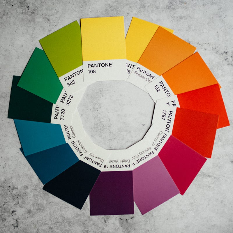
Analogus color is a type of color perception associated with color theory and design. It’s defined as colors that have a similar hue or colors perceived to be similar. Analogous colors tend to be found next to each other on the color wheel but not always.
Analogus colors are associated with color perception, red, orange, yellow, and warm colors, and there are a few distinct types.
Red, Orange, Yellow
These colors work together because they are all on the same wavelength, also the longest wavelengths of visible light. The darkness and lightness of these colors help to create contrast and are considered dramatic. There could be thousands of variations of these three colors.
Blue, Purple
Purple is a mix of red and blue, which are on different sides of the color wheel, however they are still considered analogous because they share a common hue. Blue and purple can be used together to create a calming and serene feeling.
Green, Brown
Brown can be made by adding black to green, or by taking away red and yellow from green. These colors are also on different sides of the color wheel, but they work together because they share a common hue. Green and brown can be used together to create a naturalistic and earthy feeling.
Analogous colors are one approach to developing color schemes. Some factors to consider when using analogous colors are the following:
- The colors you choose should be within one or two steps of each other on the color wheel.
- The colors you choose should have a similar hue. (Hue is defined as the color itself, without taking into account the value or chroma. Value is the lightness or darkness of a color, and chroma is the intensity or saturation of a color.)
- The colors you choose should be of the same lightness or darkness.
- The colors you choose should be of the same chroma, or intensity.
- You can create variation within your color scheme by adding tints, shades, or tones of your colors. (A tint is a color + white, a shade is a color + black, and a tone is a color + gray.)”
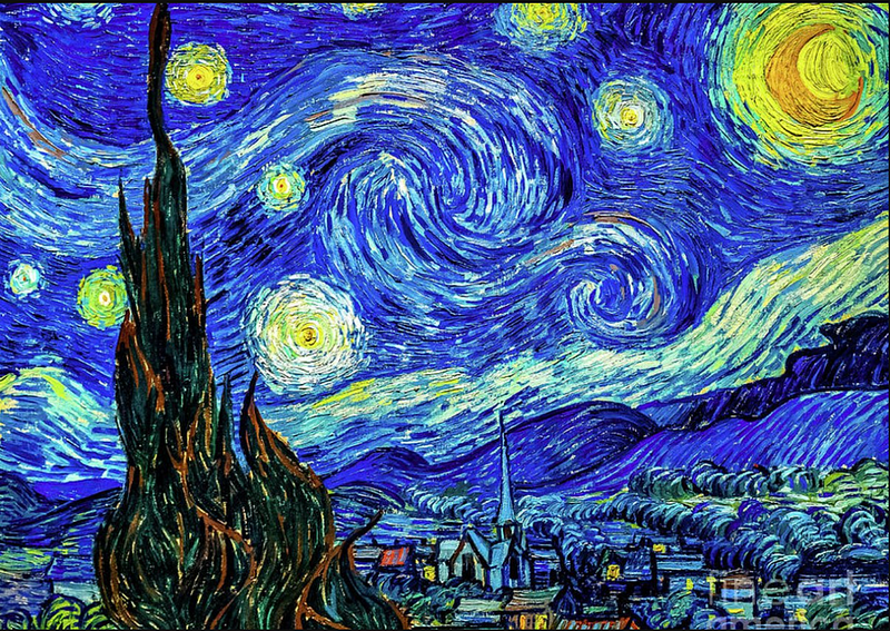
The famous artist, Van Gogh, used a lot of analogous colors in his paintings. One example is the painting “Starry Night.” In this painting, Van Gogh used different shades and tints of blue, purple, and green to create a calming and serene feeling.
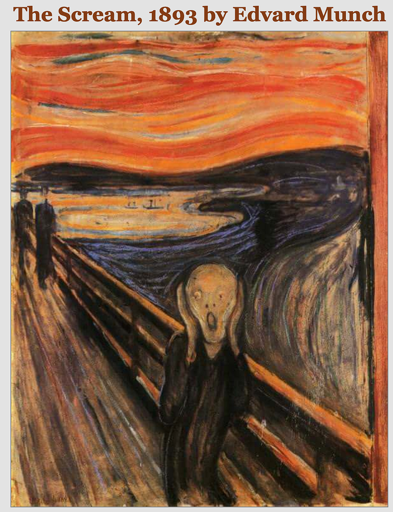
Another work of art you might recognize is “The Scream” by Edvard Munch. In this painting, Munch used different shades and tints of red, orange, and yellow to create a feeling of terror and horror.
As you can see, analogous colors can be used to create a wide range of feelings and emotions. When choosing colors for your own project, think about the feeling you want to conveyed and choose colors accordingly.
The reason color theory and concepts like analogous colors are important for designers, artists, and creatives is because of the strategy behind creating certain moods or feelings in messages.
One of the best places to learn about color is on the Adobe color website.
Also, read
Color Theory is a complex study related to the properties of light and human perception.
If you’ve enjoyed my writing, please consider supporting me by becoming a Medium Member, accessing unlimited Medium articles. Follow the link to subscribe for $5 a month or $50 per year. Thank you!


