
Predict Feast or Famine with Google Earth Engine
From Crop Area to Crop Production
In the world, agriculture occupies half of the livable land. And yet, 10% of the world’s population often goes to bed hungry. The current food problem has gotten worse as a result of climate change, the war in Ukraine, and COVID-19. The affordability, availability, quality, and safety of food have declined globally since 2019 in 113 nations, according to the 11th Global Food Security Index, as well as sustainability and adaptability.
A company called Descartes Labs is mentioned in Robert Downey Jr.’s The Age of AI. It has created a method based on weather and satellites to forecast food production and, consequently, famine. That is significant because we can prevent starvation and even violent conflicts if we can forecast famine and distribute food supplies in a timely manner. This beneficial method is, however, a trade secret of Descartes Labs and is not available to the public.
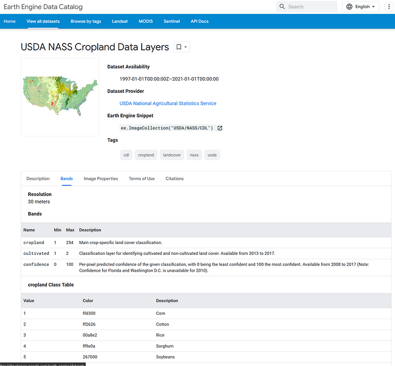
Can we do what Descartes Labs is doing, but with free tools and public data? We do have public satellite images from Google Earth Engine (GEE), which is free of charge for noncommercial use and research projects. In my previous articles, I have shown how to use GEE to monitor land use land cover (LULC), vegetation, climate, and others. In its data catalog, we can find valuable datasets such as the Cropland Data Layer (CDL). It is a detailed map of crops for the USA with a resolution of 30 meters between 1997 and 2021. It allows us to calculate the total cultivation areas of the 254 crop types for a given year in the USA. I can also gather the annual crop production statistics from the National Agricultural Statistics Service (NASS). With these two datasets, I want to answer two simple questions. Is it true that the larger the crop area, the higher the production? If the answer is yes, can we predict the latter based on the former alone?
In this article, I attempt to answer these questions. I will see how well the two data series are correlated. If the correlation is strong, it can become the basis for our crop production prediction in the future. The code for this project is hosted on my GitHub here.
And my processed data is in Google Sheets.
1. Calculate cultivation areas based on the CDL data in Colab
The CDL divides the map of the USA into a series of pixels and classifies each pixel into one of the 254 crop types year after year. If we want to calculate the cultivated area of corn for a given year, we can count the number of corn pixels in that year and multiply the number by the pixel area. It seems that the pre-2008 data missed large parts of the USA. So I only take the post-2008 data into account.
Because the satellite images cover the entire continental USA (Alaska is not included the whole time, though), there are many pixels in the dataset. I attempted to devour all the pixels at once in GEE’S online editor, but that led straight to the “Too many pixels in the region” error. So, I turned to the map-reduce strategy: the pixel counting goes from counties to states, and from states to the whole nation. We can get the names and geometries of the administrative regions from the FAO/GAUL/2015/level1 dataset. For example, we can obtain the state names by executing the following code in GEE’s online editor.
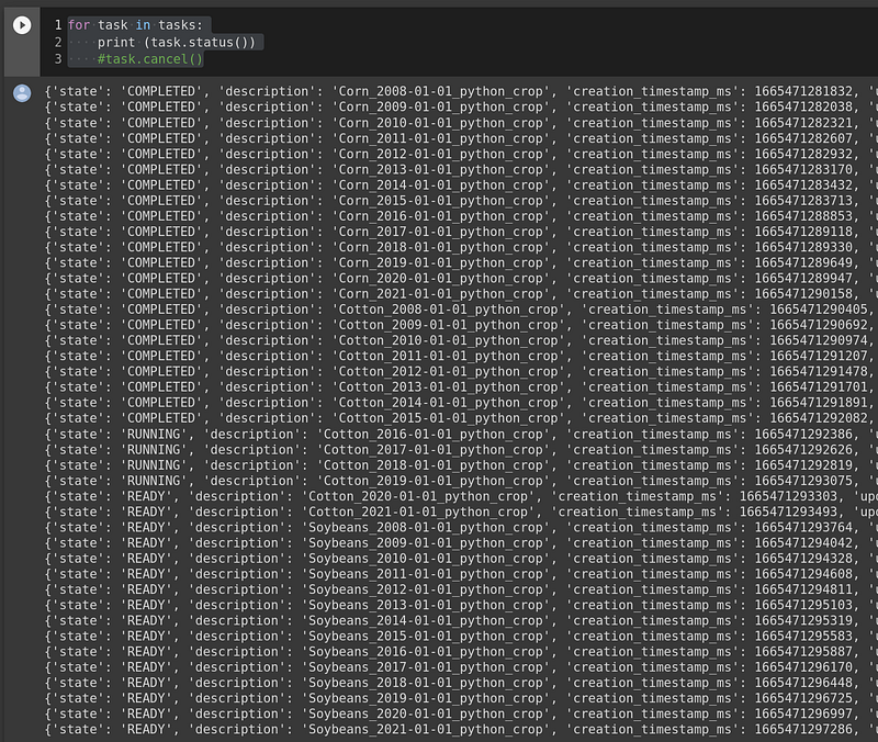
When I started calculating the state agriculture areas using this list, the “Computation timed out” error then appeared. To resolve this problem, Google suggests using the Export.table technique. It submits the jobs to the background and writes the outputs to your personal Google Drive. There were many jobs in this case because I wanted value for each of the three crop types and from each year. If I did it in the online editor, I would have to click many buttons to start the jobs. So, I used GEE’s Python API in Colab in this project.
In your Colab notebook, first name the output folder.
We can then start the pixel counting like this.
The reduce_state function (between lines 5 and 31) calculates the cultivation area of a given crop for a given state and for a given period. It has a child function called reduce_county. This child function comes from my previous project, and it counts the pixels in each county. The maxPixels = 1e10 is necessary because the default value of 1e7 is too low for some counties.
The main loop is between lines 49 and 66. It goes through three types of crops (corn, cotton, and soybeans) for each year between 2008 and 2021. The task holds the list of submitted jobs. It allows us to examine or cancel the jobs.
After all the jobs are completed, you can check the files in the output folder. Afterward, we can mount our Google Drive in Colab, put them all together, and generate one single output table.
The result is a TSV file called crop_area.tsv.

You can download this TSV from the sidebar to your computer.
2. Obtain the U.S. crop yields between 2008 and 2021
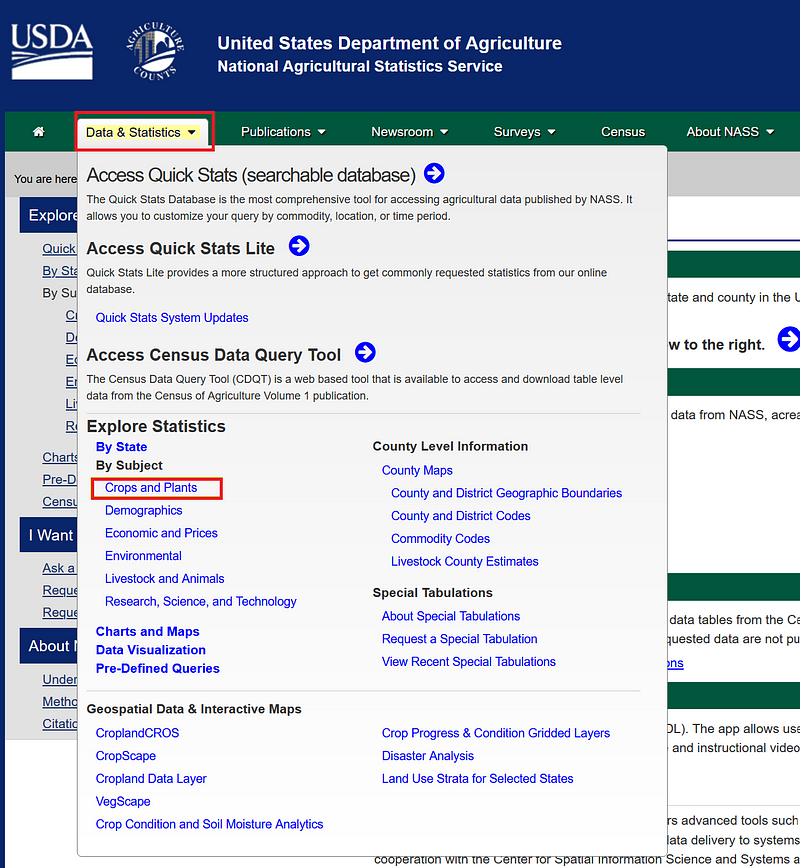
Now, we can combine the data from NASS. Go to its homepage and select Data & Statistics ➡️ Explore Statistics ➡️ Crops and Plants.
Once inside, select CROPS ➡️ FIELD CROPS. In Commodity, select the crops and then select the data item in Choose Data Items. In this case, we choose SOYBEANS — PRODUCTION, MEASURED IN BU for soybeans, COTTON — PRODUCTION, MEASURED IN 480 LB BALES for cotton, and CORN, GRAIN — PRODUCTION, MEASURED IN BU for corn. Click the Continue button and more … to open the spreadsheet.
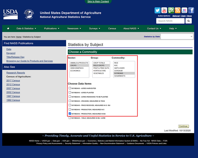
We can download the spreadsheet by clicking the Spreadsheet link.
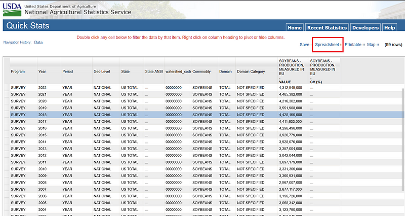
We can then integrate these data into our TSV file in Google Sheets.

3. Calculate the correlations
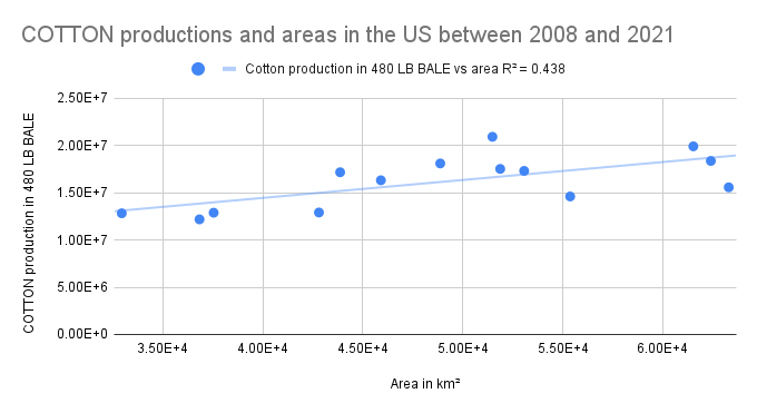
Now we can create scatter plots for all three types of crops. We can do this either in Google Sheets or Excel.
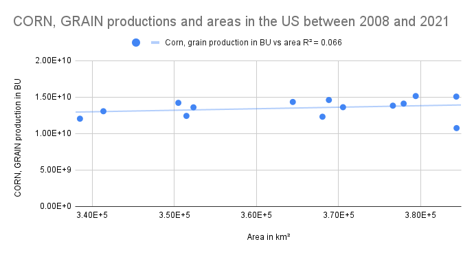
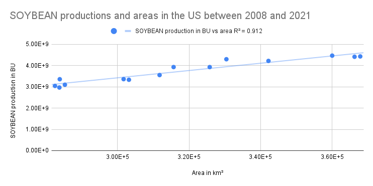
As you can see in the figures above, although we can see upward trends between productions and areas for all three crop types, their R² are quite different. On the one hand, the correlation between cultivation area and production is weak for corn grain. In other words, it is quite hard to predict how many bushels of corn grain are going to be produced based on the area alone. For example, we observed the largest corn area in 2012. But in that very same year, we had the lowest corn grain production.
For cotton, the R² (0.438) is also quite weak. So our model is unlikely to predict its production reliably. On the other hand, soybean production seems to be more predictable based on its area, as indicated by its high R² of 0.912. It can indicate that the yield of soybean per unit of land is relatively stable over time in the US. However, I have not found any recent yield data to confirm this. A relevant but outdated study by Ray et al. (2012) has shown that the majority of the US corn (92.4%) and soybean (91%) fields witnessed increasing yields between 2004 and 2008.
Here we have a so-called multiple testing problem. Since we have done three calculations, it is possible that this one strong correlation just happened by chance. So we really need to do more to confirm that the correlation is valid. For example, we can cultivate soybeans under different climate conditions and compare their yields. Or we can collect census observations and calculate the yields.
Conclusion
In order to feed a growing world population without devouring the planet, we strive for high yields with the lowest environmental impact. In his book Regenesis, author George Monbiot wrote:
In other words, we need an Earth Rover Program, to explore thoroughly the surface of our own planet, whose intimacies are as little known to us as the surface of Mars. Scientists working under this program would seek to map the world’s agricultural soils at much finer resolution than has yet been achieved, understand their varied ecologies, and work out the means by which large amounts of food can be grown with the lowest possible supplements and the smallest possible impacts.
And the CDL dataset is a step in the right direction, although it only covers the US. It is a pity that such high-quality datasets are so rare. The Canada AAFC Annual Crop Inventory allows us to do similar analyses for Canadian soil between 2009 and 2020. And the EUCROPMAP 2018 dataset contains data about agricultural land use in the EU. But as its name suggests, its data spans only between 2018.01.01 and 2019.01.01. To realize Monbiot’s vision, we need satellite data that can provide global coverage with high resolution. So, CDL is a piece of the solution, and we need more datasets like these.
In this project, I calculated the correlations between cultivation area and production for corn, cotton, and soybean. The results showed that the correlations are of different strengths. It is known that crop production can be influenced by many factors other than cultivation area alone. Soil fertility, availability of water, climate, biodiversity, and diseases or pests all play a role. And some of these data are available in GEE data catalog, too. And you can read my previous tutorials about these datasets (1, 2). So this project was my rough first attempt to predict a multivariable phenomenon with a single variable. And I encourage you to incorporate more satellite data into the prediction.


