
Monitor Vegetation with Google Earth Engine
Create NDVI + EVI time series for your favorite forests
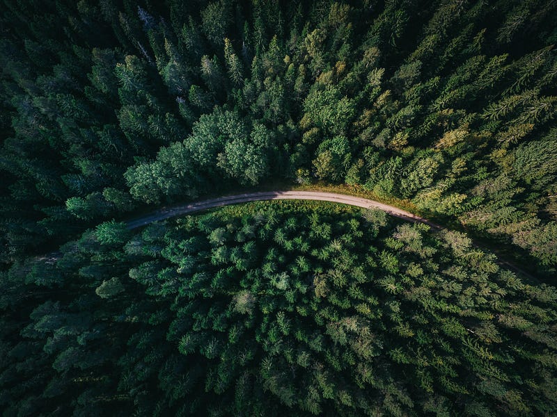
The 2022 heat waves have been scorching the earth. South America, the United States, Europe, India, China, and Japan have all been hit by high temperatures. On this rapidly warming earth, vegetation is our natural ally. But it also bears the brunt of climate change. In 2022, wildfires have raged around the globe. Large areas of forest went up in flames. This series of events rings the latest alarm bell about climate change. And we need to pay strong attention to the health of our vegetation.
To protect the plants, we first need to know more about them. And satellites can help. With satellite images, we can monitor the area changes and the health of the plants. In addition, we can calculate wildfire risks preemptively. And when wildfires occur, we can detect them quickly and assess the damages afterward with this eye in the sky.
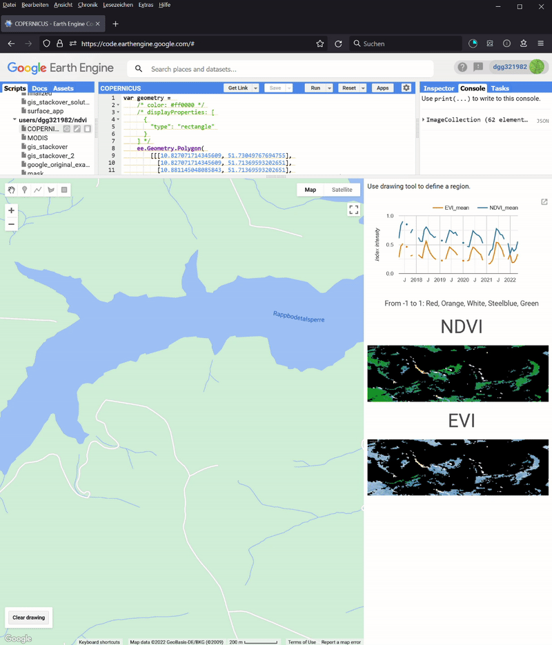
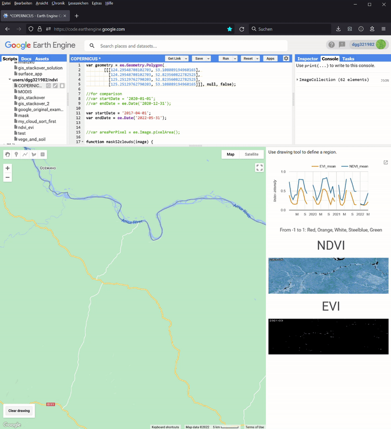
And with Google Earth Engine, we can do them for free for noncommercial and research use. Moreover, we neither need to install software nor download images on our local hard drive. In my previous article Monitor Land Use Changes with Google Earth Engine, I have shown how to use Google Earth Engine to monitor the Land Use Land Cover (LULC) for a given location. In a subsequent article Monitor Regional Climate with Google Earth Engine, I showed how to monitor the long-term climate (temperature and precipitation) and the elevation of a given region, too. In this article, I will show you how to build two new apps for vegetation monitoring based on the same code (Figure 1). We will calculate the normalized difference vegetation index (NDVI) and the enhanced vegetation index (EVI) for any land area between 2017 and 2022.
The code for this project is hosted in my GitHub repository here.
And I have them both into web apps.
1. NDVI and EVI
From your airplane window, you would say that an area is covered by plants when it is green. But strangely, satellite imagery doesn’t work that way. Plants absorb red light (620–750 nm) for photosynthesis. But they reflect the near-infrared light (NIR, 700–1100 nm) to avoid tissue damage because the photon energy at those wavelengths is too large. As a result, an area covered by plants is dark in the red channel but bright in the near-infrared channel. In contrast, the opposite is true for snow and clouds. NDVI exploits this phenomenon. And it is defined as follows:

NIR and Red stand for near-infrared and red surface reflectance, respectively. The value of NDVI is between -1 and 1.
As its name suggests, EVI is the enhanced version of NDVI. According to Wikipedia,
(it) enhances the vegetation signal with improved sensitivity in high biomass regions and improved vegetation monitoring through a de-coupling of the canopy background signal and a reduction in atmosphere influences. Whereas the Normalized Difference Vegetation Index (NDVI) is chlorophyll sensitive, the EVI is more responsive to canopy structural variations, including leaf area index (LAI), canopy type, plant physiognomy, and canopy architecture. The two vegetation indices complement each other in global vegetation studies and improve upon the detection of vegetation changes and extraction of canopy biophysical parameters…. And in the presence of snow, NDVI decreases, while EVI increases.
EVI can be calculated as follows.

As the formula shows, EVI takes not only NIR and red but also the blue reflectance into account. In other words, if you have enough information to calculate EVI, you can compute NDVI. And the four coefficients are G (gain factor) = 2.5, C1 = 6, C2 = 7.5, and L=1. EVI normally fluctuates around 0.2 and 0.8 for healthy vegetation, but it can have values out of the [-1,1] range. However, I clip its values to [-1,1] in the thumbnails of my apps.
2. The datasets
In this project, I have implemented two apps. They are based on the COPERNICUS/S2_SR_HARMONIZED (Creative Commons CC BY-SA 3.0 IGO licence) and MODIS/061/MOD13A1 (MODIS data and products acquired through the LP DAAC have no restrictions on subsequent use, sale, or redistribution.) datasets, respectively. COPERNICUS/S2_SR_HARMONIZED is provided by the European Union/ESA/Copernicus. It contains all three bands needed for EVI and NDVI. In addition, it contains a band called Scene Classification Map (SCL). Each pixel in the dataset has been classified into one of the eleven classes (vegetation, bared soil, and so on). These classification results are stored in the SCL. The older version of this app used the S2_SR product. But as my reader Philipp Gaertner pointed out, S2_SR has shifted the Digital Numbers (DN) by 1000 since January 25, 2022 and the data are not comparable afterward. Now I am using its harmonized version, because it shifts data in the newer scenes to be in the same range as in older scenes.
MODIS/061/MOD13A1 is provided by the NASA Land Processes Distributed Active Archive Center at the USGS EROS Center. MODIS stands for Moderate Resolution Imaging Spectroradiometer. Unlike COPERNICUS/S2_SR_HARMONIZED, MODIS/061/MOD13A1 only stores the precomputed NDVI and EVI instead of the electromagnetic bands. And Google uses this dataset in its tutorial for line chart.
The two datasets have different resolutions. MODIS/061/MOD13A1 can only resolve 500 meters. In contrast, the resolutions of the blue, red, and NIR bands in COPERNICUS/S2_SR_HARMONIZED are 10 meters. As a result, we can see a lot more details in its images.
In addition, MODIS/061/MOD13A1 visits the same place every 16 days. Although COPERNICUS/S2_SR_HARMONIZED has a revisit frequency of five days, I need to composite its images to get better pixel qualities. Even so, it still has gaps in its monthly composites. But its quarterly composites appear to be continuous for some European regions.
3. The apps
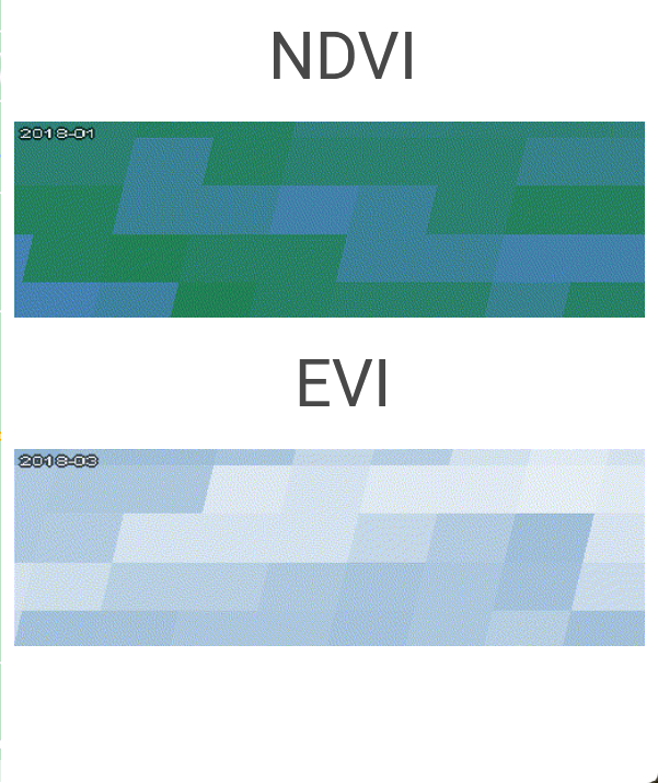
Both apps have the same structures as my LULC area monitoring app. They have four main components: generate_collection, control, line chart, and thumbnails. As its predecessor in the area monitoring app, the generate_collection function generates an image collection series between a start and an end date. In each image collection, NDVI and EVI are either computed or extracted from the corresponding dataset. These values are sent to the line chart function and the thumbnail function. The line chart gives readers quick overviews, while a thumbnail presents details. The former documents the changes in NDVI and EVI over time. And the latter is in fact a spatial heatmap. For each pixel, I map its NDVI or EVI value to a five-color scale: red, orange, white, steelblue, and green. The control component coordinates them and manages the layout. The last three functions are more or less the same as in the LULC app. Please refer to my article for more details. In other words, only the generate_collection function has been newly implemented for this project. The two apps are based on two datasets, and they have different bands. As a result, the two apps have different generate_collection functions.
3.1 The COPERNICUS app
In the COPERNICUS app, I first preprocess the images. Images with cloudy pixel percentages of less than 20% are kept (Line 48). Then I mask the cloud and keep only the vegetation and bare soil pixels by modifying the code from this post (Line 1–17 and 50–51). Then I calculate the NDVI and EVI with the band data (Line 19–44 and 53–54). Afterward, I group the images into temporal bins and calculate their mean composites (Line 56–65). These composites in turn form a new image collection (Line 56–74) and it will be returned by the function. If there is no composite for a given period of time, I fill that period with an empty image (Line 69–70).
3.2 The MODIS app
The code in the MODIS app is simpler because MODIS/061/MOD13A1 has stored the two indices as NDVI and EVI bands. So I just need to select (Line 4) and normalize (Line 7) them. My code is inspired by Google’s example.
4. Test the apps
Now it is time to test the two apps. The values from COPERNICUS are monthly composites, while the data in MODIS are measurements from individual sampling dates. In addition, they are preprocessed differently. Finally, the resolutions are different. So the results will not be exactly the same between the two apps, even from the same target region. The first question is whether the two apps can deliver similar long-term trends.
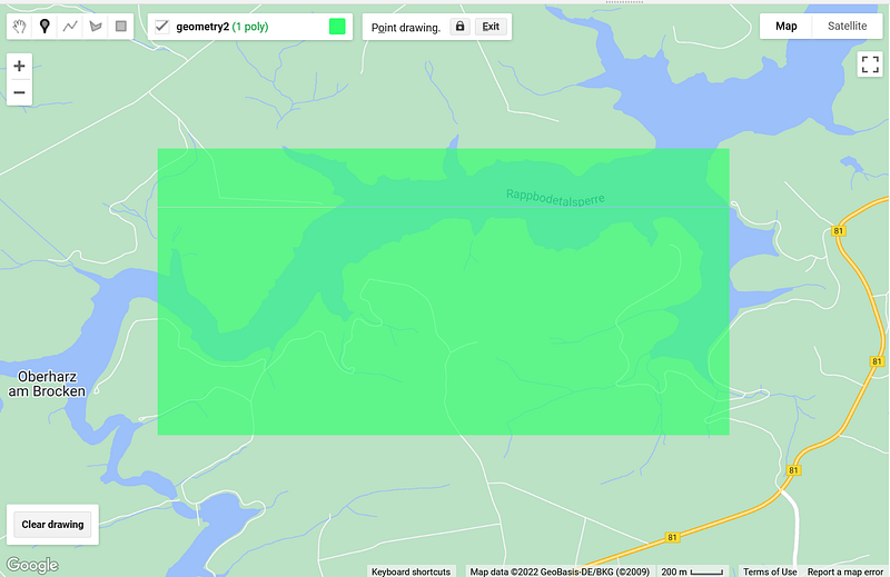
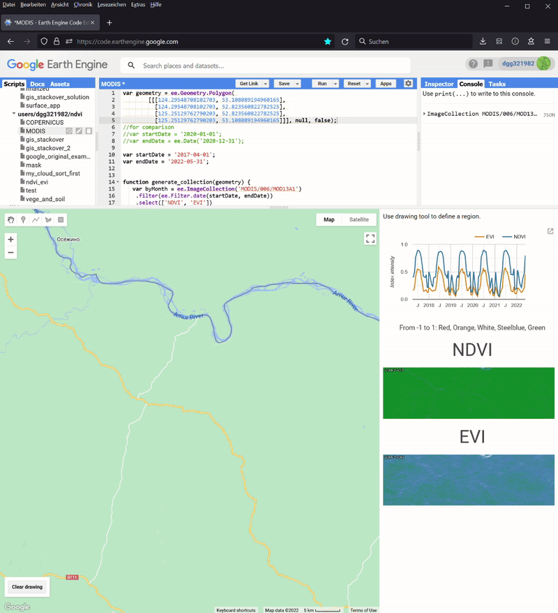
4.1 The Rappbodetalsperre region
In Figure 1 and 3, you can see the time series generated for the Rappbodetalsperre region in Germany between 2017 and early 2022 (Figure 2).
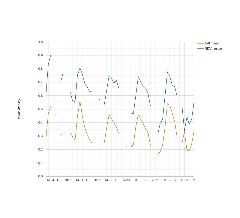
COPERNICUS and MODIS apps. Left: COPERNICUS/S2_SR_HARMONIZED; Right: MODIS/061/MOD13A1. Image by author.In Figure 3, you can see that the COPERNICUS app has several gaps in its time series, while the curves in the MODIS app are continuous. Nevertheless, the two apps deliver similar results in terms of value ranges and trends. For example, the yearly summer surges and winter dips of both indices are clearly visible in both apps. Their numeric values are comparable, too. For example, the NDVI value in June 2017 was 0.9 in the COPERNICUS app and 0.875 in the MODIS app. Finally, NDVI and EVI synchronize well in this test case.
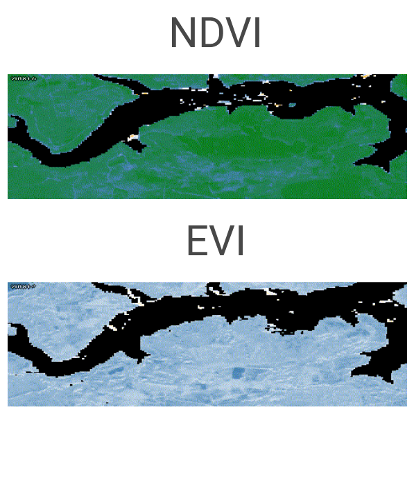
COPERNICUS and MODIS apps. Left: COPERNICUS/S2_SR_HARMONIZED; Right: MODIS/061/MOD13A1. Image by author.In Figure 4, you can see the differences in their resolutions. COPERNICUS not only shows the outline of the water body, but also the shapes of several farmlands at the southern edge. In contrast, the MODIS app has around 40 large square pixels over the entire region. The silhouette of the water body is completely lost.
4.2 The Daxing’anling region
Because Google is not accessible in China, I worried that Google Earth Engine would not work in the Chinese region. To test that hypothesis, I used the apps to monitor the Daxing’anling region in the Heilongjiang province, next to the Chinese-Russian border.
COPERNICUS/S2_SR_HARMONIZED; Right: MODIS/061/MOD13A1. Image by author.In this case, MODIS has more data than COPERNICUS. Its data cover the whole time period between April 2017 and early 2022. In comparison, COPERNICUS data only goes back to January 2019. It is also obvious that the images in COPERNICUS did not always cover the entire target region. Despite these differences, we can still see the yearly cycles of both indices in this forest area. I then tested the apps over other Chinese areas and was happy to see that they worked, too.
4.3 The Amazon rainforest
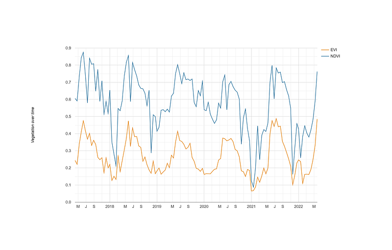
In my third test, I monitored the Amazon rainforest. I selected a region next to Carauari.
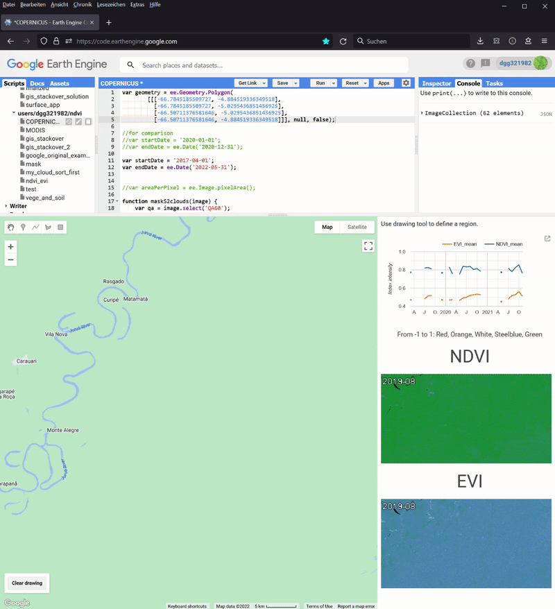
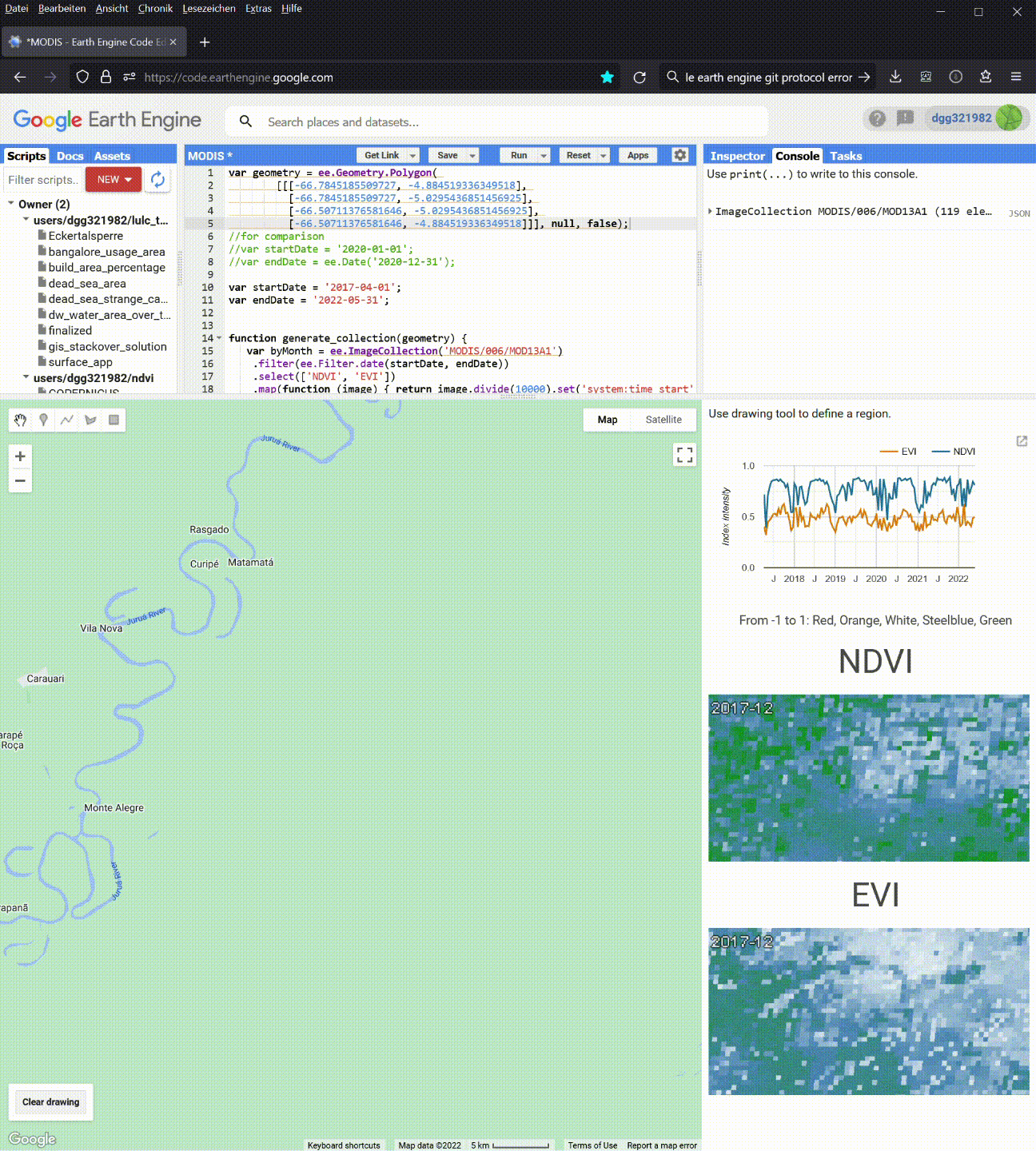
COPERNICUS/S2_SR_HARMONIZED; Right: MODIS/061/MOD13A1. Image by author.Again, the MODIS app has all the data for the entire test period. The COPERNICUS only starts in January 2019. We can also see how patchy the classifications are in COPERNICUS‘ monthly composites. Finally, the time series from COPERNICUS contain too many gaps to be useful in this test case.
We can also make some interesting observations from MODIS, too. Firstly, compared to Rappbodetalsperre and Daxing’anling, the surge periods in the Amazon rainforest were longer, which lasted from June to November. Secondly, although NDVI and EVI synchronize well, there are some small discrepancies. For example, on November 17, 2019, the NDVI was still high at 0.85, but the EVI value dropped to 0.4. Also, the NDVI normally reached the yearly high plateaus in June. In contrast, the EVI rose in June and then surged again to arrive at its summer peaks between August and October.
Conclusion
In this article, I have shown you how to create two apps to monitor the NDVI and EVI of a given region. These two indices give us hints about the productivity of the underlying ecosystems. The more productive an ecosystem, the more organisms it can support, and the more biodiverse it is. So NVDI and EVI can serve as our proxies for biodiversity. And they can complement the traditional metrics, such as species richness or species density, and tell us more about the health of the ecosystem.
The two datasets, COPERNICUS/S2_SR_HARMONIZED and MODIS/061/MOD13A1, both have their strengths and weaknesses. COPERNICUS/S2_SR_HARMONIZED has higher spatial but low temporal resolutions. Images in MODIS/061/MOD13A1 are coarse-grained, but they can cover the whole test period in all my test cases without gaps. And sometimes, MODIS is the only data source for regions such as the Amazon rainforest. As the test runs in this project show, the results of the apps are comparable. So it is advisable to use both apps and overlap their results to gain a better understanding of the target region. You can even combine them with my LULC area monitoring app to investigate a region hit by a wildfire, a drought, or other disturbances.
There is ample room for improvement, too. For example, we can allow users to upload their GeoJSON files. Because function calls in Google Earth Engine are asynchronous, the two thumbnails are out of sync in my current implementation. So I am looking for a way to sync them. Finally, we can even unify the two apps into one, where the user can see all the results at once.
And what is your idea? Do you also use Google Earth Engine to monitor vegetation? If yes, please share your experience.


