
Monitor Land Use Changes with Google Earth Engine
Temporal Land Use Land Cover Analyses with Dynamic World
One day, I watched a YouTube video about a pool tech called Mark Jones. What amazed me the most was that he used Google Maps’ satellite mode to find new customers in his subdivision for free. That video set off my interest in remote sensing and geospatial analysis. And I have learned that people have used satellite images to do many exciting projects. For example, Frake et al. mapped the mosquitoes that transmit malaria in Malawi; Piralilou et al. predicted wildfire susceptibility using machine learning on remote sensing data. Coincidentally, both teams used Google Earth Engine.
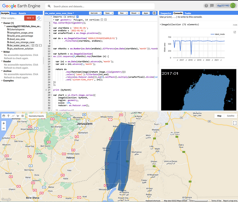
Google Earth Engine (EE) is a planetary-scale software and data platform. It runs on Google’s cloud infrastructure and boasts a petabyte-scale database with 37 years’ worth of data. EE provides us with Python and JavaScript API. We can either use the Google Colab or, more conveniently, its intuitive and powerful online Code Editor (Figure 1). EE is available for commercial use and free for academic and research use.
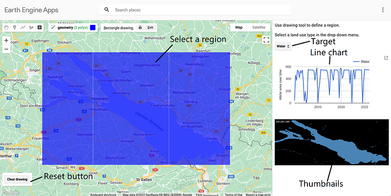
EE gives us the tools and data to do complex geospatial analyses. It is no surprise that EE itself is vast. And we need to learn a lot of basics before we can start to harness its power. Fortunately, we have many free learning materials. Lots of creative use cases are shown in EE’s gallery as well as in its Medium channel. And I want to share my own projects here. In this article, I want to describe how to make a surface area monitoring App. The Dynamic World V1 dataset from Google serves as our Land Use Land Cover (LULC) map. The app shows how the land use changes over time in a line plot. It also animates all the composite images as a series of thumbnails so that we can get a visual sense of the data. The finished app looks like this.
And you can find my code hosted in my GitHub repository here.
1. The Dynamic World dataset
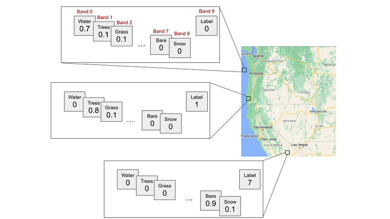
Google’s Dynamic World is a 10m global near real-time (NRT) land use land cover (LULC) image collection from June 2015 to present. Its images come from Sentinel-2 L1. Each image has ten bands. Dynamic World tries to classify each pixel into one of nine different LULC types: Water, Trees, Grass, Flooded_vegetation, Crops, Shrub_and_scrub, Built, Bare, and Snow_and_ice. It assigns a normalized probability to each type and stores it in one of the first nine bands. Then it chooses the type with the largest probability and puts its label into the tenth band (Band 9) (Figure 3).
2. The script
The script consists of four main components: the control, the line chart, the thumbnail display and the generate_collection function that refreshes the image collection. In the header, we define the start and end dates, the area per pixel, the Dynamic World image collection (dw), the sampling interval (step), and the amount of months between the two dates. I have found that a sampling interval of three months strikes a good balance between granularity and composite quality. When its value is too small, we have higher granularity but many samples are of low quality. When its value is too large, the opposite happens.
2.1 The control component
The control defines the app layout and acts as the middleman among the other components. It also adds labels, a drop-down menu and a reset button to the interface.
2.2 The generate_collection function
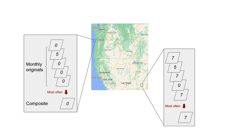
Whenever the user selects a new geometry or a new LULC type, this function takes the new value and generates a new image collection from Dynamic World. The function goes through the period from January 2016 to July 2022. In each iteration, it gets the images from a defined period, extracts the label bands and composites them into a single image. The composite image represents the mode (ee.Reducer.mode) of the original images. Imagine that we first align and stack all the images from a given period, and then take a vertical view at each pixel. We find the value that occurs most often in that pixel column and assign it to the corresponding position in the composite (Figure 4). We keep all the pixels that have the desired label (selfMask) and set their values to the pixel area in square kilometers (Line 14). All non-target pixels are removed. Finally, we timestamp the composite with the first date of the period. The ee.Algorithms.If statement catches periods without source images and returns empty dummy images.
2.3 The line chart
This component generates the line chart in the panel. It calculates the total area of the target class by adding up all the pixel values in km² (Line 6).
2.4 The thumbnails
I got this idea from user xunilk on gis.stackexchange.com. This function animates the preprocessed images. Each displays only the positive pixels. The “gena” package is used so that we can display the time stamps in the upper left corner of the images.
3. Test the app
We can copy and paste the complete code into Code Editor. Afterwards, create an app by clicking the Apps button and follow the instructions. Google will show you the app address and then deploy the app on the internet. It may take some time until the app is ready, though. Once it is online, let’s test it against some famous locations and see whether the app can calculate the correct areas.
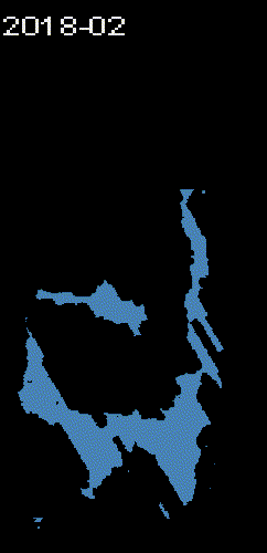
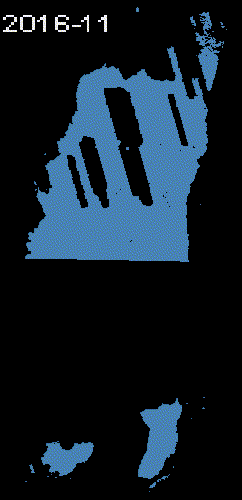
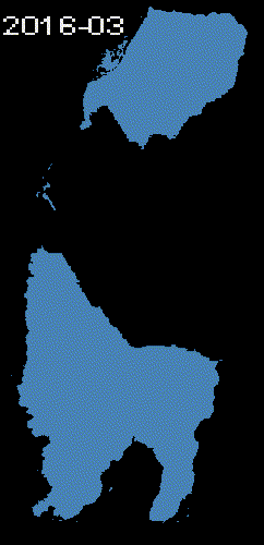
3.1 The Dead Sea
First, let’s select the Dead Sea and Water.
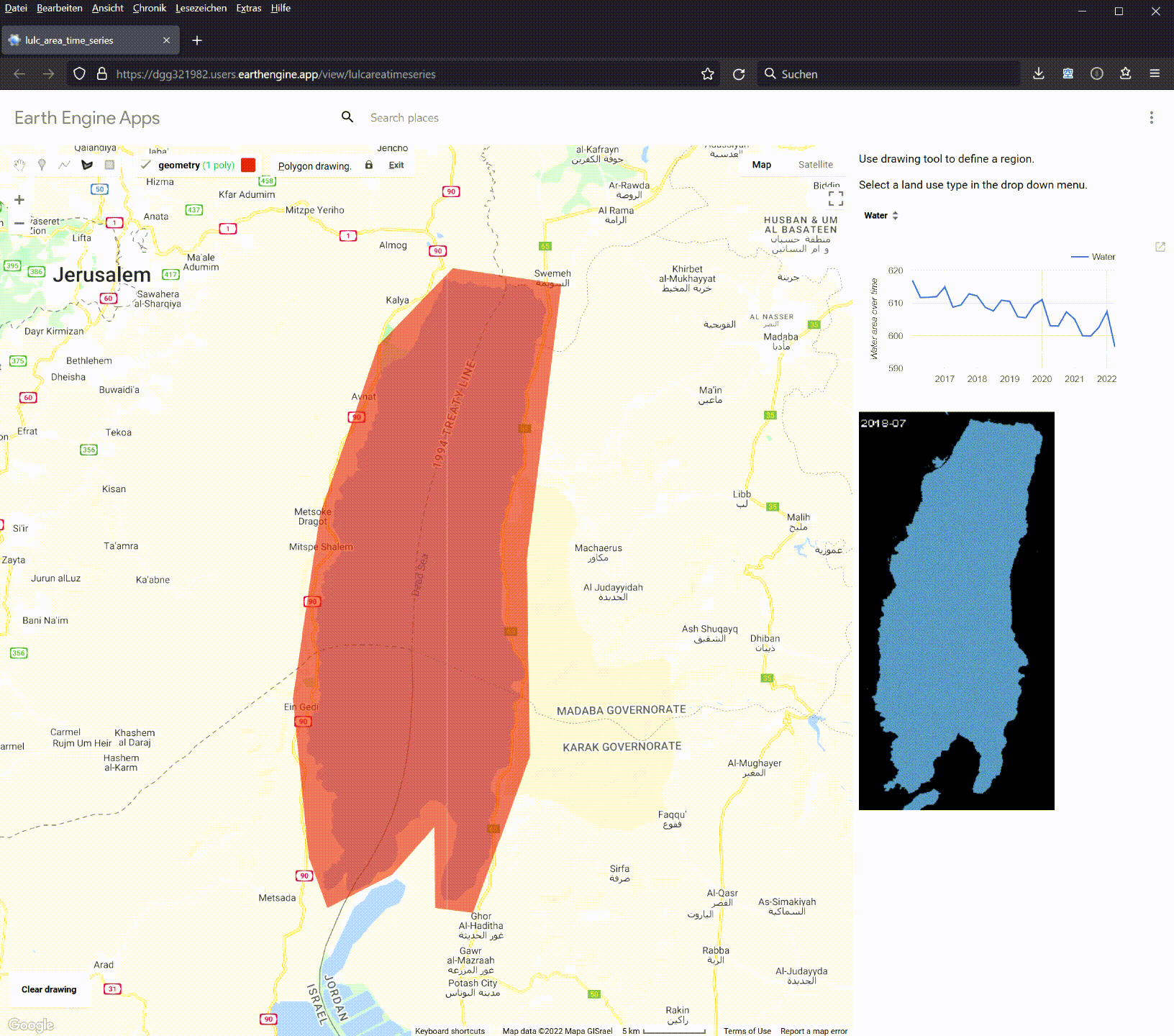
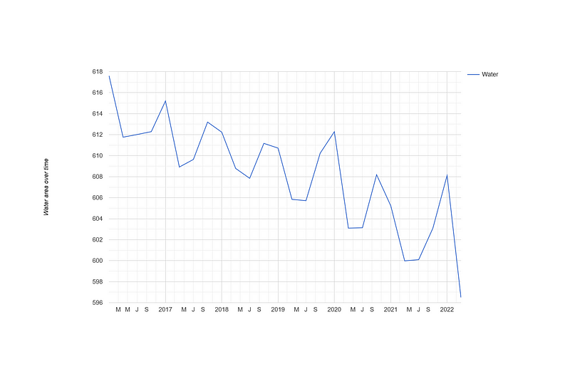
On the right panel, we can see that the Dead Sea water area declines over time. The values hover around 600-617 km². According to Wikipedia, the Dead Sea’s surface area is 605 km², which agrees with our results.
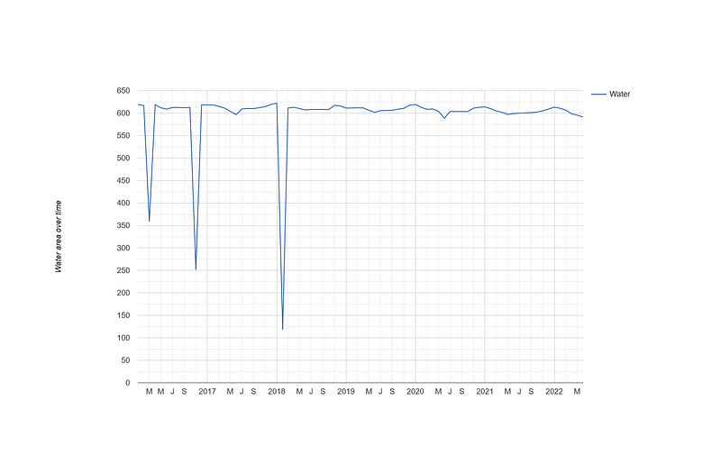
If we change the sampling interval to one month, we can see that three abnormal dips occur in March 2016, November 2016 and February 2018. I have investigated them a bit. There is only one image in the whole month of February 2018, while four images were taken in March and November 2016 respectively. All of them have large unclassified areas. It is no surprise that the composites are also of low qualities. Furthermore, the downward trend disappears in this monthly view.
3.2 Lake Touya
This beautiful lake is located in Hokkaido, Japan. Let’s observe its water areas over time.
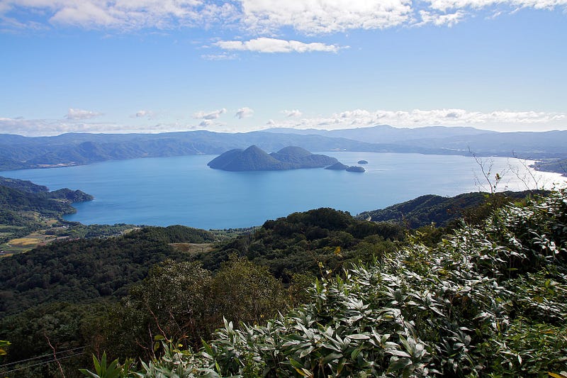
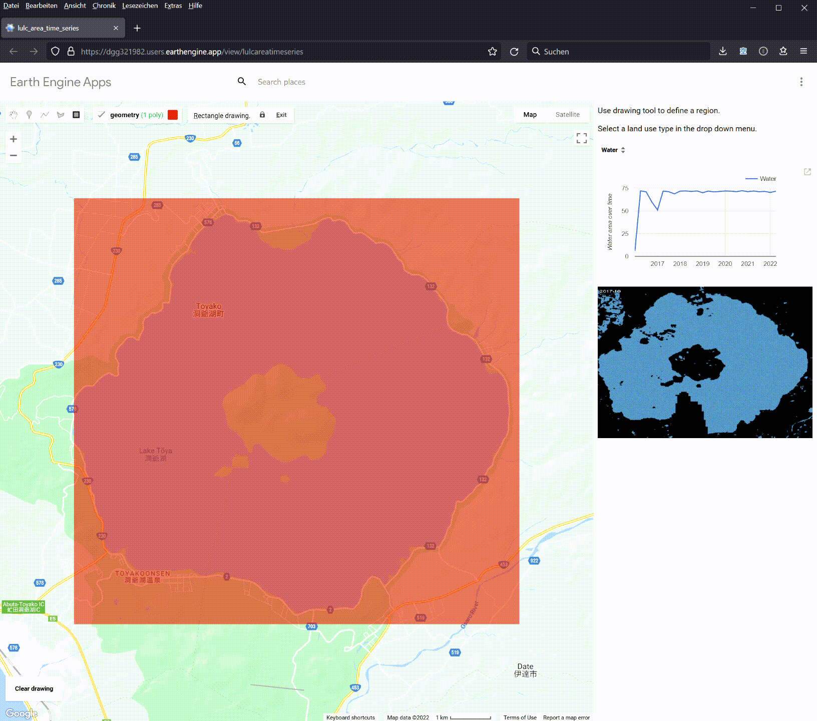
The line chart indicates that Lake Touya has a surface area of 71 km², which agrees well with the value of 70.7 km² on Wikipedia.
3.3 The Tottori Sand Dunes
Yes, there are sand dunes in Japan. The largest are the Tottori Sand Dunes. They are right next to Tottori city. We can calculate their total areas over time in the class Bare.
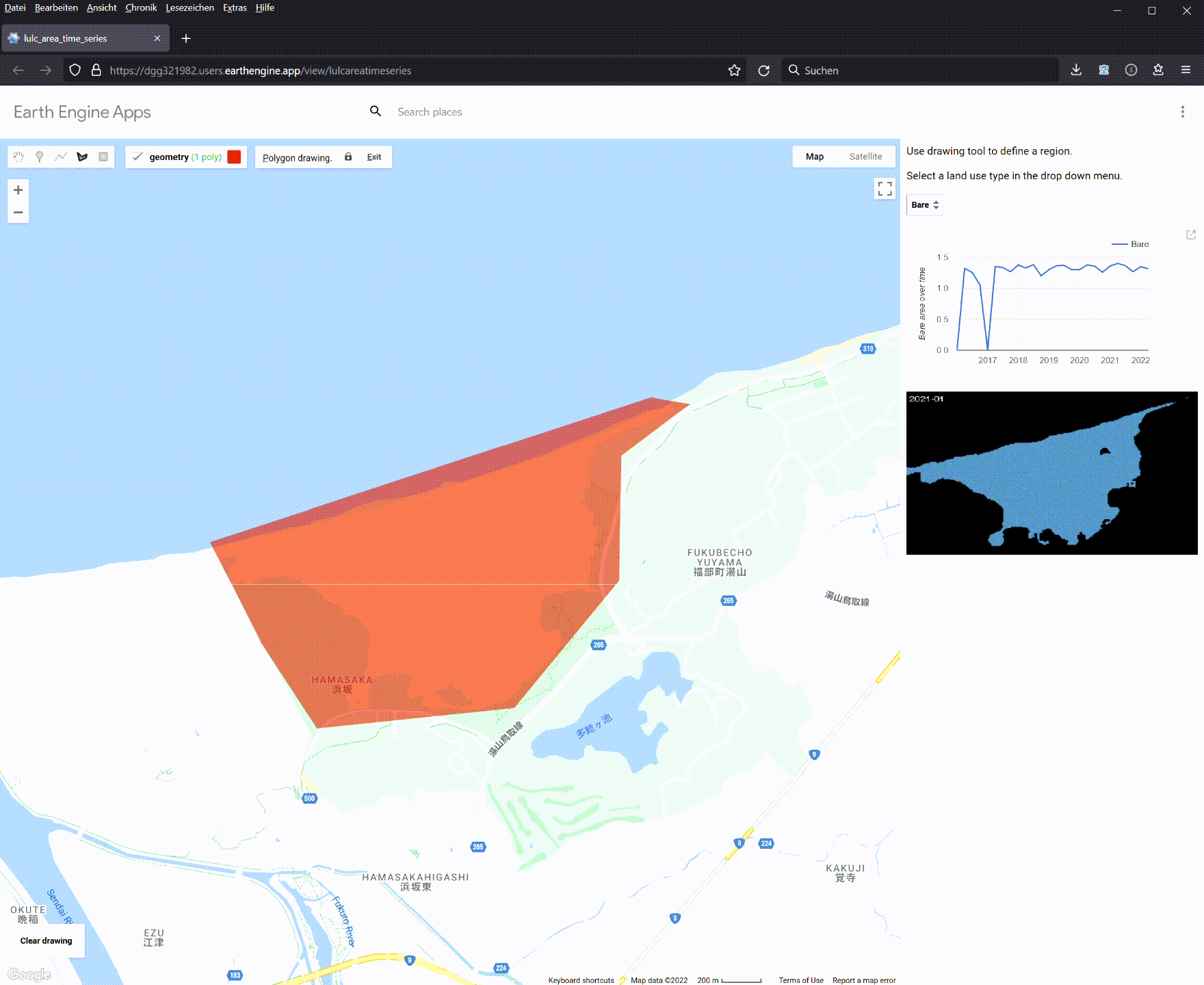
As you can see, the app indicates that the Tottori Sand Dunes have a total area of 1.2–1.3 km², which is in agreement with the value of 131 hectares provided by sakyu-vc.com. We can observe that two of the samples do not have any classification.
Conclusion
This small project demonstrates how to use Google Earth Engine’s Dynamic World to power an app for LULC area monitoring. We can use it to monitor wildfire damages, deforestation, water reduction, and desertification. Users can accomplish all these tasks at home and for free. And more importantly, these activities increase our environmental awareness. For example we can see that in Section 3, the Dead Sea is shrinking at an alarming rate.
But as the three examples demonstrate, the Dynamic World dataset is not without its problems. On the one hand, it is relatively young. Its collection starts in June 2015. On the other hand, there are many images whose classifications are too poor to be useful. Many images have large voids. Furthermore, I have discovered that some scattered pixels outside the Dead Sea were occasionally classified as water. Because Dynamic World uses Sentinel-2 L1C images with CLOUDY_PIXEL_PERCENTAGE ≤ 35%, the cloud should not be the main cause for such glitches. Currently, the only clue that I can find is in its documentation page. It reads:
Given Dynamic World class estimations are derived from single images using a spatial context from a small moving window, top-1 “probabilities” for predicted land covers that are in-part defined by cover over time, like crops, can be comparatively low in the absence of obvious distinguishing features. High-return surfaces in arid climates, sand, sunglint, etc may also exhibit this phenomenon.
In conclusion, the Dynamic World classification is valuable, but it needs some improvements before we can use it in long-term, fine-grained LULC applications. Or we can sacrifice the granularity a bit more for fewer but better classified composites. And I encourage you to use it for your own projects.


