
System Design
6 Months Ago I Built My Own Data Infra. Why I’m Now Tearing It Down.
How I’m rethinking my build and what new data engineers can learn about system design and data automation development.
Do you find designing your own data infrastructure to be intimidating? Start small. Get started with my free, 5-page data project ideation guide.
Data Doodling: System Design On Paper
A luxury of developing, scaling and maintaining your own systems is unlimited freedom. You’re free to choose the logic behind infrastructure, the data you ingest and how it’s presented to end users.
The downside is that with this great freedom comes absolutely no responsibility.
This becomes dangerous as you see cracks in your foundation and think “One day I’ll fix that.” No manager or stakeholder is going to raise the concern that you’re running five similar processes in separate VMs or that your processing time could be increased by using material views.
No one will tell you that. And you don’t want to admit it.
So on that day when you finally gather the courage to finally correct the problems it goes from plugging holes to a complete system overhaul.
What then?
In my case, I set my system up relatively quickly after months of promising myself I would do it. I used spare time while in a distraction-free French apartment to finally build the analytics pipeline that would help me unlock insights to create more precise, more resonant writing and present that to an audience who would be both receptive to the content and benefit from it.
The only problem was that this proved to be a ton of work. And overhauling it will require even more. With motivation and direction in short supply, the last thing I want to do is open an IDE.

Knowing the benefits of writing things down, I’ve tried collecting my thoughts into a wish list I kept on my phone.
But while that list reminded me of tasks to complete, it didn’t give me the “whole picture” that a less informal, rendered method would.
Additionally, I knew if I used software to create an arch diagram, the whole process would feel too “official” and I might not be as truthful in my conveyance of the components.
So I cracked open a notepad and made a crude but accurate representation of my primitive data mart (pictured below), complete with upstream sources, my staging resources, downstream storage and the end product, dashboards I get emailed to myself.
While I’ll cover some specifics of my process, my real goal is to show you the benefit of reviewing background processes and questioning your past decisions to arrive at a more efficient, scalable and less intimidating system–even if only for an audience of one.
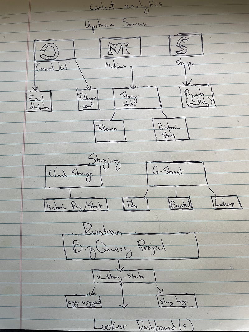
Unlike systems I’ve built professionally, this one is relatively light on upstream sources. I’m not connecting to a huge raw data source like Google Analytics.
Instead, I’m relying on APIs from the three platforms I interact with most:
- Medium
- ConvertKit
- Stripe
Each source has a corresponding cloud function that loads data. If you’d like, you can read about my processes for ConvertKit and Stripe.
Stripe is the only function that makes one call so, thankfully, that will be easy to integrate into a new process.
ConvertKit involves one API request but produces two reports, a running follower/subscriber count and another table with more granular attributes.
The process for this platform is two-fold, involving ingesting API data and a static monthly JSON file I have to manually download (unfortunately). Balancing daily loads with the monthly check isn’t too challenging, but it will require an extra task in the end product DAG.
Branching off Medium, I build out several views, though only two are pictured. The main view I use to power my dash is v_story_stats, which is a combination of tables. I also have an aggregate_engagement view I use to create a similar report but within a monthly time frame.
The part of the process I call my staging area is simple and, since part of my process is unavoidably manual, I’ll likely continue to rely on a combination of cloud storage and Google Sheets for intermediate storage.
I use Cloud Storage to store my JSON data (mentioned earlier) and a G-Sheet to store values I can’t get from my API source, i.e. whether one of my stories has been boosted.
Data from these 10+ upstream and staging sources is ingested into BigQuery where it serves as the fuel for what are, right now, conventional views.
These views power dashboards I build in Looker and produce the reports I receive daily. My final report is 8 pages, which I skim through in less than 5 minutes while brewing my morning coffee.
My main critique of my existing process is that it’s asynchronous. My cloud functions are scheduled and execute runs, views get queried when they need to and my sheets get updated.
But right now the problem is that there is no relationship between the processes. There is no upstream check, for instance, to see if my base tables have updated. I also don’t have a check to see what day it is to tell my monthly processes to run.
This has resulted in inevitable errors that result in the dreaded “No data available” output in both my BigQuery environment and my Looker dash.
To convert this from a mashup of cloud processes to a symbiotic flow, I need to first understand timing.
For simplicity, I’m breaking down my processes into two categories:
Daily
- Medium_etl
- Convert_kit
Monthly
- Stripe
- Medium (historic data)
I also need to take stock of downstream tables.
In perhaps the most embarrassing part of this exercise, here are all the views that are currently propping up my Looker reporting:
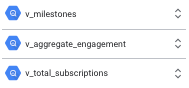
Though, my monthly dash is a wayyy bigger offender.

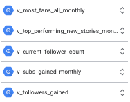
Truthfully, I have way too many views powering my end product. To reduce processing time, my end goal will be to convert these to materialized views, a.k.a. static tables.
With that, my to-do list now includes:
- Establish checks for daily availability
- Materialize all views (and consolidate, if possible)
- Build out a DAG that can orchestrate these processes intuitively and seamlessly
What You Can Learn
Since a majority of this piece was dedicated to demonstrating how I break down an existing system, I wanted to close with some helpful advice for those seeking to solve problems and build complex infrastructure at any level.
I can’t emphasize enough how important it is to solve problems on paper. The biggest mistake newer engineers make (myself included) is that we start with code and with supporting technologies. You can stare at a Python script for hours and you’re unlikely to understand it as well as you could writing out your intended use case, your build’s components and any stray thoughts you have related to solving the problem at hand.
For more on my on-paper problem-solving method, check this out.
If that isn’t working, don’t be afraid to represent information in a different way. I doodled my way toward understanding my infrastructure needs, but you might find it more helpful to use notecards tacked to a board or talk it out with a colleague or friend. Problem solving is medium agnostic.
The end result matters more than the process.
When designing data systems in particular you want to think in terms of reduction. Namely, you want to find a way to decrease the following:
- Run times, especially for downstream applications
- Compute resources
- Costs
- Complexity
If you’re hitting a ceiling with optimization, I encourage you to read this.
Even though it sounds like I want to tear this process apart and start from 0, the truth is, there are some really great components in place here. The trick is to reduce complexity and streamline dependent processes.
When it comes to solving a problem of any size, I’m a firm believer that you won’t get anywhere close to a solution without fully understanding the obstacle you intend to overcome.
This philosophy extends to this exercise. I could have made an arch diagram. I could have white boarded. I chose “doodling” because I like a tactile, stream of consciousness approach.
By taking stock of what I have before I try to orchestrate a flow, I will save myself a lot of ambiguity and frustration.
In the near future, I intend to show how I’ll take this understanding and apply it to the work of first designing and then constructing a DAG to streamline my data ingestion.
But first, I need to find another pen.
For 200+ other data industry resources, follow Pipeline.


