

Getting Started
5 Powerful Tricks to Visualize Your Data with Matplotlib
How to use LaTeX font, create zoom effect, outbox legend, continuous error, and adjust box pad margin
Data visualization is used to shows the data in a more straightforward representation and more comfortable to be understood. It can be formed in histograms, scatter plots, line plots, pie chart, etc. Many people are still using Matplotlib as their back-end module to visualize their plots. In this story, I will give you some tricks, 5 powerful tricks in using Matplotlib to create an excellent plot.
- Using LaTeX font
In default, we can use some nice fonts that are provided by Matplotlib. But, some symbols are not good enough to be created by Matplotlib. For example, the symbol phi (φ), as shown in Figure 1.
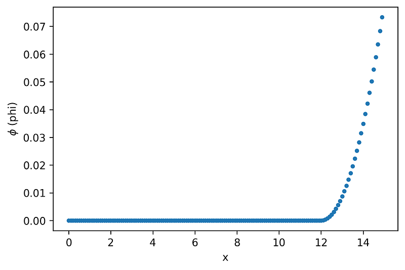
As you see in the y-label, it is still the symbol of phi (φ), but it is not good enough for a plot label for some people. To make it prettier, you can use LaTeX font. How to use it? Here is the answer.
You can add the code above at the beginning of your python code. Line 1 is defining the LaTeX font used in your plot. You also need to define the font size, larger than the default size. If you did not change it, I think it will give you a small label. I choose 18 for it. The result after I apply the code above is shown in Figure 2.
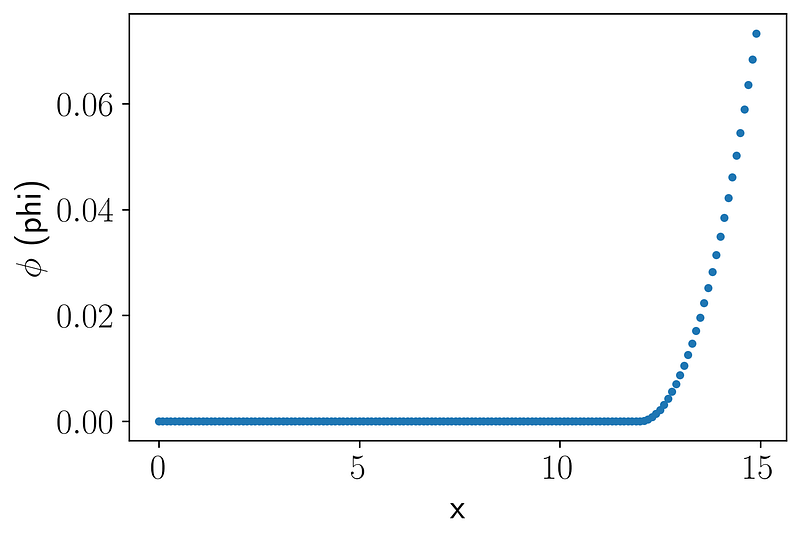
You need to write double dollar ($ … $) in the beginning and at the end of your symbol, like this
If you have some errors or have not installed the required libraries for using LaTeX font, you need to install them by running the following code in your Jupyter Notebook cell.
!apt install texlive-fonts-recommended texlive-fonts-extra cm-super dvipngIf you want to install them via terminal, you can remove !, so
apt install texlive-fonts-recommended texlive-fonts-extra cm-super dvipngOf course, you can use some different font families, like serif, sans-serif (the example above), etc. To change the font family, you can use this code.
plt.rcParams['font.family'] = "serif"If you add the code above in your code, it will give you a plot shown in Figure 3.
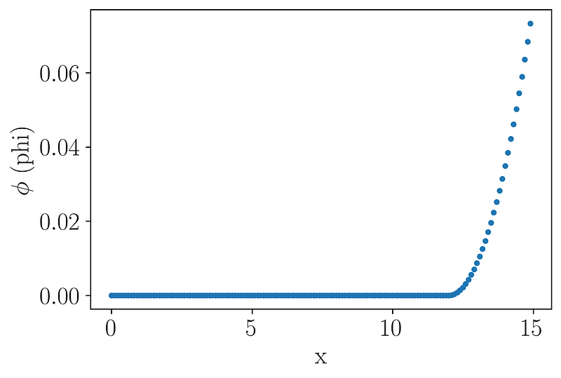
Can you realize the difference between Figure 3 and Figure 2? Yups, if you analyze it carefully, the difference is the tail of the font. The latter figure is using serif, whereas the former one is sans-serif. In simply, serif means tail, sans means no. If you want to learn more about the font family or typeface, I recommend this link.
You can also set the font family/typeface using the Jupyterthemes library. I have made the tutorial on using it. Just click the following link. Jupyterthemes also can change your Jupyter themes, dark mode themes, for example.
We want to give you a complex text inserted in Matplotlib, as shown in the title of Figure 4.
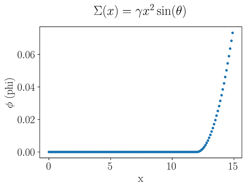
If you want to create Figure 4, you can use this full code
If you have some questions about the code, please write it in the comment.
2. Creating zoom-in effect
In this trick, I will give you a code to generate a plot, as shown in Figure 5.
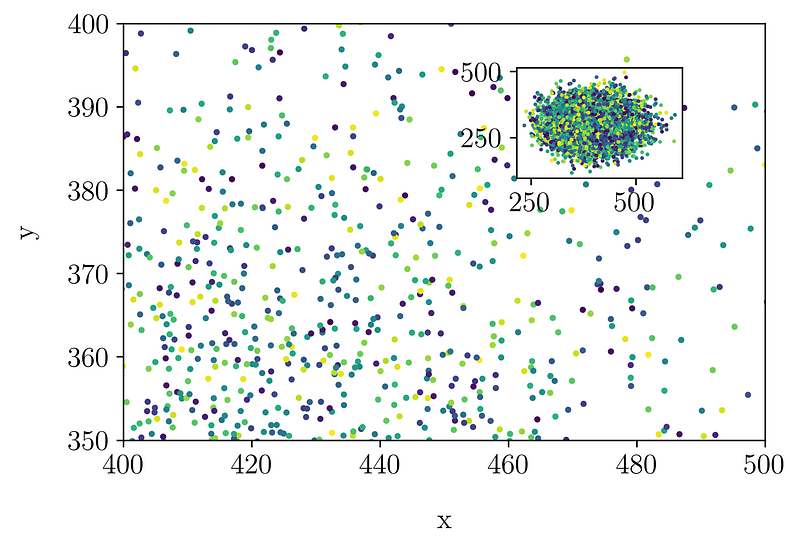
Firstly, you need to understand the difference between plt.axes() and plt.figure(). You can review it in the following link. Code plt.figure() covers all the objects in a single container, including axes, graphics, text, and labels. Code plt.axes() just covers the specific subplot. Figure 6 can give you a simple understanding, I think.
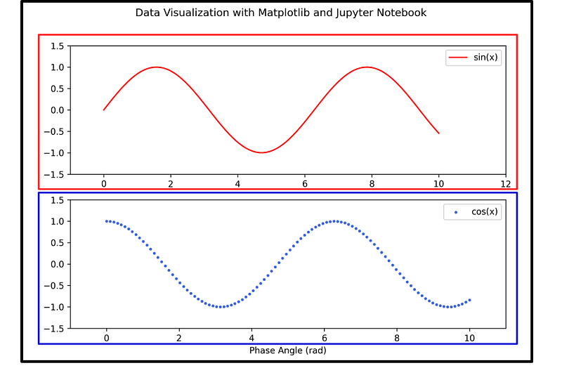
The black box is under plt.figure() and the red and blue boxes are under plt.axes(). In Figure 6, there are two axes, red and blue. You can check this link for the basic reference.
After you understand it, you can analyze how to create Figure 5. Yups, in a simple, there are two axes in Figure 5. The first axes is a big plot, zoomed-in version from 580 to 650 and the second one is the zoomed-out version. Here is the code to create Figure 5.
If you need the basic explanation for the code, you can visit this link.
I also give another version of the zoom effect you can use using Matplotlib. It is shown in Figure 7.
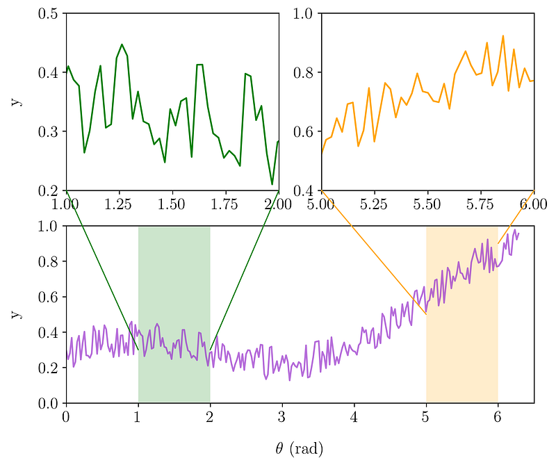
To create Figure 7, you need to create three axes in Matplotlib using add_subplot or another syntax (subplot). Here, I just use add_subplot and avoid using looping to make it easier. To create them, you can use the following code.
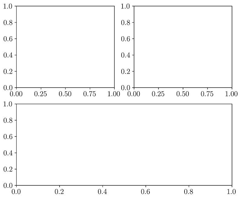
The code will generate a figure, as shown in Figure 8. It tells us that it will generate 2 rows and 2 columns. Axes sub1 (2, 2, 1) is the first axes in the subplots (first row, first column). The sequence is started from the left-top side to the right. The second axes sub2 (2, 2, 2) are placed in the first row, the second column. The last axes, sub3 (2, 2, (3, 4)), are merged axes between the second-row first column and second-row second columns.
Of course, we need to define a mock data to be visualized in your plots. Here, I define a simple combination of linear and sinusoidal functions, as shown in the code below.
If you apply the code into the previous code, you will get a figure, as shown in Figure 9.
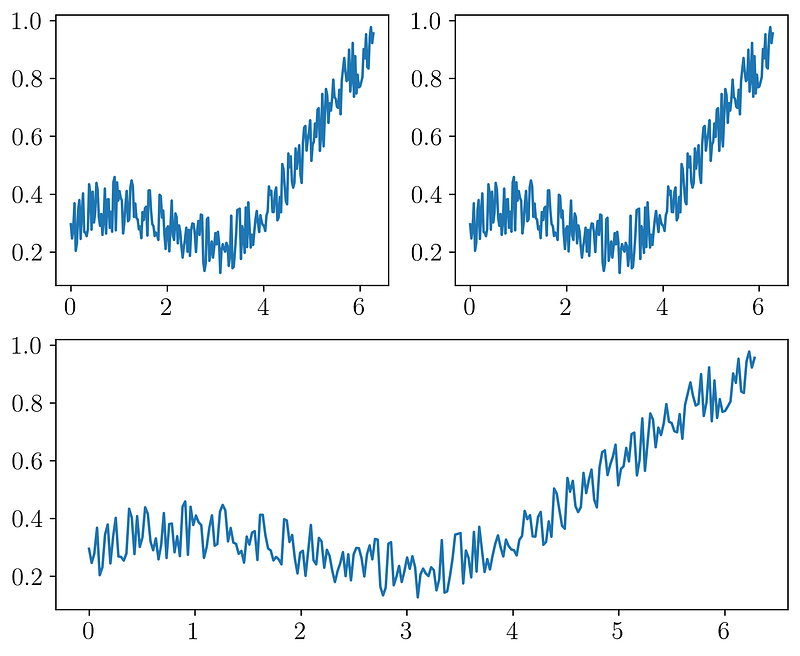
The next step is limiting the x-axis and y-axis in the first and second axes (sub1 and sub2), creating blocked areas for both axes in sub3, and create ConnectionPatch(s) that are the representatives of the zoom effect. It can be done using this full code (remember, I did not use looping for the simplicity).
The code will give you an excellent zoom effect plot, as shown in Figure 7.
3. Creating outbox legend
Did your plot have many legends to be shown in a plot, like a Figure 10? If yes, you need to place them out of the main axes.
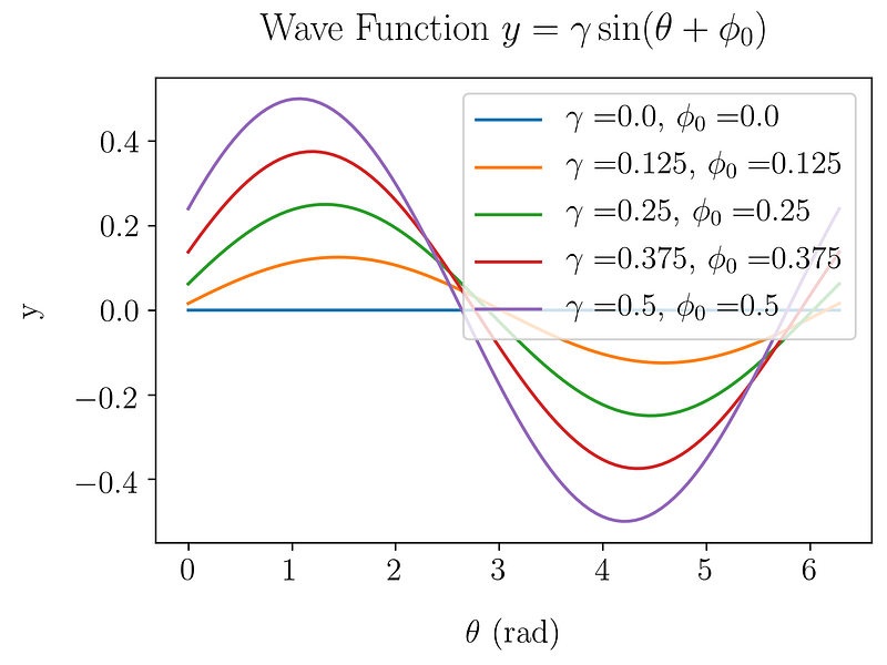
To place the legends outside of the main container, you need to adjust the position using this code
plt.legend(bbox_to_anchor=(1.05, 1.04)) # position of the legendThe value of 1.05 and 1.04 is in the coordinate x and y-axis toward the main container. You can vary it. Now, applying the code above to our code,
After run the code, it will give a plot, as shown in Figure 11.
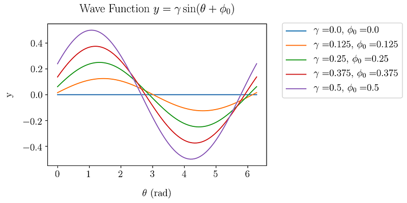
If you want to make the legend box more beautiful, you can add a shadow effect using the following code. It will show a plot, as shown in Figure 12.
plt.legend(bbox_to_anchor=(1.05, 1.04), shadow=True)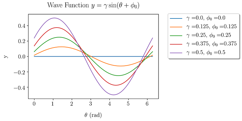
4. Creating continuous error plots
In the last decade, the styles in data visualization are moved to a clean plot theme. We can see the shift by reading some new papers in international journals or web pages. One of the most popular is visualizing the data with continuous errors, not using error bars. You can see it in Figure 13.
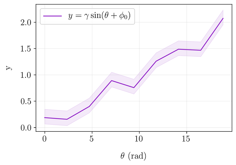
Figure 13 is generated by using fill_between. In fill_between syntax, you need to define the upper limit and lower limit, as shown in Figure 14.
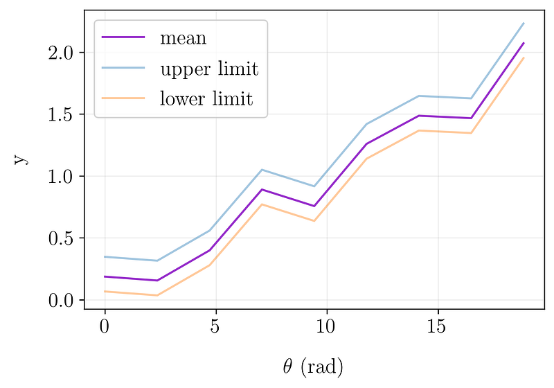
To apply it, you can use the following code.
plt.fill_between(x, upper_limit, lower_limit)Arguments upper_limit and lower_limit are interchangeable. Here is the full code.
5. Adjusting box pad margin
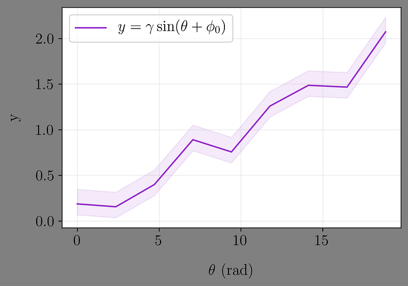
If you analyze each code above, you will get a syntax plt.savefig() followed by a complex argument: bbox_inches and pad_inches. They are accommodating for you when you are constructing a journal or article. If you did not include them, your plot would have a larger margin after you save it. Figure 15 is presenting the different plots with bbox_inches and pad_inches and without them.
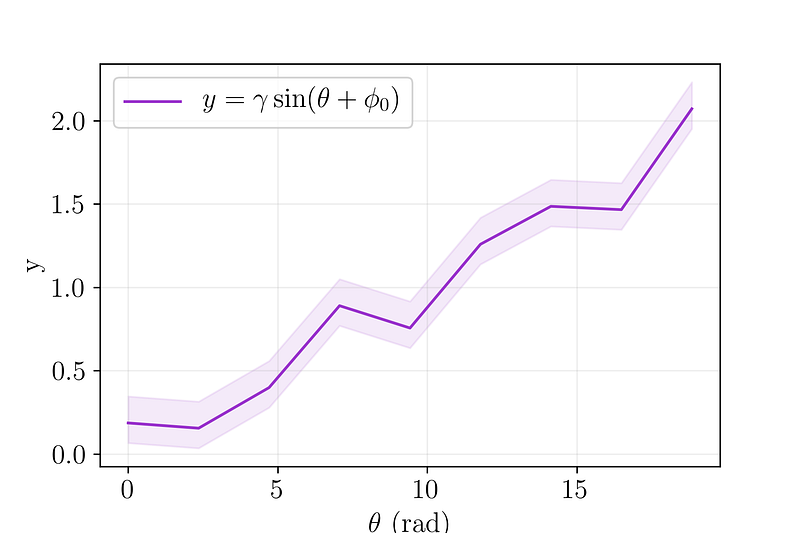
I think you can not see the difference between the two plots in Figure 15 well. I will try to present it in different background colors, as shown in Figure 16.
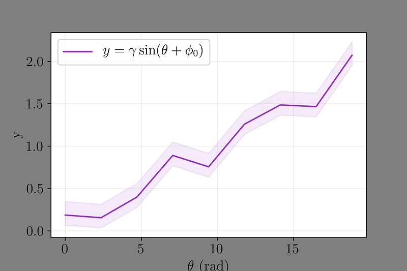
Again, this trick helps you when you are inserting your plots into a paper or an article. You did not need to crop it to save the space.
Conclusion
Matplotlib is a multi-platform library that can play with many operating systems. It is one of the old libraries to visualize your data, but it is still powerful. Because the developers always make some updates following the trends in data visualization. Some tricks mentioned above are examples of the updates. I hope this story can help you visualize your data more interesting.
If you liked this article, here are some other articles you may enjoy:
That’s all. Thanks for reading this story. Comment and share if you like it. I also recommend you follow my account to get a notification when I post my new story.


