
DESIGNING WITH MATPLOTLIB
Python Data Visualization with Matplotlib — For Absolute Beginner Python Part I
Your first step in working with Matplotlib

Here is the tutorial on visualizing our data with Matplotlib and Jupyter Notebook, a powerful Phyton module.
Step 1: Importing Matplotlib in your Jupyter Notebook
This step can be done with writing
import matplotlib.pyplot as pltas show in the Figure 1.
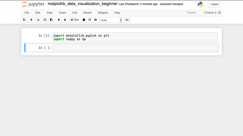
The code means that we will call the submodule “pyplot” in the Matplotlib module, as plt and Numpy module as np.
We use Numpy to make arithmetic operations, such as addition, subtraction, multiplication, division, etc.
Step 2: Create Simple Line Function
To create the sinusoidal function, we need to define two variables to be placed in the x-axis and y-axis, as shown in Figure 2 and Figure 3.
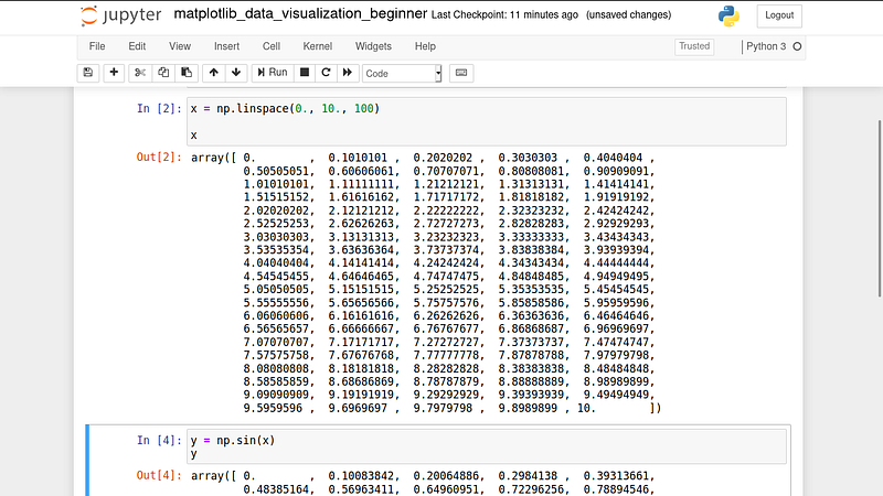
Variable x is the array numbers from 0 (as float) to 10 (float), with 100 numbers. The members are shown in Figure 2, from 0., 0.1010101, 0.2020202, …, 10.

y-variable is the sinus function of each x. For example, the sinus of the first member of x is 0, because sin 0 = 0. The value of each x in y function is in radian, not in degree. If you prefer to use a degree, you can change with the following code.
y = np.sin(np.deg2rad(x))Step 3: Visualize Your Function
For visualizing your function, you need to define a container for your picture using
plt.figure(figsize = (9, 6)) #picture container of 9 x 6
plt.plot(x, y) #show line plot of x and y
with figsize is the size of your picture. Next, you can show your function in your defined picture with the code shown in Figure 4.
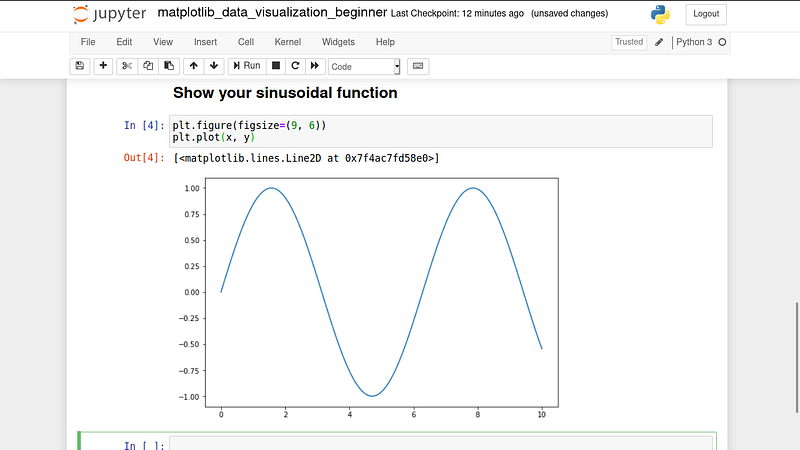
code plt.plot is used to show the plot lines. As shown in Figure 4 it will show the plot of x-variable as x-axis and y-variable as the y-axis.
Showing the function with Jupyter Notebooks does not need use
plt.show()because it will be shown automatically in your cell on Jupyter Notebooks.
Step 4: Working with Title, Label, and Legend
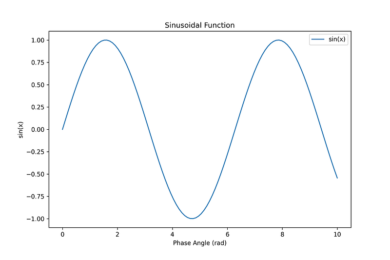
We have created our line plots but haven’t customized the label, x-axis and y-axis label. We can add the title of our plot with
plt.title('Sinusoidal Function')We can add the label using
plt.xlabel('Phase Angle (rad)') #take x-axis label
plt.ylabel('sin(x)') #take y-axis label
To add the legend, firstly, we have to make a label in our line plot code as follows
plt.plot(x, y, label = 'sin(x)') #take a label of sin(x)
plt.legend(loc = 'best') #show legend in best location
The result is shown in Figure 5.
Step 4: Saving Your Plot
How to save your picture in Matplotlib? You can use the following python code
plt.savefig('sin_function.png', dpi = 300) #save in png of 300dpiYou can save in other formats, such as .jpg, but I recommend you in .png format with a standard resolution of 300dpi.
Conclusion
Here is the full code for this tutorial, “ Python Data Visualization with Matplotlib — For Absolute Beginner Python Part I”.
#Importing modules
import matplotlib.pyplot as plt
import numpy as np
#Create data and its function
x = np.linspace(0., 10., 100)
y = np.sin(x) #in radian#Show and save your line plot
plt.figure(figsize=(9, 6))
plt.plot(x, y, label = 'sin(x)')
plt.title('Sinusoidal Function')
plt.legend(loc = 'best')
plt.xlabel('Phase Angle (rad)')
plt.ylabel('sin(x)')
plt.savefig('sin_function.png', dpi = 300)Do you need more tutorials in data visualizing with Matplotlib and Jupyter Notebook? You can leave a comment below.
Please wait until we update to the next part, part II and part III for a more advanced and more complicated plot in Matplotlib and Jupyter Notebook, such as adjust line colors and line styles, adjust axes limits, use LATEX font for your plot, customize font size, make plot grids for some pictures automatically.
[UPDATE] You can visit this link to read Part II.
Thanks.