
DESIGNING WITH MATPLOTLIB
Python Data Visualization with Matplotlib — For Absolute Beginner Part II
A guideline to adjust your plots in Matplotlib

We will learn about adjusting colors, axes limit, and making grids in matplotlib with Jupyter Notebook. If you have not read the last part, you can read via this link.
1. Adjusting colors
Talking about colors used in matplotlib, if you did not adjust the colors, matplotlib would generate your blue colors. You can use the following code to adjust the colors for the line plot we create in Part I.
plt.plot(x, np.sin(x), label = 'sin(x)', c = 'red')
plt.plot(x, np.cos(x), label = 'cos(x)', c = 'darkorchid')
Matplotlib will give you a plot like this.
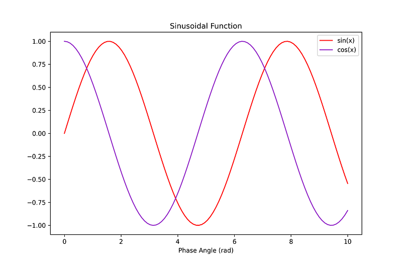
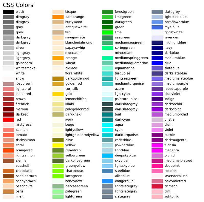
The red line plot represents sin(x), whereas cos(x) is presented by the ‘dark orchid’ line. If you did not know the colors in matplotlib, here I attach it.
If you want to create scatter plots, you can use
plt.scatter(x, np.sin(x), label = 'sin(x)', c = 'red')
plt.scatter(x, np.cos(x), label = 'cos(x)', c = 'darkorchid', s = 10)
where the code ‘s’ means the size of the scatter plot. Here is the plot
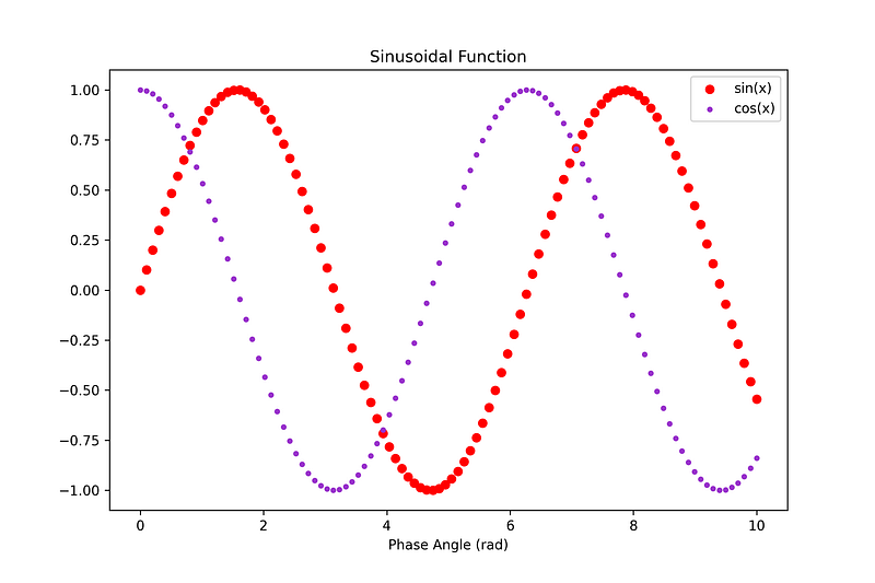
The number of dots is 100, the same number as x. You can check it in Part I.
2. Adjusting axes limits
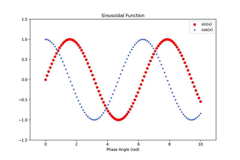
You can use this code to limit your axes.
plt.xlim(-1, 11)
plt.ylim(-1.5, 1.5)
Here is the result. Try to compare it with the previous plot.
3. Complex plot using grid
I will show the example of grid utilization in matplotlib
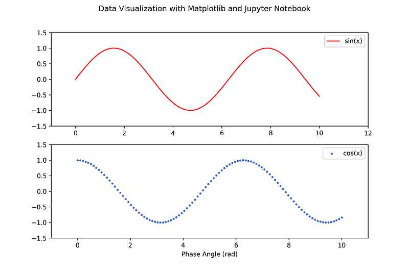
The code to create the grids is shown below
plt.figure(figsize=(9, 6))
plt.suptitle('Data Visualization with Matplotlib and Jupyter Notebook') # title for all plotsplt.subplot(2, 1, 1) # number of rows, columns, and the panel number
plt.plot(x, np.sin(x), label = 'sin(x)', c = 'red')
plt.legend(loc = 'best')
plt.xlim(-1, 12)
plt.ylim(-1.5, 1.5)plt.subplot(2, 1, 2)
plt.scatter(x, np.cos(x), label = 'cos(x)', c = 'royalblue', s = 5)
plt.legend(loc = 'best')
plt.xlabel('Phase Angle (rad)')
plt.xlim(-1, 11)
plt.ylim(-1.5, 1.5)plt.savefig('grids_matplotlib.png', dpi = 300)First, as a standard procedure, we need to create a container. Then, we need to add the title for all the plots, as shown by line 2. After that, we should define the number of rows, columns, and the panel number for each plot. We will create two plots in similar rows. So, we define the number of rows is 2 and 1 for the columns. The sin plot will be plotted in panel 1 and cos plot in panel 2. Check the codes!
That’s all. If you need a tutorial for a more complex plot, please inform me.
Bonus
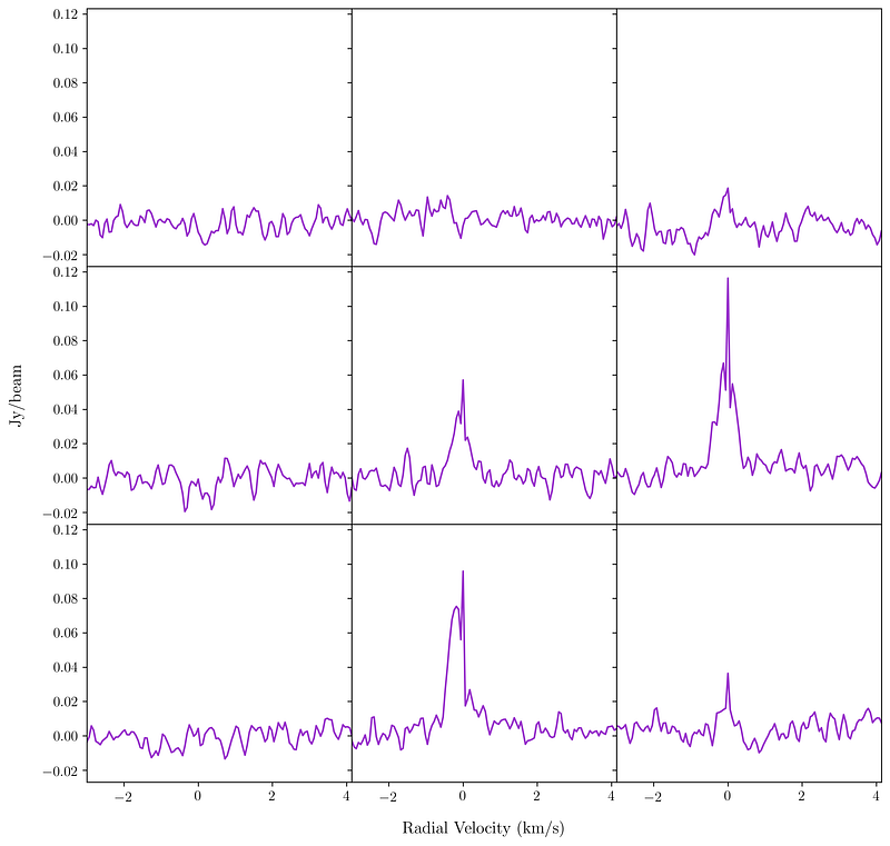
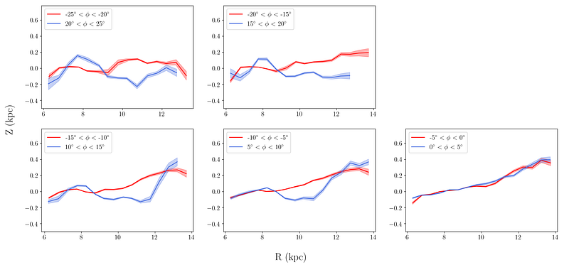
I will give you the complex plots I have generated.
Thanks!