
What’s Going On With American Marathoners? Are They Speeding Up or Slowing Down?
Let’s use data from six of the largest races in the United States to help determine how runners in different subgroups are performing.
Over the past few weeks, I’ve been taking a deep dive into data from some of the biggest marathon races in the United States.
This journey was prompted by a discussion around an article claiming that America’s marathoners were slower than ever. In particular, this article claimed that even the fastest runners in a race were getting slower.
I was ready to believe that average times were increasing — with more participation from newer, less experienced runners. But I just wasn’t ready to believe that experienced runners were actually getting slower over time.
It just didn’t make any sense. So I dug up a lot of data, and I set about trying to answer the question: Have serious runners, finishing towards the front of the pack in marathons, gotten faster or slower?
Note: This article is part of a larger series that is behind Medium’s paywall. If you’re not a member of Medium, you can use this form to get access to this series. I’ll e-mail you a special link to one article each week.
For more context and background, check out the original article in this series. That article also includes links to the rest of the series, where you can find a more detailed analysis of the individual races I’ve looked at.
But today, we’re going to step back and look at the big picture. If we combine the data from six of the largest marathons — New York City, Chicago, Boston, Marine Corp, Los Angeles, and Philly — what can we learn?
Let’s find out.
A Note About Data And Methodology
If you read the individual articles about each race, I provide some additional detail about where and how I collected the data. But here’s the short version:
- Boston data came from the Boston Data Marathon Project, BAA’s website, and Marathon Guide.
- New York City data came from the NYRR website.
- Chicago data came from the Chicago Marathon’s website.
- MCM, Philly, and LA data came from Marathon Guide.
The results were scraped using Python and Selenium, cleaned to remove obvious errors, and collated into large CSV files including the finisher’s name, age, gender, overall place, and time. I used the Pandas and Plotly packages in Python to manipulate the data and create the visuals that you will see throughout this article.
Although I was able to find results for some races going back to the 1970s, we’re going to focus today on a smaller time period: 2001 to 2019. This is the time period across which I have reliable data for all six races.
Within that time period, note that the NYC Marathon was not held in 2012 (Superstorm Sandy).
The resulting dataset includes 2,746,894 individual race results.
In this analysis, I will make reference to runners at a certain percentile. This means a runner that finished ahead of a given percentage of other runners. So the runner at the 98th percentile is ahead of 98% of other runners in their category — or the top 2%.
I’m using the 98th (Top 2%) and 90th (Top 10%) percentiles to represent serious amateur runners finishing towards the front of a race. We’ll also look at the 75th and 50th percentiles to get an idea of how the slightly above-average and average runners are doing.
Why These Six Races?
I settled on these six races because I think they offer a good cross-section of the running community.
Boston is unique in that it requires a qualifying time for most of its runners. This ensures that there’s a large sample of fast runners in the sample set.
New York City and Chicago also both offer entry through time qualification, but in each case, only about 10% or less of the runners qualify by time. The bulk of the runners earn entry through a random lottery. These races should include some fast runners as well as a representative sample of other runners.
LA, MCM, and Philly are all large races that appeal to a broad group of runners. MCM and LA tend to be less competitive, and they have many slower runners in their fields. Collectively, these ensure that we’re looking at a broad swatch of the running community — from the sub-elite man running 2:20 or 2:30 to the casual first-timer finishing in 6 or 7 hours.
Collectively, these races also make up a large portion of the marathons finished in the United States every year. Until I can collect a bigger dataset that includes a sample of smaller races, I think it’s safe to assume that this sample set is fairly representative of the population of marathoners in the United States.
How the Field Has Grown
Before we get into the issue of speed, let’s start by looking at how the field has grown and changed since the turn of the century.
Marathoning is a relatively new sport — at least as a mass participation event. Although the Boston Marathon has a long and storied history, most long-distance races in the United States were small affairs until the 1970s.
Through the 1980s and 1990s, these races grew with a few ballooning into massive events. Although the explosive growth had ended by 2000, the sport would still continue to grow over the following two decades.
The graph above shows the total number of finishers across our six marathons from 2000 to 2022. Note that due to data issues, the LA Marathon results from 2000 and 2022 were excluded, so those two years will appear slightly lower than they should.
There are two big outliers you should notice right away — 2012 and 2020–21.
In 2012, the New York City Marathon was canceled due to the aftermath of Superstorm Sandy. It’s the largest of the six races, so it makes a sizeable dent in the field size.
In 2020, the LA Marathon was the only one that took place. It was run on March 8, 2020, about a week before the world shutdown. The remainder of the races were canceled in 2020, and Marine Corps Marathon was canceled again in 2021. The remainder returned in 2021, but mostly with reduced field sizes.
In the first half of the period — 2000 to 2010 — the field grows pretty steadily. It increases almost 50%, from around 100,000 finishers in 2000 to over 150,000 runners in 2010.
The field size peaks in 2014, and from 2014 to 2019 it remains more or less constant.
Looking ahead, one question worth asking is: Will marathons fully rebound in 2023 and 2024?
Looking at the Field Through the Lens of Gender
The graph above breaks the field size into men (blue) and women (red).
At first glance, they look like they’re growing in tandem and following the same trend. At the beginning of the time period, there are more men than women — and that’s still true at the end of the time period.
However, a closer look shows that the women’s field is growing more rapidly than the men’s field.
The men’s field goes from a little over 60,000 to a little under 100,000 at its peak. An increase of about 60%.
The women’s field, on the other hand, starts at a little over, 30,000 and increases to a peak of just under 80,000. It more than doubles.
If you were to look back to the 1980s, things would be much more lopsided with more men than women. Over time, things have balanced out, but we still haven’t quite gotten to the point where the number of men and women running marathons is equal.

Looking at the Field Through the Lens of Age
One of the other trends I noticed as I explored the data was that there was a shift toward older runners. This varied a bit between the individual races, so let’s take a look at what’s happening on the macro level.
The chart above shows the total number of runners in each age group — broken down into 5-year spans from 35 to 70.
The largest group is, and always has been, younger runners under 35. However, that group peaks in 2014 and shrank slightly over the next five years.
The next two groups — 35–39 and 40–44 — also increased through 2014 and then stagnated. But the older groups — from 45 up through 70 — all continued to grow through 2019.
The graph above also focuses on the age of runners. However, instead of showing the total number of runners in each group, it represents the percentage of the whole field that comes from each age group.
This makes it easier to see how the overall distribution is changing. Despite the number of runners under 35 increasing from 2000 to 2014, they make up a smaller and smaller portion of the overall field. They’re slightly over 40% in the early 2000s and closer to 35% by 2019.
The biggest shift occurs in the 45–49 and 50–54 age groups. These both increase fairly significantly as a percentage of the overall field.
So What Can We Conclude About the Make-Up Of the Field
Overall, the data from the six races supports three general conclusions about the composition of the field:
- The total number of runners increased throughout the time period, but it plateaued around 2015.
- The disparity between men and women is shrinking, although there are still more male finishers than female finishers.
- The field is shifting towards older runners, with the youngest age group shrinking and the older age groups growing.
Looking ahead to the future, some questions to consider are:
- Will the number of runners rebound after COVID?
- If marathons do fully rebound in 2023 and 2024, will the field continue to grow? Or will it stagnate near the 2014–2019 peak?
- Will the field ever reach parity between men and women? Or will men continue to outnumber women?
- Will the field continue to shift towards older runners? Or will it eventually reach a new equilibrium and remain constant?
Are Runners Getting Faster Or Slower?
But let’s get to the real question we’re trying to answer.
What’s happening to the finish times for runners? Are they getting faster or slower?
The graph above is a snapshot of the entire field of runners — men, women, and all ages combined.
Each line represents a runner at a different percentile — from the front of the field (0.02 or the Top 2%) to the back of the field (0.98 or the Bottom 2%).
Are there any big trends here?
Not really. A few of the lines shift this way or that a little bit, but none have big sustained changes.
The slowest runners (the bottom 2%) look like they’re getting a little faster. Meanwhile, the next three groups (the bottom 10% to the median) look like they’re getting a little slower. And if you zoomed in on the bottom three lines, you’d see they more or less stayed the same.
But we already established above that the field itself is changing — shifting towards more women and more older runners. Given the fact that women are, on average, slower than men, and older runners are slower than faster runners, this population shift could have an impact and shift finish times slower.
To really understand what’s happening, then, we need to zero in on these subgroups and see how they’re faring.
Breaking Things Down By Gender
Let’s start with gender and see if either the men or women are experiencing any changes in finishing times.
We’re also going to focus on the fastest runners — the 98th, 90th, and 75th percentiles — since those are the groups we’re really interested in.
The slower two groups stay pretty much the same. The 75th percentile has a baseline of around 3:40 — with some spikes and then reversions to the mean. The 90th percentile has a baseline of about 3:15, again with some spikes.
The 98th percentile, on the other hand, does shift down a bit. They start out finishing around 2:53, and by the end of the time period, 5 of the last 7 years are at least slightly under 2:53. Not a huge difference, but possibly a trend.
The story on the women’s side is similar.
The times for the 75th percentile bounce around, but they tend to settle back around 4:05. A few years are higher, and a few years are slightly lower, but they don’t really shift. The 90th percentile does the same thing around 3:40.
But at the 98th percentile, the second half of the time period is quicker. In the beginning, times hover around 3:19. From 2011 to 2019, 7 out of 9 years they finish faster than 3:19.
So when we break it down by gender, the fastest runners (the 98th percentile) do appear to be getting slightly faster.
But there’s still the potential confounding factor of age.
Breaking Things Down by Age
So what happens when we break the groups down by gender and age?
The graph above shows the 98th percentile of male runners in each age group — from the under 35 runners to the over 70 runners.
At the top of the graph, there’s a lot of variation. But that’s likely because the actual number of runners 60 and older is fairly low. This makes the subgroups susceptible to outliers. If there are a few extra or fewer fast runners in a given year, that can have an outsized effect.
But as you move down the graph, the lines become more stable and tell a story.
From the 50s down to 35, the finish time is fairly stable. They bump up and down a bit, but from 2013 to 2017 they all come back around to the same times they ran in 2001 and 2002. In most cases, 2018 and 2019 are a little faster — but with there only being two fast years it’s possible it’s just a fluke or an outlier.
But among the young runners, under 35, the times are trending slightly down. The finishing time is around 2:45 at the start of the period — and keeps coming back to it through the middle of the period.
But from 2013 to 2019, every year except for 2016 is faster. The last two years are significantly faster.
So among the men, it’d be fair to say that the youngest men are getting faster, the rest are staying about the same, and no one is really getting slower.
And here’s the same graph for the women.
You might notice that there’s even more variation among the older women than there was among the older men. That’s because these subgroups are even smaller — especially towards the beginning of the period and towards the older age groups.
In the early 2000s, there were very few women in their 60s or older. In 2001, there were only 40 women 70 or older — so the 98th percentile was the age group winner. There were 284 women in the 60–64 age group, so the 98th percentile would have been around the 5th or 6th finishers.
By 2019, the final three age groups have grown to 1,824 (60–64), 637 (65–69), and 254 (70+) women, so they’re getting large enough to have more stable results.
But if you were to zoom in on the younger groups — from 55–59 down to 35 and under — they all follow the same pattern. They start high, vary somewhat in the middle, and end lower.
For women in their 40s, the shift isn’t huge, and without 2019 you might question whether it was actually a shift. But for women in their 50s and under 40, times get significantly faster.
Among the youngest women — under 35 — they’re finishing around 3:16 to 3:17 in 2001–02. From 2009 to 2019, the only year they finished slower was in 2012 — and that’s likely due to the cancellation of New York and the shift in the field that year.
Even if you ignore 2019, the other two fastest years (2015, 2018) were close to 3:10 — a 6 to 7-minute improvement over the beginning of the time period.
In other words, women are getting faster — especially the youngest women.
Looking at Time Distributions
One final way to look at this problem is to take a look at how finish times are distributed across a subgroup.
Rather than pick a single percentile — like the Top 2% — and isolate their finish times, we can plot every finish time and look at what percentage of runners finished below that time.
If the field is getting faster, then more people should finish at the same time. If the field is getting slower, fewer people should finish at the same time.
The visual above shows the distribution of finish times for men in 2001. The x-axis goes from 2 hours to 8 hours, in 3-minute increments, and shows what percentage of runners finished below each threshold.
If you’re on a mobile device, you may want to zoom in — or better yet, save this article and check it out on a desktop later. These graphs are interactive, and they perform better on a desktop device.
In case you can’t interact with the visual, though, I’ll highlight a few specific times in a minute and tell you what percentage of runners finished below that time.
But first, here’s the visual for the end of the time period — 2018.
Note that I picked 2018 for this visual — instead of 2019 — because there was a steep drop in times between 2018–19. I thought 2018 would give a better glimpse at the more gradual change (or lack thereof) across the full-time period, in case 2019 was simply an outlier.
It appears at first glance that the graph has shifted to the left a bit. That would indicate that more runners are finishing at faster times. But let’s highlight a few times and see if there is indeed a difference.
So it turns out there isn’t a huge shift. At 2:30, 2:45, and 3:30, things are all about the same.
There are significantly more runners finishing under 3 hours, so maybe something is happening there. It’s a common target for people who train seriously, and so maybe that group is getting better for one reason or another.
What about the women?
Here’s the distribution of finish times for women in 2001. Notice that the entire graph is further to the right than men. That’s to be expected, since women on average finish slower than men.
I kept the x-axis the same, to make visual comparisons easier, even though there’s no data for the first few bars near 2 hours.
And here’s the same graph for women in 2018. Similar to the men, let’s pick a few key finish times and compare what percentage of women beat that time in 2001 vs 2018.
Overall, things look kind of similar to the men. About the same small portion of women are running the fastest times — under 3 hours.
But at 3:30 — a challenging but achievable goal — there is an increase. This is similar to what happened with men finishing under 3 hours.
Narrowing the Distribution to One Age Bracket
For one final look at the visual data, let’s narrow the distributions down to one age bracket — the youngest runners under age 35.
They are the ones that appeared to be speeding up in the previous graphs. It’s possible that the shift in age is obscuring a trend there when we look at each gender as a whole.
Here’s the distribution for finish times among men under 35 at the beginning of the time period.
And here’s the same visual for men under 35 in 2018.
It’s kind of hard to see without zooming in — especially if you’re on a mobile device — but the left portion of the graph definitely looks like it’s gotten taller.
Let me call out a few specific times again to see what’s happening from 2:30 to 3:30.
Among the fastest runners — 2:30 and 2:45 — there still isn’t any change.
But the difference at 3 hours is now pretty big — from 5.64% to 8.87%. That’s only a few percent of the overall group, but as a proportion of the initial subgroup that’s a 50–60% increase.
There are also small but significant increases at 3:15 and 3:30.
And here’s the distribution for women under 35 in 2001.
And the same distribution for women under 35 but in 2018.
Again, it’s a little hard to see without zooming in. But it appears that the left portion of the graph is getting a bit taller.
Let’s pull out some specific times and see.
Here, there’s an increase across the board.
The distribution and increase at 3:30 is about the same as it is for the men. But here, every time saw an increase in the percentage of women hitting that time — with a more muted increase at 3:00 and 3:15 and the largest increase at 3:30.
Let’s End With Some Fancy Statistical Numbers
That’s been a ton of graphs and visuals, along with some explanation. But what about hard statistics?
We’ll wrap up with some of those.
First, we’ll look at correlations. The correlation coefficient is a measurement of the strength and direction of a relationship between two variables.
In this case, the variables we are looking at are the year and the finish time. If times are increasing, there should be a positive correlation. If times are decreasing, there should be a negative correlation.
In terms of strength, the closer the number is to -1 or 1, the stronger it is. The closer the number is to zero, the weaker the strength is.
The table above contains a series of correlation coefficients.
I broke the data down by gender and by age bracket, took the finishing time for finishers at four places (98th, 90th, 75th, and 50th percentiles), and calculated the correlation between the finishing time for each of those placements and the year (from 2001 to 2019).
Essentially, this takes the two visuals up top that graphed the finish times for each of these percentiles and converts it into a correlation coefficient. By breaking it down by gender, age group, and percentile, we can see if there are different results among different subsets of the running population.
Across the board, the correlations are almost all negative. There are a few exceptions (like the median women under 45), but these positive numbers are also very weak correlations.
Overall, this supports the argument that finish times are decreasing overall and there is no evidence that finish times are increasing. The question, however, is whether these correlations are strong enough to signify a real change over time.
Another statistic to look at is R-squared — the square value of the correlation coefficient. This eliminates the direction and focuses just on the strength.
The closer an R-squared value is to 1, the stronger the relationship is. A value above 0.49 can be considered a fairly strong relationship and a value above 0.25 can be considered a moderately strong relationship. Anything less than that is weak enough that it should probably be ignored.
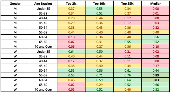
The table above calculates the R-squared value for each grouping from the correlations above. I then applied conditional formatting to highlight strong relationships in green (with the strongest relationships bolded), weak to moderate relationships in yellow, and no relationships in red.
There are some groupings for which there is no strong relationship — notably the median runners from ages 40 or 50 down. The Top 2% of older runners, as well, have no strong relationship.
But most of this chart is yellow or green.
Among the men, there’s a moderate relationship indicating faster finish times for most groups. But I’ll highlight the two strongest relationships. For young men (under 40) finishing at around the Top 10%, there’s a strong correlation. These are those men finishing at or around 3 hours, who we saw in the distribution above.
The other group is older men, in their 60s. Here, even the median runner is getting significantly faster. This is likely a product of more masters runners participating in marathons over the time period — creating more competition and a more representative field.
Among the women, there’s even more green. Among the young women under 35, there’s a strong relationship for both the Top 2% and the Top 10%.
But among women over 50, in most cases covering the Top 2% all the way back to the Median, there’s a fairly strong relationship towards faster times. Again, this is likely a result of the increased participation of masters runners leading to a better quality field — and faster times.

The Bottom Line — What Can We Conclude?
Based on all that — the data, the visuals, and the statistics — I think we can safely draw a few conclusions.
When you look at runners as a whole, or at each gender as a subgroup, it’s hard to identify a real trend in finish times. But this is likely caused by a shift in the population that comprises the field.
When you break the field down into gender and age subgroups, a relationship does become clear.
- Runners near the Top 10%, among both men and women, are getting faster.
- Across the board, there’s a moderate relationship showing faster times for men in most subgroups.
- Across the board, there’s a strong relationship showing faster times for women in most subgroups.
- There’s no evidence that comparable groups of runners — whether you look at the front of the pack or the middle of the pack — are getting slower.
So What’s Next?
If you’ve read this far — and especially if you’ve been following along since the beginning of the series — thanks for sticking with me.
When I first started investigating finish times at the Boston Marathon, I thought maybe the results from that race were a fluke. After all, Boston represents the fastest runners in the country.
But now that I’ve looked at these six large marathons, covering close to 200,000 finishers per year, I’m beginning the think the evidence speaks for itself.
However, there is still the possibility that large marathons attract a different crowd from smaller marathons. Although these six marathons do make up a large portion of the marathons run in the United States — they don’t cover a majority of those finishers.
There are still tens (or hundreds) of thousands of runners who compete in much smaller races every year.
So to wrap up this series, and definitively answer my original question, I’m going to do three final things.
First, I plan to take a look at the total number of marathons run in the United States, the total number of finishers at those races, and determine a way to classify them according to things like size and typical finishing time.
Once I’ve done that, I can then identify a few groups (like small, fast races or medium-slow races) to use to create a representative sample. I’ll collect results from those races and analyze the trends in finish times among each subgroup.
Finally, I can combine those races into my full dataset — which at that point would cover a majority of marathons run in the United States each year — and repeat some of the analysis I’ve done here.
So, if you want to see how this plays out, be sure to follow me here on Medium. You should also check out the original story in the series if you haven’t already. It includes links to the individual articles throughout the series, and I’ll update it with the final pieces as they are published.
And if there are other questions you’re wondering about — leave a response. When I’m done with this series, I plan to explore some other running-related topics with the use of data. It’s often the questions and comments from readers that inspire me to go in a specific direction.
I’m an avid runner as well as a data nerd. My most recent marathon was 3:09:47 at Erie, PA, and I hope to run the Chicago Marathon next fall. If you’re looking for help improving your own marathon times, take a look at this comparison of marathon training plans from my blog, Running with Rock. You can also follow me on Strava.


