
Have Finishers At the Boston Marathon Gotten Slower?
This post is the first in a series that will take a deep dive into data about marathon running. It was inspired by an article claiming that American runners are getting slower — and that if you zero in on the front-of-the-pack runners, you’ll find that they are also getting slower.
While I don’t necessarily dispute that average finishing times have gone up over the last twenty or thirty years, I think the other claim is a bit suspect.
For more context, check out my introductory post on this topic. You can also refer back to there for links to the rest of the series as I publish it.
Note: This article is part of a larger series that is behind Medium’s paywall. If you’re not a member of Medium, you can use this form to get access to this series. I’ll e-mail you a special link to one article each week.
But the short version is this series is a response to the Run Repeat mega study and its claim that there is a slowing trend in marathon finishing times for serious amateur runners at the front of the pack in recent years.
Today we’re going to look specifically at data on finishers from the Boston Marathon. In future articles, I’ll dive into a few other major marathons before exploring some medium-sized races.
Are the Runners at Boston a Representative Sample Set?
An important question you should always ask yourself when looking at data is whether your sample is representative or not.
In other words, is there anything special about this group of people that will shape the outcome or your analysis? Or will it tell a true, unbiased story?
The Boston Marathon is indeed special, and there are some unique characteristics about the group of people who sign up for and finish the race. Although some runners earn entry through fundraising and other means, the vast majority of runners qualify for entry by meeting a specific qualifying time.
This group is not representative of the average runner — but it probably is representative of the serious, dedicated runner. The majority of runners meet a qualifying time to gain entry, and one might expect that the majority of runners capable of running that qualifying time also take their training pretty seriously.
So this is the perfect place to start if we’re trying to explore what has been happening with serious amateur runners.
Where Did the Data Come From?
The data I used for this analysis came from two places.
First, I have to give a shout-out and hat tip to Adrian Hanft, who collected a lot of this data and made it available on GitHub. Specifically, he has CSV files containing the results for finishers from 1897 to 2019. I chose to start my exploration in 1986, and so I’ve used the CSV files he provided for 1986 to 2019.
More recent data, for 2021–2023, came directly from the Boston Athletic Association. They make results available for the media through their website (link for 2023 results). I downloaded the results for all runners for 2021, 2022, and 2023. I then renamed the fields to be consistent with the CSV files I already had.
Next, I wrote a simple Python script that would read each of these files and isolate a few data points for each year, broken down by gender. Specifically, it identified the winning time, along with the position and time of the finisher in the 98th, 95th, 90th, 75th, and 50th percentiles. The 98th percentile means the person who beat 98% of all finishers and finished in the top 2%.
All of this data was collected into one Excel spreadsheet. From there, I could manipulate the data, create charts, and calculate statistical results.
First: Examining the Field Size
Before we dive into the data on finishing times, I found it interesting to look at the data on field size over time. It helps tell the story of the history of the Boston Marathon.
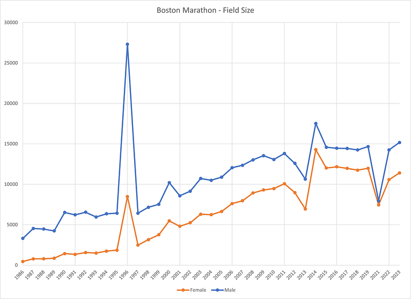
The first obvious trend is that participation has been increasing since the 1980’s. What started out as a more modest race of a few thousand people has exploded into a massive operation with around 30,000 runners. The field size stabilized around 2015 after years of growth, and about 25,000 to 27,000 runners finish the race in a given year.
There are, however, a few outliers in that trend.
The first is 1996. This was the 100th anniversary of the Boston Marathon. I imagine there was a lot of excitement around the race, and the data tells the tale. In 1995, a little over 8,000 runners finished the race. In 1996, over 35,000 did.
Another story appears in 2013 and 2014. There is a significant drop in finishers in 2013, as a result of the horrific bombing at the finish line. Many of the runners were re-routed along the way. The next year, there was a large rebound in participation as runners were eager to stand in solidarity with the city and its runners.
A final outlier occurs in 2021. As a result of the COVID-19 epidemic, there was no in-person race in 2020. The Boston Marathon returned in person in October 2021 with a reduced field. It’s clear on the chart that the field was significantly smaller than in other recent years.
The other story you see in this chart is the explosive growth of women’s running. Until the 1970s, women weren’t even allowed to run the race. In the 1980s, they made up a small fraction of the total field.
Following the 1996 race, there is a steep upward trend. By 2015, women make up over 40% of the field.
How Field Size Impacts the Percentiles
Throughout this analysis, I’ll refer to finishers at a given percentile — i.e. the 98th or the 95th percentile.
Again, the 98th percentile means that the finisher beat out 98% of other runners and finished in the top 2%. If there were 1,000 runners, this means the 98th percentile finisher would be in 20th place.
As a general rule, this means that as the field size increases the actual placement of that person in real terms is lower.
For example, from 1986 to 1989, the field size was (relatively speaking) quite small. For men, the 98th percentile sat in the top 100 of all finishers. The 90th percentile was in the top 400 to 500.
In the modern era, with close to 30,000 total participants, the 98th percentile equates to around the 300th finisher for men and 200th finisher for women. The 90th percentile is around 1500 for men and 1100 to 1200 for women.
Also, the magnitude of the change is far greater for women given how quickly their field size grew. In 1986, when only 456 women finished the race, the 98th percentile was the 9th finisher.
This is why setting an absolute standard — i.e. the 100th finisher — doesn’t make sense when you’re looking out over a large time period with such varied field sizes. Percentiles may not be perfect, but they at least scale better with field size to help make apples-to-apples comparisons.
Next Up: Trends in Finishing Times
I’m a data nerd, and I could write about charts all day. But let’s get to the data we’re really interested in — the finishing times for runners at the Boston Marathon.
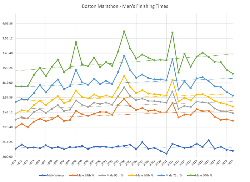
The chart above summarizes all the data I collected for men finishing the Boston Marathon from 1986–2023.
Each line represents one particular finisher — first the winner, then the 98th percentile, then the 95th percentile, and so on. The top line is the 50th percentile — the median. They are literally in the middle of the pack, with half of the finishers ahead of them and half behind them.
The dotted line is a trendline created by Excel, which approximates the line of best fit if you attempt a linear regression on the data.
One thing that becomes obvious here, before we dig into the trends, is that focusing on one race means that there will be more variation from year to year due to weather.
In 2004 and 2012, there were pretty large spikes in finishing times. These were also two of the hottest years in recent history for the race, with temps in the 80’s. As someone who hates running in the heat, it’s insane to me that there’s hardly any change in the winning time. Among the regular folks, you can see the finishing top increase by 20 to 30 minutes.
The other huge spike occurred in 1996. This was likely a result of the spike in participation. In a typical year, there is no lottery for Boston, but in 1996, over 10,000 runners gained entry through the lottery, charities, or running clubs. This undoubtedly brought in more casual runners, dragging upwards the finishing times at similar percentiles.
Have the Men Gotten Faster or Slower?
So, back to the question at hand. Have runners gotten faster or slower?
Well, the answer is probably “both.”
The trend line on that first graph does appear to be going up, slightly. But it’s not a great fit, and you can see points above and below the line. Frankly, a linear regression just isn’t a good choice here.
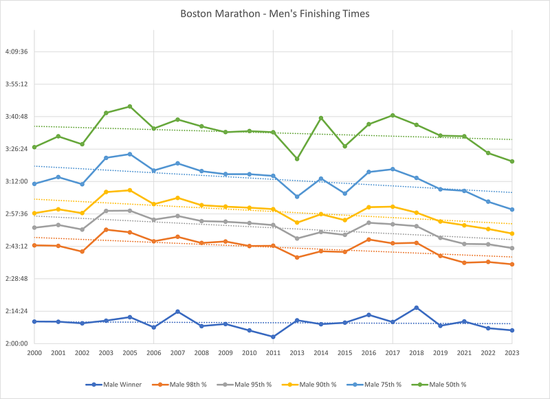
Instead, let’s see what happens if we break this larger period down into two time periods — 1986 to 2000 and 2000 to 2023.
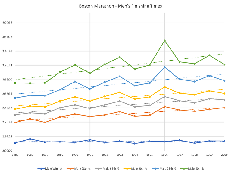
Here, there’s a pretty satisfying trendline showing a general increase in finishing times. The winners stayed pretty constant — around 2:09 to 2:10, give or take a minute.
But as you move further back in the field, times creep up over that 15-year period. At the 98th percentile, the finishing time goes from around 2:30 to 2:40. Still fast, but significantly slower.
The effect is magnified as you move further back in the pack. The median runner finished under 3:10 from 1986–1988, but he finished closer to 3:30 from 1997 to 2000.
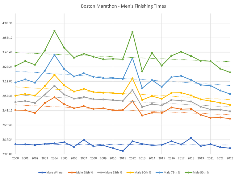
And what happens after the year 2000? The trend reverses.
Again, the winner’s time stays pretty constant. There’s some year-to-year variation, but no clear trend downwards.
As you move back in the back, though, there is a clear downward trend. At the 98th percentile, the finishing time is in the low 2:40s from 2000 to 2002. From 2021 to 2023, it’s in the mid-2:30s.
Again, the trend is magnified as you move further back in the field. The median runner is getting much faster, especially in the last few years.
Although the trendlines showed a decent fit, the two outliers (2004, 2012) obscured things a little bit. If you take out those two super hot years, the lines look to fit even better.
Two other outliers here are 2013 (fewer finishers) and 2014 (more finishers). The data should provide a more clear picture when we look at other races, and it should be even more clear when we combine several of them together to see the big picture.
The question of how much faster the men are running today is obfuscated a bit by these outliers, but the trend is clear.
Whereas the Run Repeat mega study made the claim that front-of-the-pack runners were getting slower from 2000 to 2016, based on the average finishing time for the 100th finisher — this data shows that men who finished the Boston Marathon got faster over that period and on to 2023.
What About the Women?
Let’s not forget about all the women who run the Boston Marathon. Are they getting faster or slower?
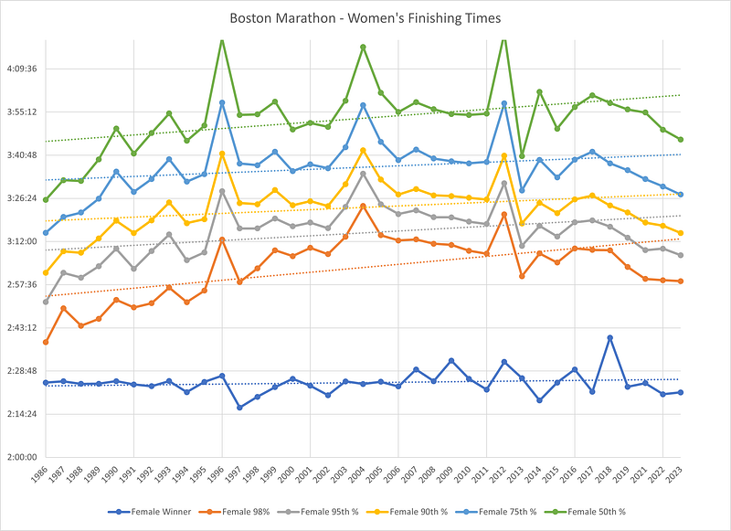
The overall graph looks somewhat similar to the men’s finishing times. Again, the winners are fairly consistent over the years. There’s some variation from year to year, but no clear trend.
The trendlines for each other group — from the 98th percentile down to the median — do point upwards. This suggests an average slowing of finishing times. But the trendlines aren’t very satisfactory. They kind of cut through the data, but in most cases, the individual data points don’t actually sit near the line.
This is a clear sign that the trendline doesn’t tell a story that accurately fits the data. So let’s try breaking the data up into two time periods again.
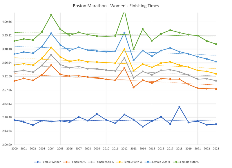
When we focus on the first time period — 1986 to 2000 — the trendlines fit a lot better. There is still some annual variation, with an outlier in 1996. Each line trends upward pretty clearly. There was probably a larger field size effect for women in 1996 than for men.
For the finisher at the 98th percentile, finishing times go from in and around the 2:40’s to well over 3:00. That’s an increase of 20 to 30 minutes. The slope of each line is similar, although the annual variation gets greater as you move further back in the pack.
But it’s fair to say that women at all levels, except for the winners, got significantly slower from 1986 to 2000.
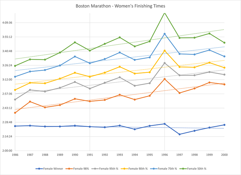
Here’s the chart for women’s finishing times from 2000 to 2023.
Again, the trendlines look much more accurate. There are a few outliers — notably 2004, 2012, and 2013 — but for each group, there is a small but significant decrease in finishing times.
The effect is greater for the front of the pack — the 98th to the 90th percentile — while it looks a bit weaker for the median finisher. At the 98th percentile, the finishing time is 5 to 10 minutes faster.
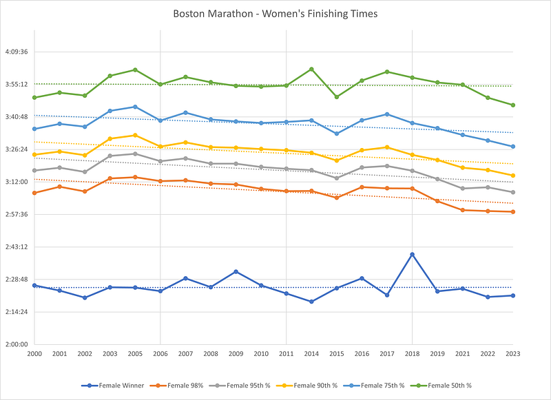
If you take out the three main outliers (2004, 2012, and 2013), the trendlines fit very well. From the 98th to the 75th percentile, there’s a clear downward trend.
In this case, the outlier in 2004 may have been pulling up the finishing times for the median runner and distorting the previous trendline. Without those three outliers, the trendline for the median runner is pretty flat. There are a couple years at the end where it drops, but we’ll have to wait a few years to see whether that becomes a sustained decrease or whether it is simple annual variation.
But it does seem safe to conclude that from 2000 to 2023, women at the front of the pack (from the 98th to the 75th percentile) who finished the Boston Marathon were getting faster.
What About Fancy Statistical Numbers?
The trendlines and graphs are easier to look at and understand visually. You can eyeball pretty well whether the general trend matches or not. But we can calculate some statistics to more objectively assess these trendlines.
Two stats in particular are useful here: the correlation coefficient (R) and its squared value (R-squared).
In short, the correlation coefficient is a number from -1 to 1 that expresses how strong a relationship is between two sets of numbers and which direction the trend is going. A positive number means it’s going up, and a negative number means it’s going down. A number near zero means there’s little change and a number closer to 1 means there’s more change.
The R-squared eliminates the directional aspect of this but focuses just on the strength of the correlation. It’s a number from 0 to 1, where a number closer to 0 indicates a weak relationship and a number closer to 1 indicates a strong relationship.
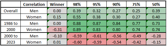
The chart above summarizes the correlation coefficients of each trendline we saw previously. It’s also color-coded to indicate the direction and strength of the relationship.
Green means the value is increasing —finishing times are getting slower — while red means the values are decreasing — finishing times are getting faster.
When you look at the winners, there’s no real relationship here. Their times are pretty consistent from 1986 to 2023, other than some annual variation.
When you look at the overall trend for that entire period, there is a positive relationship — indicating times are getting slower. But it is pretty weak. The relatively low R values indicate that a simple linear relationship doesn’t exist across the full dataset.
But when you break it down into two time periods, the relationship gets much stronger. There’s a strong positive relationship from 1986 to 2000. Times are getting slower.
Then, when you look at 2000 to 2023, there’s a clear negative relationship. It’s not quite as strong, but it’s not nothing. Notably, the relationship is weaker towards the middle of the pack than it is for the front of the pack. Times are, for the fastest runners, getting faster.
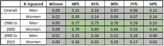
If you look at the R-Squared values across the full dataset, this confirms the same thing. There’s a very weak correlation across the full time period, a strong correlation from 1986 to 2000, and a moderate correlation between 2000 to 2023 for the fastest runners (98th, 95th, and 90th percentiles).
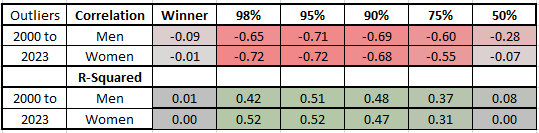
Finally, we can adjust the dataset a little bit to account for a few particular outlier years. Remember that 2004, 2012, and 2013 had times that didn’t fit the trendline very well at all, due to the particular circumstances of those years’ races.
If we recalculate R and R-squared for the remainder of the time period, the relationship appears much stronger. For the 98th, 95th, and 90th percentile, there’s a clear relationship here. For the 75th, it’s a little fuzzier. And for the median runner, it’s fair to say that there is no clear trend.
So What Does All This Mean?
That’s a lot of charts, graphs, and numbers, so let me reiterate a few of the key things I saw in the data for Boston Marathon Finishers from 1986 to 2023.
- The field size grew significantly over the time period, especially for women.
- There is no significant trend in finishing times for the winner of the race. It varies somewhat from year to year, but doesn’t move in any one direction.
- Overall, finishing times for all other runners increase over the time period but the trendline created by a linear function is relatively weak.
- If you focus on 1986 to 2000, there is a clear trend in finishing times getting slower.
- If you focus on 2000 to 2023, there is a moderate trend in finishing times getting faster.
- If you remove the outliers and focus on the fastest runners (the 98th, 95th, and 90th percentiles), the downward trend in finishing times is stronger.
- It is simply not true, speaking specifically about finishers of the Boston Marathon, that runners at the front of the pack have gotten slower from 2000 to 2023.
So What’s Next?
This is a first attempt at answering the question of whether marathon runners have gotten faster or slower over the last twenty years or so. It gives us a glimpse into the answer, but ultimately it is far from a definitive one.
First, remember that the people who run the Boston Marathon are not necessarily representative of the people who run other marathons. Due to its unique rules, with no lottery and a limited number of charity slots, the people who run Boston likely skew much faster than people who run other large marathons.
Second, this is just one marathon. There is likely a good amount of year-to-year variation that is explained by things like weather and field size as opposed to general trends in running. This is born out in the data, where two hot years (2004 and 2012) yielded significantly higher finishing times.
So we’ll have to look at some other races to see if a) the trend towards faster finishing times holds with other groups and b) whether data from more races reduces the amount of noise and produces stronger trendlines.

With that in mind, my plan is to dig into the New York City Marathon next. Once I’m able to put together a similar dataset for the finishers of that race, I’ll produce a similar analysis and write up a new article.
If you bookmark the introductory article here, I’ll add links to the next article (and all future ones) there to keep things organized. When I’m finished, I’ll also be sharing the full dataset I used so that anyone can conduct their own analysis. You can also follow me on Medium to get regular updates.
I’m an avid runner, and my next marathon is on September 10 in Erie, PA. Wish me luck. You can follow me on Strava, and I write a lot about running at my blog, Running with Rock.