
LA, Philly, and Marine Corps Marathons: How Do They Compare to the Majors?
Are runners at these marathons getting faster, slowing down, or staying about the same? Let’s explore the data and find out.
For the past few weeks, I’ve been exploring data relating to marathons and finishing times.
I started out by looking at the three American Marathon Majors — Boston, New York City, and Chicago. Now, it’s time to look outside the Majors to see what’s happening at other large marathons.
This project was sparked by a discussion about an article published by RunRepeat — American Runners Have Never Been Slower (Mega Study).
They made the claim, based on a very large dataset, that American marathoners have been getting slower since 2000. I started with a simple question — is this true?
And so far, I’m beginning to think that it’s not — at least not for runners at the front of the pack.
Note: This article is part of a larger series that is behind Medium’s paywall. If you’re not a member of Medium, you can use this form to get access to this series. I’ll e-mail you a special link to one article each week.
For more context and background, check out my original post kicking off this series. There, you’ll also find links to each article in the series.
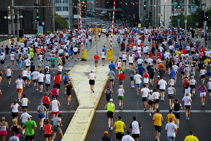
Today, we’re going to look at three other large races — the Los Angeles (LA), Marine Corps (MCM), and Philadelphia Marathons — to see what the data can tell us.
A Recap of Previous Findings
For a thorough analysis of the other marathons, check out the previous articles in this series. But I’ll start by briefly restating a few key conclusions.
Since 2000, the field size of the marathons has grown significantly. This increase was faster for women. At the same time, the age distribution was shifting towards masters runners. The typical field is more balanced along gender lines and older than it was in 2000.
In each race, there appeared to be long-term trends in typical finishing times, but these were obscured by outliers. Often these were caused by weather, but they could also be caused by other events specific to the history of a particular marathon.
Since 2000, there has been some evidence that the fastest runners are getting faster. It seems pretty clear that finishing times are getting faster at Boston. There’s more noise in the data, but runners at Chicago and New York are either getting faster or remaining about the same.
In none of these races did I find any evidence that pointed towards a slowing of finishing times — whether you looked at the fastest runners or the middle of the pack.
Why These Three Marathons?
So why did I choose these three marathons to look at today?
I started this project by looking at Boston, New York, and Chicago. All three of them involved time qualifiers — so they were guaranteed to have some fast runners involved.
LA, MCM, and Philly are different in that they do not require (or offer) time qualifiers for entry. Therefore, they should have a field of runners that is more representative of the broader running community.
The Marine Corps Marathon doesn’t offer prize money, and it takes pride in its nickname, “The People’s Marathon.” Los Angeles and Philly do offer prize money and have elite fields up front, but the rest of the field is a cross-section of the running community.
Marathons of this size, situated in major US cities, should be able to attract fairly representative groups of runners — whereas smaller marathons may draw from more localized and varied populations of runners.
These three races, then, should give us some insight into how the other half runs. If the American Marathon Majors, especially Boston, showed us how the most serious runners are doing — this will help us understand how the more typical runners are doing.
Note About Data and Methodology
Before we dive into the data, let me briefly explain where it came from and how we’ll analyze it.
None of these races had a full dataset available on their website. Some recent years were available from LA and Philly, but not enough to do a full analysis. The Marine Corps Marathon did offer historical results on its website through 1993. However, the website doesn’t currently appear to be functioning and I could not actually retrieve any results from it.
Instead, I used the website Marathon Guide as my primary source, and I scraped the race results from their website.
I did notice some errors in the Marathon Guide data, and as a result, I had to exclude the results from the 2000 and 2022 LA Marathons. The results for 2000 were missing an entire age group (Men, 40–49). The results from 2022 were compromised because runners outside the marathon category were included as marathon finishers.
The analysis will include results from the 2001 to 2021 LA Marathons, and 2000 to 2022 Philly and Marine Corps Marathons. Note that Philly was canceled in 2020 and MCM was canceled in 2020 and 2021 due to COVID.
Once I collected the data, which included the name, age, gender, overall place, and finishing time for each participant, I used the Pandas and Plotly packages of Python to perform the analysis and generate the visuals that you see throughout this article.
In order to make apples-to-apples comparisons between races and across time, I’m focusing on runners at certain percentiles among the participants — not runners at specific places. For example, the runner at the 98th percentile finished ahead of 98% of the other runners in their group — and they finished in the top 2%.
The 98th percentile represents the fastest amateur runners in the race, right behind the elites. The 90th percentile are runners that are far faster than average. The runner at the 75th percentile is slightly above average, and the 50th percentile or median runner is literally the one “average” runner finishing directly in the middle of the race.
How the Field Has Changed
Before we get into the finishing times, let’s start by looking at how the field has changed over the years.
There are a few things worth noting here.
First, the Philly Marathon starts out much smaller than the other two. LA began in the ’80s and MCM began in the '70s, whereas the modern Philly Marathon started in 1994. So while it grew to be a much bigger event, it was relatively small back in 2000.
As a result, Philly sees some dramatic growth — almost tripling in size from 2000 to its peak in 2012.
LA and MCM, on the other hand, don’t grow a lot over this time period. The last few races pre-COVID were larger than the races in 2000–2001, but not by a huge margin.
Another interesting thing to note is that all three races have a dip in participation from their peak. MCM peaks around 2012 to 2015 and then drops off by about 10%. LA peaks a few times (2005–07, 2010, 2014–16) but then there are troughs in between. Philly peaks in 2012 and declines for several years, before rebounding slightly.
Other outliers worth noting are of course 2021–2022, where field sizes were lower as a result of COVID. And LA in 2009 saw depressed participation, likely as a result of the change in date from March to Memorial Day.
Overall, participation is growing in this time period — but not as drastically as in the Majors.
Breaking the Field Down by Gender
Now that we’ve looked at how the fields are (or aren’t) growing, let’s take a look at how this breaks out by gender.
The chart above looks just at the number of male finishers in each race.
Overall, the trend looks pretty similar to the trend for the full field. But if you look closely, it is slightly different.
For LA and MCM, the overall field varied quite a bit year to year but it was growing slowly from beginning to end. When you isolate the men, the graphs are flatter. Participation in 2016–19 looks similar to participation in 2000–04.
Philly is growing significantly on the men’s side, as it is overall. But the rate of change is smaller. It doubles from 2000 to the 2012 peak (~3,000 to ~6,000) whereas the overall field size almost tripled.
This suggests that if there is some growth, it may be coming from the women’s side.
And here’s the number of finishers on the women’s side of the race.
When you look at LA and MCM, there is more clearly an increase here. So the field size on the women’s side is growing, and the fields are becoming more balanced by gender.
The difference isn’t huge, though. In 2000, MCM is split just over 60–40 men and in 2015 it’s just under 60–40. It shifted by a few percentage points. The shift is similar in LA.
Philly, on the other hand, sees much more dramatic growth in the women’s field. It’s only about 1,000 women in 2000 and it quintuples to 5,000 at the peak in 2012. The ratio in 2000 is about 65–35 men and closer to 55–45 in 2012.
So overall, participation is shifting towards women — but the effect is much greater at Philly than it is at MCM or LA.
Age Shift in the Men’s Field
One other characteristic to look at is how the age of runners is changing.
There are two very different stories here.
MCM follows a similar trend to the Majors — the percentage of runners in their 20s and 30s is declining pretty rapidly — from almost 60% to just over 40%.
LA and Philly, on the other hand, actually increase the proportion of men who are young. It’s not a huge shift, but it’s very noticeable given the fact that all of the other races we’ve looked at are getting older.
If you look at men in their 40s, there are again two different things happening.
The MCM field is pretty stable — it goes up a bit and then comes back down, but it doesn’t change much overall. It’s at a similar level — 30% — to the Majors.
At LA and Philly, though, the percentage of men in their 40s is decreasing. LA drops a bit from 2000 to 2010 before stabilizing, and Philly declines steadily throughout the entire time period.
Finally, here’s the percentage of men who are 50 and above.
Again, MCM is the outlier — with a pretty drastic increase over the time period. So MCM, like Boston, Chicago, and New York, is shifting significantly older.
But LA and Philly aren’t. LA is pretty stable throughout the entire time period, and Philly shifts a modest amount. But there’s not a huge change.
Age Shift in the Women’s Field
Is the story different on the women’s side?
It is, a little bit.
MCM still stands apart from the other two races. There’s a significant decline in the percentage of women who are under 40.
Whereas LA and Philly both shifted towards younger fields on the men’s side, that’s not happening on the women’s side. LA is fairly stable throughout, and Philly declines a little bit.
As with the men, LA and Philly are pretty stable throughout the time period.
The percentage of women 40–49 does increase at MCM — whereas on the men’s side, it was stable.
And finally, here’s the percentage of women 50 and over.
At LA, there’s not much change, other than the year post-COVID.
Philly sees a modest increase, which matches up with the modest decrease in women under 40.
But MCM sees the biggest shift — from less than 10% in 2000 to almost 20% pre-COVID and 25% post-COVID.
Overall, the MCM field is shifting towards older runners on both sides. Philly is getting slightly older on the women’s side. And LA is staying about the same — or possibly getting a little bit younger on the men’s side.
Are Runners Getting Faster, Slower, or Staying the Same?
Now, let’s move on to the real question — are marathon runners getting faster, slower, or neither?
We’ll go through each race one at a time to see if there’s a pattern.
Finish Times in Philadelphia
Philly is the youngest of these three marathons. Although there have been races in and around Philadelphia back to the early 20th century, the modern race known as the Philadelphia Marathon started in 1994.
It quickly grew to be a major event. Marathon weekend includes an 8k, a half, and a marathon — and at its peak, 30,000 runners participated. However, in 2016 the half marathon was moved to Saturday. The marathon on Sunday is now a large but more manageable event.
The course has seen some minor changes over the years — notably in 2016 and again in 2021. Overall, the course remains relatively flat with some rolling hills in the middle. It’s generally considered a relatively fast course, even if it’s not pancake-flat.
One of the nice things about Philly is that it’s in late November — so you never really have to worry about the weather being too warm. You just have to worry about the weather being too cold. Regardless, weather isn’t going to have an impact on these results as it did at Chicago.
The chart above shows finishing times for men at five places in the field.
The blue line at the bottom represents the winner. The elite competition looks to have gotten a bit more intense over the years, with the time coming down slightly and getting more consistent. But note that the winner’s time here is at least a few minutes slower than it is at the Majors.
Moving back to the 98th percentile, we can see that the serious runners at the front of the pack are also getting faster. There’s some variation, and the line seems relatively flat through 2011. But for the last decade, there’s a small but decided downward trend. A similar trend occurs back at the 90th percentile as well.
However, further back in the pack — the 75th percentile and the median — the times seem to get slightly slower over time. They drop in the last two years — 2021 and 2022 — but this doesn’t seem like enough to call it a trend.
On the women’s side, the story is similar.
Here, there’s a much larger decrease when it comes to the winner’s time. It drops by about 10 minutes from 2000 to 2022. Again, note that while these times are fast they are not on par with the elite times at Boston or Chicago.
At the 98th percentile, there is a little bump in 2008 that didn’t occur with the men. But after that, there is a general downward trend. The final years — from 2018 to 2022 — are all faster than the beginning of the time period, with 2021 and 2022 being much faster.
Here, the trend is continued back through the 75th percentile — although it’s a little more muted.
You have to move all the way back to the median runner to find a finisher that isn’t getting faster.
Overall, it would be fair to say that the fastest runners at the Philly Marathon — at the 98th and 90th percentiles — are getting faster.

Finish Times at the Marine Corps Marathon
Unlike Philly and LA (and most other big marathons), the Marine Corps Marathon does not offer prize money for the winner.
As a result, the marathon doesn’t attract a field of true elites. But there are still plenty of fast, serious runners who participate. You’ll notice that the winning times are much slower than the other races, but the other times aren’t necessarily slower.
In terms of weather and outliers, it should be noted that 2016 was the hottest year on record for the race — with temps reaching 80 degrees.
The race is typically the last weekend in October, so it’s usually got fairly decent weather. But of course, that’s not always the case.
This time, we’ll start by looking at the women first.
The winner’s time varies quite a bit, and if it’s getting quicker over time it’s a very small trend.
Further back, the times don’t change all that much over the years. For the 98th percentile, there are a few peaks (2003–04, 2014–19), but there’s also a long valley (2005–2013).
If you move further back in the field, the peak from 2014–2019 does appear to slow more significantly from the general average finishing time. But 2016 was a weather outlier, the times do improve in 2018 and 2019, and the times in 2022 are much faster.
Overall, I’d say there isn’t a trend towards finishing faster, there are a few years where runners are slightly slower, but it’s hard to say if that’s a sustained trend or not.
The trend for the men tracks pretty much with the women.
The winner’s time is a little more stable, but it doesn’t appear to change much one way or the other.
At the 98th percentile, there’s not much change in either direction, either.
Further back, at the 90th and 75th percentile, there are again the same peaks (2003–04, 2014–19) and the same valley (2006–13). And the times drop again in 2022 — lower than the average for the previous 20 years.
In both cases, the field size is smaller in 2022, and that may explain why the finishing times are somewhat quicker. Otherwise, there’s no evidence that the men are getting quicker — but some possible evidence that the men towards the back are getting slightly slower.
Finish Times in Los Angeles
There were several less successful races in LA through the 1970s and the early 1980s. But following the 1984 Olympics, organizers were able to get the LA Marathon off the ground in 1986.
The race has been going strong since, but not without some issues. In 2009, the race was shifted from its usual March date to take place on Memorial Day. This proved unpopular, and the next year it returned to an earlier date.
There have been several course changes over the years, with the last major change happening with the 2021 race. The course is net downhill, but it has rolling hills throughout.
Although the race is typically early enough to avoid hot weather, that hasn’t always been the case. In 2004, temperatures soared into the 80s. In 2014, temperatures hit a record high of 85 degrees on race day. And it got even worse in 2015, when race day temps approached 90 degrees. Over 50 runners were taken to the hospital.
So … maybe the weather hasn’t always been that great.
At first glance, this chart of finishing times looks like many others. Unless you look closely at the y-axis, you might not notice that it is in fact very different.
Although the elites who win the LA marathon run typical elite times, the rest of the field is much slower. The man at the 98th percentile is finishing well above 3 hours. This is much slower than a comparable runner at Philly.
Note, however, that there is still a slight trend towards faster times. At the beginning of the period, the 98th percentile runner is finishing around 3:10 to 3:15. By the end of the period, it’s closer to 3:00 to 3:05.
There are much bigger spikes back towards the median group. These are likely driven by heat. Since they’re slower than the front of the pack, they’re on the course longer and out later in the day — when the heat is most intense.
As you move back, there is both more variation in the middle and a trend towards slightly faster times at the end. You could view this as a bunch of noise without a clear trend — but it’s most definitely not a slowing trend.
Looking at the women’s side, there is again a mild trend towards quicker times at the front of the pack.
As you move further back in the pack, there is again some annual variation driven by the weather. With all the noise, it’s a bit hard to say whether there’s a downward trend or whether things are constant.
But again, there’s no evidence that they are slowing down. In fact, the median runner finishes in about the same speed from 2016 to 2020 as they were in 2001 to 2004.
What Can We Conclude From This?
So what does this data tell us about the larger question — what’s happening with marathons and are runners getting faster or slower?
In terms of field size, these marathons support a different conclusion from the Majors. The data suggests that they reached a peak size at some point in the recent past, and they are not continuing to grow.
They are also not experiencing the same shift in the types of participants. Whereas the Marathon Majors were all shifting hard towards women and older runners, these three marathons are more of a mixed bag.
In terms of finishing times, there’s again a mix of results. At Philly and LA, finishers seem to be getting quicker — at least towards the front of the pack. At MCM, they’re staying the same — and the slower runners may be getting a little slower.
Here’s one last graph to highlight the men finishing at the 98th percentile.
It’s important to note that the fields at MCM and LA are relatively slow — compared to Philly and definitely compared to the Majors. They are more representative of the “average” runner.
So if there isn’t a trend towards slower finishing times here — it makes me question whether there is a broad trend across the board.
When it comes to our main question — are the fastest runners getting faster, getting slower, or staying about the same — the answer again is that they are either getting slightly faster or staying about the same.
I don’t see any evidence here that would support a claim that the fastest runners at these marathoners are getting slower over time.
What’s Next?
So where do we go from here?
The first place we go is to collect all of this data and look at it one more time as a whole. So far, we’ve isolated each race and looked at the placement of finishers in the context of their own race.
But collectively, these six races represent somewhere around 175,000 finishers per year. That is a large chunk, although probably not quite a majority, of all the marathons run each year in the United States.
So we can pool all of these finishing times together and see as a whole — are they getting slower, faster, or staying the same? We can also look at how the field grows and shifts as a whole.
After that, it’s time to identify which other marathons I want to look at. For the ease of collecting data, I’ll probably stick with marathons that list results on Marathon Guide. But I need to come up with a thoughtful way to identify which other marathons to focus on.
I’ll probably start by identifying how many marathons there are and trying to sort them into categories based on things like field size and the winner’s finishing times — with a goal of collecting a representative sample of races that are small, medium, large, as well as fast and slow.
And then it’s time to collect some additional data and look at the results from other marathons.
If that sounds interesting to you, then follow me here on Medium and bookmark the original article in this series. I’ll go and add links to each new article there once it’s published.
I’d love to hear your thoughts about the data we’ve explored here. And if you have other questions — leave a response and let me know. I’m often inspired with new questions to explore based on the feedback people have.
I’m an avid runner, and I ran my most recent marathon at Erie, PA in 3:09:47. Like thousands of other runners, I just found out that my qualifying time won’t earn me a trip to Boston in 2024. Oh well. If you’re looking to get faster, check out some of these marathon training plans on my blog, Running with Rock. You can also follow me on Strava.


