
Have Runners at the Boston Marathon Gotten Older?
Another Look at the Data
I’ve been working on a project to explore data on marathon finishing times across major US marathons over the last 40 years.
Specifically, I’m looking for trends in whether serious runners — the ones training consistently and finishing towards the front of the pack — are getting faster or slower. You can read some more background and context in the original post here.
In the first post, I looked at the finisher data for the Boston Marathon. The general trends I found were:
- The field size grew significantly over time, especially for women.
- Finishing times slowed throughout the ‘80s and '90s.
- There’s an inflection point in the early 2000s, after which finishing times seem to be getting slightly faster.
Note: This article is part of a larger series that is behind Medium’s paywall. If you’re not a member of Medium, you can use this form to get access to this series. I’ll e-mail you a special link to one article each week.
After publishing that article, some of the feedback and discussions of it have raised two other questions worth considering:
- How has the age of the runners changed over time?
- If it has changed, do the changes in finishing times hold true if you disaggregate the data by age group?
So today, I’m going to dive back into the data and look at it differently. We’ll see how age plays into this.
Changes In Boston Qualifying Times
First, though, a little background. One thing that is special about the Boston Marathon is that it relies heavily on time qualifiers.
Although some runners are able to gain entry through fundraising partners, the vast majority of runners earn entry by running a qualifying time. These times have changed over the years, and these changes are what first made me consider how the distribution of age brackets may also have changed.
Early on, the qualifying standard was quite lax. The first standard, in 1970 was 4:00. In 1971, this was reduced to 3:30. Those are good times for recreational runners, but rather mediocre by “serious” standards.
In 1977, this was tightened up considerably. The new standards were 3:00 for men — and a ridiculous 3:05 for women. This made things comparatively harder for women to qualify. Masters runners of either gender (40+) could qualify with a slower time (3:30).
In 1980, the qualifying times reached their strictest point — 2:50 for the open men (19–39), 3:10 for masters men (40+), and 3:20 for all women. For older runners in their 50s and 60s, that’s a very hard standard to reach.
In 1981, additional categories (50–59, 60+) were added for masters runners, and in 1987 the qualifying times for everyone were increased slightly. In 1990, they increased again. At this point, the standard was 3:10 for young men and up to 3:50 for men 70+. For women, it was 3:40 for the 18–34 age group and up to 4:20 for women 70+.
But in 2003, there was a huge shift in the qualifying standards for masters runners. For younger runners (44 or younger), the times stayed the same. For everyone else, they increased. Sometimes by a lot. For a 65-year-old man, the qualifying standard went from 3:45 to 4:15.
Although the qualifying standards have come down twice since then (in 2013 and 2020), there’s still a similar spread between the younger runners and the older masters categories.
One might surmise, then, that there would be a shift after 2003 towards more older runners and fewer younger runners, given the relaxed standards for those in their mid-40s or older.

So Did the Age Distribution of Runners at Boston Change?
Absolutely, it did.
Here’s a chart showing the distribution of male runners in different age brackets from 2000 to 2023. Note that the data source I had access to does not include age data for races prior to 2000, so the analysis must start here.
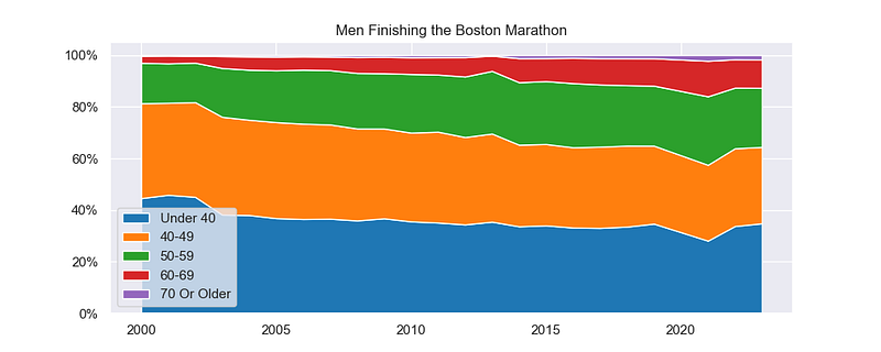
The trend here is pretty clear. The share of finishers in the two youngest age groups — under 40 and 40–49 — decreases. The share of runners in the older age brackets increases.
The increase is perhaps most stark for those in their 60s — although they are still a fairly small share of the overall field.
In 2000, a little over 80% of the finishers were in their 40s or younger. By 2023, that had dropped to just under 65%.
By contrast, the share of runners in their:
- 50s increased from 15.6% to 22.9%
- 60s increased from 2.7% to 10.9%
- 70s + increased from 0.3% to 1.8%
Clearly, the field is getting older and grayer.
It’s hard to say for certain given the absence of data for the ‘90s, but it appears that there’s a shift that starts in 2003 and continues throughout the next 20 years. This would coincide with the major shift in qualifying standards in 2003.
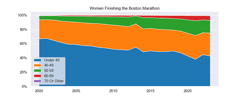
When you look at the age distribution of women, the difference is even more glaring.
For women, there were very few finishers in their 50s or over in 2000. By 2023, this had shifted considerably. However, the field still tilts much younger when compared to the men’s field.
In 2000, almost 94% of female finishers were in their 40s or younger. This decreased over the time period to about 75%.
By comparison, runners in their:
- 50s increased from 5.6% to 17.7%
- 60s increased from 0.6% to 6.6%
- 70s + increased from 0.02% to 0.64%
The trend in the last twenty years is clearly towards more masters runners and fewer runners under 50.
Although the trends are the same for men and women, the relatively younger field for women is an interesting question that deserves some further investigation. In part, this is likely due to the fact that the running boom in the 1970’s was male-dominated. But there could be other societal factors at play, like the impact of motherhood and the way that household duties are (often inequitably) divided.
A question for another day, though. And one that we can’t answer from the dataset we’re exploring.
How Does Age Interact with the Finishing Time Trends?
So the age of the runners finishing the marathon has increased. As an overall group, a higher average age would also likely lead to a higher average finishing time.
Which begs the question — if we isolate the youngest runners, does their trend in finishing times differ from the trend for the masters runners?
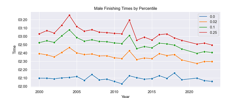
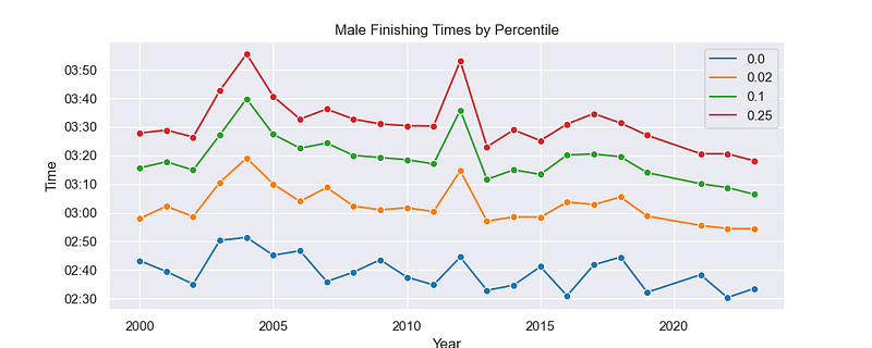
The chart above shows the finishing time for men under 40 at the Boston Marathon, from 2000 to 2020. The blue line represents the #1 finisher in the age bracket (presumably the overall winner). The lines above show the finishing time at the top 2%, top 10%, and top 25%.
The trend for all three groups is negative — which means they are getting faster. For the fastest runners — the top 2% — it’s a fairly weak trend. But the effect looks greater as you move further back in the pack.
Compare that to this graph — which shows the same data for men in their 50s. As a whole, they are much slower than the younger men. Note that the y-axis has changed, and the finishing times are 20 to 30 minutes slower overall.
If you observe the trend over time, it looks much weaker here. There is still a downward trend in the last few years, but the picture is muddled when you look at the middle of the period.
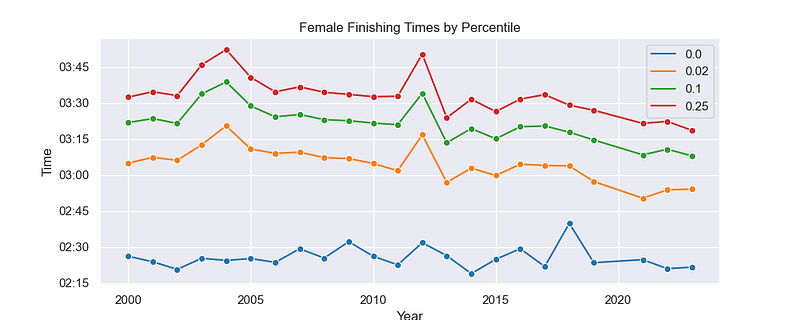
Here’s the data for women under 40. Similar to the men, there’s a fairly clear albeit minor decrease in finishing times. There’s some noise in the data from a few outliers, but the latter half of the period is clearly lower than the first half.
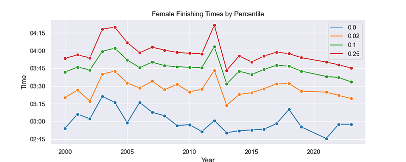
And one final chart — the same data for women in their 50s. As with the men, the picture here is more muddled. There appears to be a slight decrease, but there’s quite a bit of noise. If there is a legitimate trend here, it is much more muted than it is for the younger women (and men).
Overall, this data suggests that the trend toward faster finishing times is strongest among the youngest men and women in the race — those in the under-40 age bracket. In the same time period, masters runners are seeing much less (if any) improvement.
So What Does This All Mean?
On the one hand, this supports the conclusion I made in my previous post. The fastest runners in the race — the men and women in their 20s and 30s who are finishing towards the front of the pack — have been getting faster since 2000.
It also provides another way to understand the larger trend — that Americans running marathons have been getting slower overall. The older runners are slower than their younger counterparts. So if the field is shifting towards an older participant, it will also shift towards slower finishing times.
In part, this may be a Boston phenomenon. There’s a possible driving force behind the demographic shift, and that’s the relaxation of qualifying times for masters runners in 2003. But, seeing as that trend continued to strengthen over the next twenty years, I suspect that we’ll see a similar aging of the field in other marathons.
So What’s Next?
I promised at the end of my last post that we’d be looking at the New York City Marathon next. And that’s still my plan.
It was, however, a bit harder to gather the data for that. There was no readily available data set, so I had to write a script to scrape the data from available sources. Now that I have the data, I’ll be able to prepare it and analyze it this week.
So forgive me for the brief detour back through Boston. But I thought the age question was an interesting one that deserved exploration. I’ll be back next week with the analysis of New York. Then, we’ll see if the trends we saw at Boston hold true for another big race — or if they were unique to the faster field at the Boston Marathon.
To keep up with this series as I publish it, follow me here on Medium or bookmark the original post. I’ll add links to each of the subsequent articles there as I publish them.
I’m an avid runner, and my next race is the Erie Marathon on September 10. Wish me luck. You can follow me on Strava, and you can read about my own running story on my blog, Running with Rock. For more stories about the data behind running, follow me here on Medium.


