
The Chicago Marathon: Are the Fastest Runners Getting Faster?
Also, how has the age and composition of the field changed?
Lately, I’ve been exploring the data around finishing times for marathon runners over the last few decades.
This project was spurred on by an article from Run Repeat — “American Runners Have Never Been Slower (Mega Study)”. As the title suggests, the article claims that American runners have been getting slower. And if you look at the average runner, that’s probably true.
But one claim in particular stuck in my craw — that that trend continued if you focused on the fastest runners finishing at the front of any given race.
This led me down a rabbit hole in search of data to refute or confirm this claim. You can read some more about the background in this introductory post, where you’ll also find links to all of the articles in this series.
So far, I’ve looked at data on finishers from the Boston and New York City Marathons. Today, we’re going to focus on the last World Marathon Major in the United States — Chicago.
Note: This article is part of a larger series that is behind Medium’s paywall. If you’re not a member of Medium, you can use this form to get access to this series. I’ll e-mail you a special link to one article each week.
A Quick Recap of the Previous Findings
If you go back through the earlier articles from this series, you can find detailed analyses of the Boston and New York data. But I will summarize a few key findings here.
As we dive into the data from Chicago, you should ask yourself whether the new data confirms or refutes these previous findings.
Here are key findings, true of both Boston and New York:
- The field size has grown significantly since the 1980s, especially for women.
- There has been a significant shift towards older runners among both men and women.
- The finishing time for the winners of the race remains relatively constant, despite annual fluctuations.
- Overall, finishing times for all other runners have increased since the 1980s — but the trend line created by a linear function is relatively weak.
- If you focus on the 1980s and the 1990s, there is a clear trend toward finishing times getting slower.
And here’s where the two data sets diverge:
- In Boston, there’s been a moderate trend towards faster finishing times since 2000.
- In New York, finishing times have neither trended faster nor slower since 2000.
A Quick Note About Data and Methodology
I started this series with the Boston Marathon because someone had already gone through the trouble of collecting the results into CSV files for easy analysis. When I got to New York, I wasn’t so lucky, and I had to write a script to scrape the results myself.
With Chicago, I found myself in the same situation. There is no readily available source to download the full results set for the Chicago Marathon, but historical results starting with 1996 are available on the Chicago Marathon website.
Thankfully, these results can be displayed on the page 1,000 finishers at a time. This made it much easier for me to write a Python script that could scrape the results and save them to a CSV file. At the end, I had the results for each year’s race compiled into a CSV file with the runner’s name, gender, age, country, overall finishing time, and overall placement.
The archive starts in 1996, and I could not find results for previous races. So our analysis will start there. This will, of course, make it impossible to draw conclusions and comparisons about trends in the 1980s and early 1990s. From 1996 to 2022, the only year without a race was 2020 — due to Covid.
Note that for age, each runner was identified by their age bracket (i.e. 25 to 29). Actual ages were not provided in the race results. Since my analysis focuses on age brackets, and not a relationship between actual age and results, this won’t actually impact the findings.
In analyzing the finishing times, I’m focusing on a few specific placements. I defined these by percentiles. For example, the runner at the 98th percentile is one who beat out 98% of the other runners and finished in the top 2%. If there were 40,000 finishers in the race, the 98th percentile would be at the overall place #800.
When we get to the results, I’ll use the following as reference points:
- The top finisher (in other words the winner)
- The 98th and 90th percentiles — fast runners towards the front
- The 75th percentile — faster than average, but not outstanding runners
- The Median or 50th percentile — the runner directly in the middle of the pack
The reason I picked percentiles — instead of a specific placement — is that it scales well with field size. If I focused on a particular place — like the 10th or 100th finisher — that means something entirely different in a race with 2,000 finishers than in a race with 20,000 finishers. It also makes it easier to divide the field into subcategories by age and gender and make apples-to-apples comparisons.
As a metric, it’s not without its flaws. But it’s the one I’ve chosen to use.

How Does a Runner Get Into the Chicago Marathon?
Before we get to an analysis of the results, it’s also worth considering how a runner actually gets into the Chicago Marathon. As with Boston and New York, there are a limited number of spots, and the selection criteria could impact the type of runner who ends up in the race.
There are three main ways to get into the Chicago Marathon: as a charity runner, through the random lottery, and by running a qualifying time.
There are also other opportunities — like international tour operators and legacy runners — but they account for a small percentage of the overall field.
According to the FAQ from the Chicago Marathon, the number of lottery spaces is not determined ahead of time — that number is essentially what’s leftover after guaranteed spots are accounted for. They don’t release numbers on the lottery regularly, but in 2015 about two-thirds of the overall field came through the lottery (source: Runner’s World).
Charity runners are a significant group. According to the Runner’s World article, about 6,000 of the 40,000 runners in 2015 gained entry through a charity. But it’s grown since then. By 2021, there were over 12,000 charity runners.
In 2015, approximately 3,500 of the 40,000 runners gained entry through a time qualifier. This was the third largest group, behind lottery winners and charity runners.
Assuming the number of time qualifiers has been fairly constant (along with other guaranteed entrants like legacy finishers and deferred entries), the increase in charity spots would have to reduce the number of lottery spots available.
Using the 2015 Runner’s World article as a starting point and then making a few additional assumptions, out of approximately 45,000 runners, there should be roughly:
- 12,000 charity runners
- 4,000 time qualifiers
- 5,000 runners through other guaranteed means
- 24,000 lottery runners
The time qualifiers likely make up the top 8 to 10% of the field — so we can assume that the 98th percentile runner got in (or could have gotten in) via a time qualification, but the 90th percentile is right on the cusp. Runners further back in the field are likely more representative of the running community at large.
A final note about time qualifying at Chicago — The Chicago Marathon has more lenient standards (3:05 for men under 30, 3:35) than do Boston (3:00 for men under 35, 3:30 for women) and New York (2:53 for men under 35, 3:13 for women).
How Has the Field of Runners at Chicago Changed?
To start our analysis, we’ll first look at how the field of runners at the Chicago Marathon has changed.
Below is a line graph showing the number of finishers, broken down into the men’s and women’s fields, from 1996 to 2022.
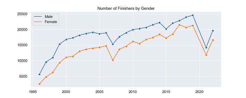
The race saw meteoric growth in the late 1990s. In 1996, there were less than 10,000 finishers. By 2000, that number had roughly tripled. The field continued to grow from there, albeit more slowly, peaking in 2019 at around 45,000.
As always, there are a few outliers in here that tell a story. 2007 is a particularly interesting one — with a significant drop in finishers compared to 2006 and 2008. So what happened?
That year, Chicago saw unseasonably hot conditions. It was in the 70s with high humidity at the start, and temperatures rose into the 80s late in the morning (source: Runner’s World). The race was eventually canceled around 11:30, preventing many from finishing. Runners had to be taken to the hospital, and one died on the course. The headline in the NYTimes the next day was “Death, Havoc, and Heat Mar Chicago Race.”
The other huge outliers are 2021 and 2022. As with other large races, Chicago returned in 2021 with a reduced field. It rebounded in 2022, but not back to 2019 levels. This year’s running — the 2023 Chicago Marathon — is expected to have a field similar to that of 2019.
It’s also of interest that the field size started to stagnate in the early 2000s, and it picked up steam again later in the decade. Chicago has always been a large race, but I wonder if the creation of the World Marathon Majors in 2006 helped spur on some of that additional growth.
As with New York City and Boston, the other story here is the explosion in women’s running. In 1996, women made up a tiny percentage of the overall field. That increased drastically over the years, often at a faster rate than the men. While there are still more male finishers than female finishers, the gap has mostly disappeared in recent years.
Have the Runners at Chicago Gotten Older, Too?
One of the interesting trends I noticed in other races was that the field was shifting toward a greater proportion of masters runners. Is that happening in Chicago, as well?
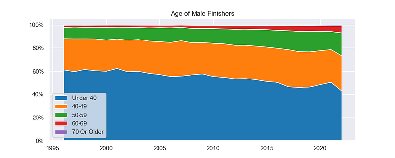
If you’re looking back at the last article and comparing graphs, it’s important to note here that the scale of time is different. I had age data for the NYC Marathon back into the 1980s, but I only have results for Chicago starting in 1996. So it’s anybody’s guess how the age of runners here shifted in the 1980s.
Through the late 1990s, things look relatively stable, but they start to shift after 2000. By 2022, the percentage of men under 40 has shrunk significantly — from just over 60% to just over 40%. A big chunk of that change was offset by more runners in their 50s, but there are also more runners in their 40s and 60s.
Unlike NYC and Boston, there are very few runners in their 70s — the line isn’t even visible on the chart.
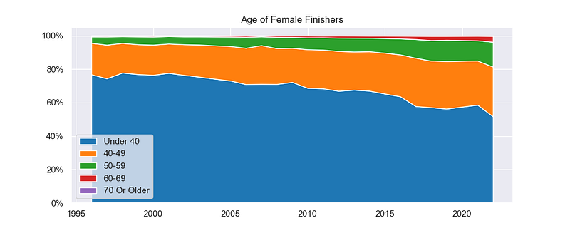
The women’s field follows a similar trend. It’s fairly stable early on, before starting to shift in the early 2000s. It’s still a very young field in 1996 — with almost 80% of women under 40 — and by 2022 that’s dropped to close to 50%. Here, there’s a large increase in both their 40s and 50s, with a small but significant group of women in their 60s in the later years.
The trend here — towards fewer younger runners and more masters runners — is similar to the other races we’ve looked at. By 2022, the actual age breakdown here is very similar to New York City, whereas the field at Boston skews a little more heavily towards older runners.
Have Runners at the Chicago Marathon Gotten Faster or Slower Since 1996?
But what about the main question we’re looking at — have runners at Chicago gotten faster, slower, or remained about the same?
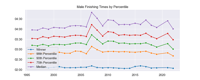
Again, keep in mind there’s no data on this chart from the 1980’s. But the trend looks very different from the graphs for New York and Boston.
From 1995 to 2005, times or more or less stagnant. As you move back in the field, there’s a very slight upward trend, but nothing big. Then you have a huge outlier in 2007 (the heat) followed by another steady time period (2008 to 2017). For the fastest finishers, there appears to be a slight downward trend from 2018 to 2022 — but with so few years to look at it’s hard to say if it’s a trend or just a fluke.
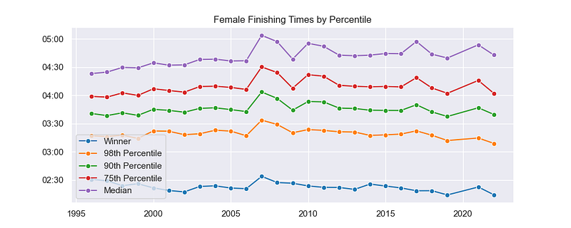
The graph for the women’s finishing time looks pretty similar. From 1996 to 2006, things are pretty stable, with a very slight upward trend. After 2007, things are again pretty stable. And there appears to be a slight dip in the final few years.
One difference here is the trend for the winner. The women did get significantly faster in the beginning, with world records being set in 2001 (Catherine Ndereba) and 2002 (Paula Radcliffe). They jumped back up in the late 2000s and have been declining since — with another world record set in 2019 (Brigid Kosgei).
What If We Break Up the Time Period?
Looking at the data, 2007 seems to be a good breaking point. There looks to be a small, but perceptible, increase in finishing times before then. And there looks to be a small but perceptible decrease in finishing times after that.
So what happens if we break the graphs down into two parts, and focus on those two time periods?
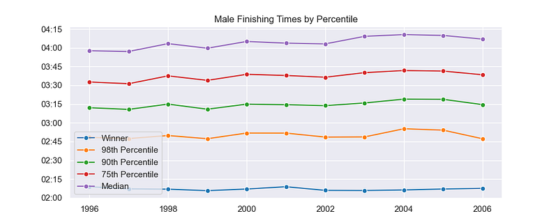
Here’s the graph for the men. Sure enough, when you zoom in there does appear to be a very slight increase in times — from the 98th percentile back to the median.
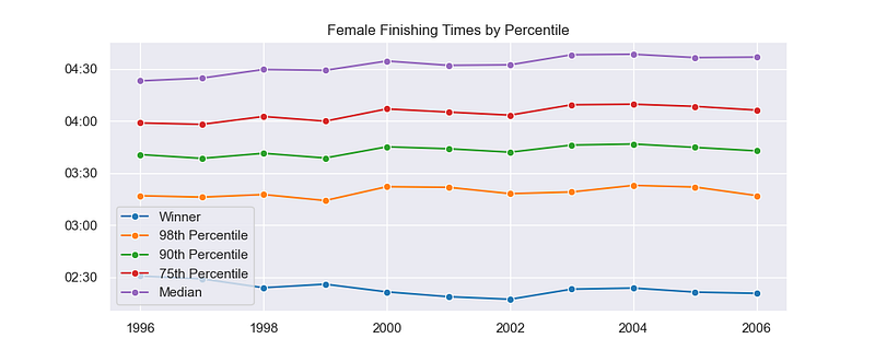
Likewise, here’s the graph for the women from 1996 to 2006. In this case, the winner does get significantly faster — at least in the first few years. But from the 98th percentile back to the median, there is a mild slowing trend.
In both cases, the effect looks to be larger at the median than at the front of the pack. But it’s there nonetheless.
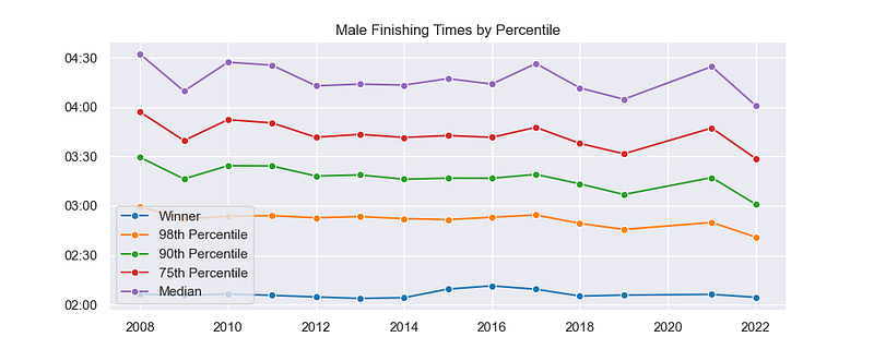
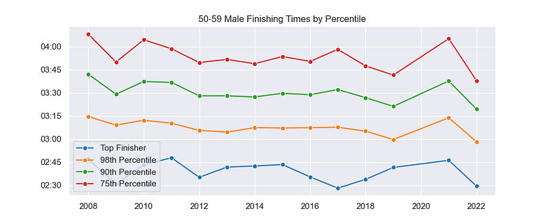
Now here’s the chart with the men’s finishing times from 2008 to 2022. There looks to be more annual variation here, and there were more warm years in this time period than in the previous one. So maybe there’s just more noise here than there was previously.
But it does look like there’s a slight decrease in finishing times. There’s much less noise at the front of the pack, and for runners at the 98th and 90th percentile, there appears to be a stronger relationship.
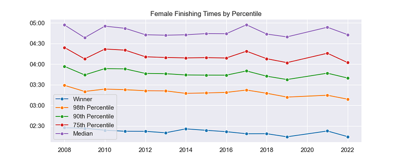
And finally, here’s the graph with the women’s finishing times. Again, there’s a fair amount of noise in there, with less noise towards the front of the pack. But the trend looks to be slightly negative.
In 2008, the woman at the 98th percentile finished at about 3:30. Over the next few years, it seems to settle around 3:20ish. By the end of the time period, those finishing times are closer to 3:10 to 3:15.
Do the Results Vary by Age Group?
Later on, we’ll take a look at some statistics that can show us a bit more objectively whether or not there’s an increase or a decrease. But one final thing that might make it more clear in the graphs is disaggregating the data by age group.
If the field is getting older, with a greater proportion of runners in their 50s and a small proportion of runners in their 20s and 30s, then it’s possible that this could skew the results. So let’s zoom in on the younger runners and the runners in their 50s.
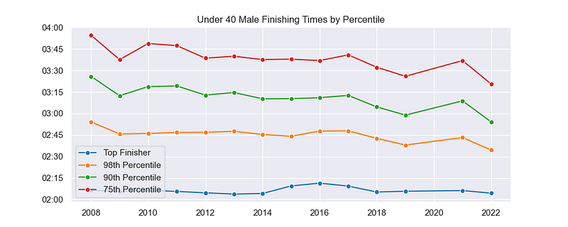
In this age group — the youngest and fastest — the effect looks to be a little stronger now. After starting the time period at or slightly above 2:45, the runner at the 98th percentile is finishing below that mark from 2018 on. For the runners further back in the field, there’s an even more clear trend.
And here’s the older age group. The fastest men — at the 98th percentile — still look like they might be getting slightly faster (aside from 2021, which was a warm year). But there’s a lot more noise here, and the trend looks less clear for the runners further back.
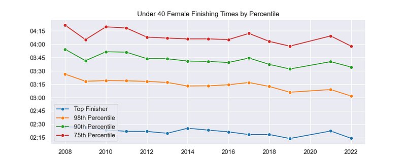
And finally, here’s the women. For women under 40, there’s an even more clear trend towards faster finishing times. I don’t think there’s any question here that they are getting faster — especially when you look at the 98th percentile.
From 2009 to 2013, they’re finishing just above 3:15. Over the next few years, it dips under that mark, and from 2019 to 2022 it’s much faster.
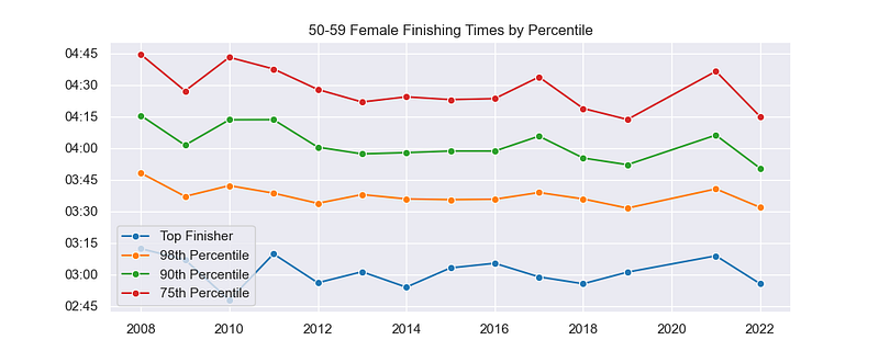
Compare that to women in their 50s. For the finisher at the 98th percentile, things look pretty stable. Further back, there’s a lot more noise. There may be a slight downward trend, but it’s obscured by the annual variation.
When you isolate runners under 40, whether you’re looking at women or men, it does appear that there is a trend towards faster finishing times since 2008.
And this supports the general conclusion that the fastest runners do appear to be getting slightly faster — but a shift in the makeup of the field may obscure that trend when you look at the finishing times as a whole.
Let’s Not Forget the Fancy Statistics
Although graphs and pictures help tell a story, let’s also refer to some raw statistics. Two numbers in particular help identify whether there is a relationship between two numbers — the correlation coefficient (R) and R-squared.
The correlation coefficient is a number between -1 and 1 that describes a relationship between two variables. In this case, we’re looking at the relationship between the year (time) and the runners’ finishing times.
A number closer to -1 means there’s a strong negative relationship — times are getting faster. A number closer to 1 means that there’s a strong positive relationship — that times are getting slower. A number closer to 0 suggests that there isn’t a relationship or that the relationship is weak.
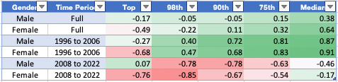
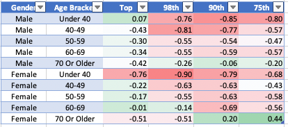
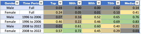
Here’s a chart showing the correlation coefficients between year and finishing time, broken down by gender and by time period.
If you’re looking at the full-time period (1996–2022), then there is no relationship for most of the field, with a weak to moderate relationship towards slower times for the median runner at the middle of the pack.
But when you break the time period down into two parts — 1996 to 2006 and 2008 to 2022 — it looks like there’s a more reliable relationship.
In the early period, there’s an increase — weaker for the fastest runners and strongest for the slowest runners. And in the later time period, there’s a decrease in finishing times — strongest for the runners in the front of the pack and weakest in the middle.
Note, also, that there is a relatively strong negative correlation for the winning female in both time periods.
This chart shows the correlation coefficients for the later time period, broken down by age group. The relationships are strongest for the youngest runners, and they are weaker as you move into the master’s categories.
Given the fact that the composition of the field is changing and shifting towards more masters runners, this would make it tougher to distinguish clear trends by looking at the field as a whole.
Finally, you can also look at the R-squared value for the relationship. This is a number from 0 to 1. It ignores the direction but focuses only on the strength. A number closer to 1 means there is a stronger relationship.
This highlights the fact that there isn’t really a strong relationship at all, if you try to look across the full-time period (1996 to 2022). The median female finisher is the only group that could be said to have any meaningful relationship here. Perhaps there would be, if we could rewind the clock and include results from the 1980s. But we don’t have that data.
In the early time period, there’s a fairly strong relationship for runners from the 90th percentile back to the median — which we identified above as a positive or slowing trend. And in the later time period, there’s a fairly strong relationship for runners at the 98th and 90th percentile. — which we identified above as a negative or quickening trend.
While the magnitude of the change may be small, there seems to be a pretty clear trend towards faster finishing times among the younger, faster runners in the time period 2008 to 2022.
Bottom Line: What Can We Conclude?
We started with a set of conclusions drawn from data from the Boston and New York City Marathons. Without data from the 1980s, it’s hard to support or refute some of those claims based on the data from Chicago.
But I think it is fair to say about finishers at the Chicago Marathon that:
- The field size grew tremendously, especially among women.
- There was a significant shift towards older runners.
- The time period can be broken into two parts, with different trends.
- In the latter time period, the fastest runners appear to be getting slightly faster.
That last point jives with the conclusion from the Boston analysis, although it wasn’t supported by the results from New York City. But based on all three races, I think it’s fair to conclude that:
- In none of these marathons have the fastest runners gotten slower after the year 2000.
In other words, the claim made in the Run Repeat Mega Study is looking weaker and weaker.
What’s Next?
There are three other large marathons that I plan on looking at — Philadelphia, Los Angeles, and the Marine Corps Marathon. I may combine them into one article, instead of going through each one individually.
Ultimately, after doing an analysis of them, I want to average out the results from the six marathons to see if that smooths out some individual variations and highlights a trend one way or the other.
But first, there are a few questions I want to focus on regarding the three Majors.
Which has the fastest runners? Given the fact that the Boston Marathon places the greatest emphasis on time qualifiers, they are probably the fastest. But Chicago is traditionally seen as a “faster” course, so I’m curious how the front of the pack in each of the three races stacks up against each other.
Which has the oldest runners? I made a few quick comparisons between the three races in this analysis, but I want to create a few charts and visuals to make that analysis more robust.
How much does weather matter? A common theme in the analysis of these three marathons was that temperature variations could cause huge fluctuations in finishing times. I’m curious to look at the actual relationship between race day weather and finishing times to see how much of the variation is possibly due to weather conditions.
So my next article will likely focus on those three questions. In the meantime, I’ll assemble the data for the other three marathons and probably focus the following article on them.
If you want to keep up to date with this series, you can follow me here on Medium. You can also bookmark the introductory post, where I’ll continue to add links to each article as it's written.
I am an avid runner, and most recently I participated in the Erie Marathon. I finished in 3:09:47 — which will earn me entry into the Chicago Marathon in 2024. You can read the race report on my blog, Running with Rock, and follow me on Strava.