
The New York City Marathon: How Have the Field and Times Changed?
Runners at the Boston Marathon are speeding up. Is the same thing true of runners at the New York City Marathon? Let’s look at the data.

I’m working on a project to analyze trends in finishing times among marathon runners over the last few decades.
This project was inspired by an article published by Run Repeat, entitled “American Runners Have Never Been Slower (Mega Study).” I took issue with one of their conclusions — that the trend towards slower finishing times was occurring across the board, and that serious runners at the front of the pack were also getting slower.
You can read more about the background in this introductory post. But the main question I’m investigating is, “Have serious runners at the front of the pack gotten slower in recent years?”
I started this project by looking at the data from the Boston Marathon, and this week I’ll be exploring data from the New York City Marathon.
Note: This article is part of a larger series that is behind Medium’s paywall. If you’re not a member of Medium, you can use this form to get access to this series. I’ll e-mail you a special link to one article each week.
A Quick Recap of the Boston Data
In the first part of this series, I dove into the data from the Boston Marathon. You can read the full article here, along with a brief follow-up focusing on the age of the runners. But I’ll summarize a few key findings for you.
As we look at the data from NYC, a key question to think about is whether this new data is confirming or refuting what the Boston data suggested.
Here are the six key findings:
- The field size grew significantly over the time period, especially for women.
- There’s been a significant shift towards older runners among both men and women.
- There is no significant trend in finishing times for the winner of the race. It varies somewhat from year to year, but it doesn’t move in any one direction.
- Overall, finishing times for all other runners increase over the time period but the trend line created by a linear function is relatively weak.
- If you focus on 1986 to 2000, there is a clear trend in finishing times getting slower.
- If you focus on 2000 to 2023, there is a moderate trend in finishing times getting faster.

Are the Runners at the NYC Marathon a Good Sample?
An important question to start with is — Why the New York City Marathon? Are its runners representative of runners as a whole, and are they a good sample to use to explore our particular question of interest?
As with Boston, it may be true that runners at New York City are not truly representative of the larger running community. It is one of the largest marathons in the world, and so it attracts a broad swath of the population. But there are restrictions on who actually gets to run.
In 2022, approximately 50,000 runners entered the race. Of them, about 10,000 gained entry via a random lottery (source: NY Times). Another 9,000 gained entry through a charity partner (source: ABC News).
The remainder either qualified by running a certain time, ran in a certain number of NYRR races, had deferred from 2020, or made it in via a few other smaller pathways.
It’s unclear how many spots are set aside for time qualifiers. It seems likely that a smaller portion of the NYC field gets in through time qualifiers than Boston, but it’s nonetheless the case that the field at NYC should skew at least slightly towards faster runners. Note that the qualifying standards for NYC are significantly faster than for Boston.
Many runners attempt to get into the race through the lottery and are denied, and the time qualifying system offers additional opportunities for faster runners to enter.
So we should expect that the group of runners finishing the NYC marathon are faster, on average, than marathon runners as a whole. Since our particular question focuses on serious runners who are on the faster side — this makes NYC a good race to look at.
Methodology and Data Sources
One of the reasons I started with Boston was that the data was readily available. Someone had already gone to the trouble of collecting finishing times into a large dataset to analyze.
I had no such luck with the NYC Marathon. New York Road Runners does have an archive of official race results on its website, with marathon results going back to 1970. However, it does not offer a way to export these results as a CSV file.
What I ended up doing was writing a Python script that used Selenium to retrieve groups of race results, scrape the data, and save it into separate CSV files. Each page had 51 results, so it took quite a bit of time to scrape the full set from 1980 to 2022. If you’re interested in that process, you can read about it here.
Note that there is no data for 2012 or 2020. In 2012, the race was scheduled to happen only days after Superstorm Sandy, and it was ultimately canceled. In 2020, the race was canceled amid the ongoing COVID-19 pandemic.
All told, the dataset covers 40 years' worth of races and over 1.3 million individual finishing times.
After the initial results were saved to separate CSV files, I used Python to combine the individual results into one larger CSV file for each race. The file contained the runner’s name, age, gender, state, country, finishing time, and overall place.
To analyze the data, I read all of the CSV files into one large Pandas DataFrame. This allowed me to use different statistical tools to explore the dataset. Ultimately, I used the matplotlib and Seaborn packages to render some visuals that will appear throughout this article.
I decided to do this instead of exporting my analysis to Excel to create visualizations. I’m not overly familiar with matplotlib and Seaborn, so it took me a while to get things set up. But it will make the process more streamlined and efficient for future parts of this series.
How Has the Field of the NYC Marathon Changed?
Before we get into the actual results and finishing times, let’s take a look at the field size and composition of the race.
The race started in 1970, and in that first year only 55 men finished the race. Only one of the 127 people who registered for the race was a woman. Over the next 50 years, the field has certainly changed a lot.
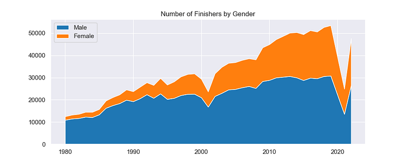
The chart above shows the enormous growth of the race since 1980. By that point, the little race with 100 runners had already ballooned to over 10,000 finishers. It has continued to grow steadily, peaking in 2019 with over 53,000 finishers.
To put that in perspective, that’s almost twice the size of Boston — which is itself a very large race.
There are two notable outliers here, and each tells its own little story.
In 2001, the race took place a few short months after 9/11. Although this did not prevent the race from continuing, there is a significant decrease in the number of finishers in that year. It’s also interesting (odd?) that there is a bigger impact on the number of female finishers than male finishers that year.
The other is in 2021. As with many races, there was a reduced field size that year as a response to COVID. It was still a huge race, but it was only about half of its usual size and scope.
Perhaps the biggest story, though, is in the number of women finishing the race. In 1980, that number had grown to a small but mighty few. But they were still a tiny fraction of the overall field. The women’s field has grown much faster than the men’s since then, and in recent years nearly half of the finishers have been women.
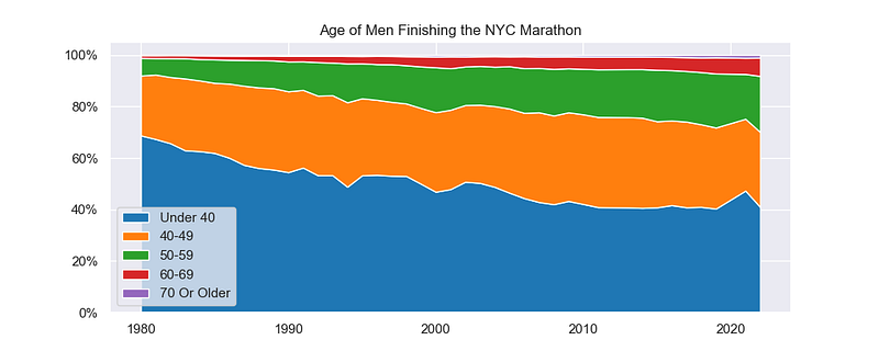
If you take a closer look at the men’s field, you’ll find that there has been a shift in the age of the runners. The percentage of the field under 40 has shrunken steadily through the 2010s, and the share of runners in their 40s, 50s, and 60s has grown.
In 1980, close to 70% of men finishing the race were under 40. In recent years, that’s been closer to 40%. The portion of the field in their 40s has grown slightly, but the real growth is among runners in their 50s and 60s. Men in their 50s now make up close to 20% of the field.
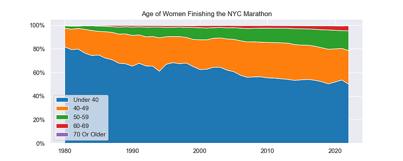
The women’s field has seen a similar shift towards older runners, although the women’s field is still younger as a whole than the men’s field.
In 1980, over 80% of the women finishing the race were under 40. Almost the entire remainder of the field was women in their 40s, with a tiny fraction of those finishing the race aged 50 or over.
The share of women in their 40s has increased steadily since then, more or less doubling from 1980 to 2022. But again, it’s runners in their 50s and 60s that make up a large portion of the growth.
Whereas the under-40 portion of the men’s field seems to have stabilized in the 2010s, the women’s field continued a shift towards fewer runners under 40. At this point, half the finishers are still under 40 — and perhaps the shift will continue in the coming years.
The trends here — towards a much larger field, towards more women, and towards older runners — more or less mirror the trends I found when analyzing data from the Boston Marathon.
It also offers one possible explanation if we see a general trend towards slower times since the field is composed of an older mix of runners.
What Do I Mean By “Percentile”?
A quick word about vocabulary.
Throughout the rest of the analysis, I’ll be referring to runners at a certain percentile. For example, the runner at the 98th percentile.
By this, I mean the runner whose finishing time is faster than 98 percent of other finishers. In other words, they are in the top 2%.
The 98th and 90th percentile represent fast runners at the front of the pack. The 75th percentile is a runner who is above average, but finishes towards the middle of the pack. Finally, the median runner is literally in the middle of the pack — half of the race finished before, and half of the race finished after. It’s quite possible that these different runners have different trends over time.
Focusing on percentiles allows us to make comparisons across different time periods and field sizes. If we focused instead on an overall placement — say the 100th finisher — that would mean something very different in the year when 10,000 people ran than in the year 50,000 people ran.
Have the Men Finishing the NYC Marathon Gotten Faster or Slower?
Let’s start with the big picture. What has happened to finishing times among men over the full-time period — 1980 to 2022?
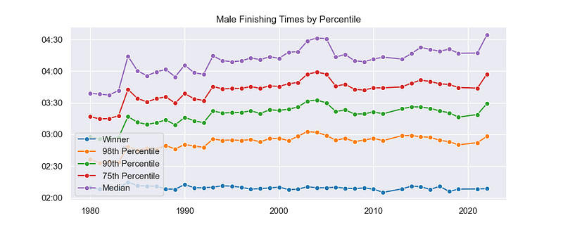
The graph above shows those finishing times for each of our groups — the fastest finisher, followed by the 98th percentile, 90th percentile, 75th percentile, and the median.
Throughout the time period, the winner’s finishing time has stayed more or less constant. There’s a little annual variation, but it’s pretty consistent without a large shift up or down. Course records were set in 1980, 1989, 2001, and 2011. But the winning time has fluctuated between 2:08 and 2:10 for most of these years.
Starting from 1980, there is a large shift in finishing times for the other groups, though. It’s at its lowest in the early ’80s, it increases in the late ’80s, and it increases again in the ’90s. But at some point, that increase plateaus.
Although there’s a general slowing of times, there are also a few years that stick out as outliers. 1984 is the first obvious outlier, and that year the temperature reached the high 70’s and humidity was in the 90’s. There’s another bump in 2003, 2004, and 2005. All three years, temps were in the mid to high 60’s. And finally, 2022 was another warm year. In each case, there’s a spike in finishing times compared to other years before and after.
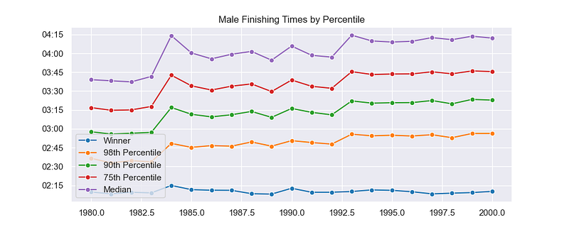
If you focus just on the first half of the time period, there does appear to be a significant slowing of times from 1980 until the early 1990’s. But towards the end of the graph, things definitely flatten out.
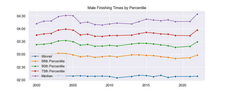
Zeroing in on the second half of the time period, it seems fair to say that there is no significant trend up or down. There are four years that were unseasonably warm — 2003, 2004, 2005, and 2022). In a couple years — like 2018 and 2019 — times dip slightly.
As you move back in the pack, the annual variation increases a bit. But whether you look at the 98th percentile or the median runner, there’s no clear trend. At the 98th percentile, the graph is nearly flat.
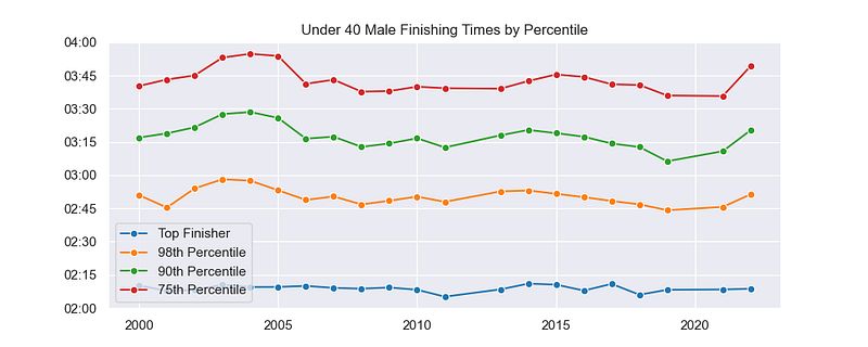
One final thing to look at is whether separating out the youngest and most competitive age groups would yield a trend. The graph above is like the previous ones, but it only shows finishing times among men under 40.
Note that the actual finishing times are much faster — the 98th percentile of under 40 runners is around 2:45, while in the overall men’s field the 98th percentile is around 3:00. There appears to be a downward trend from 2013 to 2019, but this is preceded by a little bump in 2013–14. So it may be a reversion to the mean more than anything else.
As with the Boston data, there seems to be a definitely slowing from the 1980s to the 1990s. However, in Boston, the fastest runners were getting (slightly) faster in the last 20 years. In New York, at least for the men, finishing times over the last 20 to 30 years seem to have been pretty consistent.
Have the Women Finishing the NYC Marathon Gotten Faster or Slower?
What about the women? Does the women’s field follow the same trends, or are they different?
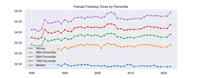
Here, again, is a graph for the full-time period. The winner appears to be slightly faster today than in the 1980s, but there’s not a big shift. In the 1980s and ‘90s, the winner typically finished in between 2:25 to 2:30. In recent years, that’s come down to 2:23 to 2:26.
Meanwhile, further back in the pack, there is a general trend towards slower finishing times. That slowing looks to continue through the mid-90s before leveling off.
You see the same outliers here due to weather. Another outlier that exists here — but not on the men’s graph — is in 2001. At the 98th percentile, the women were much faster. There was a much smaller women’s field in this particular year, so maybe it’s just a fluke of who actually ran. There doesn’t appear to be any effect further back in the field.
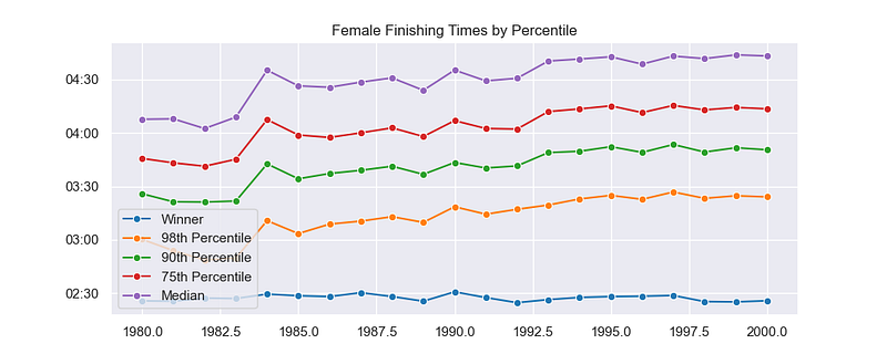
Zooming in on the first half of the time period, you can clearly see a slow and steady increase in finishing times. It looks like the middle of the pack plateaued around 1992 to 1993, while the 98th percentile had a longer, more gradual increase before plateauing later in the ‘90s.
But there is a clear and unambiguous trend.
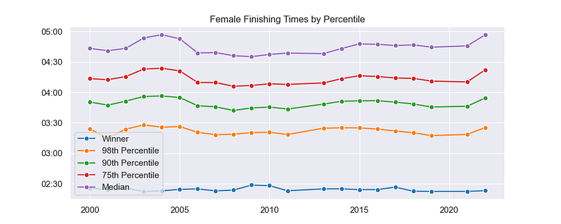
As with the men, that trend evaporates after 2000. Times go up a little bit in the warm years, and they dip a little bit in other years.
But they definitely aren’t continuing the slowing that occurred in the 1980s and ‘90s. There doesn’t appear to be any movement towards faster times, either.
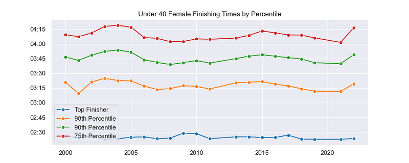
Finally, if you separate out the under-40 age group, the graph doesn’t really change much. You find the same relatively flat graph, with some annual variation. It appears to be declining at first, due to the 2003–2005 peak, but then it bumps back up from 2013–2015.
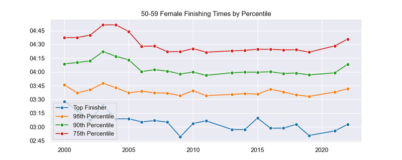
If you look at the older age groups — in this case, women in their 50s — then there is a slight drop in times since 2000. The graph for women in their 60s looks similar. The finisher definitely got faster, and everyone back to the 75th percentile saw a slight improvement, as well.
If there is an effect, though, it seems to be isolated in the first part of the graph — 2000 to 2005. After that, times tend to stay consistent as with the other age and gender groups.
So, for the most part, it would be true to say for women as well that times got slower throughout the 1980s and 1990s, and then they stayed more or less consistent through the next two decades. Some age groups had a brief recovery from 2000 to 2005, but no sustained speeding up.
Let’s Break Out the Fancy Statistics
Although the graphs speak for themselves — and a picture is worth a thousand words — it’s good to back things up with cold, hard statistics.
So let’s take a look at two stats — the correlation coefficient and R-squared.
The correlation coefficient (R) is a number between -1 and 1 that indicates whether or not a relationship exists between two variables. In this case, a negative value would indicate that times are decreasing and a positive value would indicate that times are increasing. The closer the number is to -1 or 1, the stronger that correlation is.
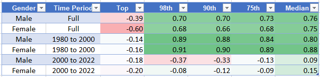
The chart above shows the correlation coefficients between year and finishing time. The first two rows are for the full-time period, while the last four rows break it out into two time periods.
Across the full-time period, there is a weak negative correlation for the winners — suggesting they are getting slightly faster. This does happen, as the course record continues to come down bit by bit. But for everyone else, the correlation is positive — indicating that they are getting slower.
When you break the time period down into 1980–2000 and 2000–2022, though, there is a very strong positive correlation from 1980 to 2022 and no real correlation for the second half of the period.
R-squared is another way to look at the strength of correlation. It’s a number between 0 and 1. The higher is it, the stronger the correlation.
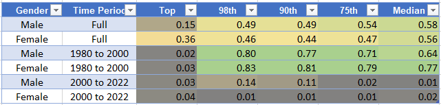
Again, there is a moderate correlation across the full-time period. But the strongest correlation is for 1980 to 2000. In general, it would be fair to say that times increased from 1980 to 2000, and that there is no clear trend towards faster or slower finishing times from 2000 to 2022.
Although the men at the 98th and 90th percentile did have a negative correlation from 2000 to 2022, it was very weak. Here, the R-squared is 0.14 and 0.11, which indicates that there isn’t a strong relationship between year and finishing time.
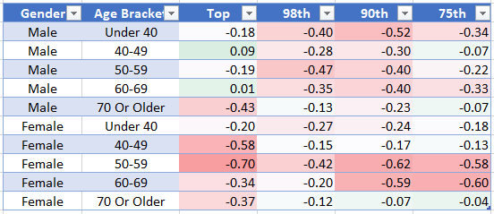
Focusing just on the second half of the period (2000 to 2022), the chart above breaks down the correlation coefficients by gender and age bracket.
By breaking things out, there are a few subgroups that do appear to have a decent negative correlation. Some of the men’s age groups have a weak correlation, but the relationship is strongest for older women.
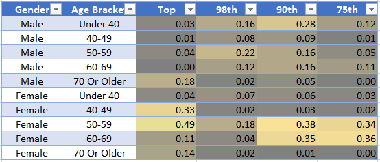
This chart replicates the chart above, but with R-squared values instead of correlation coefficients. The only groups that seem to have any significant correlation are the top finishers among women in their 40s and 50s, as well as the 90th and 75th percentile of women in their 50s and 60s.
Overall, the correlation statistics support the conclusion that finishing times got slower throughout the 1980s and that they remained relatively consistent throughout the early 21st century. If there is any decrease in the last twenty years, it’s quite modest and it’s limited to certain subgroups
Bottom Line: What Does All This Mean?
So let’s add all this up. What’s going on with finishers at the New York City Marathon?
We started by stating some conclusions from an analysis of the Boston Marathon and then asking whether the data from the New York City Marathon backed up those conclusions.
Of those six conclusions, five of them are supported by this data.
- The field size grew tremendously, from 1980 to 2022, and the biggest portion of this growth came from broader participation among women.
- The field shifted towards older runners, growing especially among those in their 50’s and 60's.
- There wasn’t a large change in the winner’s finishing time over the time period.
- Finishing times increased from 1980 to 2022, but it does not appear that the same linear relationship holds across the full-time period.
- If you focus on the earlier time period, 1980 to 2000, there are much stronger correlations showing an increase in finishing times.
The final conclusion, however, was not supported by this data. In New York, it does not seem that runners have been getting faster from 2000 to 2022. Although a few subgroups saw modest decreases in finish times, there was no broad trend or strong correlation.
However, this data also fails to support the conclusion of the Run Repeat Mega Study. There is no evidence here that finishing times among the fastest runners have increased since 2000. In fact, whether you look at the front of the pack (98th percentile) or the middle (the median), there is no trend towards slower finishing times after 2000.

What’s Next?
So where do we go from here? There are a few things worth exploring.
First, I plan to continue in this vein with the final World Major Marathon in the United States — Chicago. I’ll put together a similar dataset and explore to see whether it supports the conclusions I’ve drawn from Boston and New York.
But this analysis of New York raises a few other questions that could be interesting to look at further.
One of those is the impact of weather. I wonder how the temperature on race day impacts finishing times for the various subgroups. The outliers clearly show that heat slows people down. It could be that race day temperature does show a strong correlation — and that any changes from 2000 to 2022 are really a product of temperature changes.
Another is the overall speed of New York City finishers vs Boston finishers. I had expected the New York City field to be fast overall due to its qualifying standards. But now I’m guessing that only a small portion of the field actually makes it in through that qualifying standard.
A man under 40 needs to run 2:53 (under 35) to 2:55 (35 to 39) to qualify for New York City. The 98th percentile beat that standard, but that 90th percentile was way behind it with finishing times closer to 3:15.
Meanwhile, the top 25% of male runners at Boston under age 40 are finishing around 2:50. I’m interested to see exactly how they stack up, but it appears that the Boston field is much faster overall — once you get past the very front of the pack.
But those are questions for another day.
Look out for an update next week exploring data from the Chicago Marathon. If you bookmark the original post in this series, I’ll continue to add links to the new articles there. You can also follow me here on Medium to make sure you see updates as they are published.
I’m an avid runner, and my next marathon is this weekend! I’m running the Erie Marathon on Sunday, September 10. Wish me luck, and check my blog for a race report in the coming days. You can also follow me on Strava.


