
Using Time Periods as Slicers to Enhance Power BI Line or Area Charts’ Range
Enhancing Data Visualization: Mastering Time Frame Selection in Power BI Reports
PBIX file available for download at the end of this article.
Introduction
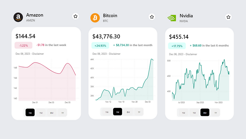
The flexibility to choose a specific time frame for data visualization can be very helpful, especially in domains like stock/asset data analysis. This feature, commonly seen in platforms like Google Finance and CoinMarketCap, allows users to tailor their data analysis to specific periods, offering more targeted insights.

In this article, I’ve utilized data from Investing.Com to create the visuals showcased in the cover image. I will guide you through the detailed steps to replicate these visuals in Power BI. Below is a glimpse of the Stock Data table loaded into Power BI, which forms the basis of our analysis:

You can view the data extracts and steps applied in Power Query in the project folder available for download at the end of this article.
1. Building a Date Period Slicer
The first step is to build a date period table where the period column can be used as a slicer in your Power BI report. In my case, I built the following Period table in Excel and loaded it to Power BI.
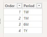
To ensure that the periods appeared in the right order in the slicer, I sorted the Period column by the Order column.

Once this period table was ready, I added a new slicer to the report and add the Period column under Field.

I applied a few formatting steps to the slicer to give it my desired look and feel to it.

If you would like to learn more on the different formatting options you can apply to Power BI’s new slicer, you can check out this article:
2. Calculating Minimum and Maximum Dates
To define the period range for all calculations (such as stock price, variation, percentage variation), it’s essential to calculate the minimum and maximum dates.
The easiest is the Maximum Date. We basically need to calculated the latest date available in our dataset. Here is the DAX calculation:
Maximum Date = MAX('Stock Data'[Date])The Minimum Date depends on the user’s selection in the slicer. Using the Maximum Date, the calculation involves subtracting time based on the selected period. In my case, here were the requirements:
1W: substract 7 days from theMaximum Date1M: substract 1 month from theMaximum Date6M: substract 6 months from theMaximum Date1Y: substract 1 year from theMaximum Date
Here is the DAX measure that was created to achieve this:
Minimum Date =
VAR _MaxDate = [Maximum Date]
VAR _SelectedPeriod = SELECTEDVALUE(Period[Period])
VAR _MinimumDate =
SWITCH(
TRUE(),
_SelectedPeriod = "1W", _MaxDate-7,
_SelectedPeriod = "1M", EDATE(_MaxDate,-1),
_SelectedPeriod = "6M", EDATE(_MaxDate,-6),
_SelectedPeriod = "1Y", EDATE(_MaxDate,-12)
)
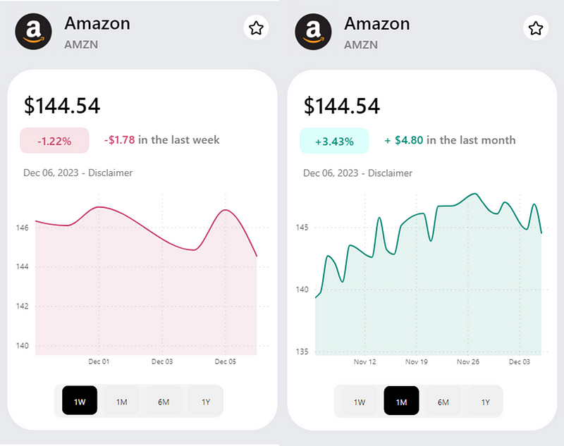
RETURN _MinimumDate 3. Setting the Minimum Axis to the Line Chart
The final step involves setting the Minimum Date measure as the X-axis minimum range in the line or area chart.
In my case, the following area chart was built using the Date column as X-axis and Price column as Y-axis from the Stock Data table.

Then I set the minimum X-axis as follow:

Once this step is completed, the line/area chart range will dynamically change as you select different values from the slicer:

Conclusion
Implementing time period slicers in Power BI line or area charts significantly enhances data visualization, particularly in stock data analysis. This approach offers users the flexibility to view data over various time frames, thereby providing deeper insights and a more interactive experience. The combination of calculated minimum and maximum dates, along with dynamic chart ranges, transforms data analysis into a more tailored and insightful process. As we continue to explore the vast capabilities of Power BI, it’s clear that such customization options are not just advantageous but essential for efficient and effective data analysis.
You can download my report with all visuals and formatting as displayed in the cover picture of this article here.
Your feedback fuels my content! Engage through comments, and if you find value in such insights, your claps encourage more of this content. Thank you for your readership!
Stay Tuned
Make sure to follow me on Medium to access all my articles on advanced techniques in Power BI visualization.
In my next article, I will be covering how to dynamically change the color of line and area charts in Power BI, like in the example below.
In the meantime, here are other articles you might enjoy on data visualization in Power BI.
Connect or Follow Me Here:
Don’t forget to subscribe to
👉 Power BI Publication
👉 Power BI Newsletter
and join our Power BI community
👉 Power BI Masterclass


