
Enhance Your Power BI Reports: 4 Dynamic Color Coding Techniques
Unlock the full potential of your Power BI bar charts with these innovative color coding strategies.
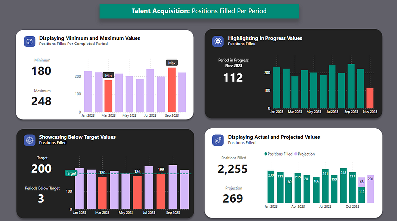
PBIX file available for download at the end of this article.
Introduction
Have you ever struggled to make your Power BI bar charts more insightful and visually appealing in your data visualization efforts? You’re not alone. Many data analysts seek ways to enhance their reports for better clarity and impact. In this guide, I’ll walk you through four innovative approaches to dynamic color coding that will transform your Power BI bar charts into compelling stories.
- Emphasizing Extremes: Displaying Minimum and Maximum Values
- Tracking Progress: Highlighting In Progress Values
- Operational Insights: Showcasing Below Target Values
- Forecasting Trends: Displaying Actual and Projected Values
Each section will include a step-by-step approach, illustrated with clear visuals and concise explanations.
The Data Context
The following talent acquisition charts are built using dummy data on positions filled. The following table has been loaded to Power Query and named Positions Filled.
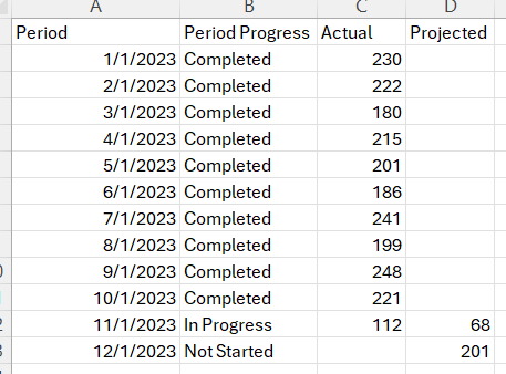
The sample Excel data file is also available in the downloadable folder at the end of this article.
1. Emphasizing Extremes: Displaying Minimum and Maximum Values
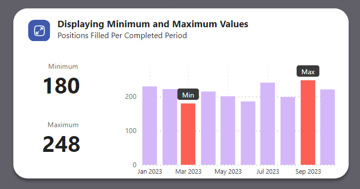
The ability to pinpoint the highest and lowest data points in a dataset is crucial in data analysis. This section guides you through creating a bar chart in Power BI that distinctively marks the minimum and maximum filled positions, captured over various months.
First we need to define the DAX measures to create the displayed bar chart, starting with the positions filled for completed periods (months January to October 2023).
Positions filled periods completed =
    CALCULATE(
        SUM('Positions Filled'[Actual]),
        FILTER(
            'Positions Filled',
            'Positions Filled'[Period Progress] = "Completed"
        )
    )
We now have the required fields to build the bar chart. Selecting the stacked column chart, we will use the Period column as the X-axis and the measure we just created Positions filled periods completed as the Y-axis.
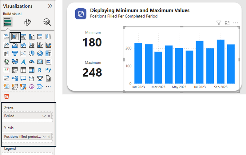
Next, we need to define the minimum and maximum values that need to be highlighted in the chart.
Min Value =
    CALCULATE(
        MIN('Positions Filled'[Actual]),
        FILTER(
            'Positions Filled',
            'Positions Filled'[Period Progress] = "Completed"
        )
    )


Max Value =
    CALCULATE(
        MAX('Positions Filled'[Actual]),
        FILTER(
            'Positions Filled',
            'Positions Filled'[Period Progress] = "Completed"
        )
    )
Following this, we need to create the conditional coloring measures in DAX. In this example, we want the minimum and maximum values to be colored in orange, and the other values in purple.
Color Orange = "#fe5f55"


Color Purple = "#d4b7f9"


Color Min-Max Values =
VAR _MinValue =
    CALCULATE(
        [Min Value],
        ALL('Positions Filled')
    )
VAR _MaxValue =
    CALCULATE(
        [Max Value],
        ALL('Positions Filled')
    )
VAR _Color =
    SWITCH(
        TRUE(),
        [Positions filled periods completed] = _MinValue, [Color Orange],
        [Positions filled periods completed] = _MaxValue, [Color Orange],
        [Color Purple]
    )
RETURN _Color
We can now select the chart and assign the last measure Color Min-Max Values as its dynamic columns’ color.
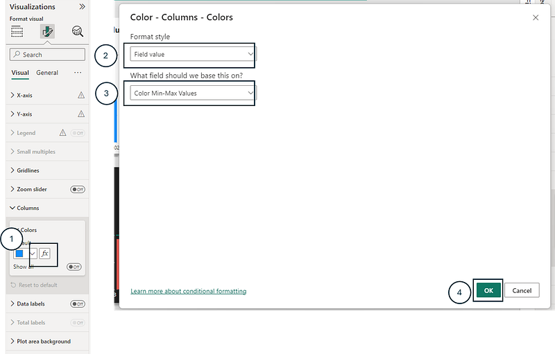
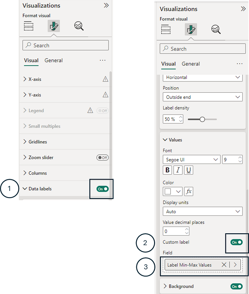
To add the data labels to this chart, we need to create the following measure that will render a data label only if the value is the identified minimum or maximum value.
Label Min-Max Values =
VAR _MinValue =
    CALCULATE(
        [Min Value],
        ALL('Positions Filled')
    )
VAR _MaxValue =
    CALCULATE(
        [Max Value],
        ALL('Positions Filled')
    )
VAR _Label =
    SWITCH(
        TRUE(),
        [Positions filled periods completed] = _MinValue, "Min",
        [Positions filled periods completed] = _MaxValue, "Max"
    )
RETURN _Label
We finally need to assign this measure Label Min-Max Values as a custom data label to this chart.
2. Tracking Progress: Highlighting In Progress Values
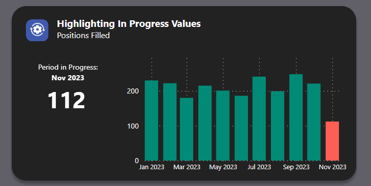
Identifying ongoing activities is vital in dynamic business environments. This segment explains how to visually distinguish between completed and in progress periods in a bar chart.
To achieve this, we first need to create a DAX measure that identifies positions filled across all periods.
Positions filled all periods = SUM('Positions Filled'[Actual])Creating a similar bar chart to the one done in the previous step (1. Displaying Minimum and Maximum Value), we need to assign this new measure Positions filled all periods to the Y-axis.
Then, we need to create DAX measures that will assign the columns’ color.
Color Green = "#018b77"


Color In Progress Values =
IF (
    SELECTEDVALUE('Positions Filled'[Period Progress]) = "In Progress",
    [Color Orange],
    [Color Green]
)
The Color In Progress Values can then be assigned as the columns’ color, as explained in 1. Displaying Minimum and Maximum Values.
3. Operational Insights: Showcasing Below Target Values
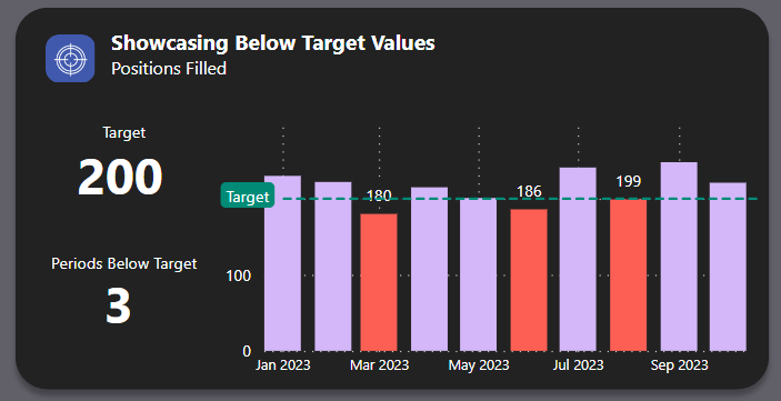
Recognizing areas that require attention is a fundamental aspect of operational management. This part of the article focuses on how to use color coding to highlight periods where certain targets, such as the number of positions filled, are not met.
We need to start by using the same bar chart from 1. Displaying Minimum and Maximum Value and create the following measures to assign the columns’ color:
Period target = 200


Color Below Target =
    IF(
        [Positions filled periods completed] < [Period target],
        [Color Orange],
        [Color Purple]
    )
The measure Color Below Target can then be assigned to the columns’ color, as explained in 1. Displaying Minimum and Maximum Values.
For the labels, the following measure can be assigned as custom data label.
Label Below Target =
    IF(
        [Positions filled periods completed] < [Period target],
        [Positions filled periods completed]
    )
If you are interested in seeing how the target line was created to this chart, you can view this article:
4. Forecasting Trends: Displaying Actual and Projected Values
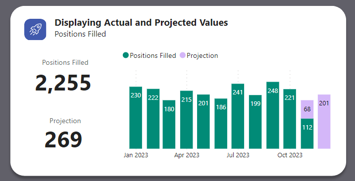
Forecasting is a key element in strategic planning. This section demonstrates how to represent both actual and projected values in a single bar chart.
In this case, we have a different measure that calculates projected positions. Using the initial stacked column chart, all we need to do is add the following measure to the Y-Axis.
Projection = SUM('Positions Filled'[Projected])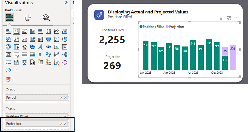
Conclusion
By implementing these four dynamic color coding techniques, you’ll not only improve the aesthetic appeal of your Power BI bar charts but also enhance their ability to communicate complex data stories effectively. Remember, the right color coding can make your data more intuitive and insightful.
You can download my report with all visuals and formatting as displayed in the cover picture of this article here.
Your feedback fuels my content! Engage through comments, and if you find value in such insights, your claps encourage more of this content. Thank you for your readership!
Connect or follow me here:
Enjoying tips and tricks in advanced data visualization in Power BI? Here are a few recommended reads:
Don’t forget to subscribe to
👉 Power BI Publication
👉 Power BI Newsletter
and join our Power BI community
👉 Power BI Masterclass


