
Creating a Process Tracker in Power BI
Elevate Your Operational Oversight with Advanced Visualization Techniques
PBIX file available for download at the end of this article.
Power BI is often thought of as a tool to showcase performance results and display key indicators. However, it can also be a powerful option for monitoring and tracking the progression of a process. Inspired by Bas Dohmen’s ideas and the UI from his video “Visualization Status Tracking in Power BI,” I developed the following tracker using a different approach and methodology. While I find Bas’ approach very crafty by leveraging existing Power BI chart visualization options, I believe the approach I present provides more opportunities for visual customization, e.g., leveraging icons to represent process steps, using custom indicators to display progress, and further color formatting in process details.
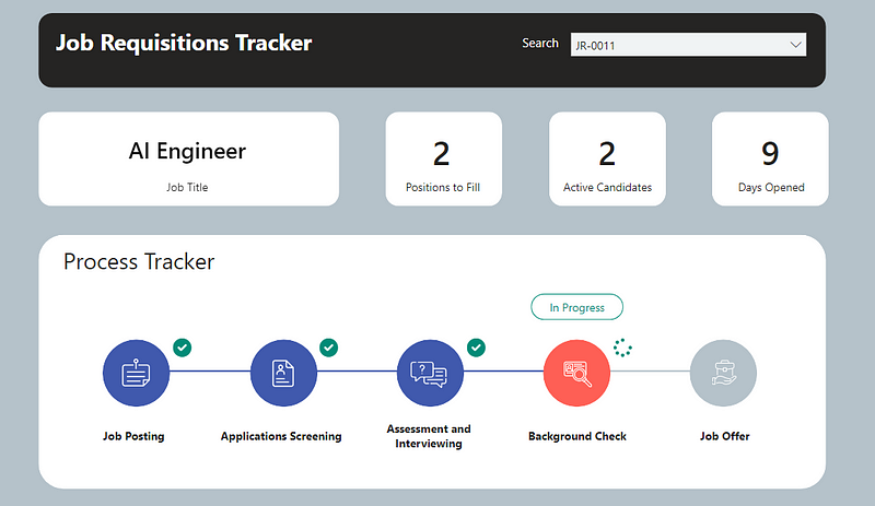
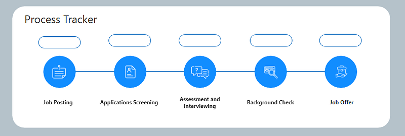
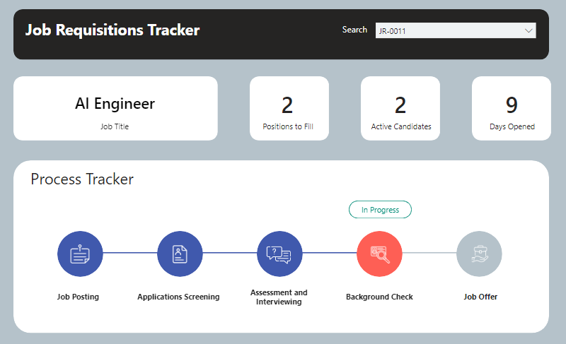
In this article, I will present how I developed the process tracker featured on the cover image. This example is based on the talent acquisition context, aiming to track the progress of each job requisition.
1. Setting Up the Data
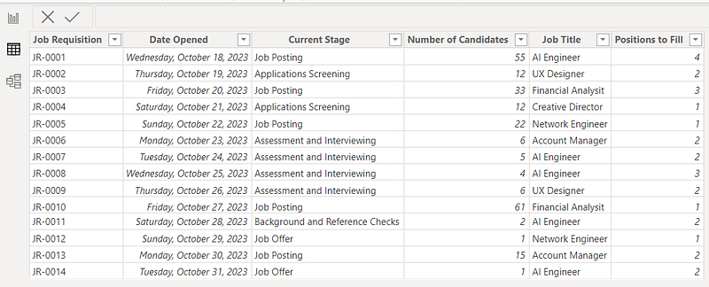
Here is the initial dummy data table titled JobReqs that I created and loaded in Power BI. Each line provides the detail of an active job requisition.
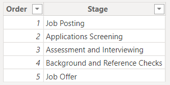
I also created the following table in Excel that was loaded in Power BI and titled Stages. It provides the order of recruitment stages to facilitate calculations in the next steps.
No links were created between these tables in the data modeling tab.
These two tables are available in the folder that can be downloaded at the end of this article.
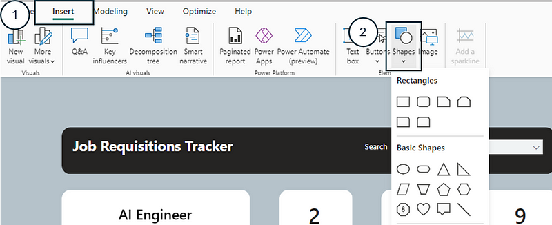
2. Setting Up the Initial Process Shapes
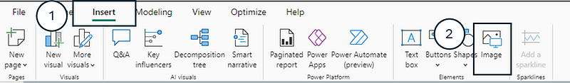
Before diving into the DAX measures that were used to format the colors and icon display of each process step, I selected and placed the different shapes representing each step of the process from the Insert tab.
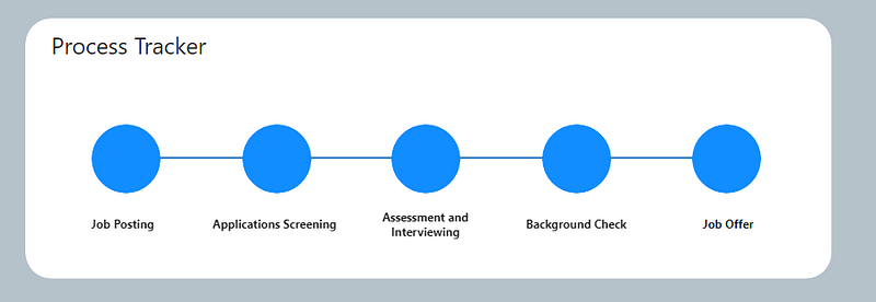
I used ovals for each process step and lines as connectors. I also used text boxes to write the name of each step under each oval.
Here is what the progress tracker looked like initially:
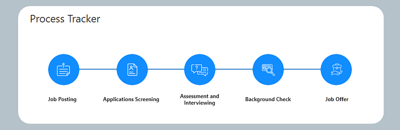
To improve the visual, I added icons on top of each process circle. I retrieved these icons from the website Flaticon and imported them as PNG images in Power BI.
I overlayed each icon over the circle of its respective process step.
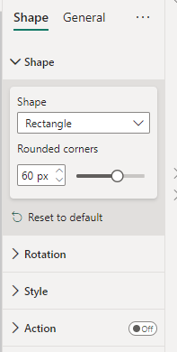
Following this, I also added rectangle shapes (that were used to display the “In Progress” label) above each process step. I rounded the corners of the rectangles to visual appeal.
At the end of all these steps, here is what the initial set up looked like:
3. Formatting the Process Shapes’ Fill Color
We want the process shapes’ fill color to appear:
- Blue if the step has been completed
- Orange if the step is in progress
- Light Grey if the step has not yet been started
First I set up these colors in DAX measures:
_const Color Blue = "#4059ad"

_cost Color Orange = "#fe5f55"

_const Color Light Grey = "#B5C2CA"
The second step was to develop the measures that will be used to dynamically fill each shape. I started by creating the measure that gives the Selected Stage Order for each job requisition when selected by a slicer.
Selected Stage Order =
VAR _SelectedStage = SELECTEDVALUE(JobReqs[Current Stage])
VAR _StageOrder =
    CALCULATE(
        MAX(Stages[Order]),
        FILTER(
            Stages,
            Stages[Stage] = _SelectedStage
        )
    )
RETURN _StageOrder
Then I created the following measure for each step, starting with the first step “Job Posting”:
Job Posting Fill Color =
SWITCH(
TRUE(),
[Selected Stage Order] > 1, [_const Color Blue],
[Selected Stage Order] = 1, [_cost Color Orange],
[_const Color Light Grey]
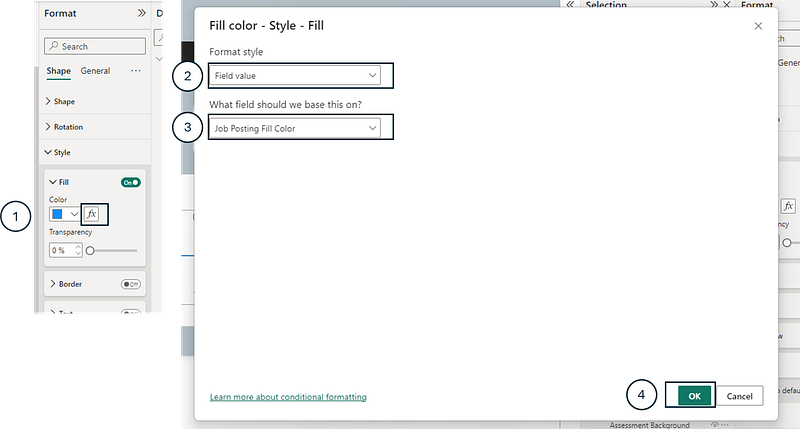
)Then, selecting the circle shape of “Job Posting”, I dynamically assigned this measure to its Fill Color.
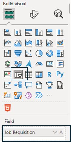
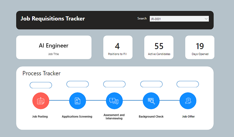
I started testing by adding a Slicer to the report and dropping the Job Requisition column from the JobReqs table to ensure that the measures and visuals were properly working.
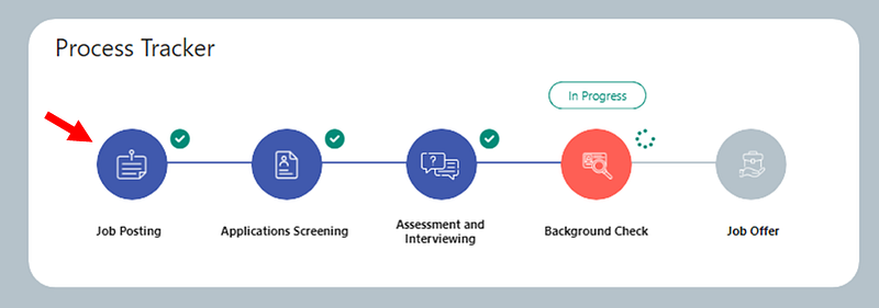
For example, when selecting JR-001 from the slicer, the fill color is orange:
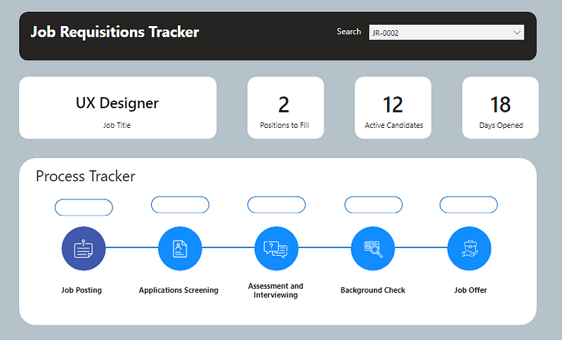
And when selecting JR-0002, it appears blue:
These steps were then repeated for the fill color of each process shape.
4. Formatting the Line Color Between Each Step
In this case, I wanted the line to be:
- Blue if the previous step has been completed
- Light grey if the previous step in in progress or not started
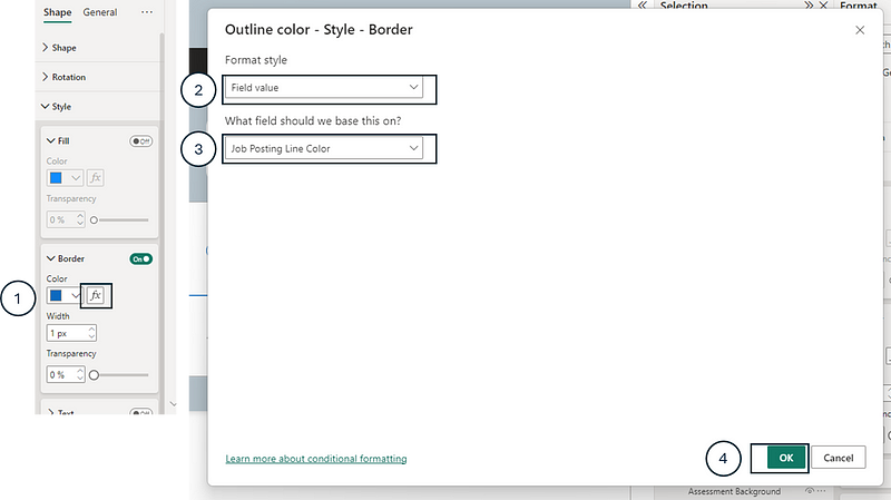
Similar to the previous step, I assigned a DAX measure to the border color of each line for each step, starting with the line between Job Posting and Applications Screening:
Job Posting Line Color =
    IF(
        [Selected Stage Order] > 1,
        [_const Color Blue],
        [_const Color Light Grey]
    )
The equivalent of the previous measure was created for each subsequent step and then assigned to the line’s border color.
5. Formatting the In Progress Label Above Each Process Step
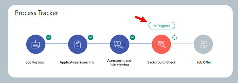
Here I wanted these In Progress labels to only appear if the step is “In Progress”. Therefore, I needed to create measures that will make the border of the rectangle shapes:
- Green if In Progress
- Transparent if Completed or Not Started
Here are the measures that specify the colors that were used:
_const Color Green = "#018b77"


_const Color Transparent = "#FFFFFF00"
Then the measure to assign to the shape’s border was the following for each process step, starting with “Job Posting”:
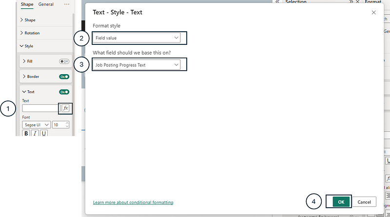
Job Posting Progress Color =
    IF(
        [Selected Stage Order] = 1,
        [_const Color Green],
        [_const Color Transparent]
    )
Similarly, for the text inserted to each shape, I wanted it to display :
- In Progress if the step is In Progress
- Empty if the step is Completed or Not Started
Job Posting Progress Text =
    IF(
        [Selected Stage Order] = 1,
        "In Progress"
    )
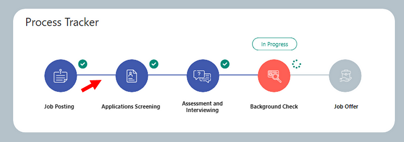
By this point, the tracker was looking like this:
The last step was to add the icons to the top right of each process step.
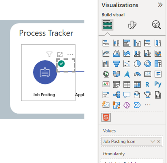
6. Adding the Progress Icons to Each Process Step
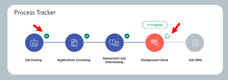
In this step, I wanted the following type of icon to each process step :
- A check mark if the process step has been completed
- A spinner if the step is in progress
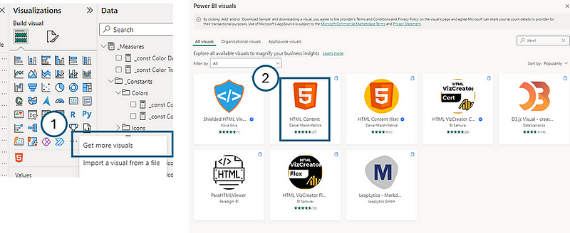
To achieve this, I leveraged the HTML Content visual. Here is how to import this custom visual:
Then I used free html icons from this site Font Awesome. Here are the measures created to leverage these HTML icons:
_const Icon Font awesome icon set up = "<head><link rel=""stylesheet"" href=""https://cdnjs.cloudflare.com/ajax/libs/font-awesome/6.1.1/css/all.min.css""/></head><div style=""margin:right;""><i style=""color:{COLOR}"" class=""{ICON_CODE} {SIZE}""></i> "
_const Icon green checkmark =
SUBSTITUTE(
SUBSTITUTE(
SUBSTITUTE(
[_const Icon Font awesome icon set up],
"{ICON_CODE}",
"fa-solid fa-circle-check"
),
"{SIZE}",
"fa-xl"
),
"{COLOR}",
[_const Color Green]
)
_const Icon in progress =
SUBSTITUTE(
SUBSTITUTE(
SUBSTITUTE(
[_const Icon Font awesome icon set up],
"{ICON_CODE}",
"fa-solid fa-spinner"
),
"{SIZE}",
"fa-xl"
),
"{COLOR}",
[_const Color Green]
)Once these measures created, I develop the following measure for each process step, starting with Job Posting:
Job Posting Icon =
    SWITCH(
        TRUE(),
        [Selected Stage Order] > 1, [_const Icon green checkmark],
        [Selected Stage Order] = 1, [_const Icon in progress]
    )
Then I added HTML Content visuals to the top right of each process step and drag its associated measure.
Conclusion
In conclusion, the customization of a process tracker in Power BI, as demonstrated in this article, highlights all visualization possibilities beyond performance dashboards. The detailed walkthrough provided — from setting up the foundational data and initial shapes to the nuanced formatting of process stages and dynamic integration of HTML content — showcases many customization opportunities you can leverage to elevate your Power BI reports. The final product stands as a testament to the power of creative problem-solving and the practical application of BI tools in operational contexts. By leveraging such techniques, individuals and organizations can transform their data into actionable insights, ensuring that key processes are not only monitored but also optimized for efficiency and effectiveness.
You can download my report with all visuals and formatting as displayed in the cover picture of this article here.
Your feedback fuels my content! Engage through comments, and if you find value in such insights, your claps encourage more of this content. Thank you for your readership!
Connect or follow me here:
Enjoying tips and tricks in advanced data visualization in Power BI? Here are a few recommended reads:
Don’t forget to subscribe to
👉 Power BI Publication
👉 Power BI Newsletter
and join our Power BI community
👉 Power BI Masterclass


