
Enhancing Data Visualization in Power BI: Color-Coded Markers and Target Lines for Impactful Area Charts
Unlocking Advanced Charting Techniques: A Step-by-Step Guide to Elevating Your Power BI Reports
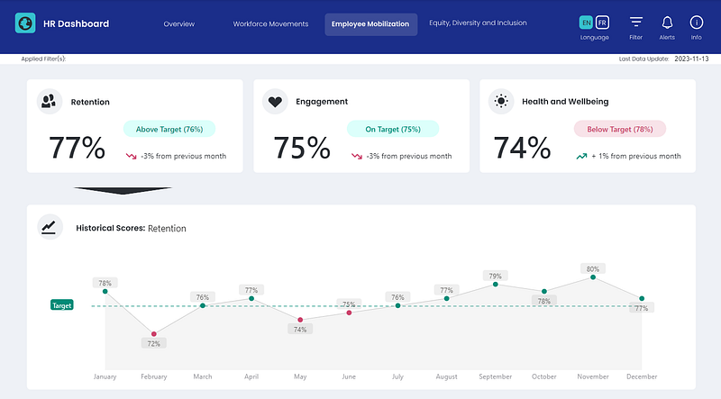
PBIX file available for download at the end of this article.
Adding color-coded data markers and integrating target lines into area charts in Power BI can significantly enhance your visualizations, making them more engaging for users and aiding in data interpretation. In this article, I will guide you through the process of adding these features to your Power BI reports, as demonstrated in the cover image of this article.
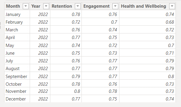
Here is the initial dummy data table titled “Employee Scores” that I created and loaded into Power BI:
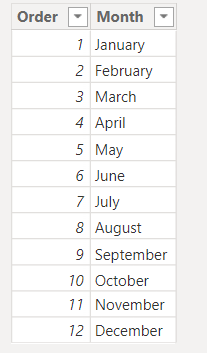
I also developed a “Month Order” table in Excel and imported it into Power BI to facilitate month sorting.
The sample Excel data file is also available in the downloadable folder at the end of this article.
Color-Coding Data Markers on Area Charts (or Line Charts!)
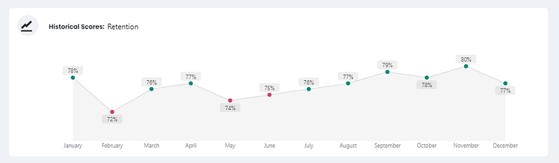
I discovered this technique while converting a bar chart into a line chart in Power BI. The outcome is impressive and offers multiple use cases, particularly for highlighting data points above or below a target value. In my scenario, it was used to construct a custom data card for employee retention, featuring a chart that displayed historical results.
Interestingly, this result is not directly achievable using a standard area/line chart in Power BI. Initially, you need to start with a bar chart and then switch to a line chart. If you know of a native method within a line chart, please share it in the comments below. 😅
1. Preparing the Initial DAX Measures
The first step involves preparing the necessary DAX measures and setting up the area chart in Power BI.
The first measures created are to calculate the employee Retention Score, starting by calculating the maximum date and then using it to retrieve the latest score.
Maximum date =
VAR _MaxDateOrder = MAX('Month Order'[Order])
VAR _MaxDate =
    CALCULATE(
        MAX('Month Order'[Month]),
        FILTER(
            'Month Order',
            'Month Order'[Order] = _MaxDateOrder
        )
    )
RETURN _MaxDate


Retention Score =
VAR _MaxDate = [Maximum date]
VAR _Score =
    CALCULATE(
        MAX('Employee Scores'[Retention]),
        FILTER(
            'Employee Scores',
            'Employee Scores'[Month] = _MaxDate
        )
    )
RETURN _Score
Subsequently, I set the target value for retention at 0.76, a figure that could be calculated or retrieved from a parameter file:
Target Retention = 0.762. Preparing the Color Coding Measures
After storing the score and target values in measures, we can develop measures to color code the data markers of the area/line chart.
First, I defined the colors I planned to use in DAX measures:
Color Dark Green = "#018B77"

Color Dark Red = "#CC426B"
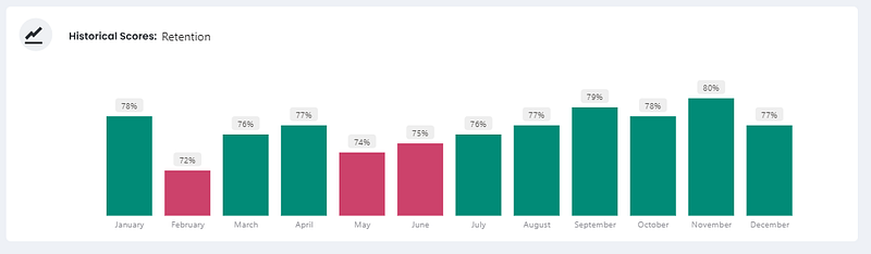
Then, I crafted the formatting measures to determine the appropriate color. If the retention score falls below the target value, the data markers turn red; otherwise, they are green:
Color Retention =
    IF(
        [Retention Score]<[Target Retention],
        [Color Dark Red],
        [Color Dark Green]
    )
3. Building a Bar Chart and Converting it to an Area Chart
The initial step is to select the Stacked Column chart from the Visualizations pane, placing the Month column on the X-axis and Retention Score on the Y-axis.
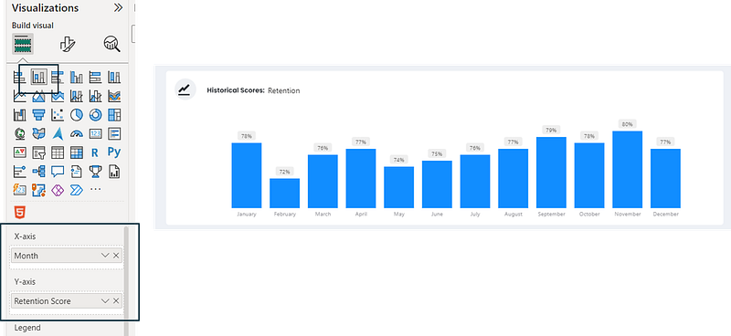
I implemented several additional formatting steps, such as:
- Removing the Y-axis and its title
- Removing the X-axis’ title
- Adding data labels
Subsequently, I assigned the Color Retention measure to the columns’ color in the Format Visual pane.
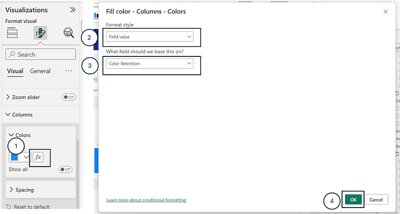
This resulted in the following:
And now, the intriguing part: with my bar chart selected, I switched to the Area chart in the Visualizations pane...
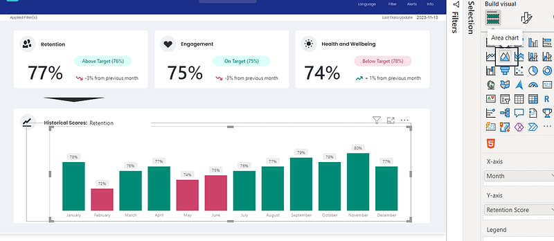
… and the data markers of the area chart appeared, matching the colors of the previous bar chart.
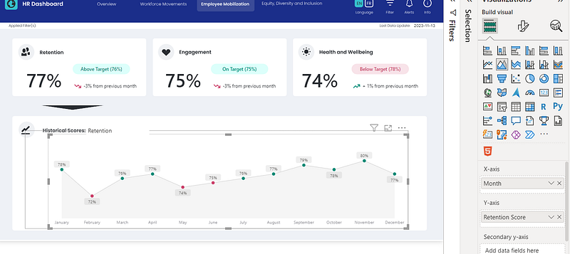
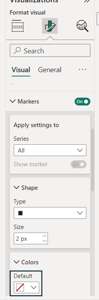
It’s unclear whether this is a bug or a feature, but it’s fascinating that it works. Notably, you cannot dynamically assign color to markers of an area or line chart in the visualization options.
Adding a Target Line to Area Charts
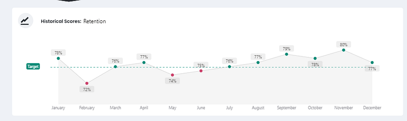
When using an area chart, there isn’t a native method to display one of your X-Axis measures as a line instead of a shaded area. To achieve this, you need to work with two charts: one area chart and one line chart, overlaying them. To ensure the axes are aligned, dynamic measures for the minimum and maximum axis values of both charts are necessary. The details of this process are as follows:
1. Adding a Line Chart Behind the Area Chart
The first step is to add a line chart and overal it behind the area chart, assigning the Month column in the X-axis and Target Retentionin the Y-axis. By double-clicking on the Target Retention measure in the X-Axis, I renamed it to Target.
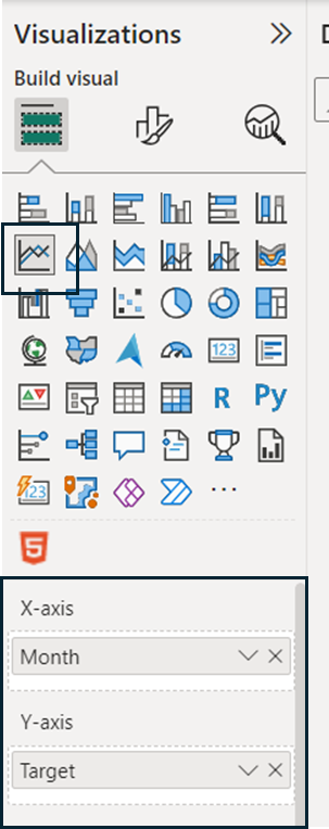
I applied the following formatting steps to the line chart:
a) Removed the X and Y Axis values and titles
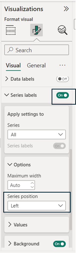
b) Added and positioned the Series Label on the left
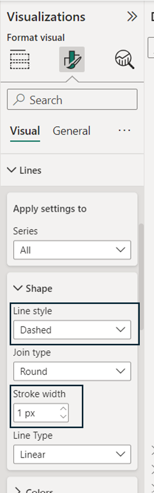
c) Formatted the line style to Dashed and reduced its Stroke to 1 px
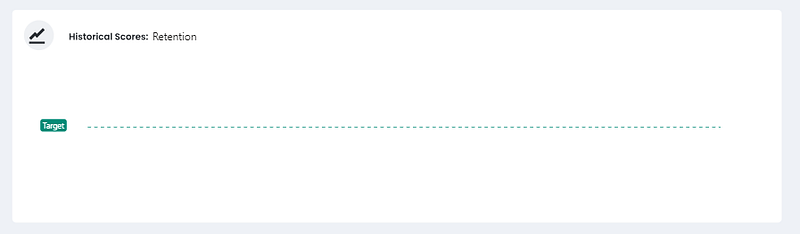
The Target Line Chart appeared as follows after these steps:
I then placed it behind the area chart.
2. Setting the Min and Max Y-Axis Values
To ensure that the axes of both graphs are synchronized, we need to set their Min and Max Y-Axis values.
This was achieved by creating measures based on the minimum and maximum values of my dataset and adding/subtracting 5%. The DAX measures used were:
Max Axis Retention = MAX('Employee Scores'[Retention]) + 0.05


Min Axis Retention = MIN('Employee Scores'[Retention]) - 0.05
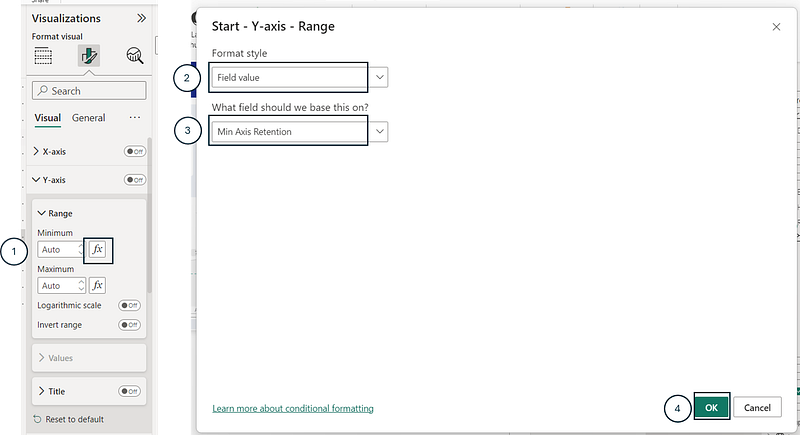
These measures were then assigned to the Min and Max Y-axis values of both graphs. Below is an example of how to assign the Minimum Y-axis value:
Conclusion
In conclusion, this article demonstrates the versatility of Power BI and its DAX language in creating more insightful and visually appealing area charts. The combination of color-coded data markers with target lines not only enhances the visual representation of data but also makes it more intuitive and actionable for users.
You can download my report with all visuals and formatting as displayed in the cover picture of this article here.
Your feedback fuels my content! Engage through comments, and if you find value in such insights, your claps encourage more of this content. Thank you for your readership!
Connect or follow me here:
Enjoying tips and tricks in advanced data visualization in Power BI? Here are a few recommended reads:
Don’t forget to subscribe to
👉 Power BI Publication
👉 Power BI Newsletter
and join our Power BI community
👉 Power BI Masterclass


