
Unlock the Power of Data: Crafting Advanced KPI Cards in Power BI
Transforming Data into Stories: Crafting Visually Engaging and Insightful Dashboards
PBIX file available for download at the end of this article.
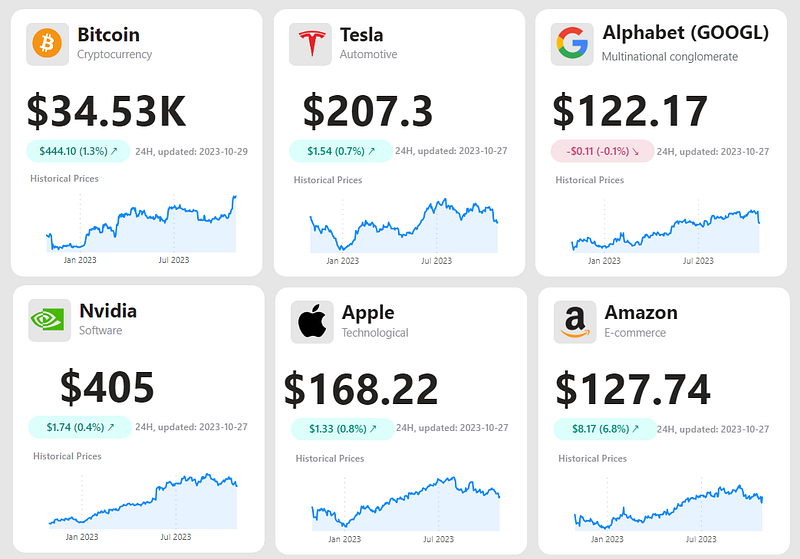
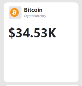
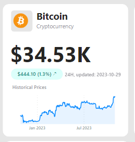
KPI cards are a staple in dashboard development, frequently used for their efficiency in conveying critical metrics. Power BI offers robust visualization tools for enhancing KPIs, but in this article, I aim to take you a bit further. I will guide you through creating your own KPI cards, similar to the ones in our cover image, that go beyond displaying just a single metric. We’ll dive into how to incorporate trends, variations, and even the latest data update details. By the end of this tutorial, you’ll be able to construct KPI cards that offer a richer, more comprehensive data narrative.
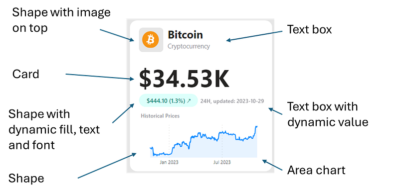
Anatomy of the KPI Card
Let’s start by breaking down the composition of one of the KPI cards I created.
Steps to Develop a KPI Card
1. Crafting the Background of the KPI Card
The first step is to prepare the KPI card background. Here are the three steps to integrate the white background, logo and title:
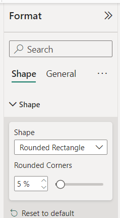
a) White Background: Begin by inserting a rounded rectangle shape from the Insert tab. You can customize this shape in the Format tab — I chose to paint it white and soften the edges by setting the corner rounding to 5%.
b) Logo: Next, add another rounded rectangle shape to serve as the foundation for your logo. From the same Insert tab, upload your logo image. For optimal results, I recommend using an image with a transparent background. In my experience, SVG format images tend to render more crisply in Power BI reports.
c) Title: Finally, add a text box for the card’s title. You have the freedom to style the text to suit your design — in my design, I opted for a bold main title complemented by a subtler, smaller-font subtitle to provide additional context.
2. Embedding the Main KPI into the Card
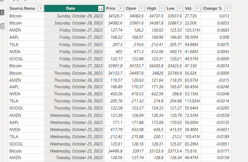
The next step involves incorporating the main KPI into your card. For this example, I used data sourced from Investing.com. The data, once loaded, is structured as follows in my table:
You can view the CSV extracts and Power Query transformation steps in my file available for download at the end of this article.
To calculate the current Bitcoin price, I formulated two initial measures:
Maximum Date = MAX('Stock Data'[Date])
Bitcoin Current Price =
VAR _Date = [Maximum Date]
VAR _Price =
CALCULATE(
MAX('Stock Data'[Price]),
FILTER(
'Stock Data',
'Stock Data'[Source.Name] = "Bitcoin" &&
'Stock Data'[Date] = _Date
)
)
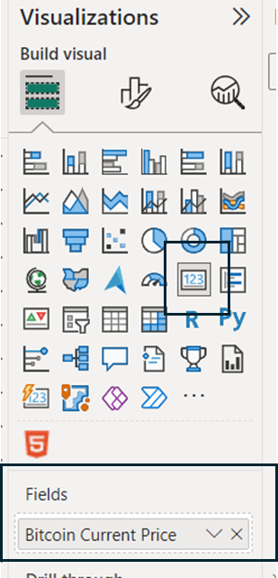
RETURN _Price After setting up these measures, incorporate them into a card visual sourced from the Visualizations pane. This visual is then positioned on the KPI card background to highlight the current Bitcoin price effectively.
3. Incorporating Variation Data into the KPI
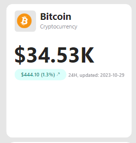
The subsequent stage involves enriching your KPI card with variation data. This data not only shows the current state but also contextualizes it with past performance. The process begins by crafting measures to dynamically update the content within shapes and text boxes on the card.
Start with the variation text displayed in the green rounded rectangle:
Bitcoin Price Yesterday: This measure captures the Bitcoin price from the previous day. It’s calculated using the following DAX formula:
Date 1 Day Before = [Maximum Date] - 1

Bitcoin Price Yesterday =
VAR _Date = [Date 1 Day Before]
VAR _Price =
    CALCULATE(
        MAX('Stock Data'[Price]),
        FILTER(
            'Stock Data',
            'Stock Data'[Source.Name] = "Bitcoin" &&
            'Stock Data'[Date] = _Date
        )
    )
RETURN _Price
Bitcoin Price Variation: This is the difference between today’s price and yesterday’s, calculated simply as:
Bitcoin Price Variation = [Bitcoin Current Price] - [Bitcoin Price Yesterday]Bitcoin Percentage Variation: To express this variation as a percentage, use the formula:
Bitcoin Percentage Variation =
    DIVIDE(
        [Bitcoin Price Variation],
        [Bitcoin Price Yesterday]
    )
Visual Indicators (Arrows): Represent upward and downward trends with Unicode characters: UNICHAR(8599) for up (↗) and UNICHAR(8600) for down (↘).
Arrow Down = UNICHAR(8600)

Arrow Up = UNICHAR(8599)
Bitcoin Text Variation: Combining the above elements, this measure creates a dynamic text showing price change and its direction:
Bitcoin Text Variation =
VAR _VariationText = FORMAT([Bitcoin Price Variation], "$0.00") & " (" & FORMAT([Bitcoin Percentage Variation], "0.0%") & ") "
VAR _TextToReturn =
    SWITCH(
        TRUE(),
        [Bitcoin Price Variation]>0, _VariationText & [Arrow Up],
        [Bitcoin Price Variation]<0, _VariationText & [Arrow Down]
    )
RETURN _TextToReturn
Next, define the aesthetic elements — the font and background colors for the variation data, based on its nature (positive or negative):
Colors Defined in DAX:
Color Dark Green = "#018B77"


Color Dark Red = "#CC426B"


Color Light Green = "#DCFFFB"


Color Light Red = "#F8E3E9"


Color Transparent = "#FFFFFF00"
Conditional Formatting Measures:
Bitcoin Font Color and Bitcoin Background Color are set using SWITCH statements, changing colors based on whether the price variation is positive or negative.
Bitcoin Font Color =
SWITCH(
TRUE(),
[Bitcoin Price Variation]>0, [Color Dark Green],
[Bitcoin Price Variation]<0, [Color Dark Red],
[Color Transparent]
)
Bitcoin Background Color =
SWITCH(
TRUE(),
[Bitcoin Price Variation]>0, [Color Light Green],
[Bitcoin Price Variation]<0, [Color Light Red],
[Color Transparent]
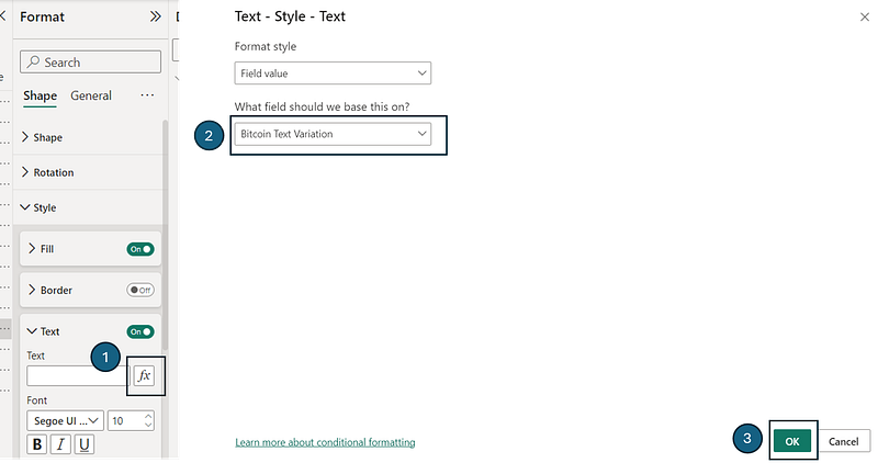
)After establishing these measures, integrate another rounded rectangle shape into your KPI card. Utilize the ‘Format’ tab to dynamically apply the Bitcoin Text Variation, Bitcoin Font Color, and Bitcoin Background Color to the shape's fill, text, and font color settings. Here is an example for the Bitcoin Text Variation:
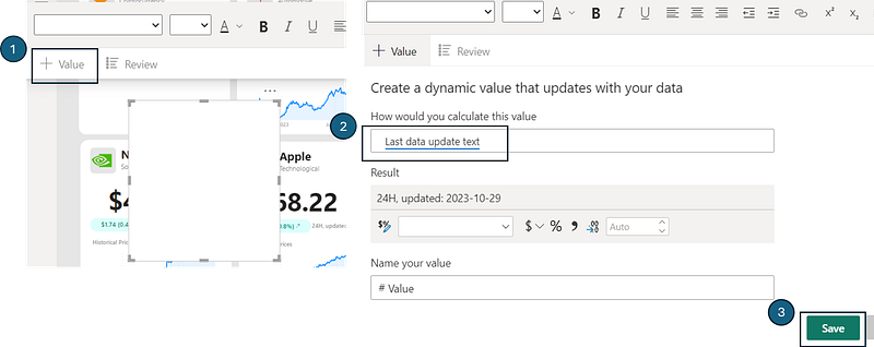
Finally, to add the information on the last data update, start by creating the DAX measure, as follow:
Last data update text = "24H, updated: " & FORMAT([Maximum Date], "YYYY-MM-DD")Incorporate this measure into a text box (or a custom HTML visual, if preferred). By adding the measure to the text box and saving it, you enable dynamic updates of the last data refresh time.
Complete the process by formatting the text font to match the overall design and positioning it aptly on the KPI card background.
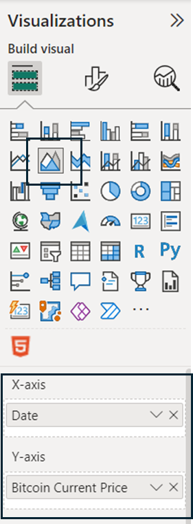
4. Integrating the Graph with Historical Prices
The final enhancement to our KPI card involves adding a graph that displays historical price trends. To accomplish this, follow these steps:
- Selection and Setup: Begin by choosing an area chart from your toolkit. Assign the
Datecolumn as the X-axis and the measureBitcoin Current Priceas the Y-axis. This forms the basic structure of your graph.
- Graph Customization for a Trend-Focused Look: To create a visually appealing and trend-focused graph, implement the following formatting modifications:
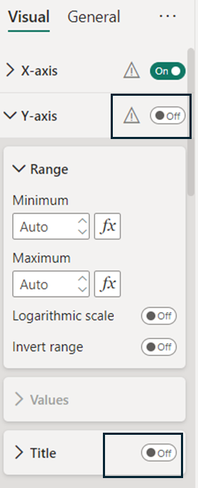
a) Y-Axis Modifications: Eliminate the Y-axis and its title to simplify the graph. This keeps the focus on price trends over time.
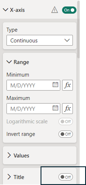
b) X-Axis Adjustments: Remove the title from the X-axis. This minimalistic approach aids in highlighting the data itself rather than the chart’s components.
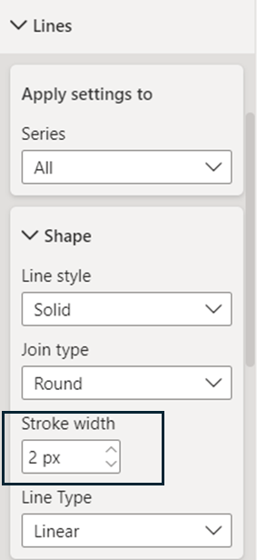
c) Line Aesthetics: Alter the stroke width of the line chart. Reducing it from 3 to 2 creates a sleeker, more refined appearance.
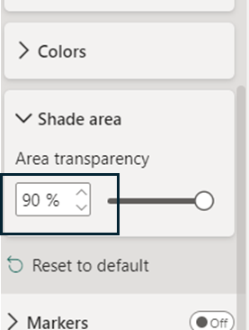
d) Area Transparency: Adjust the chart’s area transparency to 90%. This change allows for a better focus on the line graph while maintaining the context provided by the area shading.
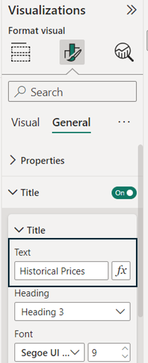
e) Adding a Title: Conclude by incorporating a title to the graph. This guides the viewer’s understanding and reinforces the graph’s purpose.
Conclusion: Beyond Basic Visualization
In conclusion, this tutorial demonstrates the intricate process of creating dynamic and visually engaging KPI cards using Power BI. In a world where data is abundant but insights are scarce, mastering such customizations in Power BI paves the way for more informed decisions and a stronger grasp of business dynamics.
You can download my report with all visuals and formatting as displayed in the cover picture of this article here.
Your feedback fuels my content! Engage through comments, and if you find value in such insights, your claps encourage more of this content. Thank you for your readership!
Connect or follow me here:
Enjoying tips and tricks in advanced data visualization in Power BI? Here are a few recommended reads:
Don’t forget to subscribe to
👉 Power BI Publication
👉 Power BI Newsletter
and join our Power BI community
👉 Power BI Masterclass


