
Adaptive Insights: Harnessing Dynamic Visuals in Power BI
Elevate Data Confidentiality and User Experience with Context-Sensitive Visualizations
PBIX file available for download at the end of this article.
Introduction
Here is a cool tip inspired from Guy in Cube (view their tutorial here ), that allows for the dynamic rendering of diverse visualizations in Power BI, tailored according to specific criteria or parameters you set. This technique is particularly beneficial in fields like HR, where data sensitivity demands prudent handling.
Contextual Scenario
In HR, the sensitive nature of data often necessitates aggregate results, especially when the subset of employees — determined via filters or row-level security — is small enough to risk individual identification. Consider scenarios like sharing employee survey outcomes or data related to equity, diversity, and inclusion. Such information, if not handled correctly, could lead to privacy issues if report viewers manage to pinpoint individual employees through extensive data manipulation.
Implementation in Power BI
We’ll explore this concept through a Power BI visualization displaying employee survey responses. The objective is to allow detailed data breakdown (e.g., by job levels: employee, manager, executive) only when the respondent count exceeds 15, ensuring anonymity. Conversely, if the count is under 15, only aggregated data is viewable, maintaining confidentiality.
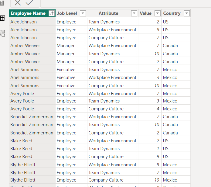
Our starting point is the following dummy dataset loaded in Power BI:
1. Establishing Base DAX Measures for Bar Charts
The initial measures that need to be created are Overall Score and Survey Respondents
Overall Scorecalculates the average survey value, normalized by 10 to obtain a percentage.Survey Respondentscounts distinct employee entries.
Overall Score =
    DIVIDE(
        AVERAGE('Survey Results'[Value]),
        10
    )


Survey Respondents = DISTINCTCOUNT('Survey Results'[Employee Name])
Use the card visual to display the Survey Respondents measure.
Following this, we will create the measures for the Overall Score per Job Levels:
Overall Score Employees =
    CALCULATE(
        [Overall Score],
        FILTER(
            'Survey Results',
            'Survey Results'[Job Level] = "Employee"
        )
    )


Overall Score Managers =
    CALCULATE(
        [Overall Score],
        FILTER(
            'Survey Results',
            'Survey Results'[Job Level] = "Manager"
        )
    )


Overall Score Executives =
    CALCULATE(
        [Overall Score],
        FILTER(
            'Survey Results',
            'Survey Results'[Job Level] = "Executive"
        )
    )
2. Determining Visual Display with a DAX Measure
The goal of this measure: Total Respondents More or Equal to 15 is to determine which chart will be displayed. If the result of the IF statement is 1, the chart with the detailed decomposition should be displayed. If the result is 0, the chart with the aggregated scores should be displayed.
Total Respondents More or Equal to 15 =
    IF(
        [Survey Respondents]>=15,
        1,
        0
    )
3. Crafting Individual Charts
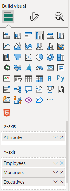
For the first chart showing the detailed job level composition, select the Clustered column chart and drop the fields as follow:
- The column
Attributeunder the X-axis. - The measures
Overall Score Employees,Overall Score ManagersandOverall Score Executivesunder the Y-axis. - You can update the names under the Y-axis by removing the “Overall Score” text to lighten the legend.
For the second chart, use the same chart type but replace the Y-axis measures by the Overall Scoremeasure.
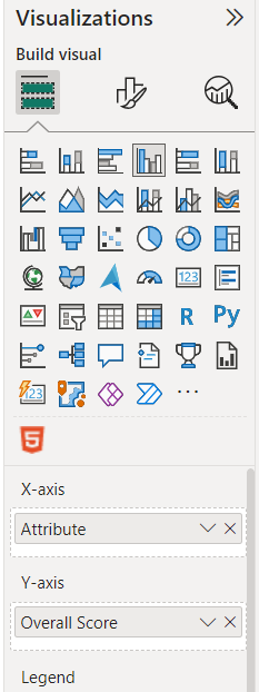
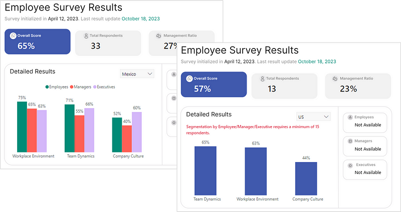
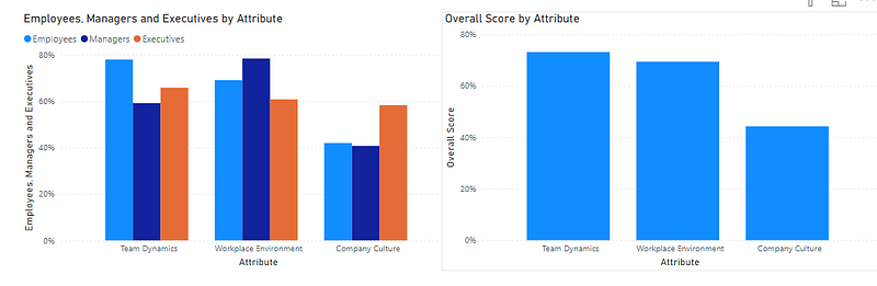
You should now have the following 2 side-by-side charts:
4. Incorporating DAX Measure into Visual Filters
We will now add the Total Respondents More or Equal to 15measure in the filter pane to each visual and set their target values.
For the chart with the detailed decomposition, set the value as 1.
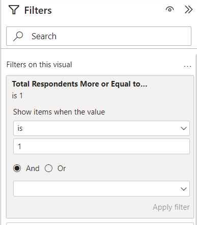
For the chart with the aggregated results, set the value as 0.
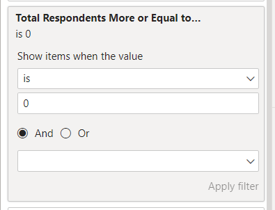
For each instance, make sure you click on “Apply filter” at the bottom.
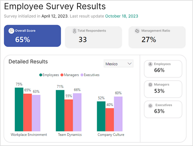
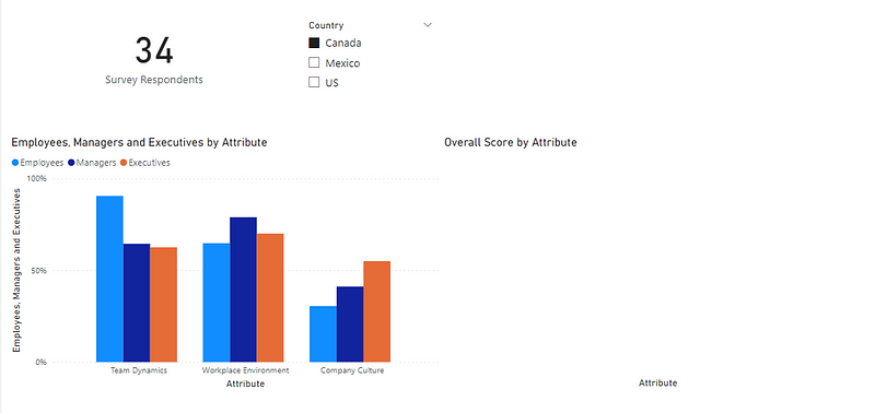
Now add a slicer to your report page and drop the ‘Country’ field to test. If you select the country ‘Canada’, you should have a total of 34 respondents and therefore the chart with the detailed decomposition should be displayed.
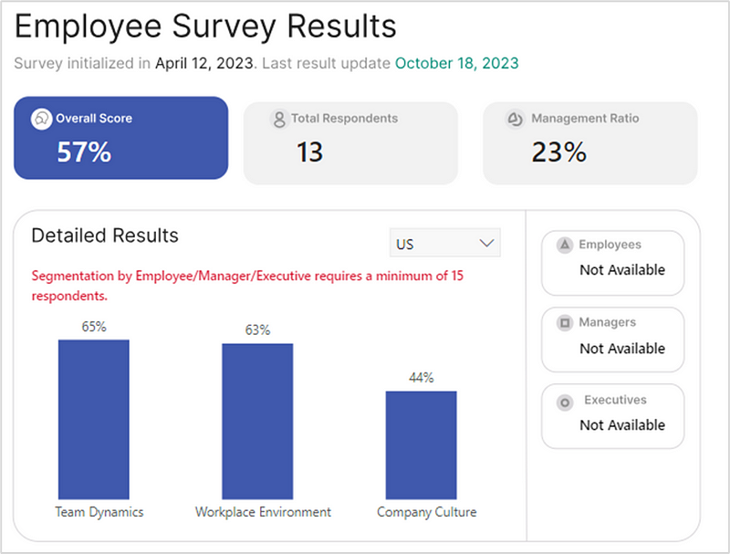
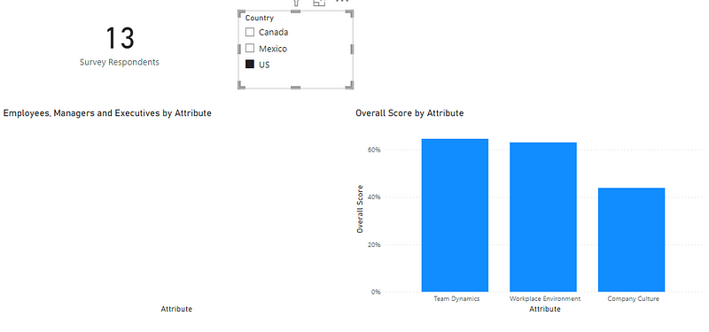
If you select the country US, the aggregated chart should be displayed as the number of respondents is inferior to 15.
5. Refining Chart Aesthetics
For each chart, make sure to:
- Remove the Chart Title
- Remove the Axis and Axis Titles
- Remove the white background
- Add data labels
You can also add additionnal formatting like I did. See the detail in the file available for download at the end of this article.
6. Merging Visuals for User Experience
The final step is to place the charts one on top of the other to give your users the feel like it’s only one chart, but rendering different results based on user selections.
Conclusion
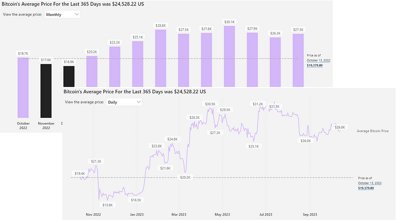
As you can see, this trick can be very practical when you want to render different visuals or simply hide some depending on set criteria. The previous example showed how it could be accomplished in the context of rendering employee data on survey results, but there are multiple use cases where this could be relevant. For example, you can decide to display different visuals based on selected field parameters if there is a more logical or cleaner way of showcasing results, like in the below example on showcasing a line chart if data is selected to be viewed daily, vs. abar chart if data is selected to be viewed monthly or weekly.
Learn more about the possibilities in using field parameters in this article.
You can download my report with all visuals and formatting as displayed in the cover picture of this article here.
Your feedback fuels my content! Engage through comments, and if you find value in such insights, your claps encourage more of this content. Thank you for your readership!
Sources
Happy dynamic visualizing in Power BI!
Don’t forget to subscribe to
👉 Power BI Publication
👉 Power BI Newsletter
and join our Power BI community
👉 Power BI Masterclass


