More Power to Your Users with Field Parameters in Power BI
Unlocking Custom Visualizations: From Daily Bitcoin Prices to Multilingual Reports
PBIX file available for download at the end of this article.
Ever since their debut in May 2022, field parameters have revolutionized the Power BI experience for both developers and consumers. They offer a greater degree of flexibility for report designers, enabling the creation of tailored views and visuals. Meanwhile, report users benefit from a wider array of data analysis options.
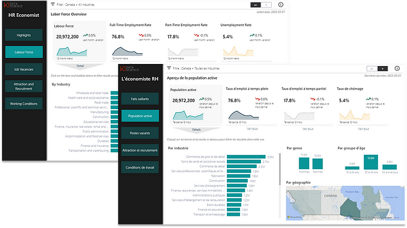
Here is an example of some of the cool visualizations that can be created thanks to this new feature. However, there are so many more options. I have even developed translated views in Power BI thanks to this feature. You can read my article Enhancing Accessibility: Developing Translated Views in Multilingual Power BI Reports on this here:
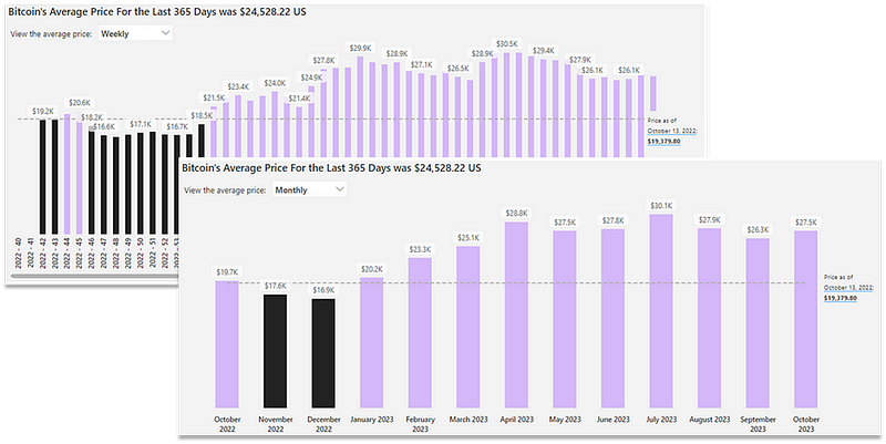
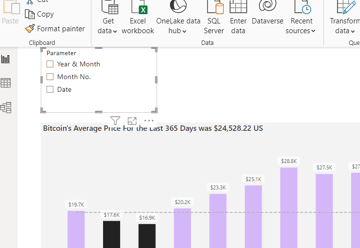
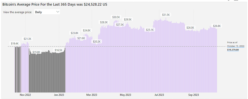
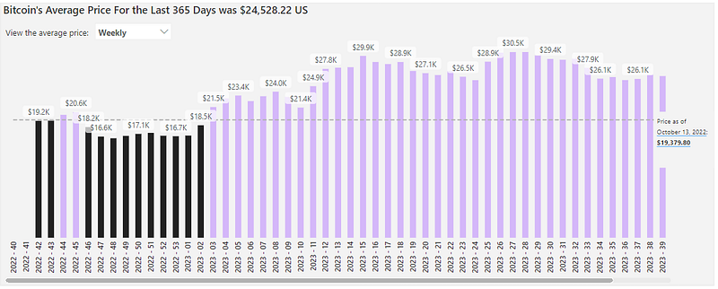
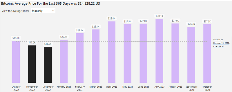
Building on my latest article Power Up Your Power BI: Dynamic Color Coding for Bar Charts (access here) detailing how to assign colors to bars based on established thresholds, I will demonstrate how you can use field parameters to provide your audience with the capacity of viewing Bitcoin’s average price on a daily, weekly or monthly basis. Our starting point is the following graph:
Step 1: Integrate a Field Parameter
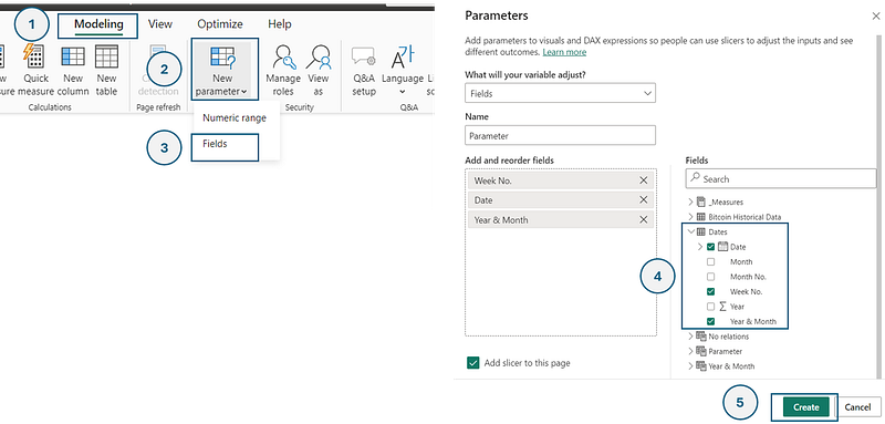
Under the Modeling Tab, click on New parameter and select Fields. A new window named Parameters will appear. Here, select the columns Date, Week No.and Year & Month . Click on Create.
Once this is completed, a slicer will apear on your active report page, such as below.
And there you have integrated a field parameter to your report! We will now format it and adjust the graph to provide the desired output.
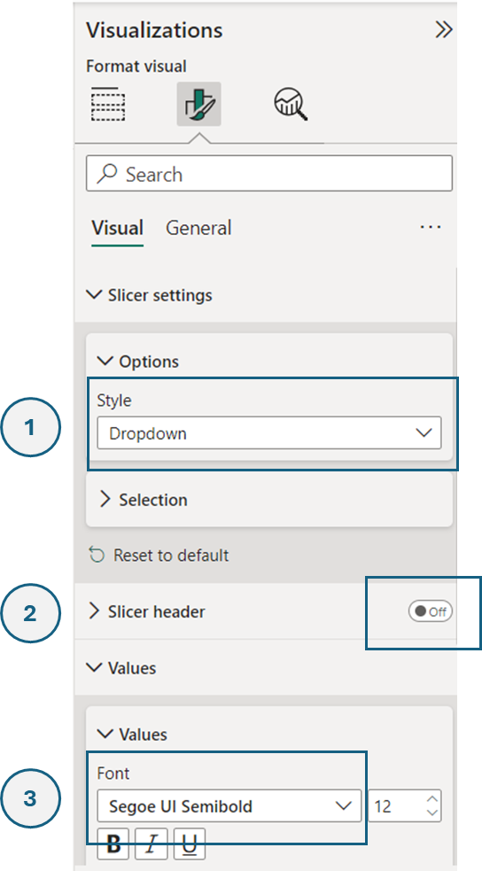
Step 2: Format the Slicer of the Field Parameter
Though optional, this step enhances the visual appeal. In the Visualizations pane of the slicer:
- Opt for the Dropdown style.
- Deactivate the Slicer header.
- Employ the Segoe UI Semibold Font for Values.
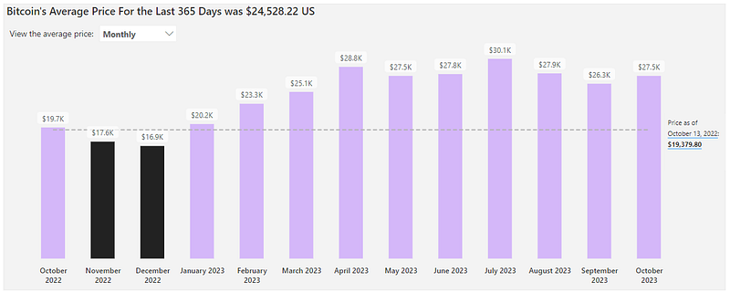
After these adjustments, position the slicer atop the graph. To its right, insert a text box stating: View the average price: .
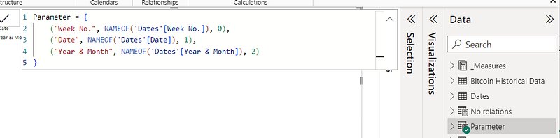
For personalized slicer values, navigate to the calculate table of the Field Parameter. In the formula bar, replace the highlighted text with your preferred titles, such as Weekly , Daily and Monthly .
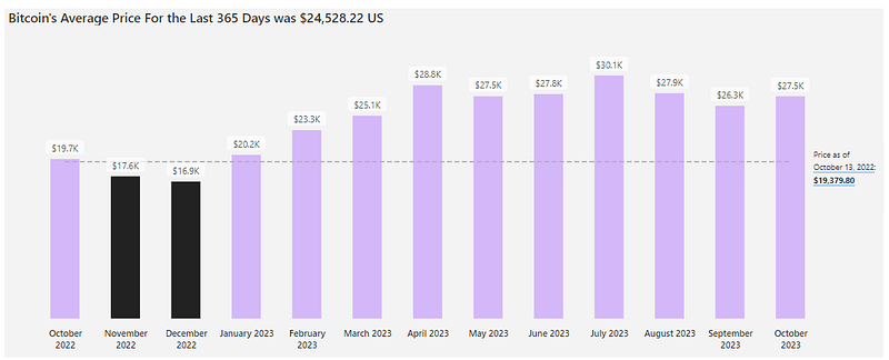
While the field parameter is not yet connected, the graph should be looking like the following at this point:
Step 3: Integrate the Field Parameter to your Graph
In the visualization pane of the graph, drag and drop the Parameter column into the X-axis.
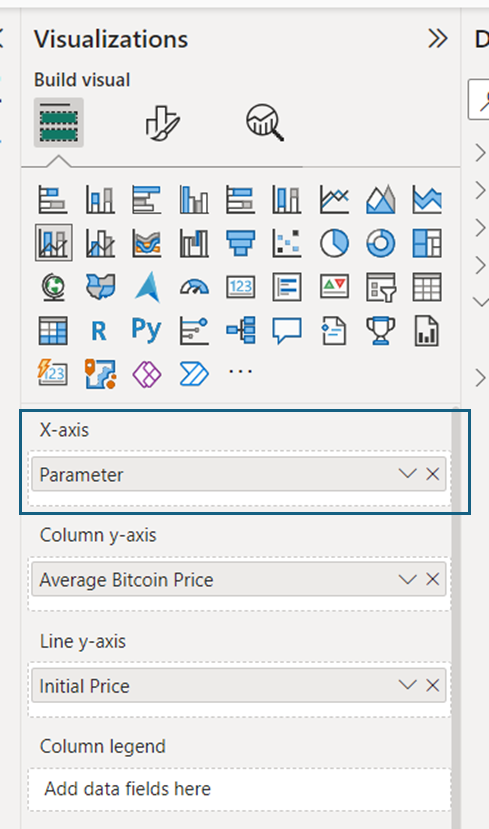
This connects the graph to the parameter field, allowing users to sift through daily, weekly, and monthly data visualizations seamlessly.
Conclusion
Field parameters in Power BI represent a monumental shift towards personalized and user-centric reporting. By equipping users with the tools to mold data visualizations to their preferences, we not only enhance their experience but also enrich their analytical capabilities. As Power BI continues to evolve, it’s thrilling to ponder the endless possibilities that await. Whether you’re a developer or a consumer, there’s no doubt that these features hold the power to transform your data interaction journey.
You can download my report with all visuals and formatting as displayed in the cover picture of this article here.
Don’t forget to subscribe to
👉 Power BI Publication
👉 Power BI Newsletter
and join our Power BI community
👉 Power BI Masterclass