
How to Unity
Unity UI Toggle — Easily Explained
One of the most important UI elements
A Toggle button is a UI element that allows users to select one or more options from a list. In the first case, it is generally referred to as a radio button, while in the latter it is called a checkbox.
It is typically used in situations where there are multiple choices (mutually exclusive or not), such as selecting a difficulty level or choosing a language.
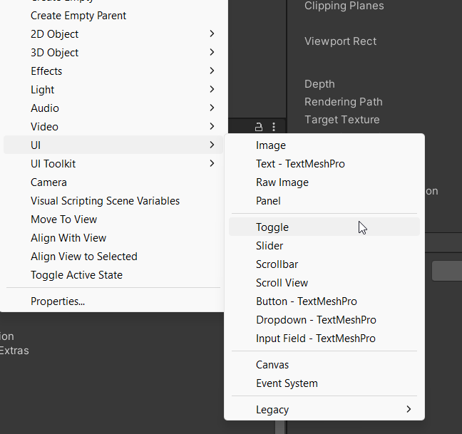

To create a Toggle button in Unity, we can just add it to the scene via the creation menu, under the UI section, this will create a UI element carrying the Toggle Component. The element will be automatically created with a couple of children:
- Background: the box images
- Checkmark: the tick or any other checkmark image (child to the background) that appears when the Toggle is clicked
- Label: a text, by default put on the right of the box.
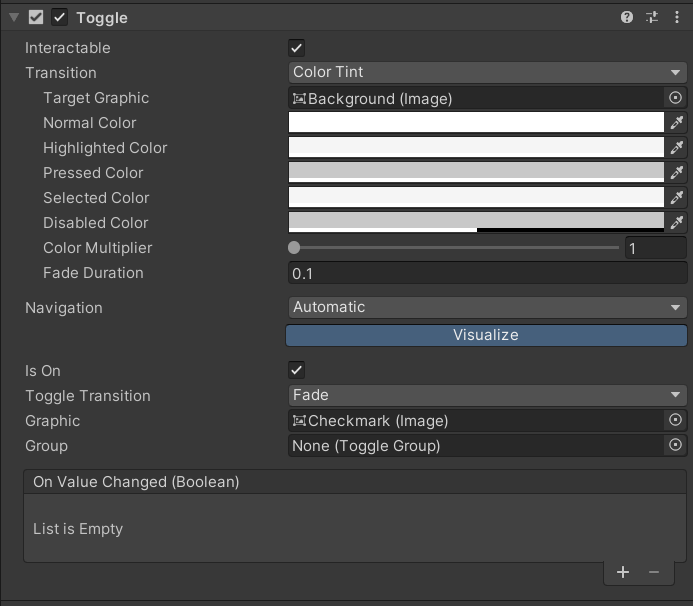
Let’s now have a look at the properties of the Toggle Component in Unity, some of them are just the same as the ones from the Button Component:
- Transition determines how the toggle button should transition between its normal and selected states. There are four options: None, Color Tint, Sprite Swap, and Animation. Check this article to learn how they work.
- Is On property tells whether the toggle button is currently selected. If it is selected, the value is true; otherwise, the value is false. It can also be modified via scripting.
- Group property allows you to group multiple toggle buttons together. When you group toggle buttons, only one button can be selected at a time within the group, acting as a radio button.
- Graphic is the visual representation of the toggle button. By default, it is an Image component, but you can also use a Text component or a custom graphic. When the Toggle is created, it points to the Checkmark gameobject.
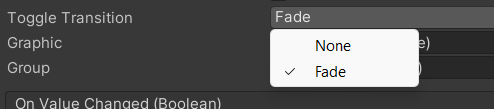
- Toggle Transition can either be Fade or None. Fade will add a fading effect on the checkmark while appearing/disappearing; while with None, the checkmark will just pop in/out.
- OnValueChanged property allows you to specify a callback method that should be called when the toggle button is selected or deselected. You can use this to perform actions based on the user’s selection, just as we did with OnClick on Button Component.

A Toggle Group in 4 Moves
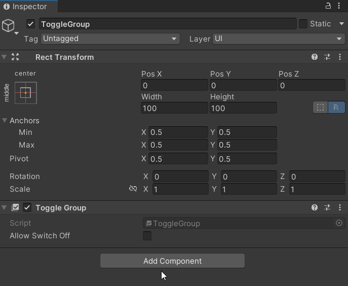
To set up a ToggleGroup in Unity, we need to:
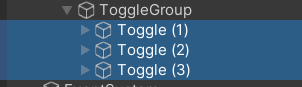
- Create an empty GameObject in the Canvas. For clarity, let’s call it ToggleGroup o so.
- Add a ToggleGroup component to it.
- (Optional) Add the Toggle object as children to the ToggleGroup object. Not required but useful to keep the hierarchy clean and tidy.
- Drag the ToggleGroup object/component on the Group properties of each Toggle, or do it just once by keeping all of them selected.
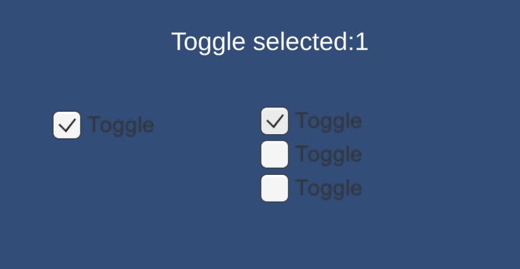
Now only one Toggle can be selected at a time within the group, and any other Toggles in the same group will automatically be deselected.
The “Allow Switch Off” property of the ToggleGroup component allows (or not) the user to deselect all toggles in the group. If this property is set to false, the user must always have one toggle selected in the group (the default one can be selected using the EventSystem, as explained here).


Use of Callbacks
Here is an example of callback usage (OnValueChanged). I created a script which holds references to a text label and the list of toggles in the group. There is a public method that can be fired each time the toggle value is changed, passing a simple string parameter. If none is selected, there is a specific behaviour. ALERT: use of Linq ahead!

If you liked the article, please clap to it and share it! Also, take a look at my games!

Get access to my stories and those of other Medium writers for just $5 a month. With no additional cost to you, I will receive half of your payments as a commission: it’s a great way to support me!
Join my newsletter and receive regular notifications when I post.


