
How to Unity
The Ultimate Guide to Unity UI Buttons
Unity UI Buttons explained
In Unity, buttons are UI elements that can be added to the canvas using the creation menu.

As per many other elements, the key features of a button can be found in the “Button” component in the Inspector window, meaning that any Unity UI element can become a button by simply attaching this component.

A newly created button also comes with an Image component, to ensure the possibility of having a custom sprite acting as a button or, in other words, having buttons of any possible shape. Also, a child Text or TextMeshPro (TMP) object is created along.

The button's main features are:
- Navigation: Allows to specify how to switch between buttons using a gamepad, keyboard, or mouse when more than one is on the canvas.
- Transition: Specifies the visual transition that occurs when the button’s state changes, such as when it is selected or pressed. It could be a shift in colour, in the sprite, an animation…
- Interactable: Determines whether the button can be interacted with. It can be modified via script for programmatical control.
- OnClick: Specifies a list of actions performed when the button is clicked. It is possible to assign them via Inspector or via script.
Navigation

If we click on the Visualize button, on the Scene view arrows will appear showing how the navigation is set by default. We can then change the way the user navigates through buttons using some preset.

Transition

The transition section is governed by choice in the drop-down menu
“None” will disable any transition during button interaction
“Color Tint” allows transition in colour during interaction and offers the following setting:
- Target Graphic: Specifies the image used for the button, if any.
- Highlighted Color: Specifies the colour the button’s target graphic will change to when it is highlighted.
- Pressed Color: Colour when pressed.
- Selected Color: Colour when selected.
- Disabled Color: Colour when it is disabled.
- Color Multiplier: Specifies a multiplier that will be applied to the button’s target graphic’s colour.
- Fade Duration: Duration of the transitions.
“Sprite Swap” allows changing the button sprite during interaction.
It offers quite the same settings as above, but instead of choosing an RGB-A colour, we can choose a whole new sprite for each interaction type.
“Animation” allows to specify animations that will be triggered when interacting with the button.
Again, for each interaction, an Animation trigger can be set.
Event Handling
OnClick is an event. This means that the Unity EventSystem listens and reacts when the button is clicked, i.e. the OnClick event is triggered.
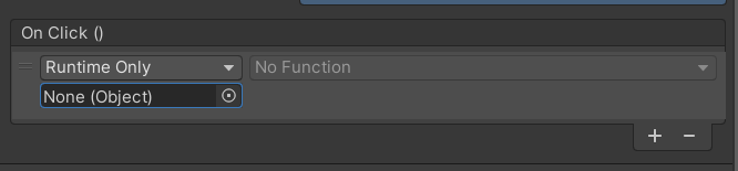
To add an action to the OnClick event via Inspector, we must click on the plus button. We can drag any object onto the placeholder, usually gameobjects carrying a component with public methods or carrying custom C# scripts having public methods.
In this example, I dragged the main camera. When clicking on the Function drop-down, a list of all eligible components/scripts is shown: the ones with public methods.
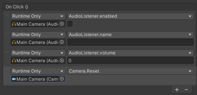
In this example, I added several actions, which will be performed in this specific order. Each of them is related to a given function, method or property in the chosen component/script. If it is a property or a method requesting ONE or NONE primitive parameter, the inspector shows a prompt to assign a value to that parameter:
- a checkbox for booleans
- an input text area for strings or numbers
If no parameters are needed, no input is shown.
Public methods with more than one parameter will not be shown.
When the button is clicked, those methods are called from that specific component/script instance. But a more programmatical way is possible.
Scripting with Buttons
To add an action to the OnClick event, to Unity buttons, via a script:
- Attach a script to the GameObject that contains the button.
- Get a reference to the
Buttoncomponent on the GameObject, via theGetComponentmethod or using the SerializedField attribute. - Create a
UnityActiondelegate, pointing to a method that can be invoked without arguments. - Add a new listener to the
Button.onClickevent using theAddListenermethod and passing in the instance of theUnityActiondelegate.
private void Start()
{
    button = GetComponent<Button>();
    UnityAction action = () => Debug.Log("Button was clicked");
    button.onClick.AddListener(action);
}
The following is another way, without lambda functions:
private void Start()
{
    button = GetComponent<Button>();
    UnityAction action = CallAnotherMethod;
    button.onClick.AddListener(action);
}

private void CallAnotherMethod()
{
    Debug.Log("Button was clicked, and now calling another method.");
    //or do something else
}
Or spice things up, also passing parameters (in this way, more than one is allowed) with the help of the delegate keyword:
private void Start()
{
    int p1 = 0;
    string p2 = "Yo Mama";
    button = GetComponent<Button>();
    UnityAction action = CallAnotherMethod;
    button.onClick.AddListener(delegate
                {
                  ParameterMethod(p1, p2);
                }
    );
}
private void ParameterMethod(int p1, string p2)
{
    Debug.Log($"Calling method with params {p1} and {p2}.");
}
Check the meaning of the $-symbol (string interpolation in C#) here:
More on Unity Buttons:
Unity UI Button Navigation Explained
Learn how and why to implement the button navigation
medium.com
Hope you find it useful!
If you liked the article, please clap to it and share it! Also, take a look at my games!

Get access to my stories and those of other Medium writers for just $5 a month. With no additional cost to you, I will receive half of your payments as a commission: it’s a great way to support me!
Join my newsletter and receive regular notifications when I post.


