
The Crazy Truth about the Medium Logo Redesign
The Secret is Revealed! And It Could Be a Metaphor.
You’ve probably noticed that Medium has just redesigned its logo.
It used to be be a stylized M. Which stood for Medium.
Now it is three dots. Viewed sort of sideways. Like three dots in the process of going around a corner.
Your first thought on seeing the new logo might have been What?
Your second thought might have been Why??
What the three dots reminded me of was Damien Hirst’s dot paintings. Which I was pretty certain wasn’t what they were supposed to remind me of. But I didn’t care. Who really cares about logos?
Then I stumbled upon an article by Medium’s Marketing VP about the logo redesign. It took six minutes to read, and contained scads of information about why and how and by whom the logo was redesigned, but here’s the gist of it:
The symbol, like our illustration style, is inspired by language and typography. It is born from the ellipses: a punctuation mark that represents an unfinished or impending thought, an idea to come, what’s next. This is, again, what happens on Medium — there’s always a new idea, always more to the story.
Okay! So we’ve moved from a stylized M to a stylized Ellipses.
Fine. Cool. Whatever.
In the Responses section, more than one person pointed out that if you needed to post a six minute article to explain your new logo, your logo design was a failure.
I’m not sure this is true.
I suppose this depends on how you define “failure.”
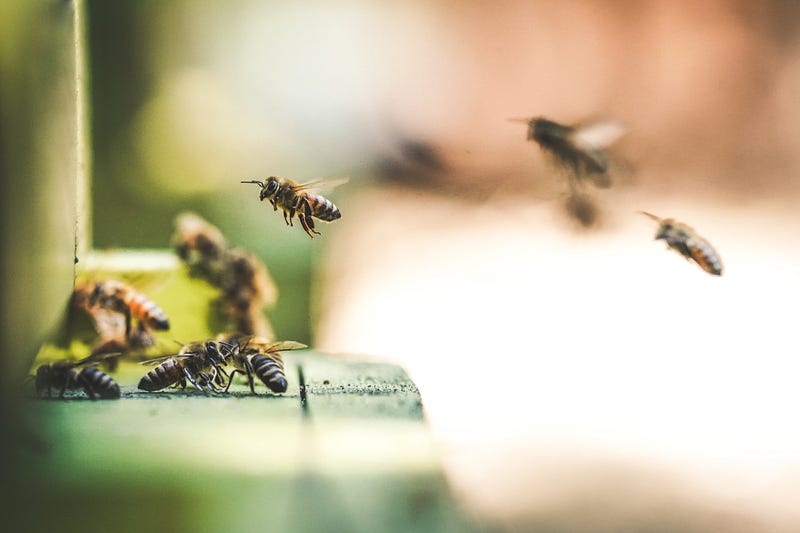
The change certainly got us all buzzing. (Foreshadowing alert!)
And, of course, a bunch of brown-nosers in the comments section gushed about how wonderful and fabulous and fun the new logo is and how truly grateful they are for it.
That was funny too.
But the very best comment was by writer Ayo Suber, who observed:
It’s the mirror image of the beehome.design logo.
This sent me right to the beehome.design homepage. And guess what? She’s absolutely right! It is. (See for yourself here.)
What a funny coincidence.
It’s both impressive and amusing that Medium put all of this time and effort and thought and money into the redesign their logo, when all they had to do was hold a mirror up to the logo of an online outfit that sells hives for bees.
But wait! Is this really just a coincidence? Or are the folks behind this new logo trying to draw some kind of snarky comparison between a hive full of buzzing bees and a platform full of blogging writers?
Is it really all about the ellipses, Medium logo redesigners?
Or are you having a good chuckle at our expense?
Not that I really care. I’ve been on this platform through several “upgrades” and with luck, I’ll be here for several more. They can change the logo into a stylized image of a wombat or a dirigible or Ev Williams’s left eyeball.
Busy little bee that I am, I’m going to just keep writing.
Writing Coach and Medium Sherpa Roz Warren writes for everyone from the Funny Times to the New York Times, has been in 15 Chicken Soup for the Soul collections, and is the author of Our Bodies, Our Shelves. Drop her a line at [email protected].
Thanks for reading! If you enjoyed this story by Roz Warren, you might also enjoy: