
Step-by-Step Depth Introduction of Matplotlib with Python
A useful handful of examples for data science and machine learning projects
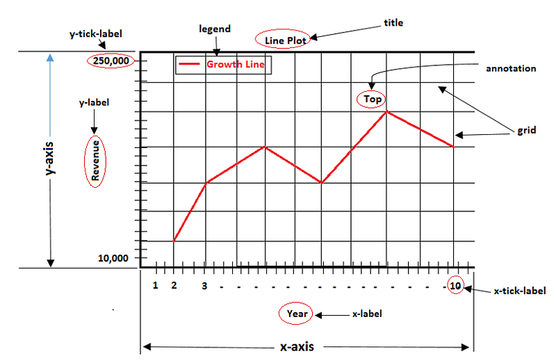
This library is frequently used by data scientists, python developers, and machine learning engineers to make graphs and plots for visual analysis.
Visualization has become an integral part of data analytics. The matplotlib has many modules depending upon the applications. Some of the modules are axis, pyplot, contour, dates, figure, etc.
As a data analysis with python, many learners or in production use pyplot for plots. The pyplot module of matplotlib is like a toolkit to make graphs and plots Matlab friendly.
To make a friendlier of making plots, we can use python.
To use the plyplot, we need to install the matplotlib library.
Pip install matplotlibFirst, we need to know the two types of interfaces in the matplotlib i.e. object-oriented API and pyplot. For the API type, we need to use axes to render the plots with the figure method. The pyplot type is based on matlab i.e. state-based interface.
Let’s see the different components of the figures or plots
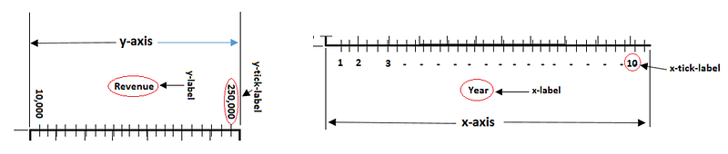
- Axis: It is a vertical and horizontal scale used to generate ticks i.e. labels on the axis.
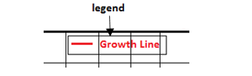
- Legends: It is used inside of the plot area to name the line plot or other plot type.
- Major tick label: These are the values on the axis that are represented as a label.
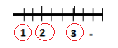
- Minor tick: These are the marks on the axis to represent the values.
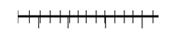
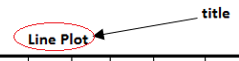
- Title: It is used to describe the plot.
Let’s see some examples of plots with python
- Basic line plot with matplotlib with one input
import matplotlib.pyplot as plt
plt.plot([10,11,12,13,14])
plt.show()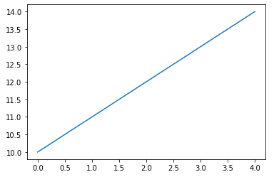
Observations:
- Importing the library with the alias name plt is used instead of matplotlib.
- The data generated the line in the graph.
- The plot methods have a parameter
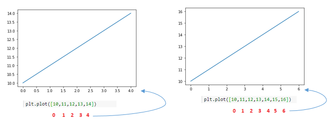
*argsi.e. it can take multiple inputs. In the above example, we took a single input and it assumes this single input for the y-axis and generates the x-axis ticks based on the number of inputs from zero indexing.
- Basic line plot with matplotlib with two input
import matplotlib.pyplot as plt
plt.plot([10,11,12,13,14], [15,16,17,18,19])
plt.show()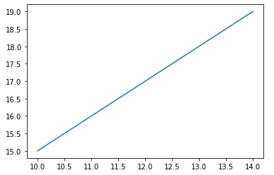
Now, in the above example, we give two inputs and this time the plot method takes these two as x and y input.
Observations:
- When we give two inputs, it takes them as a positional argument i.e. first input for the x-axis and the second input for the y-axis.
What if we don’t give the inputs to the plot method. The plot will empty with default axis values.
import matplotlib.pyplot as plt
plt.plot()
plt.show()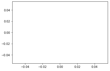
- Markers in plot method
They are very helpful to differentiate the multiple data in a single plot. We can change the shape of the data points with the help of markers.
Creating a circle of blue, red, green color.
import matplotlib.pyplot as plt
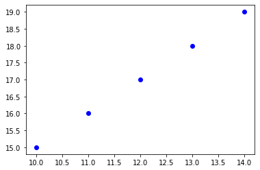
plt.plot([10,11,12,13,14], [15,16,17,18,19], 'bo')
plt.show()
The third argument is a marker and the change in the graph is shown below. In this parameter the first alphabet is a name of color i.e. ‘b’ means blue color and the second alphabet or character is the type of shape.
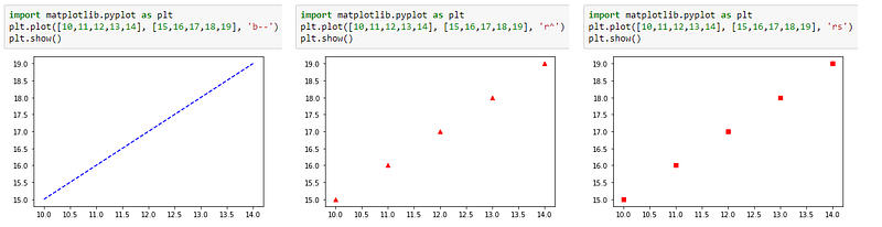
Let’s change data points with different markers. The dash line marker (b- -), the triangle marker (r^), and the square marker (rs).
Now, let’s plot the three data points in a single plot with different markers.
import numpy as np# the samples are evenly distributed
t = np.arange(1., 20., 2)# Data points with three different markers
plt.plot(t, t, 'r^', t, t**2, 'b--', t, t**3, 'gs')
plt.show()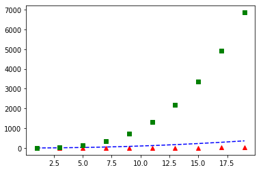
- To show the grid in the plot. Here, we need to specify the grid method with true to enable the grids in the plot.
import matplotlib.pyplot as plt
plt.plot([10,11,12,13,14], [15,16,17,18,19], 'rd')
plt.grid(True)
plt.show()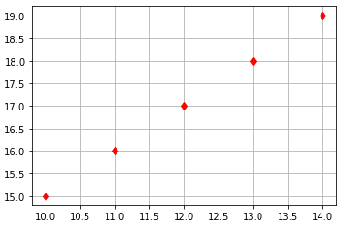
- There is also a magic to do changes in the figure size. If we put the code after the inputs then it will increase the size of the grid figure.
import matplotlib.pyplot as pltplt.plot([10,11,12,13,14], [15,16,17,18,19], 'rd')
plt.figure(figsize=(15., 7.))
plt.grid(True, axis = 'y')
plt.show()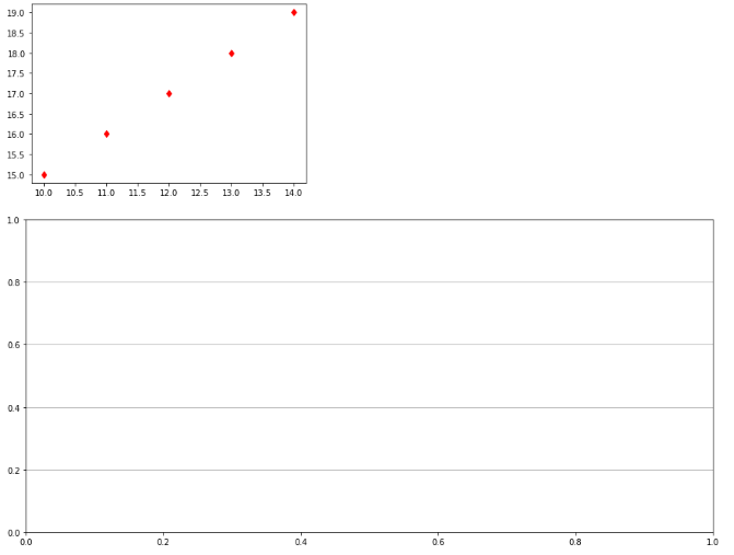
- If we put the figure method before the inputs then it will increase the figure size.
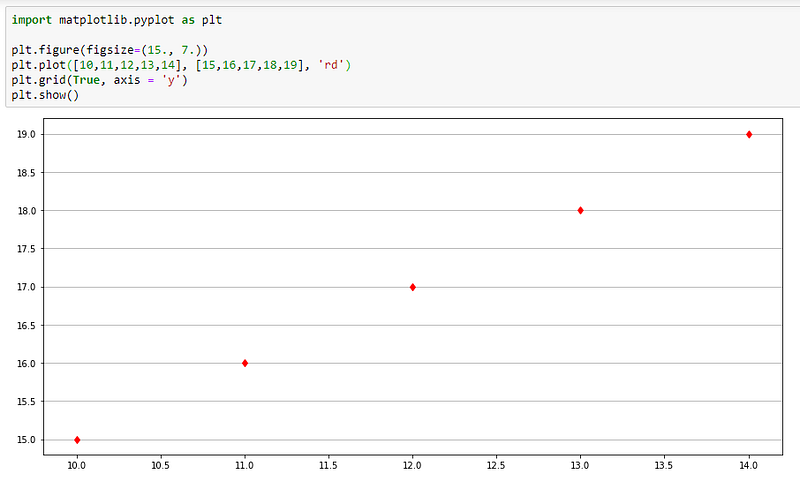
- The axis label depends on the inputs in the plot method. We can also manage to give axis labels with the axis method as shown below.
#Syntax
axis[xmin, xmax, ymin, ymax]plt.plot([10,11,12,13,14], [15,16,17,18,19], 'rd')
plt.axis([10, 16, 15, 20])
plt.show()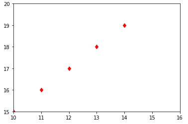
- We can observe that the labels are changed after applying the axis method.
In this section, we will manage to give the labels to the axis.
plt.plot([10,11,12,13,14], [15,16,17,18,19], 'rd')
plt.axis([10, 16, 15, 20])
plt.xlabel('X-Label')
plt.ylabel('Y-Label')
plt.show()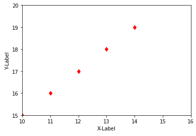
- To add the text in the plot, we use the text method.
#Syntax
text(X-position, Y-position, r'text data')plt.plot([10,11,12,13,14], [15,16,17,18,19], 'rd')
plt.axis([10, 16, 15, 20])
plt.xlabel('X-Label')
plt.ylabel('Y-Label')plt.text(11.2, 15.9, r'This is second point')plt.show()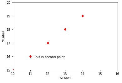
I hope you like the article. Reach me on my LinkedIn and twitter.
Recommended Articles
1. 8 Active Learning Insights of Python Collection Module 2. NumPy: Linear Algebra on Images 3. Exception Handling Concepts in Python 4. Pandas: Dealing with Categorical Data 5. Hyper-parameters: RandomSeachCV and GridSearchCV in Machine Learning 6. Fully Explained Linear Regression with Python 7. Fully Explained Logistic Regression with Python 8. Data Distribution using Numpy with Python 9. Decision Trees vs. Random Forests in Machine Learning 10. Standardization in Data Preprocessing with Python


