
Someone Break Out a Site Map: Medium’s Looking a Bit Different
New look for Medium
If you are having trouble viewing this content here’s how to fix that.
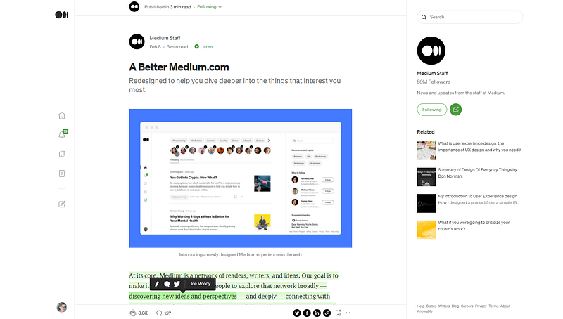
Medium is rolling out a new look to streamline the writer’s user experience as well as the readers’. The result is a clean interface that appears well thought out and designed, though for us writers who have been here for a few years, bouncing around in the echo chamber, we’re banging our mice against the mousepad and trying to figure out which way the cursor went.
In other words, this is going to take some getting used to!
Some users are already reporting an uptic in notifications, namely other users saving their stories to lists, which is coming through as notifications now, a nice addition.
While the profile screen for the UX design didn’t eliminate the on-screen showing of the clap feature as UX Collective predicted in 2020, Medium writers are thankful for at least a small sneak peak into what was coming. The changes, however, are quite significant. It’s been long overdue for a real improvement to the user experience, a major one — not just a rollout of a funky new icon or some other smaller change that has no significant impact. Recent glitchiness seems to be a good indication something’s been going on behind the scenes.
While writers appreciate a clean user experience, the real test will be with readers:
- Will they read more?
- Will bounce rates drop?
- Will readers be funneled through more stories they like and find that transition to be more seamless than before?
- Will readers stick around and be excited to see the new look?
After a “brief tour” of reading today, I find I did actually spend more time just browsing, so perhaps Medium is “onto something” here. Hopefully the excitement trickles over into the MPP program (which by the way, is still glitchy lately to access with downstream time-outs and errors, some users report). Let’s hope the future is bright for Medium writers on a platform that still ranks well on Google. As writers and readers who love the Medium platform, let’s all enjoy the new clean user experience.
And write. Because, it’s what we do. (And don’t forget…find something truly amazeballs to read on Medium today. Start here.)
Stay tuned….Medium is ever changing!
Thanks for reading. It is always my pleasure to write words that matter to you, dear reader.


