
Recreate a Dribbble App Design with UIKit Episode 1 — Part 3
This article will guide you through my thought process and approach to programmatically recreating a cool UI design.

Hey guys, welcome back to my chann…err…whoops? (Subscribe, if videos are more your thing, there’ll be some content coming very very soon) Welcome back to the article series(part one here, part two here) on how I recreated this Dribbble design using UIKit. But before we jump back in, I have some good news, and some not-so-good news.
The Not-So-Good News
We will be starting the ‘body’ portion of the design, but unfortunately, in order for us to accomplish this (see image below), a bit of code refactoring is needed.
(p.s. this article will be a tad bit longer than the previous two.)
I’m thinking, a good ol fashioned CollectionView.
Actually, No. Not the ol fashioned CollectionView where we would have a main CollectionView and then use a CollectionViewLayout that would require placing an entirely different CollectionView inside of a CollectionViewCell for a section in the main CollectionView just to scroll horizontally… (intentional run on sentence to depict the utter confusion, and exasperation the old way of accomplishing this used to cause me)
The Good News
We’ll be using the brand spanking new(ok, ok, it was introduced way back at WWDC19, I haven’t written these sort of articles in a while, im sorry 🥹) UICollectionViewCompositionalLayout.
A compositional layout is a type of collection view layout. It’s designed to be composable, flexible, and fast, letting you build any kind of visual arrangement for your content by combining — or compositing — each smaller component into a full layout.
Collection View
To start things off, create a CollectionViewCell, call it HeaderCell and insert the mandatory init function, within the init function, add configViews() and configConstraints() (we’ll add the functions from the main ViewController in a sec), it should look something like this:
import Foundation
import UIKit

class HeaderCell: UICollectionViewCell {

  override init(frame: CGRect) {
      super.init(frame: frame)
      //Sets the background color
      backgroundColor = UIColor(named: "bgGray")
      //function to config views and constraints, taken from the ViewController
      configViews()
      configConstraints()
  }

  required init?(coder: NSCoder) {
      fatalError("init(coder:) has not been implemented")
  }
}
Next, copy and paste all the remaining code from ViewController.swift, into HeaderCell.swift, you will get a few errors prompting you to remove all instances of “ view. ”
func configViews(){

// Originally, when in ViewController.swift
// the line of code was 'view.addSubview(profileImage)'
// within HeaderCell.swift, it is simply 'addSubview(profileImage)'
// remove ALL instances of ' view. '

        addSubview(profileImage)
        addSubview(greetingLabel)
        addSubview(notificationButton)
        // Add the title label and search view to parent view
        addSubview(titleLabel)
        addSubview(searchView)

        // the icon and textfield are ADDED TO the searchview
        // the previously empty UIView
        searchView.addSubview(searchIcon)
        searchView.addSubview(searchTextField)


        //First, the stackview is added
        addSubview(categoryStackView)
        categoryStackView.addArrangedSubview(newCategory)
        categoryStackView.addArrangedSubview(featuredCategory)
        categoryStackView.addArrangedSubview(trendyCategory)


        greetingLabel.attributedText = configAttributedTitle("Hi, Charles", "!")
    }
Full source code for HeaderCell.swift can be found here.
Refactoring
Next, we’ll refactor and rename ViewController.swift to HomeController.swift, change its type to UICollectionViewController, remove all the code within the file, except the viewDidLoad() function and add the mandatory init functions. Inside of viewDidLoad(), register the HeaderCell as a collectionViewCell.
The init functions require a layout to be specified, here is where we will implement the CompositionalLayout.
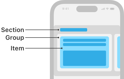
A CollectionView layout is comprised of sections, sections are comprised of groups, and groups are comprised of items and optionally other groups.
Our code will now look like this
import UIKit

class HomeController: UICollectionViewController {

let headerCell = "HeaderCell"

override func viewDidLoad() {
      super.viewDidLoad()
      collectionView.backgroundColor = UIColor(named: "bgGray")
      collectionView.register(HeaderCell.self, forCellWithReuseIdentifier: headerCell)
    }


    init() {
// A layout is comprised of sections,
// which are comprised of groups,
// which are comprised of items.


// Items - for the header, we will have one time
// it will fill its containing group
// so it's length and width will be set to 1.0
        let itemSize = NSCollectionLayoutSize(widthDimension: .fractionalWidth(1.0), heightDimension: .fractionalHeight(1.0))
        let item = NSCollectionLayoutItem(layoutSize: itemSize)

// Group will be as wide as its containing section
// but its height will be 320,
// this should be enough to house all the items in the HeaderCell.

        let groupSize = NSCollectionLayoutSize(widthDimension: .fractionalWidth(1), heightDimension: .absolute(320))
        let group = NSCollectionLayoutGroup.vertical(layoutSize: groupSize, subitems: [item])

//Init the section with the group created, which contains the item created
        let section = NSCollectionLayoutSection.init(group: group)
        let layout = UICollectionViewCompositionalLayout(section: section)
        super.init(collectionViewLayout: layout)
    }

    required init?(coder: NSCoder) {
        fatalError("init(coder:) has not been implemented")
    }

}
In order to be able to get a visual representation of the HeaderCell within our CollectionView, override the following CollectionView functions
override func numberOfSections(in collectionView: UICollectionView) -> Int {
  1
    }
override func collectionView(_ collectionView: UICollectionView, numberOfItemsInSection section: Int) -> Int {
  return 1
    }
override func collectionView(_ collectionView: UICollectionView, cellForItemAt indexPath: IndexPath) -> UICollectionViewCell {
  let cell = collectionView.dequeueReusableCell(withReuseIdentifier: headerCell, for: indexPath) as! HeaderCell
  return cell
    }
As I mentioned earlier, this article will be kinda lengthy, BUT, we’re kinda sorta halfway there. Next we’ll create a model object, call it Product.swift, this will house the information for the various scrollable product items in the ‘body’.
import Foundation

struct Product{

    let image: String
    let price: String
    let title: String
    let subtitle: String

    // array of Product items
    static let products:[Product] = [
        Product(image:"camera",price: "891.99",title: "EOS M50 Mark II",  subtitle: "EF-M mount. DIGIC 8"),
        Product(image:"playstation",price: "499.99",title: "PS5 Controller",  subtitle: "Play Has No Limits"),
        Product(image:"switch",price: "349.99",title: "Switch Controller",  subtitle: "Switch and Play"),
        ]
}
We will now create a CollectionViewCell to present this information, call it BodyCell.swift
class BodyCell: UICollectionViewCell {
override init(frame: CGRect) {
super.init(frame: frame)
backgroundColor = .white
layer.cornerRadius = 16
configViews()
configConstraints()
}
required init?(coder: NSCoder) {
fatalError("init(coder:) has not been implemented")
}
// when the cell is initialized,
// the array of data on the model object : Product
// will be passed in
var products: Product? {
didSet{
manageData()
}
}
//Create the views
// Image -> Product price -> Product title -> Product Subtitle
//Image
let productImage: UIImageView = {
var productImg = UIImageView()
productImg.backgroundColor = .white
productImg.contentMode = .scaleAspectFit
productImg.clipsToBounds = true
productImg.layer.cornerRadius = 10
productImg.translatesAutoresizingMaskIntoConstraints = false
return productImg
}()
//View to house the price, title, subtitle
let productContainer: UIView = {
let container = UIView()
container.translatesAutoresizingMaskIntoConstraints = false
return container
}()
//Custom view for Product price
let productPrice: PriceTag = {
let lb = PriceTag()
lb.translatesAutoresizingMaskIntoConstraints = false
return lb
}()
//Label for Product title
let productTitle: UILabel = {
let productTitle = UILabel()
productTitle.numberOfLines = 2
productTitle.lineBreakMode = .byWordWrapping
productTitle.font = .systemFont(ofSize: 22, weight: .semibold)
productTitle.textColor = .black
productTitle.translatesAutoresizingMaskIntoConstraints = false
return productTitle
}()
//Label for Product subtitle
let productSubtitle: UILabel = {
let productSubtitle = UILabel()
productSubtitle.numberOfLines = 0
productSubtitle.font = .preferredFont(forTextStyle: .subheadline)
productSubtitle.textColor = .systemGray3
productSubtitle.translatesAutoresizingMaskIntoConstraints = false
return productSubtitle
}()
//Add views to parent view
private func configViews(){
addSubview(productImage)
addSubview(productContainer)
[productPrice, productTitle, productSubtitle].forEach {
productContainer.addSubview($0)
}
}
//Constraints for the views within the parent view
private func configConstraints(){
NSLayoutConstraint.activate([
productImage.topAnchor.constraint(equalToSystemSpacingBelow: topAnchor, multiplier: 2),
productImage.leadingAnchor.constraint(equalToSystemSpacingAfter: leadingAnchor, multiplier: 2),
productImage.heightAnchor.constraint(equalToConstant: 180),
trailingAnchor.constraint(equalToSystemSpacingAfter: productImage.trailingAnchor, multiplier: 2),
productContainer.topAnchor.constraint(equalToSystemSpacingBelow: productImage.bottomAnchor, multiplier: 1),
productContainer.leadingAnchor.constraint(equalToSystemSpacingAfter: leadingAnchor, multiplier: 2),
productContainer.heightAnchor.constraint(equalToConstant: 80),
trailingAnchor.constraint(equalToSystemSpacingAfter: productContainer.trailingAnchor, multiplier: 2),
productPrice.topAnchor.constraint(equalToSystemSpacingBelow: productContainer.topAnchor, multiplier: 2),
productTitle.topAnchor.constraint(equalToSystemSpacingBelow: productPrice.bottomAnchor, multiplier: 3),
productSubtitle.topAnchor.constraint(equalToSystemSpacingBelow: productTitle.bottomAnchor, multiplier: 1),
bottomAnchor.constraint(equalToSystemSpacingBelow: productContainer.bottomAnchor, multiplier: 3)
])
}
func manageData(){
// Product data will be set to the respective views
guard let product = products else { return }
productPrice.priceLabel.text = product.price
productTitle.text = product.title
productSubtitle.text = product.subtitle
productImage.image = UIImage(named: product.image)?.withRenderingMode(.alwaysOriginal)
}
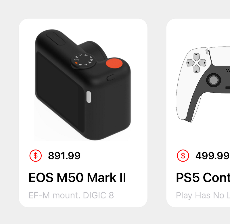
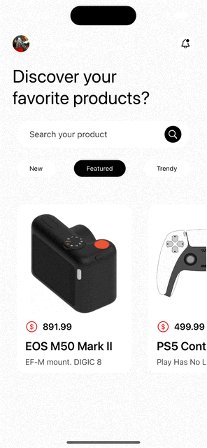
}The above code, when the data is provided, will produce the following individual item
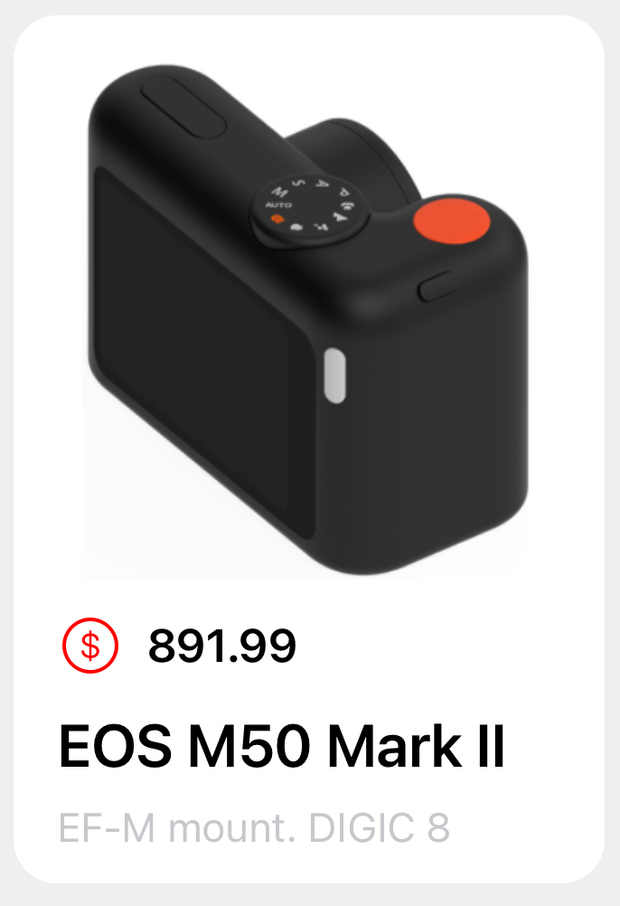
The PriceTag custom view simply displays the colored dollar sign and the price label horizontally, that code can be found here.

A bit more…refactoring
Now that we’ve completed the BodyCell, we need to display it on the HomeController, which as you know is a CollectionView.
Head back over to its viewDidLoad() function and register the BodyCell, and change the numberOfSections to 2. We also have to apply a bit of logic to the numberOfItemsInSection function; we want the first section(the header) to return 1 item, and the 2nd section (the body) should return the number of items in the Product array, then finally we need to let the CollectionView know which cell should be displayed at a particular index(if i’ve lost you here…check the code, this sentence will make more sense)
let headerCell = "HeaderCell"
let bodyCell = "BodyCell"
//products array, from the Product model object
let products = Product.products
override func viewDidLoad() {
    super.viewDidLoad()
    collectionView.backgroundColor = UIColor(named: "bgGray")
    collectionView.register(HeaderCell.self, forCellWithReuseIdentifier: headerCell)
    collectionView.register(BodyCell.self, forCellWithReuseIdentifier: bodyCell)
}

//let collectionview know that it will have 2 sections now
// first section is the header
// section section is the body
override func numberOfSections(in collectionView: UICollectionView) -> Int {
    2
}


// section at index 0 (the header), will only have one item
// section at index 1 (the body),
// will have the same number of items in the products array.
override func collectionView(_ collectionView: UICollectionView, numberOfItemsInSection section: Int) -> Int {
    if section == 0
    {
    return 1
    }
    else
    {
    return products.count
    }
}


override func collectionView(_ collectionView: UICollectionView, cellForItemAt indexPath: IndexPath) -> UICollectionViewCell {
    switch indexPath.section {
        case 0:
            let cell = collectionView.dequeueReusableCell(withReuseIdentifier: headerCell, for: indexPath) as! HeaderCell
            return cell
        default:
            let cell = collectionView.dequeueReusableCell(withReuseIdentifier: bodyCell, for: indexPath) as! BodyCell
            cell.products = products[indexPath.row]
            return cell
     }
}
If you run this code now, you’ll probably see something like this :
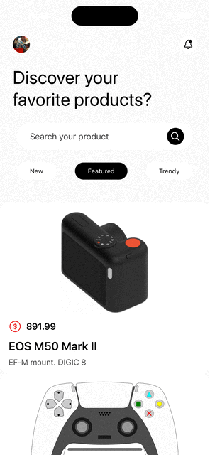
And you’ll probably get angry and say “THIS IS WHY PEOPLE ARE CHOOSING SWIFTUI!”, but hold on, there’s just one last tiny little change to make, we have to declare a second layout for the body cell to be displayed properly, for this we’ll just create a new file and call it Layouts.swift, then we’ll apply some logic to the HomeController to determine which layout is applied to which cell, the final code can be found here.
import Foundation
import UIKit

class Layouts {

//singleton
    static let shared = Layouts()


//layout configuration for the headercell

    func headerSection() -> NSCollectionLayoutSection {
        let item = NSCollectionLayoutItem(layoutSize: .init(widthDimension: .fractionalWidth(1.0), heightDimension: .fractionalHeight(1.0)))
        let group = NSCollectionLayoutGroup.vertical(layoutSize: .init(widthDimension: .fractionalWidth(1), heightDimension: .absolute(320)), subitems: [item])
        let section = NSCollectionLayoutSection.init(group: group)
        return section
    }

//layout configuration for the body cell
    func bodySection() -> NSCollectionLayoutSection {

        let item = NSCollectionLayoutItem(layoutSize: .init(widthDimension: .fractionalWidth(1), heightDimension: .fractionalHeight(1)))
//determines how much horizontal padding to apply to the items
        item.contentInsets = NSDirectionalEdgeInsets(top: 0, leading: 16, bottom: 0, trailing: 16)

        let group = NSCollectionLayoutGroup.horizontal(layoutSize: .init(widthDimension: .absolute(250), heightDimension: .absolute(320)), subitems: [item])

        let section = NSCollectionLayoutSection(group: group)
//how much spacing to apply between the items
        section.contentInsets = NSDirectionalEdgeInsets(top: 10, leading: 16, bottom: 16, trailing: 0)
//snaps the items as they scroll
        section.orthogonalScrollingBehavior = .groupPaging

        return section
    }

}
And that concludes Part 3! As always, the github repo has everything we’ve covered in this article.
Check out the finale where we’ll create a custom tab bar!