
Recreate a Dribbble App Design with UIKit Episode 1 — Part 4
This article will guide you through my thought process and approach to programmatically recreating a cool UI design.
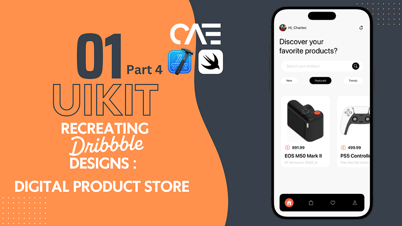
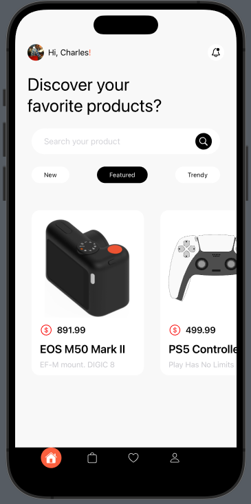
Hey everyone, I appreciate your return for the finale of Episode 1! As a quick reminder, way back in part 1, we dissected the design into 3 primary sections;
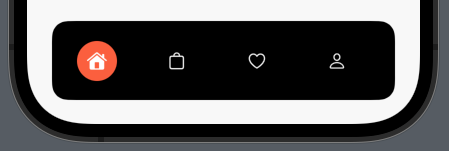
We’re finally on the last leg of this series, so let’s kick things off by tackling the footer in this article. (I crack myself up sometimes.)
First off, create a MainTabController.swift file, as the name suggests, this will house the UITabBar, therefore make it a class of type UITabBarController. Override viewDidLoad() function and call configTabBar() and configConstraints() functions, which we will create right afterward.
override func viewDidLoad() {
        super.viewDidLoad()
        configTabBar()
        configContraints()

    }
    func configTabBar(){

}
    func configContraints(){

}
We’ll get back to these, but for now, let's create the tab bar items(the little buttons on the tab bar), since the design does not require a title for each item, we will use regular UIButtons here.
    //Create buttons
    let homeBtn: UIButton = {
        var btn = UIButton()
        let config = UIImage.SymbolConfiguration(pointSize: 16, weight: .light, scale: .large)
        let image = UIImage(systemName: "house.fill", withConfiguration: config)
        btn.setImage(image, for: .normal)
        btn.backgroundColor = UIColor(named: "orangeColor")
        btn.tintColor = .white
        btn.layer.cornerRadius = 20
        btn.translatesAutoresizingMaskIntoConstraints = false
        return btn
    }()
    let bagBtn : UIButton = {
        var btn = UIButton()
        let config = UIImage.SymbolConfiguration(pointSize: 16, weight: .light, scale: .large)
        let image = UIImage(systemName: "bag", withConfiguration: config)
        btn.setImage(image, for: .normal)
        btn.backgroundColor = .clear
        btn.tintColor = UIColor(named: "whiteColor")
        btn.translatesAutoresizingMaskIntoConstraints = false
        return btn
    }()

    let heartBtn : UIButton = {
        let btn = UIButton()
        let config = UIImage.SymbolConfiguration(pointSize: 16, weight: .light, scale: .large)
        let image = UIImage(systemName: "heart", withConfiguration: config)
        btn.setImage(image, for: .normal)
        btn.backgroundColor = .clear
        btn.tintColor = UIColor(named: "whiteColor")
        btn.translatesAutoresizingMaskIntoConstraints = false
            return btn
        }()

    let userBtn : UIButton = {
        let btn = UIButton()
        let config = UIImage.SymbolConfiguration(pointSize: 16, weight: .light, scale: .large)
        let image = UIImage(systemName: "person", withConfiguration: config)
        btn.setImage(image, for: .normal)
        btn.backgroundColor = .clear
        btn.tintColor = UIColor(named: "whiteColor")
        btn.translatesAutoresizingMaskIntoConstraints = false
        return btn
        }()
Back to configTabBar(), we will set the tab bar’s rootViewController to HomeController, add the buttons we created, and then set the tab bar’s background color to black.
    func configTabBar(){
//Set the HomeController we created in the previous articles
// as the main ViewController for the tabbar
        viewControllers = [HomeController()]

//Add each of the buttons to the tab bar
        tabBar.addSubview(homeBtn)
        tabBar.addSubview(bagBtn)
        tabBar.addSubview(heartBtn)
        tabBar.addSubview(userBtn)
        tabBar.backgroundColor = .black
    }
Finally(maybe, maybe not), inside of configConstraints(), (we’re not actually using constraints this time around, but I figured I’d keep the naming convention) we’ll set the frame of each button to span the width of the tab bar
func configContraints(){
// the x value for each button is unique
// to place each button at a differnet location
// along the tab bar's X (horizontal) axis.
// You can play with these values as you like
        homeBtn.frame = CGRect(x: self.tabBar.bounds.width / 8, y: 0 , width: 40, height: 40)
        bagBtn.frame = CGRect(x: self.tabBar.bounds.width / 2.95, y: 0 , width: 40, height: 40)
        heartBtn.frame = CGRect(x: self.tabBar.bounds.width / 1.75 , y: 0 , width: 40, height: 40)
        userBtn.frame = CGRect(x: self.tabBar.bounds.width / 1.25, y: 0 , width: 40, height: 40)

    }
Running this now will produce the following :
This…is not quite what we wanted, but I can explain.
The default appearance of UIKit’s tab bar is rather plain in terms of visual aesthetics. To achieve our desired outcome, we need to apply some customizations.
Let’s head back to configTabBar(), we’ll use CAShapeLayer to create a shape; essentially a black horizontal rectangle with rounded corners, we will specify its width and height and then assign that shape to the Tab bar’s layer.
func configTabBar(){
        //Set the HomeController we created in the previous articles
        // as the main ViewController for the tabbar
        viewControllers = [HomeController()]

        //Add each of the buttons to the tab bar
        tabBar.addSubview(homeBtn)
        tabBar.addSubview(bagBtn)
        tabBar.addSubview(heartBtn)
        tabBar.addSubview(userBtn)

// creates a black horizontal rectangle with rounded corners
        let layer = CAShapeLayer()
        let x: CGFloat = 25
        let y: CGFloat = 20
        let height = self.tabBar.bounds.height + y * 1.5
        layer.path = UIBezierPath(roundedRect:
        CGRect(x: x, y: self.tabBar.bounds.minY - y,
        width: self.tabBar.bounds.width - 50,
        height: height),
        cornerRadius: 16).cgPath
        layer.fillColor = UIColor.black.cgColor
// assign the shape to the tabbar
        tabBar.layer.insertSublayer(layer, at: 0)

// this sets the portions of the tab bar,
// not governed by the horizontal shape
// to be transparent
        tabBar.backgroundImage = UIImage()

    }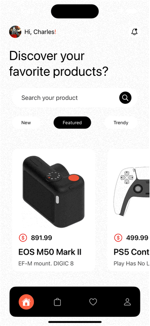
We now have that customized tab bar and thus concludes this episode. If you enjoyed this series of articles or found them helpful, let me know your thoughts in the comments, stay tuned for more recreations, and as always you can find the completed code in the GitHub repo right here