
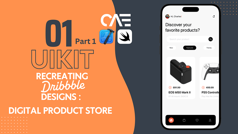
Recreate a Dribbble App Design with UIKit Episode 1 — Part 1
This article will guide you through my thought process and approach to programmatically recreating a cool UI design.
Earlier this week, I stumbled across this youtube video by AJ Picard recreating a design he randomly found on Dribbble using SwiftUI, and it immediately had me thinking:
- That’s kinda interesting, seeing him basically bringing the design to life.
- I should probably try my hand at that, (I think we all should brush up on our UI skills from time to time) but using UIKit.
So, I went and did some scrolling of my own on Dribbble and this Digital Product Store App design caught my eye.
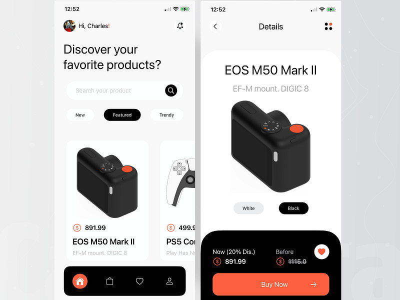
Before jumping into the code, lets quickly take a second to analyze and perhaps break down this design into smaller sections. I found it fitting to name these sections : the header, body & footer (if these sound familiar, it’s because I am also a web developer).
The Header
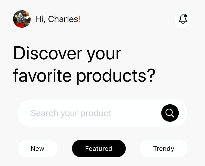
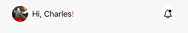
Right off the bat, there are a few things to note, a custom navigation bar is being used…actually no, the area where the navigation bar would be is replaced with (from left to right) a small circular image(with the user’s profile picture), a greeting, and a notification button. My approach for this was: a UIImageView, a UILabel and a UIButton
override func viewDidLoad() {
super.viewDidLoad()
view.backgroundColor = UIColor(named: "bgGray")
configViews()
configConstraints()
}
// Create the views
// UIImageView was assigned an image file named "charles"
// from the assets folder, and given a corner radius of 16
let profileImage: UIImageView = {
let imageView = UIImageView()
imageView.image = UIImage(named: "charles")
imageView.layer.cornerRadius = 16
imageView.clipsToBounds = true
imageView.translatesAutoresizingMaskIntoConstraints = false
return imageView
}()
// The greeting label
let greetingLabel: UILabel = {
let label = UILabel()
label.textColor = .black
label.text = "Hi, Charles!"
label.font = .preferredFont(forTextStyle: .callout)
label.translatesAutoresizingMaskIntoConstraints = false
return label
}()
// The UIButton has an SF Symbol image attached,
// a tint of black, background color of white, and rounded corners
let notificationButton: UIButton = {
var button = UIButton()
let image = UIImage(systemName: "bell.badge")
button.setImage(image, for: .normal)
button.backgroundColor = .white
button.tintColor = .black
button.layer.cornerRadius = 16
button.translatesAutoresizingMaskIntoConstraints = false
return button
}()
// Add the views to the parentview
func configViews(){
view.addSubview(profileImage)
view.addSubview(greetingLabel)
view.addSubview(notificationButton)
}
// Add some contraints, to arrange them out horizontally
func configConstraints() {
NSLayoutConstraint.activate([
profileImage.topAnchor.constrnnaint(
equalToSystemSpacingBelow: view.safeAreaLayoutGuide.topAnchor, multiplier: 1),
// this ^^^^^^ line
// constraintconstraint(
// equalToSystemSpacingBelow: safeAreaLayoutGuide.topAnchor,
// multiplier: 1)
// means that the top of the image
// is set to the top of the parent view
// within the safe area (below the iPhone's notch/dynamic island),
// by a multiplier of 1, (which is equivalent to 8 pts)
profileImage.leadingAnchor.constraint(
equalToSystemSpacingAfter: view.leadingAnchor, multiplier: 3),
// leadingAnchor.constraint(
// equalToSystemSpacingAfter: leadingAnchor, multiplier: 3)
// this means that the left of the image
// is set to the side of the parent view,
// by 24 pts (multiplier of 3. 3 * 8 = 24)
profileImage.heightAnchor.constraint(equalToConstant: 32),
profileImage.widthAnchor.constraint(equalToConstant: 32),
// this sets the height and width to 32
// which along with the corner radius previously set to 16
// gives the image the full circular shape
greetingLabel.centerYAnchor.constraint(equalTo: profileImage.centerYAnchor),
greetingLabel.leadingAnchor.constraint(
equalToSystemSpacingAfter: profileImage.trailingAnchor, multiplier: 1),
// The greeting label's Y anchor is equal to the Y anchor of profile image,
// aligning them horizontally
// the greeting label's left side
// is set to 8pts awy from the profile image's right side
notificationButton.heightAnchor.constraint(equalToConstant: 32),
notificationButton.widthAnchor.constraint(equalToConstant: 32),
notificationButton.centerYAnchor.constraint(equalTo: greetingLabel.centerYAnchor),
view.trailingAnchor.constraint(
equalToSystemSpacingAfter: notificationButton.trailingAnchor, multiplier: 3),
// this means that the right side of the parent view
// is set to 24 (3 * 8) pts
// from the notification button's right side
])
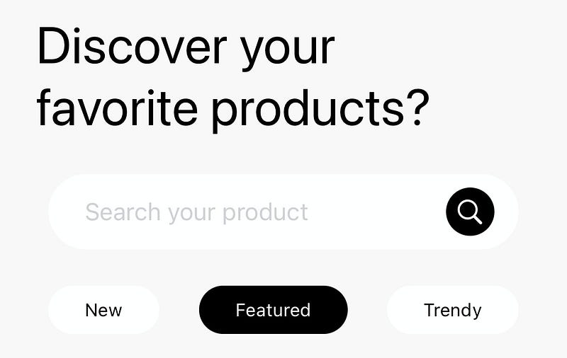
}Next, there’s a large title (spanning two lines), below that there’s a search bar (with placeholder text and a custom icon within it) and lastly, some “pills” containing words, matching the width of the search bar above it.
// Create the views
// Title label is assigned a value of 2 for its 'numberOfLines' property
// and 'lineBreakMode' is set to '.byWordWrapping'
// This allows it to span multiple lines
// I then set the size to Apple's 'largeTile' fontsize,
// which you can already guess what this does
let titleLabel: UILabel = {
let label = UILabel()
label.numberOfLines = 2
label.lineBreakMode = .byWordWrapping
label.text = "Discover your favorite products?"
label.textColor = .black
label.font = .preferredFont(forTextStyle: .largeTitle)
label.translatesAutoresizingMaskIntoConstraints = false
return label
}()
// An empty uiview with a corner radius of 25,
// I'll revisit this shortly
let searchView: UIView = {
let searchView = UIView()
searchView.backgroundColor = .white
searchView.layer.cornerRadius = 25
searchView.translatesAutoresizingMaskIntoConstraints = false
return searchView
}()
// UIButton, with an SF symbol and background color,
// similar to the notification button earlier
let searchIcon : UIButton = {
var button = UIButton()
let image = UIImage(systemName: "magnifyingglass")
button.setImage(image, for: .normal)
button.backgroundColor = .black
button.tintColor = .white
button.layer.cornerRadius = 16
button.translatesAutoresizingMaskIntoConstraints = false
return button
}()
// Textfield to input text
let searchTextField: UITextField = {
var textField = UITextField()
textField.attributedPlaceholder = NSAttributedString(string: "Search your product", attributes: [.font: UIFont.preferredFont(forTextStyle: .callout),.foregroundColor: UIColor.systemGray4])
textField.borderStyle = .none
textField.translatesAutoresizingMaskIntoConstraints = false
return textField
}()
func configViews(){
view.addSubview(profileImage)
view.addSubview(greetingLabel)
view.addSubview(notificationButton)
// Add the title label and search view to parent view
view.addSubview(titleLabel)
view.addSubview(searchView)
// the icon and textfield are ADDED TO the searchview
// the previously empty UIView
searchView.addSubview(searchIcon)
searchView.addSubview(searchTextField)
}
NSLayoutConstraint.activate([
// The large title is anchored 32 pts below the first set of items,
// 24 pts from the left of the parent view,
// 32 pts from the right of the parentview
titleLabel.topAnchor.constraint(
equalToSystemSpacingBelow: greetingLabel.bottomAnchor, multiplier: 4),
titleLabel.leadingAnchor.constraint(
equalToSystemSpacingAfter: view.leadingAnchor, multiplier: 3),
view.trailingAnchor.constraint(
equalToSystemSpacingAfter: titleLabel.trailingAnchor, multiplier: 4),
// SearchView is set to 24 pts below the large title
// and 32 pts from the left of the parent view
searchView.topAnchor.constraint(
equalToSystemSpacingBelow: titleLabel.bottomAnchor, multiplier: 3),
searchView.leadingAnchor.constraint(
equalToSystemSpacingAfter: view.leadingAnchor, multiplier: 4),
// Height anchor set to 50
// Remember the corner radius was set to 25?
// this will give it the circular look
searchView.heightAnchor.constraint(equalToConstant: 50),
view.trailingAnchor.constraint(
equalToSystemSpacingAfter: searchView.trailingAnchor, multiplier: 4),
// Remember, the search icon is placed WITHIN the searchview
// its Y anchor is then set to the searchview's own, centering it horizontally
searchIcon.centerYAnchor.constraint(equalTo: searchView.centerYAnchor),
searchIcon.heightAnchor.constraint(equalToConstant: 32),
searchIcon.widthAnchor.constraint(equalToConstant: 32),
// since it is to the RIGHTmost side of the searchview...
// set the SEARCHVIEW's trailing anchor to be 16 pts from the icon's trailing
// looking at that piece of code may confuse you, so think of it as...
// the right of the search icon is set to 16 pts FROM the right of the search view
searchView.trailingAnchor.constraint(
equalToSystemSpacingAfter: searchIcon.trailingAnchor, multiplier: 2),
// Remember, the textfield is placed WITHIN the searchview
// so it's Y anchor is set to the searchviews, centering it horizontally
searchTextField.centerYAnchor.constraint(equalTo: searchView.centerYAnchor),
searchTextField.leadingAnchor.constraint(equalToSystemSpacingAfter: searchView.leadingAnchor, multiplier: 3)
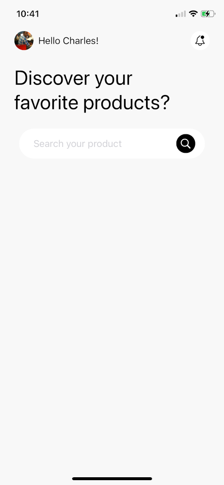
])Let’s take a look at what we’ve got so far shall we?
But wait a second….what about the ‘pills’??
We will cover that in Part 2 of this series.
Everything covered so far is available in the GitHub repo, in case you might have missed something.
Thanks for reading!


