
Performance Recipes: React-Window, React-Virtualized, and React-Virtuoso
Comparing popular React windowing libraries for efficiently rendering large lists and tabular data

Performance is defined as how efficiently a software can accomplish its tasks. In web development, performance is measured by how fast the initial webpage is loaded, and how fast it reacts to a user action.
A large list or tabular data may take long time to render all content. Windowing, also called virtualizing, is a technique to help with this type of situations. i.e. it only renders a small subset of data at any given time, which can dramatically reduce the time it takes to render the components, with less number of DOM nodes created.
react-window, react-virtualized, and react-virtuoso are popular windowing libraries. The following npm trends diagram compares the three libraries:
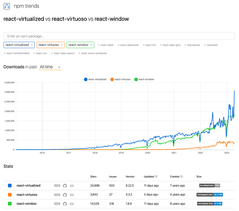
Brian Vaughn wrote both react-window and react-virtualized. react-virtualized is bulky with full functionality. react-window is a complete rewrite of react-virtualized, which focused on making the package smaller and faster. If react-window provides sufficient functionality for a project, it is strongly recommended to use react-window, instead of react-virtualized.
react-virtuoso is newer. Petyo Ivanov, the author, said his goal is to have common cases working out of the box that does not force the user to jump through unnecessary hoops that are easy to address from the inside. It is nice to have an option not to hardcode the height, while useWindowScroll uses the document scroller automatically.
Let’s take a look how these libraries work:
• React-Window
 - FixedSizeList and VariableSizeList
 - FixedSizeGrid and VariableSizeGrid

• React-Virtualized
 - List
 - Grid
 - Table
 - Collection and Masonry
 - AutoSizer
 - Other Helpers and Decorators

• React-Virtuoso
 - Virtuoso
 - GroupedVirtuoso
 - TableVirtuoso
 - VirtuosoGrid
React-Window
react-window is a set of React components for efficiently rendering large lists and tabular data. It renders part of a large data set, just enough to fill the viewport:
- It reduces the amount of work and time required to render the initial view and to process updates.
- It reduces the memory footprint by avoiding over-allocation of DOM nodes.
Set up Create React App working environment:
% yarn create react-app react-virtual-data
% cd react-virtual-data
Install the package, react-window:
% yarn add react-windowIt becomes part of dependencies in package.json:
"dependencies": {
  "react-window": "^1.8.9"
}
react-window is a small library. According to https://bundlephobia.com/, its gzipped size is 6.4 KB. Out of the box, react-window has four components, FixedSizeList, VariableSizeList, FixedSizeGrid, and VariableSizeGrid.
FixedSizeList and VariableSizeList
FixedSizeList renders a virtualized list of items. It can scroll vertically.
It can also scroll horizontally.
VariableSizeList is similar to FixedSizeList, but with additional controls, including the item size that can be variable. It can scroll vertically.
It can also scroll horizontally.
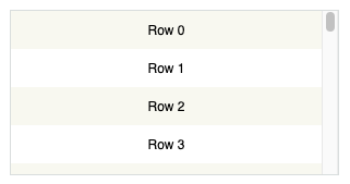
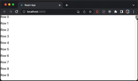
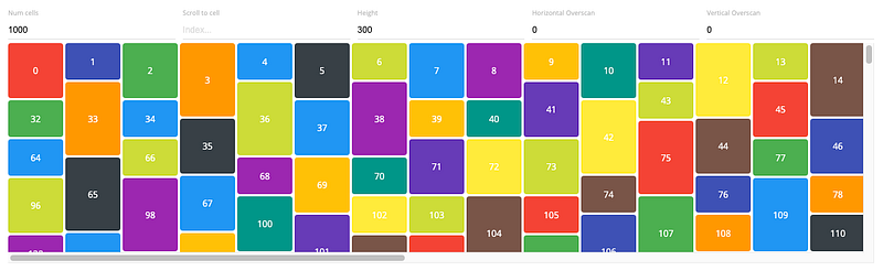
The following src/App.js creates a FixedSizeList.
import { FixedSizeList as List } from 'react-window';

const Row = ({ index, style }) => <div style={style}>Row {index}</div>;

function App() {
  return (
    <List
      height={350}
      itemCount={1000}
      // overscanCount specifies items slightly outside of visible area to
      // reduce or prevent a flash of empty space during scrolling
      // overscanCount={20}
      width="100%"
    >
      {/* if list items are expensive to render, React.memo can be used to
      generate the Row component to avoid unnecessary re-rendering */}
      {Row}
    </List>
  );
}
export default App;
Execute yarn start, and we see a virtualized list with vertical scrolling:
Here is the definition of ListProps:
export interface ListProps<T = any> extends CommonProps<T> {
  /**
   * React component responsible for rendering the individual item specified by an index prop. This component also receives a style prop (used for positioning).
   *
   * If useIsScrolling is enabled for the list, the component also receives an additional isScrolling boolean prop.
   */
  children: ComponentType<ListChildComponentProps<T>>;
  /**
   * Height of the list.
   *
   * For vertical lists, this must be a number. It affects the number of rows that will be rendered (and displayed) at any given time.
   *
   * For horizontal lists, this can be a number or a string (e.g. "50%").
   */
  height: number | string;
  /**
   * Total number of items in the list. Note that only a few items will be rendered and displayed at a time.
   */
  itemCount: number;
  /**
   * Width of the list.
   *
   * For horizontal lists, this must be a number. It affects the number of columns that will be rendered (and displayed) at any given time.
   *
   * For vertical lists, this can be a number or a string (e.g. "50%").
   */
  width: number | string;
  /**
   * Determines the direction of text and horizontal scrolling.
   *
   * This property also automatically sets the CSS direction style for the list component.
   *
   * Specifying "horizontal" or "vertical" for this value is deprecated. Use "layout" prop instead.
   *
   * @default "ltr"
   */
  direction?: CSSDirection | Direction | undefined;
  /**
   * Layout/orientation of the list.
   *
   * Acceptable values are:
   * - "vertical" (default) - Up/down scrolling.
   * - "horizontal" - Left/right scrolling.
   *
   * Note that lists may scroll in both directions (depending on CSS) but content will only be windowed in the layout direction specified.
   */
  layout?: Layout | undefined;
  /**
   * Scroll offset for initial render.
   *
   * For vertical lists, this affects scrollTop. For horizontal lists, this affects scrollLeft.
   */
  initialScrollOffset?: number | undefined;
  /**
   * By default, lists will use an item's index as its key. This is okay if:
   *
   * - Your collections of items is never sorted or modified
   * - Your item renderer is not stateful and does not extend PureComponent
   *
   * If your list does not satisfy the above constraints, use the itemKey property to specify your own keys for items
   */
  itemKey?: ListItemKeySelector<T> | undefined;
  /**
   * The number of Overscanning slightly can reduce or prevent a flash of empty space when a user first starts scrolling. (rows or columns) to render outside of the visible area. This property can be important for two reasons:
   *
   * - Overscanning by one row or column allows the tab key to focus on the next (not yet visible) item.
   * - Overscanning slightly can reduce or prevent a flash of empty space when a user first starts scrolling.
   *
   * Note that overscanning too much can negatively impact performance. By default, List overscans by one item.
   */
  overscanCount?: number | undefined;
  /**
   * Called when the items rendered by the list change.
   */
  onItemsRendered?: ((props: ListOnItemsRenderedProps) => any) | undefined;
  /**
   * Called when the list scroll positions changes, as a result of user scrolling or scroll-to method calls.
   */
  onScroll?: ((props: ListOnScrollProps) => any) | undefined;
}
VariableSizeListProps extends VariableSizeListProps, where itemSize is a function to create a variable size list.
export interface VariableSizeListProps<T = any> extends ListProps<T> {
  /**
   * Estimated size of a item in the direction being windowed. For vertical lists, this is the row height. For horizontal lists, this is the column width.
   *
   * This value is used to calculated the estimated total size of a list before its items have all been measured. The total size impacts user scrolling behavior.
   * It is updated whenever new items are measured.
   */
  estimatedItemSize?: number | undefined;
  /**
   * Returns the size of a item in the direction being windowed. For vertical lists, this is the row height. For horizontal lists, this is the column width.
   */
  itemSize: (index: number) => number;
}
In a previous article, we have used FixedSizeList to implement infinity scrolling for React Table.
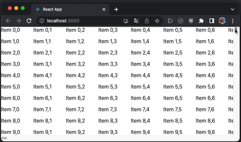
FixedSizeGrid and VariableSizeGrid
FixedSizeGrid renders a virtualized grid, which can scroll vertically and horizontally.
VariableSizeGrid is similar to FixedSizeGrid, but with additional controls, including the grid size that can be variable.
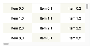
The following src/App.js creates a FixedSizeGrid.
import { FixedSizeGrid as Grid } from 'react-window';

const Cell = ({ columnIndex, rowIndex, style }) => (
  <div style={style}>
    Item {rowIndex},{columnIndex}
  </div>
);

function App() {
  return (
    <Grid
      columnCount={1000}
      columnWidth={100}
      height={350}
      rowCount={1000}
      rowHeight={35}
      // overscanColumnCount and overscanRowCount specify items slightly
      // outside of visible area to reduce or prevent a flash of empty space
      // during scrolling
      // overscanColumnCount={20}
      // overscanRowCount={20}
      width={730}
    >
      {Cell}
    </Grid>
  );
}
export default App;
Execute yarn start, and we see a virtualized grid with vertical and horizontal scrolling:
Here is the definition of GridProps:
export interface GridProps<T = any> extends CommonProps<T> {
  /**
   * React component responsible for rendering the individual item specified by an index prop. This component also receives a style prop (used for positioning).
   *
   * If useIsScrolling is enabled for the list, the component also receives an additional isScrolling boolean prop.
   */
  children: ComponentType<GridChildComponentProps<T>>;
  /**
   * Number of columns in the grid. Note that only a few columns will be rendered and displayed at a time.
   */
  columnCount: number;
  /**
   * Determines the direction of text and horizontal scrolling.
   *
   * This property also automatically sets the CSS direction style for the grid component.
   *
   * @default "ltr"
   */
  direction?: CSSDirection | undefined;
  /**
   * Height of the grid. This affects the number of rows that will be rendered (and displayed) at any given time.
   */
  height: number;
  /**
   * Horizontal scroll offset for initial render.
   */
  initialScrollLeft?: number | undefined;
  /**
   * Vertical scroll offset for initial render.
   */
  initialScrollTop?: number | undefined;
  /**
   * By default, grids will use an item's indices as its key. This is okay if:
   *
   * - Your collections of items is never sorted or modified
   * - Your item renderer is not stateful and does not extend PureComponent
   *
   * If your grid does not satisfy the above constraints, use the itemKey property to specify your own keys for items.
   */
  itemKey?: GridItemKeySelector<T> | undefined;
  /**
   * Called when the items rendered by the grid change.
   */
  onItemsRendered?: ((props: GridOnItemsRenderedProps) => any) | undefined;
  /**
   * Called when the grid scroll positions changes, as a result of user scrolling or scroll-to method calls.
   */
  onScroll?: ((props: GridOnScrollProps) => any) | undefined;
  /**
   * @deprecated since version 1.8.2, please use overscanColumnCount
   */
  overscanColumnsCount?: number | undefined;
  /**
   * The number of columns to render outside of the visible area. This property can be important for two reasons:
   *
   * - Overscanning by one row or column allows the tab key to focus on the next (not yet visible) item.
   * - Overscanning slightly can reduce or prevent a flash of empty space when a user first starts scrolling.
   *
   * Note that overscanning too much can negatively impact performance. By default, grid overscans by one item.
   */
  overscanColumnCount?: number | undefined;
  /**
   * @deprecated since version 1.8.2, please use overscanRowCount
   */
  overscanRowsCount?: number | undefined;
  /**
   * The number of rows to render outside of the visible area. This property can be important for two reasons:
   *
   * - Overscanning by one row or column allows the tab key to focus on the next (not yet visible) item.
   * - Overscanning slightly can reduce or prevent a flash of empty space when a user first starts scrolling.
   *
   * Note that overscanning too much can negatively impact performance. By default, grid overscans by one item.
   */
  overscanRowCount?: number | undefined;
  /**
   * The number of items (rows or columns) to render outside of the visible area. This property can be important for two reasons:
   *
   * - Overscanning by one row or column allows the tab key to focus on the next (not yet visible) item.
   * - Overscanning slightly can reduce or prevent a flash of empty space when a user first starts scrolling.
   *
   * Note that overscanning too much can negatively impact performance. By default, grid overscans by one item.
   *
   * @deprecated since version 1.4.0
   */
  overscanCount?: number | undefined;
  /**
   * Number of rows in the grid. Note that only a few rows will be rendered and displayed at a time.
   */
  rowCount: number;
  /**
   * Width of the grid. This affects the number of columns that will be rendered (and displayed) at any given time.
   */
  width: number;
}
VariableSizeGridProps extends GridProps, where columnWidth and rowHeight are functions to create a variable size grid.
export interface VariableSizeGridProps<T = any> extends GridProps<T> {
  /**
   * Returns the width of the specified column.
   */
  columnWidth: (index: number) => number;
  /**
   * Average (or estimated) column width for unrendered columns.
   *
   * This value is used to calculated the estimated total width of a Grid before its columns have all been measured.
   * The estimated width impacts user scrolling behavior. It is updated whenever new columns are measured.
   */
  estimatedColumnWidth?: number | undefined;
  /**
   * Average (or estimated) row height for unrendered rows.
   *
   * This value is used to calculated the estimated total height of a Grid before its rows have all been measured.
   * The estimated height impacts user scrolling behavior. It is updated whenever new rows are measured.
   */
  estimatedRowHeight?: number | undefined;
  /**
   * Returns the height of the specified row.
   */
  rowHeight: (index: number) => number;
}
In a previous article, VariableSizeGrid is used to implement infinity scrolling for Ant Table.
React-Virtualized
react-virtualized is also a set of React components for efficiently rendering large lists and tabular data. It renders part of a large data set, just enough to fill the viewport.
Install the package, react-virtualized:
% yarn add react-virtualizedIt becomes part of dependencies in package.json:
"dependencies": {
  "react-virtualized": "^9.22.5"
}
react-virtualized is a precedent of react-window. It is bulky with full functionality. According to https://bundlephobia.com/, its gzipped size is 27.3 KB. Out of the box, react-virtualized has 5 major components, Collection, Grid, List, Masonry, and Table, along with 8 high order components that help or decorate major components, AutoSizer, ArrowKeyStepper, CellMeasurer, ColumnSizer, InfiniteLoader, MultiGrid, ScrollSync, and WindowScroller.
List
List renders a virtualized list of items. It can have fixed row height.
It can also have dynamic row height.
The following src/App.js creates a List.
import { AutoSizer, List } from 'react-virtualized';

const Row = ({ index, style }) => <div style={style}>Row {index}</div>;
function App() {
  return (
    <AutoSizer disableHeight>
      {({ width }) => (
        <List
          height={350}
          rowCount={1000}
          rowHeight={35} // a function can create a variable size list
          rowRenderer={Row}
          // overscanCount specifies items slightly outside of visible area to
          // reduce or prevent a flash of empty space during scrolling
          // overscanRowCount={20}
          width={width}
        />
      )}
    </AutoSizer>
  );
}
export default App;
Execute yarn start, and we see a virtualized list with vertical scrolling:
Internally, List uses Grid to render the rows and all props. It takes GridProps.
export interface GridProps<T = any> extends CommonProps<T> {
  /**
   * React component responsible for rendering the individual item specified by an index prop. This component also receives a style prop (used for positioning).
   *
   * If useIsScrolling is enabled for the list, the component also receives an additional isScrolling boolean prop.
   */
  children: ComponentType<GridChildComponentProps<T>>;
  /**
   * Number of columns in the grid. Note that only a few columns will be rendered and displayed at a time.
   */
  columnCount: number;
  /**
   * Determines the direction of text and horizontal scrolling.
   *
   * This property also automatically sets the CSS direction style for the grid component.
   *
   * @default "ltr"
   */
  direction?: CSSDirection | undefined;
  /**
   * Height of the grid. This affects the number of rows that will be rendered (and displayed) at any given time.
   */
  height: number;
  /**
   * Horizontal scroll offset for initial render.
   */
  initialScrollLeft?: number | undefined;
  /**
   * Vertical scroll offset for initial render.
   */
  initialScrollTop?: number | undefined;
  /**
   * By default, grids will use an item's indices as its key. This is okay if:
   *
   * - Your collections of items is never sorted or modified
   * - Your item renderer is not stateful and does not extend PureComponent
   *
   * If your grid does not satisfy the above constraints, use the itemKey property to specify your own keys for items.
   */
  itemKey?: GridItemKeySelector<T> | undefined;
  /**
   * Called when the items rendered by the grid change.
   */
  onItemsRendered?: ((props: GridOnItemsRenderedProps) => any) | undefined;
  /**
   * Called when the grid scroll positions changes, as a result of user scrolling or scroll-to method calls.
   */
  onScroll?: ((props: GridOnScrollProps) => any) | undefined;
  /**
   * @deprecated since version 1.8.2, please use overscanColumnCount
   */
  overscanColumnsCount?: number | undefined;
  /**
   * The number of columns to render outside of the visible area. This property can be important for two reasons:
   *
   * - Overscanning by one row or column allows the tab key to focus on the next (not yet visible) item.
   * - Overscanning slightly can reduce or prevent a flash of empty space when a user first starts scrolling.
   *
   * Note that overscanning too much can negatively impact performance. By default, grid overscans by one item.
   */
  overscanColumnCount?: number | undefined;
  /**
   * @deprecated since version 1.8.2, please use overscanRowCount
   */
  overscanRowsCount?: number | undefined;
  /**
   * The number of rows to render outside of the visible area. This property can be important for two reasons:
   *
   * - Overscanning by one row or column allows the tab key to focus on the next (not yet visible) item.
   * - Overscanning slightly can reduce or prevent a flash of empty space when a user first starts scrolling.
   *
   * Note that overscanning too much can negatively impact performance. By default, grid overscans by one item.
   */
  overscanRowCount?: number | undefined;
  /**
   * The number of items (rows or columns) to render outside of the visible area. This property can be important for two reasons:
   *
   * - Overscanning by one row or column allows the tab key to focus on the next (not yet visible) item.
   * - Overscanning slightly can reduce or prevent a flash of empty space when a user first starts scrolling.
   *
   * Note that overscanning too much can negatively impact performance. By default, grid overscans by one item.
   *
   * @deprecated since version 1.4.0
   */
  overscanCount?: number | undefined;
  /**
   * Number of rows in the grid. Note that only a few rows will be rendered and displayed at a time.
   */
  rowCount: number;
  /**
   * Width of the grid. This affects the number of columns that will be rendered (and displayed) at any given time.
   */
  width: number;
}
Grid
Grid renders virtualized tabular data.
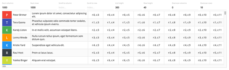
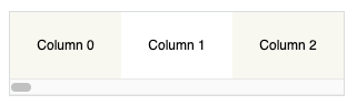
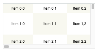
The following src/App.js creates a Grid.
import { AutoSizer, Grid } from 'react-virtualized';
const Cell = ({ columnIndex, rowIndex, style }) => (
<div style={style}>
Item {rowIndex},{columnIndex}
</div>
);
function App() {
return (
<AutoSizer disableHeight>
{({ width }) => (
<Grid
columnCount={1000}
columnWidth={100} // a function can create variable width of columns
height={350}
rowCount={1000}
rowHeight={35} // a function can create variable height of rows
cellRenderer={Cell}
// overscanColumnCount and overscanRowCount specifies items slightly
// outside of visible area to reduce or prevent a flash of empty space
// during scrolling
// overscanColumnCount={20}
// overscanRowCount={20}
width={width}
/>
)}
</AutoSizer>
);
}
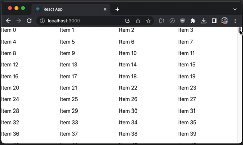
export default App;Execute yarn start, and we see a virtualized grid with vertical and horizontal scrolling:
Table
We have shown two dimensional Grid, which can be a table body. Table is a component with fixed headers and virtualized rows.
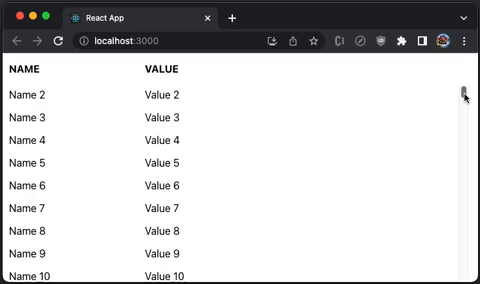
The following src/App.js creates a Table, which has two columns, Name and Value:
import { AutoSizer, Table, Column } from 'react-virtualized';
import 'react-virtualized/styles.css'; // style is needed to show Table layout

const list = Array(1000).fill(1)
  .map((_, index) => ({ name: `Name ${index}`, value: `Value ${index}` }));

function App() {
  return (
    <AutoSizer disableHeight>
      {({ width }) => (
        <Table
          height={350}
          headerHeight={50}
          rowCount={list.length}
          rowGetter={({ index }) => list[index]}
          rowHeight={35}
          // overscanRowCount specifies items slightly outside of visible area
          // to reduce or prevent a flash of empty space during scrolling
          // overscanRowCount={20}
          width={width}
        >
          <Column label="Name" dataKey="name" width={200} />
          <Column label="Value" dataKey="value" width={200} />
        </Table>
      )}
    </AutoSizer>
  );
}
export default App;
Execute yarn start, and we see a virtualized table with a fixed table header:
Here is the definition of TableProps:
export type TableProps = GridCoreProps & {
  'aria-label'?: string | undefined;
  deferredMeasurementCache?: CellMeasurerCache | undefined;
  /**
   * Removes fixed height from the scrollingContainer so that the total height
   * of rows can stretch the window. Intended for use with WindowScroller
   */
  autoHeight?: boolean | undefined;
  /** One or more Columns describing the data displayed in this row */
  children?: React.ReactNode | undefined;
  /** Optional CSS class name */
  className?: string | undefined;
  /** Disable rendering the header at all */
  disableHeader?: boolean | undefined;
  /**
   * Used to estimate the total height of a Table before all of its rows have actually been measured.
   * The estimated total height is adjusted as rows are rendered.
   */
  estimatedRowSize?: number | undefined;
  /** Optional custom CSS class name to attach to inner Grid element. */
  gridClassName?: string | undefined;
  /** Optional inline style to attach to inner Grid element. */
  gridStyle?: any;
  /** Optional CSS class to apply to all column headers */
  headerClassName?: string | undefined;
  /** Fixed height of header row */
  headerHeight: number;
  /**
   * Responsible for rendering a table row given an array of columns:
   * Should implement the following interface: ({
   *   className: string,
   *   columns: any[],
   *   style: any
   * }): PropTypes.node
   */
  headerRowRenderer?: TableHeaderRowRenderer | undefined;
  /** Optional custom inline style to attach to table header columns. */
  headerStyle?: any;
  /** Fixed/available height for out DOM element */
  height?: number | undefined;
  /** Optional id */
  id?: string | undefined;
  /** Optional renderer to be used in place of table body rows when rowCount is 0 */
  noRowsRenderer?: (() => JSX.Element | null) | undefined;
  /**
   * Optional callback when a column's header is clicked.
   * ({ columnData: any, dataKey: string }): void
   */
  onHeaderClick?: ((params: HeaderMouseEventHandlerParams) => void) | undefined;
  /**
   * Callback invoked when a user clicks on a table row.
   * ({ index: number }): void
   */
  onRowClick?: ((info: RowMouseEventHandlerParams) => void) | undefined;
  /**
   * Callback invoked when a user double-clicks on a table row.
   * ({ index: number }): void
   */
  onRowDoubleClick?: ((info: RowMouseEventHandlerParams) => void) | undefined;
  /**
   * Callback invoked when the mouse leaves a table row.
   * ({ index: number }): void
   */
  onRowMouseOut?: ((info: RowMouseEventHandlerParams) => void) | undefined;
  /**
   * Callback invoked when a user moves the mouse over a table row.
   * ({ index: number }): void
   */
  onRowMouseOver?: ((info: RowMouseEventHandlerParams) => void) | undefined;
  /**
   * Callback invoked with information about the slice of rows that were just rendered.
   * ({ startIndex, stopIndex }): void
   */
  onRowsRendered?: ((info: IndexRange & OverscanIndexRange) => void) | undefined;
  /**
   * Callback invoked whenever the scroll offset changes within the inner scrollable region.
   * This callback can be used to sync scrolling between lists, tables, or grids.
   * ({ clientHeight, scrollHeight, scrollTop }): void
   */
  onScroll?: ((info: ScrollEventData) => void) | undefined;
  /**
   * Number of rows to render above/below the visible bounds of the list.
   * These rows can help for smoother scrolling on touch devices.
   */
  overscanRowCount?: number | undefined;
  /**
   * Optional CSS class to apply to all table rows (including the header row).
   * This property can be a CSS class name (string) or a function that returns a class name.
   * If a function is provided its signature should be: ({ index: number }): string
   */
  rowClassName?: string | ((info: Index) => string) | undefined;
  /**
   * Callback responsible for returning a data row given an index.
   * ({ index: number }): any
   */
  rowGetter?: ((info: Index) => any) | undefined;
  /**
   * Either a fixed row height (number) or a function that returns the height of a row given its index.
   * ({ index: number }): number
   */
  rowHeight: number | ((info: Index) => number);
  /** Number of rows in table. */
  rowCount: number;
  /**
   * Responsible for rendering a table row given an array of columns:
   * Should implement the following interface: ({
   *   className: string,
   *   columns: Array,
   *   index: number,
   *   isScrolling: boolean,
   *   onRowClick: ?Function,
   *   onRowDoubleClick: ?Function,
   *   onRowMouseOver: ?Function,
   *   onRowMouseOut: ?Function,
   *   rowData: any,
   *   style: any
   * }): PropTypes.node
   */
  rowRenderer?: TableRowRenderer | undefined;
  /** Optional custom inline style to attach to table rows. */
  rowStyle?: React.CSSProperties | ((info: Index) => React.CSSProperties) | undefined;
  /** See Grid#scrollToAlignment */
  scrollToAlignment?: string | undefined;
  /** Row index to ensure visible (by forcefully scrolling if necessary) */
  scrollToIndex?: number | undefined;
  /** Vertical offset. */
  scrollTop?: number | undefined;
  /**
   * Sort function to be called if a sortable header is clicked.
   * ({ sortBy: string, sortDirection: SortDirection }): void
   */
  sort?: ((info: { sortBy: string; sortDirection: SortDirectionType }) => void) | undefined;
  /** Table data is currently sorted by this :dataKey (if it is sorted at all) */
  sortBy?: string | undefined;
  /** Table data is currently sorted in this direction (if it is sorted at all) */
  sortDirection?: SortDirectionType | undefined;
  /** Optional inline style */
  style?: React.CSSProperties | undefined;
  /** Tab index for focus */
  tabIndex?: number | null | undefined;
  /** Width of list */
  width?: number | undefined;
};
It is obvious that Table is limited and restrictive. Typically, a project has its own table component, and List or Grid provides more flexibility for visualization.
Collection and Masonry
Collection renders scattered or non-linear data.
Masonry is optimized for masonry layouts. It can use component scroller.
It can also use window scroller, without hardcoding the height.
AutoSizer
AutoSizer automatically adjusts the width and height of a single child. Many react-virtualized components require explicit dimensions but AutoSizer can grow to fill all of the available space.
AutoSizer is the most-used helper, and we have used AutoSizer in examples above.
Here is the definition of AutoSizerProps:
export type AutoSizerProps = {
  /**
   * Function responsible for rendering children.
   * This function should implement the following signature:
   * ({ height, width }) => PropTypes.element
   */
  children: (props: Size) => React.ReactNode;
  /**
   *     Optional custom CSS class name to attach to root AutoSizer element.
   * This is an advanced property and is not typically necessary.
   */
  className?: string | undefined;
  /**
   * Height passed to child for initial render; useful for server-side rendering.
   * This value will be overridden with an accurate height after mounting.
   */
  defaultHeight?: number | undefined;
  /**
   * Width passed to child for initial render; useful for server-side rendering.
   * This value will be overridden with an accurate width after mounting.
   */
  defaultWidth?: number | undefined;
  /** Disable dynamic :height property */
  disableHeight?: boolean | undefined;
  /** Disable dynamic :width property */
  disableWidth?: boolean | undefined;
  /** Nonce of the inlined stylesheet for Content Security Policy */
  nonce?: string | undefined;
  /** Callback to be invoked on-resize: ({ height, width }) */
  onResize?: ((info: Size) => any) | undefined;
  /**
   * Optional custom inline style to attach to root AutoSizer element.
   * This is an advanced property and is not typically necessary.
   */
  style?: React.CSSProperties | undefined;
  /**
   * PLEASE NOTE
   * The [key: string]: any; line is here on purpose
   * This is due to the need of force re-render of PureComponent
   * Check the following link if you want to know more
   * https://github.com/bvaughn/react-virtualized#pass-thru-props
   */
  [key: string]: any;
};
Other Helpers and Decorators
ArrowKeyStepper decorates another virtualized component and responds to arrow-key events by scrolling one row or column at a time.
CellMeasurer automatically measures a cell’s contents by temporarily rendering it in a way that is not visible to the user.
ColumnSizer auto-calculates column-widths for Grid cells.
InfiniteLoader manages just-in-time fetching of data as a user scrolls up or down in a list.
MultiGrid decorates Grid and adds fixed columns and/or rows.
ScrollSync simplifies the process of synchronizing scrolling between two or more virtualized components.
WindowScroller enables a Table or List component to scroll based on the window's scroll position.
React-Virtuoso
react-virtuoso is a set of React components that can render enormous data sets.
Install the package, react-virtuoso:
% yarn add react-virtuosoIt becomes part of dependencies in package.json:
"dependencies": {
  "react-virtuoso": "^4.3.1"
}
react-virtuoso is a medium-sized library. According to https://bundlephobia.com/, its gzipped size is 16.3 KB. Out of the box, react-window has four major components, Virtuoso, GroupedVirtuoso, TableVirtuoso, and VirtuosoGrid.
Virtuoso
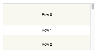
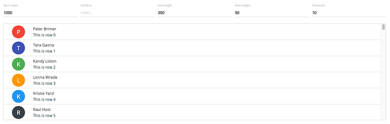
Virtuoso renders a virtualized list of items. The following src/App.js creates a Virtuoso.
import { Virtuoso } from 'react-virtuoso';

function App() {
  return (
    <Virtuoso
      style={{ height: 350 }}
      // useWindowScroll // no need to hardcode the table height in above style
      totalCount={1000}
      itemContent={(index) => <div style={{ height: 35 }}>Row {index}</div>}
      // overscanCount specifies items slightly outside of visible area to
      // reduce or prevent a flash of empty space during scrolling
      // it can be set to a number
      // overscan={20}
      // it can alos be set to an object with different numbers for the main
      // and the reverse scrollable directions
      // overscan={
      //   main: 20,
      //   reverse: 30
      // };
    />
  );
}

export default App;
Execute yarn start, and we see a virtualized list with vertical scrolling:
Here is the definition of VirtuosoProps:
export declare interface VirtuosoProps<D, C> extends ListRootProps {
  /**
   * The total amount of items to be rendered.
   */
  totalCount?: number;
  /**
   * The data items to be rendered. If data is set, the total count will be inferred from the length of the array.
   */
  data?: readonly D[];
  /**
   * Additional context available in the custom components and content callbacks
   */
  context?: C;
  /**
   * *The property accepts pixel values.*
   *
   * Set the overscan property to make the component "chunk" the rendering of new items on scroll.
   * The property causes the component to render more items than the necessary, but reduces the re-renders on scroll.
   * Setting `{ main: number, reverse: number }` lets you extend the list in both the main and the reverse scrollable directions.
   * See the `increaseViewportBy` property for a similar behavior (equivalent to the `overscan` in react-window).
   *
   */
  overscan?: number | {
    main: number;
    reverse: number;
  };
  /**
   *
   * *The property accepts pixel values.*
   *
   * Set the increaseViewportBy property to artificially increase the viewport size, causing items to be rendered before outside of the viewport.
   * The property causes the component to render more items than the necessary, but can help with slow loading content.
   * Using `{ top?: number, bottom?: number }` lets you set the increase for each end separately.
   *
   */
  increaseViewportBy?: number | {
    top: number;
    bottom: number;
  };
  /**
   * Set the amount of items to remain fixed at the top of the list.
   *
   * For a header that scrolls away when scrolling, check the `components.Header` property.
   */
  topItemCount?: number;
  /**
   * Set to a value between 0 and totalCount - 1 to make the list start scrolled to that item.
   * Pass in an object to achieve additional effects similar to `scrollToIndex`.
   */
  initialTopMostItemIndex?: number | IndexLocationWithAlign;
  /**
   * Set this value to offset the initial location of the list.
   * Warning: using this property will still run a render cycle at the scrollTop: 0 list window.
   * If possible, avoid using it and stick to `initialTopMostItemIndex` instead.
   */
  initialScrollTop?: number;
  /**
   * Use for server-side rendering - if set, the list will render the specified amount of items
   * regardless of the container / item size.
   */
  initialItemCount?: number;
  /**
   * Use the `components` property for advanced customization of the elements rendered by the list.
   */
  components?: Components<D, C>;
  /**
   * Set the callback to specify the contents of the item.
   */
  itemContent?: ItemContent<D, C>;
  /**
   * If specified, the component will use the function to generate the `key` property for each list item.
   */
  computeItemKey?: ComputeItemKey<D, C>;
  /**
   * By default, the component assumes the default item height from the first rendered item (rendering it as a "probe").
   *
   * If the first item turns out to be an outlier (very short or tall), the rest of the rendering will be slower,
   * as multiple passes of rendering should happen for the list to fill the viewport.
   *
   * Setting `defaultItemHeight` causes the component to skip the "probe" rendering and use the property
   * value as default height instead.
   */
  defaultItemHeight?: number;
  /**
   * Allows customizing the height/width calculation of `Item` elements.
   *
   * The default implementation reads `el.getBoundingClientRect().height` and `el.getBoundingClientRect().width`.
   */
  itemSize?: SizeFunction;
  /**
   * Can be used to improve performance if the rendered items are of known size.
   * Setting it causes the component to skip item measurements.
   */
  fixedItemHeight?: number;
  /**
   * Use to display placeholders if the user scrolls fast through the list.
   *
   * Set `components.ScrollSeekPlaceholder` to change the placeholder content.
   */
  scrollSeekConfiguration?: ScrollSeekConfiguration | false;
  /**
   * If set to `true`, the list automatically scrolls to bottom if the total count is changed.
   * Set to `"smooth"` for an animated scrolling.
   *
   * By default, `followOutput` scrolls down only if the list is already at the bottom.
   * To implement an arbitrary logic behind that, pass a function:
   *
   * ```tsx
   * <Virtuoso
   *  followOutput={(isAtBottom: boolean) => {
   *    if (expression) {
   *      return 'smooth' // can be 'auto' or false to avoid scrolling
   *    } else {
   *      return false
   *    }
   *  }} />
   * ```
   */
  followOutput?: FollowOutput;
  /**
   * Set to customize the wrapper tag for the header and footer components (default is `div`).
   */
  headerFooterTag?: string;
  /**
   * Use when implementing inverse infinite scrolling - decrease the value this property
   * in combination with  `data` or `totalCount` to prepend items to the top of the list.
   *
   * Warning: the firstItemIndex should **be a positive number**, based on the total amount of items to be displayed.
   */
  firstItemIndex?: number;
  /**
   * Called when the list starts/stops scrolling.
   */
  isScrolling?: (isScrolling: boolean) => void;
  /**
   * Gets called when the user scrolls to the end of the list.
   * Receives the last item index as an argument. Can be used to implement endless scrolling.
   */
  endReached?: (index: number) => void;
  /**
   * Called when the user scrolls to the start of the list.
   */
  startReached?: (index: number) => void;
  /**
   * Called with the new set of items each time the list items are rendered due to scrolling.
   */
  rangeChanged?: (range: ListRange) => void;
  /**
   * Called with true / false when the list has reached the bottom / gets scrolled up.
   * Can be used to load newer items, like `tail -f`.
   */
  atBottomStateChange?: (atBottom: boolean) => void;
  /**
   * Called with `true` / `false` when the list has reached the top / gets scrolled down.
   */
  atTopStateChange?: (atTop: boolean) => void;
  /**
   * Called when the total list height is changed due to new items or viewport resize.
   */
  totalListHeightChanged?: (height: number) => void;
  /**
   * Called with the new set of items each time the list items are rendered due to scrolling.
   */
  itemsRendered?: (items: ListItem<D>[]) => void;
  /**
   * Setting `alignToBottom` to `true` aligns the items to the bottom of the list if the list is shorter than the viewport.
   * Use `followOutput` property to keep the list aligned when new items are appended.
   */
  alignToBottom?: boolean;
  /**
   * Uses the document scroller rather than wrapping the list in its own.
   */
  useWindowScroll?: boolean;
  /**
   * Pass a reference to a scrollable parent element, so that the list won't wrap in its own.
   */
  customScrollParent?: HTMLElement;
  /**
   * Provides access to the root DOM element
   */
  scrollerRef?: (ref: HTMLElement | Window | null) => any;
  /**
   * *The property accepts pixel values.*
   *
   * By default `0`. Redefine to change how much away from the top the scroller can be before the list is not considered not at top.
   */
  atTopThreshold?: number;
  /**
   * *The property accepts pixel values.*
   *
   * By default `4`. Redefine to change how much away from the bottom the scroller can be before the list is not considered not at bottom.
   */
  atBottomThreshold?: number;
  /**
   * set to LogLevel.DEBUG to enable various diagnostics in the console, the most useful being the item measurement reports.
   *
   * Ensure that you have "all levels" enabled in the browser console too see the messages.
   */
  logLevel?: LogLevel;
  /**
   * pass a state obtained from the getState() method to restore the list state - this includes the previously measured item sizes and the scroll location.
   * Notice that you should still pass the same data and totalCount properties as before, so that the list can match the data with the stored measurements.
   * This is useful when you want to keep the list state when the component is unmounted and remounted, for example when navigating to a different page.
   */
    restoreStateFrom?: StateSnapshot;
}
Change src/App.js to have components to define Header and Footer:
import { Virtuoso } from 'react-virtuoso';
function App() {
return (
<Virtuoso
style={{ height: 350 }}
totalCount={1000}
itemContent={(index) => <div style={{ height: 35 }}>Row {index}</div>}
components={{
Header: () => <div style={{ height: 35, color: 'blue'}}>I am header</div>,
Footer: () => <div style={{ height: 35, color: 'green'}}>I am footer</div>,
}}
/>
);
}
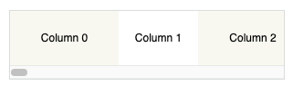
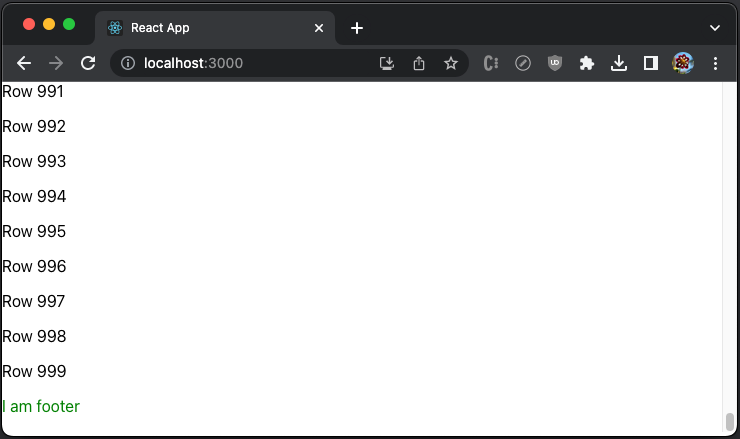
export default App; Execute yarn start, and the header is shown before the list.
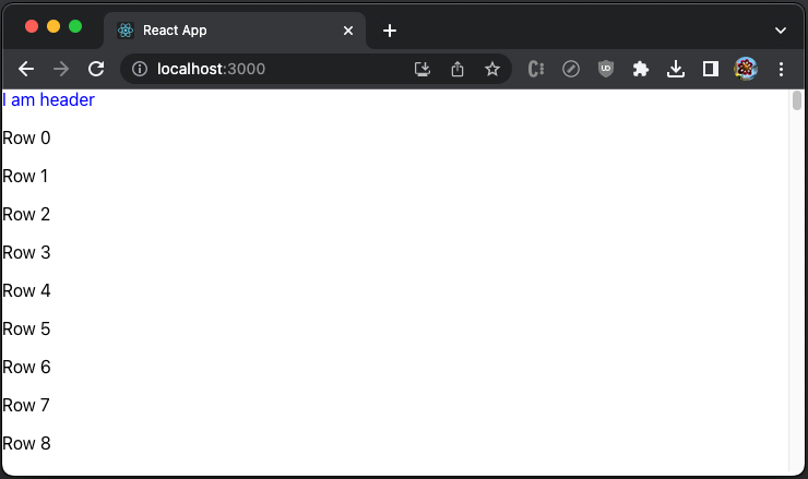
The footer is shown after the list.
GroupedVirtuoso
GroupedVirtuoso renders a virtualized list of items with grouping. The following src/App.js creates a Virtuoso that groups every 10 items.
import { GroupedVirtuoso } from 'react-virtuoso';
const groupCounts = Array(1000).fill(10);
function App() {
return (
<GroupedVirtuoso
style={{ height: 350 }}
totalCount={1000}
groupCounts={groupCounts} // define the count of items in each group
groupContent={(index) => {
// group renderer
return (
<div
style={{ color: 'blue', backgroundColor: 'white', height: '35px' }}
>
Group {index}
</div>
);
}}
itemContent={(index, groupIndex) => ( // groupIndex is available
<div style={{ height: 35 }}>
Row {index} (Group {groupIndex})
</div>
)}
/>
);
}
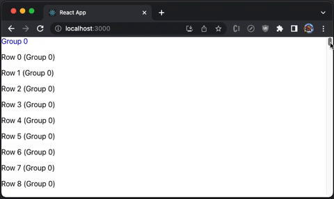
export default App;Execute yarn start, and we see the grouping header displayed at the top of each group:
GroupedVirtuosoProps almost extends VirtuosoProps:
export declare interface GroupedVirtuosoProps<D, C> extends Omit<VirtuosoProps<D, C>, 'totalCount' | 'itemContent'> {
  /**
   * Specifies the amount of items in each group (and, actually, how many groups are there).
   * For example, passing [20, 30] will display 2 groups with 20 and 30 items each.
   */
  groupCounts?: number[];
  /**
   * Specifies how each each group header gets rendered. The callback receives the zero-based index of the group.
   */
  groupContent?: GroupContent<C>;
  /**
   * Specifies how each each item gets rendered.
   */
  itemContent?: GroupItemContent<D, C>;
  /**
   * Use when implementing inverse infinite scrolling, decrease the value this property
   * in combination with a change in `groupCounts` to prepend groups items to the top of the list.
   * Both new groups and extending the top group is supported.
   *
   * The delta of the firstItemIndex should equal the amount of new items introduced, without the group themselves.
   * As an example, if you prepend 2 groups with 20 and 30 items each, the firstItemIndex should be decreased with 50.
   *
   * You can also prepend more items to the first group, for example:
   * \{ groupCounts: [20, 30], firstItemIndex: 1000 \} can become \{ groupCounts: [10, 30, 30], firstItemIndex: 980 \}
   *
   * Warning: the firstItemIndex should **be a positive number**, based on the total amount of items to be displayed.
   */
    firstItemIndex?: number;
}
TableVirtuoso
The TableVirtuoso component can display large tables with unknown row sizes. It has most of the Virtuoso capabilities, along with the support of a sticky table header.
The following src/App.js creates a TableVirtuoso with fixedHeaderContent.
import { TableVirtuoso } from 'react-virtuoso';
const list = Array(1000)
.fill(1)
.map((_, index) => ({ name: `Name ${index}`, value: `Value ${index}` }));
function App() {
return (
<TableVirtuoso
// style={{ height: 350 }}
useWindowScroll // set to useWindowScroll, no need to hardcode the table height
data={list}
fixedHeaderContent={(index, item) => (
<tr>
<th style={{ width: 200, height: 35 , background: 'white' }}>Name</th>
<th style={{ width: 200, height: 35 , background: 'white' }}>Value</th>
</tr>
)}
itemContent={(index, item) => (
<>
<td style={{ width: 200, height: 35 }}>{item.name}</td>
<td style={{ width: 200, height: 35 }}>{item.value}</td>
</>
)}
/>
);
}
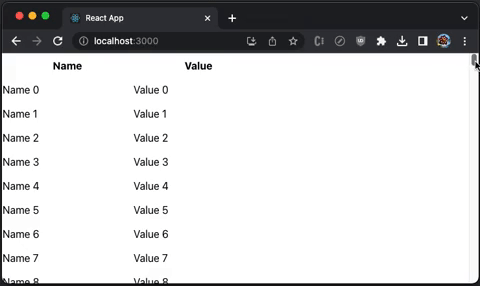
export default App;Execute yarn start, and we see a virtualized table with a sticky table header and vertical scrolling:
Here is the definition of TableVirtuosoProps:
export declare interface TableVirtuosoProps<D, C> extends Omit<VirtuosoProps<D, C>, 'components' | 'headerFooterTag' | 'topItemCount'> {
  /**
   * Use the `components` property for advanced customization of the elements rendered by the table.
   */
  components?: TableComponents<D, C>;
  /**
   * Set the contents of the table header.
   */
  fixedHeaderContent?: FixedHeaderContent;
  /**
   * Set the contents of the table footer.
   */
  fixedFooterContent?: FixedFooterContent;
  /**
   * The total amount of items to be rendered.
   */
  totalCount?: number;
  /**
   * The data items to be rendered. If data is set, the total count will be inferred from the length of the array.
   */
  data?: readonly D[];
  /**
   * Set the overscan property to make the component "chunk" the rendering of new items on scroll.
   * The property causes the component to render more items than the necessary, but reduces the re-renders on scroll.
   * Setting `{ main: number, reverse: number }` lets you extend the list in both the main and the reverse scrollable directions.
   * See the `increaseViewportBy` property for a similar behavior (equivalent to the `overscan` in `react-window`).
   */
  overscan?: number | {
    main: number;
    reverse: number;
  };
  /**
   * Set the increaseViewportBy property to artificially increase the viewport size, causing items to be rendered before outside of the viewport.
   * The property causes the component to render more items than the necessary, but can help with slow loading content.
   * Using `{ top?: number, bottom?: number }` lets you set the increase for each end separately.
   */
  increaseViewportBy?: number | {
    top: number;
    bottom: number;
  };
  /**
   * Set to a value between 0 and totalCount - 1 to make the list start scrolled to that item.
   */
  initialTopMostItemIndex?: number;
  /**
   * Set this value to offset the initial location of the list.
   * Warning: using this property will still run a render cycle at the scrollTop: 0 list window.
   * If possible, avoid using it and stick to `initialTopMostItemIndex` instead.
   */
  initialScrollTop?: number;
  /**
   * Use for server-side rendering - if set, the list will render the specified amount of items
   * regardless of the container / item size.
   */
  initialItemCount?: number;
  /**
   * Set the callback to specify the contents of the item.
   */
  itemContent?: ItemContent<D, C>;
  /**
   * If specified, the component will use the function to generate the `key` property for each list item.
   */
  computeItemKey?: ComputeItemKey<D, C>;
  /**
   * By default, the component assumes the default item height from the first rendered item (rendering it as a "probe").
   *
   * If the first item turns out to be an outlier (very short or tall), the rest of the rendering will be slower,
   * as multiple passes of rendering should happen for the list to fill the viewport.
   *
   * Setting `defaultItemHeight` causes the component to skip the "probe" rendering and use the property
   * value as default height instead.
   */
  defaultItemHeight?: number;
  /**
   * Allows customizing the height/width calculation of `Item` elements.
   *
   * The default implementation reads `el.getBoundingClientRect().height` and `el.getBoundingClientRect().width`.
   */
  itemSize?: SizeFunction;
  /**
   * Can be used to improve performance if the rendered items are of known size.
   * Setting it causes the component to skip item measurements.
   */
  fixedItemHeight?: number;
  /**
   * Use to display placeholders if the user scrolls fast through the list.
   *
   * Set `components.ScrollSeekPlaceholder` to change the placeholder content.
   */
  scrollSeekConfiguration?: ScrollSeekConfiguration | false;
  /**
   * If set to `true`, the list automatically scrolls to bottom if the total count is changed.
   * Set to `"smooth"` for an animated scrolling.
   *
   * By default, `followOutput` scrolls down only if the list is already at the bottom.
   * To implement an arbitrary logic behind that, pass a function:
   *
   * ```tsx
   * <Virtuoso
   *  followOutput={(isAtBottom: boolean) => {
   *    if (expression) {
   *      return 'smooth' // can be 'auto' or false to avoid scrolling
   *    } else {
   *      return false
   *    }
   *  }} />
   * ```
   */
  followOutput?: FollowOutput;
  /**
   * Use when implementing inverse infinite scrolling - decrease the value this property
   * in combination with  `data` or `totalCount` to prepend items to the top of the list.
   *
   * Warning: the firstItemIndex should **be a positive number**, based on the total amount of items to be displayed.
   */
  firstItemIndex?: number;
  /**
   * Called when the list starts/stops scrolling.
   */
  isScrolling?: (isScrolling: boolean) => void;
  /**
   * Gets called when the user scrolls to the end of the list.
   * Receives the last item index as an argument. Can be used to implement endless scrolling.
   */
  endReached?: (index: number) => void;
  /**
   * Called when the user scrolls to the start of the list.
   */
  startReached?: (index: number) => void;
  /**
   * Called with the new set of items each time the list items are rendered due to scrolling.
   */
  rangeChanged?: (range: ListRange) => void;
  /**
   * Called with true / false when the list has reached the bottom / gets scrolled up.
   * Can be used to load newer items, like `tail -f`.
   */
  atBottomStateChange?: (atBottom: boolean) => void;
  /**
   * Called with `true` / `false` when the list has reached the top / gets scrolled down.
   */
  atTopStateChange?: (atTop: boolean) => void;
  /**
   * Called when the total list height is changed due to new items or viewport resize.
   */
  totalListHeightChanged?: (height: number) => void;
  /**
   * Called with the new set of items each time the list items are rendered due to scrolling.
   */
  itemsRendered?: (items: ListItem<D>[]) => void;
  /**
   * Setting `alignToBottom` to `true` aligns the items to the bottom of the list if the list is shorter than the viewport.
   * Use `followOutput` property to keep the list aligned when new items are appended.
   */
  alignToBottom?: boolean;
  /**
   * Uses the document scroller rather than wrapping the list in its own.
   */
  useWindowScroll?: boolean;
  /**
   * Pass a reference to a scrollable parent element, so that the table won't wrap in its own.
   */
  customScrollParent?: HTMLElement;
  /**
   * Provides access to the root DOM element
   */
  scrollerRef?: (ref: HTMLElement | Window | null) => any;
  /**
   * By default `0`. Redefine to change how much away from the top the scroller can be before the list is not considered not at top.
   */
  atTopThreshold?: number;
  /**
   * By default `4`. Redefine to change how much away from the bottom the scroller can be before the list is not considered not at bottom.
   */
  atBottomThreshold?: number;
}
VirtuosoGrid
VirtuosoGrid displays multiple items per row. It renders tabular data with one dimensional index.
The component provides no styling out of the box. We need to install styled-components to configure multiple items per row
Install the package, styled-components:
% yarn add styled-componentsIt becomes part of dependencies in package.json:
"dependencies": {
"styled-components": "^5.3.10"
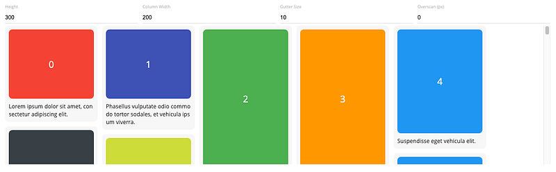
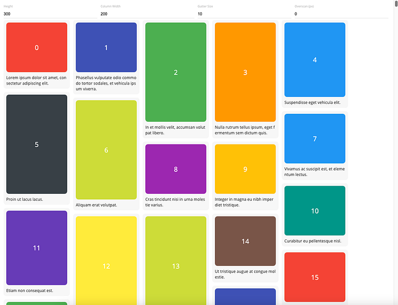
}The following src/App.js creates a VirtuosoGrid, where each item takes 25% width.
import { VirtuosoGrid } from 'react-virtuoso';
import styled from 'styled-components';

const ItemContainer = styled.div`
  width: 25%;
`;

const ListContainer = styled.div`
  display: flex;
  flex-wrap: wrap;
`;

function App() {
  return (
    <VirtuosoGrid
      useWindowScroll
      totalCount={1000}
      components={{
        Item: ItemContainer,
        List: ListContainer,
      }}
      itemContent={(index) => <div style={{ height: 35 }}>Item {index}</div>}
    />
  );
}

export default App;
Execute yarn start, and we see a grid that has 4 items per row:
Here is the definition of VirtuosoGridProps:
export declare interface VirtuosoGridProps<D, C = unknown> extends GridRootProps {
  /**
   * The total amount of items to be rendered.
   */
  totalCount?: number;
  /**
   * The data items to be rendered. If data is set, the total count will be inferred from the length of the array.
   */
  data?: readonly D[];
  /**
   * Additional context available in the custom components and content callbacks
   */
  context?: C;
  /**
   * Use for server-side rendering - if set, the list will render the specified amount of items
   * regardless of the container / item size.
   */
  initialItemCount?: number;
  /**
   * Set the callback to specify the contents of the item.
   */
  itemContent?: GridItemContent<D, C>;
  /**
   * Use the `components` property for advanced customization of the elements rendered by the list.
   */
  components?: GridComponents<C>;
  /**
   * Set the overscan property to make the component "chunk" the rendering of new items on scroll.
   * The property causes the component to render more items than the necessary, but reduces the re-renders on scroll.
   * Setting `{ main: number, reverse: number }` lets you extend the list in both the main and the reverse scrollable directions.
   */
  overscan?: number | {
    main: number;
    reverse: number;
  };
  /**
   * If specified, the component will use the function to generate the `key` property for each list item.
   */
  computeItemKey?: GridComputeItemKey<D, C>;
  /**
   * Use to display placeholders if the user scrolls fast through the list.
   *
   * Set `components.ScrollSeekPlaceholder` to change the placeholder content.
   */
  scrollSeekConfiguration?: ScrollSeekConfiguration | false;
  /**
   * Called when the list starts/stops scrolling.
   */
  isScrolling?: (isScrolling: boolean) => void;
  /**
   * Gets called when the user scrolls to the end of the list.
   * Receives the last item index as an argument. Can be used to implement endless scrolling.
   */
  endReached?: (index: number) => void;
  /**
   * Called when the user scrolls to the start of the list.
   */
  startReached?: (index: number) => void;
  /**
   * Called with the new set of items each time the list items are rendered due to scrolling.
   */
  rangeChanged?: (range: ListRange) => void;
  /**
   * Called with true / false when the list has reached the bottom / gets scrolled up.
   * Can be used to load newer items, like `tail -f`.
   */
  atBottomStateChange?: (atBottom: boolean) => void;
  /**
   * Called with `true` / `false` when the list has reached the top / gets scrolled down.
   */
  atTopStateChange?: (atTop: boolean) => void;
  /**
   * Provides access to the root DOM element
   */
  scrollerRef?: (ref: HTMLElement | null) => any;
  /**
   * Sets the className for the list DOM element
   */
  listClassName?: string;
  /**
   * Sets the grid items' className
   */
  itemClassName?: string;
  /**
   * Uses the document scroller rather than wrapping the grid in its own.
   */
  useWindowScroll?: boolean;
  /**
   * Pass a reference to a scrollable parent element, so that the grid won't wrap in its own.
   */
  customScrollParent?: HTMLElement;
  /**
   * set to LogLevel.DEBUG to enable various diagnostics in the console, the most useful being the item measurement reports.
   *
   * Ensure that you have "all levels" enabled in the browser console too see the messages.
   */
  logLevel?: LogLevel;
}
Conclusion
react-window, react-virtualized, and react-virtuoso are popular React windowing libraries. They are performance recipes to improve the webpage loading time for large lists and tabular data.
We have shown how these libraries and their components work. In the next article, we have shown how they work with other component libraries, specifically, the Ant Design System.
Thanks for reading.
Thanks S Sreeram and Durgadevi Siripurapu working with me on Domino products.
Want to Connect?

If you are interested, check out my directory of web development articles.


