
Understanding the Ant Design System — a UI Design for Enterprises
A deep dive into the button, icon, typography, modal, select, table, and tree components

What is a UI design system?
It is a collection of components governed by UI standards for patterns, themes, styles, and design philosophies that can be reused to build applications.
The Ant Design System is an open source code for enterprise-level UI design languages and React UI library. It comes with a set of high-quality React components, with theme customization capability. It is built with i18n and has been localized for dozens of languages.
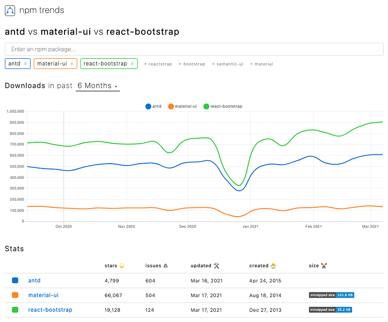
Since it was created on April 24, 2015, the Ant Design system has received about 5,000 stars on GitHub and over half a million weekly downloads from the npm registry.
Here are the npm trends for the Ant Design system (antd), compared with material-ui and react-bootstrap.
Run Ant Design System in Create React App
From building a few common components on Github, I fully understand the effort and expertise required to construct enterprise-level component libraries.
Let’s see how much effort we need to adopt the Ant Design system in Create React App.
npx create-react-app my-app
cd my-app
Set up antd:
npm i antdantd becomes part of dependencies in package.json:
Copy the following code into src/App.js:
Line 1 imports the DatePicker component.
Line 2 imports the Ant Design system theme, which is not needed since antd version 5.
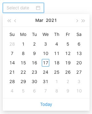
Line 6 renders the DatePicker component.
Run npm start, and the DatePicker component is displayed on the browser.
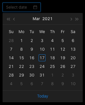
If you want to use a dark theme, change line 2 to import the dark theme.
import 'antd/dist/antd.dark.css';Then we have the dark theme.
Is this effortless?
Let’s explore more about the Ant Design system.
Button
According to Wikipedia, a button is a graphical control element that provides users a way to trigger an event by clicking it. The Ant Design system provides various buttons for use.
Copy the following code into src/App.js:
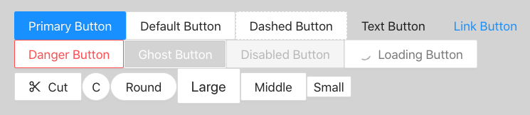
Line 8 is a primary button, which indicates the main action.
Line 9 is a normal button with a solid border.
Line 10 is dashed button with a dashed border.
Line 11 is a text button, which looks like text.
Line 12 is a link button, which looks like a link.
Line 14 is a danger button, which is red. It is commonly used for risk actions, such as deletion and authorization.
Line 15 is a ghost button, which has a transparent background as well as inverted text and border colors. It is commonly used on a colored background. It is not visible on a white background until it is hovered on.
Line 16 is a disabled button, which indicates that the action is not available.
Line 17 is a loading button, which includes the loading spinner to indicate the loading state.
Line 19 is a button with a specific icon. In this particular case, it’s scissors, indicating the cut action.
Line 20 is a button with a circle shape.
Line 21 is a button with round corners.
Line 22 is a large button.
Line 23 is a middle-size button, which is the default size.
Line 24 is a small button.
The following is how these buttons look in a browser (with a lightgray background).
The following ButtonProps definition (line 28) describes the props that can be set for buttons (lines 2–14 and some extra).
Icon
An icon, as defined by Wikipedia, is a graphic symbol to help users navigate a website. Usually, the graphic symbol conveys its meaning through its pictorial resemblance to a physical object. The Ant Design system provides a good selection of SVG icons for use.
Copy the following code into src/App.js:
The above code uses the Space component (line 11) to set component gaps. The gap size can be configured by the size prop, which is small, middle, or large. The default value is small.
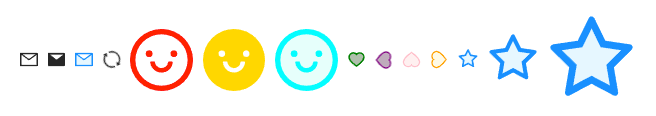
Each icon has three types: outlined, filled, and two-tone.
Line 11 is an outlined mail icon.
Line 12 is a filled mail icon.
Line 13 is a two-tone color icon.
Line 14 is an outlined sync icon, with the spinning animation.
Line 15 is an outlined smile icon, with the styling of fontSize: '50px', color: 'red'.
Line 16 is a filled smile icon, with the styling of fontSize: '50px', color: 'gold'.
Line 17 is a two-tone smile icon, with the styling of fontSize: '50px'. Its color is customized with the prop: twoToneColor="aqua".
Line 18 is a two-tone heart icon. Its color is customized with the prop: twoToneColor="green".
Line 19 is a two-tone heart icon, which is rotated 90 degrees. Its color is customized with the prop: twoToneColor="purple".
Line 20 is a two-tone heart icon, which is rotated 180 degrees. Its color is customized with the prop: twoToneColor="pink".
Line 21 is a two-tone heart icon, which is rotated -90 degrees. Its color is customized with the prop: twoToneColor="orange".
Line 22 is a two-tone star icon, which has font size 16px.
Line 23 is a two-tone star icon, which has font size 40px.
Line 24 is a two-tone star icon, which has font size 70px.
Following is how these icons look in a browser.
The following Icon definition (line 19) describes the props (lines 2–3, lines 6–11, and lines 14–16) that can be set for icons.
Typography
According to Wikipedia, “typography is the art and technique of arranging type to make written language legible, readable, and appealing when displayed.” The term typography is applied “to the style, arrangement, and appearance of the letters, numbers, and symbols created by the process.” The Ant Design system makes typography easy.
Copy the following code into src/App.js:
The above code uses Row and Col to lay out the page. The page has one row that includes three columns.
Each column is wrapped by the Space component, which sets component spacing and layout direction.
Lines 11–15 shows level 1–5 headings.
Line 20 displays the default text.
Line 21 displays the secondary text, which is lighter.
Line 22 displays the successful text, which is green.
Line 23 displays the warning text, which is orange.
Line 24 displays the danger text, which is red.
Line 25 displays the disabled text, which is light gray.
Line 30 displays the marked text.
Line 31 displays code.
Line 32 displays a keyboard input element.
Line 33 displays the underlined text.
Line 34 displays the deleted text.
Line 35 displays the bold text.
Line 36 displays a link.
The following is how typography looks in a browser.
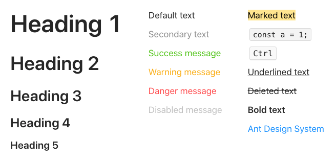
Four types of components are defined in Typography. They are Text, Link, Title, and Paragraph.
Modal
Wikipedia defines a modal as a “graphical control element subordinate to an application’s main window.” When it is visible, a modal is in front of the main window that is disabled. Typically, a modal has a title, some modal UI, and some buttons at the footer. Clicking buttons at the footer will invoke certain actions and likely dismiss the modal. The Ant Design system provides modals for use.
Copy the following code into src/App.js:
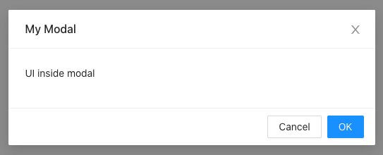
Lines 18–20 define a Modal, which has a title, the OK button, and the Cancel button.
Line 19 is a child of Modal, where specific UI code can be coded.
OK and Cancel buttons are used to handle various actions. One of the actions is to dismiss the modal — setIsModalVisible(false). Usually, Cancel simply dismisses the modal (line 14). But OK usually implements some OK logic (line 9) before it dismisses the modal (line 10).
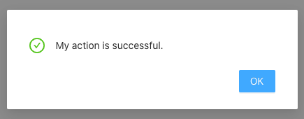
This is how the modal looks in a browser.
Let’s add some customization to the modal. Copy the following code into src/App.js:
Line 21 shows the title along with an icon.
Line 22 sets the OK text to My Action.
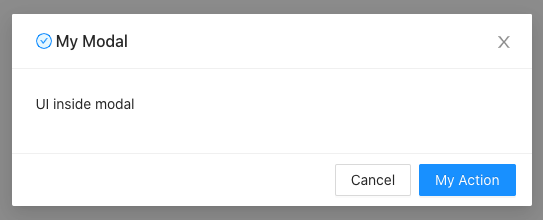
Lines 10–12 add a successful message, which is a static modal. When My Action is clicked, it pops up a successful message.
The following ModalProps definition describes the props that can be set for modals.
Select
Wikipedia defines a selection as “a list of items on which user operations will take place.” Ant Select provides as rich a set of functionalities as React Select.
Copy the following code into src/App.js:
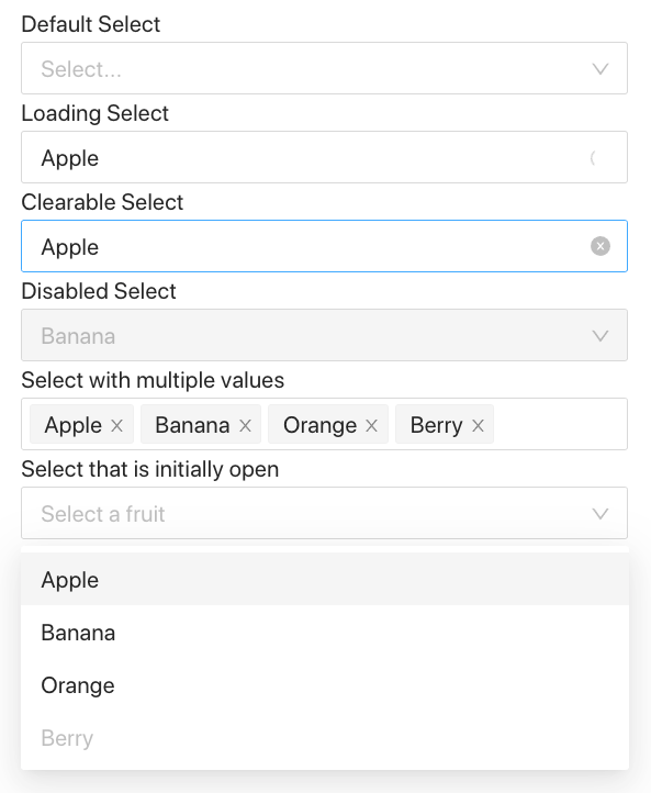
- Lines 7–12 create four options,
Apple,Banana,Orange, andBerry. - Lines 18–20 define a default
Select. - Lines 22–24 show the preselected value,
Apple. It also shows the loading animation withisLoadingbeing set. - Line 26–28 show the preselected value,
Apple. SinceallowClearis set, it allows us to clear the selected value by clicking the “x” button on the right side of the field. The “x” button is visible when theSelectis on focus. - Lines 30–32 show the preselected value,
Banana. It is a disabledSelectwithdisabledbeing set. - Lines 34–36 shows
Selectwith multiple values withmodebeing set tomultiple. Each selected value can be deleted individually, or you can use the “x” button at the right side of the field to delete all of the selected values. The “x” button is visible when theSelectis on focus. - Lines 38–45 opens the
Selectmenu initially withdefaultOpenbeing set. We do a deep clone for options. As we have mentioned in another article Create React App has built-in Lodash.cloneDeepis imported (line 3) to accomplish the deep clone operation. This allows us to set the third indexed item (Berry) todisabled(lines 40–42). WithoutcloneDeep, the code throws an error,TypeError: Cannot add property disabled, object is not extensible. This is because props is a non-extensible object. When the object is cloned, the non-extensible feature is not copied. This is a hack, but it allows us to shorten the code by reusingoptions.
The following is how Select components look in a browser.
The following SelectProps definition describes the props that can be set for the Select components. In a way, it is quite comparable to what we have described in React-Select Makes Creating Selectable Menus Easy.
The following SelectProps definition describes the props that can be set for the Select components.
Table
A table, also called a data grid, is defined by Wikipedia as “an arrangement of data in rows and columns, or possibly in a more complex structure.” Ant Table provides functionalities as rich as those in React Tables.
We reuse the same data source in our React Table example:
You may wonder why the column definition has the attribute, key, in addition to dataIndex. There is also this attribute, key, in each row of data.
This attribute, key, is used to create the key prop for a React list. More specifically, it is for each JSX element of column heads and rows. Otherwise, there will be a warning on a browser’s console: Each child in a list should have a unique “key” prop.
We create a table in src/App.js that uses the above data source:
With the Table component at line 7, the following table is displayed in a browser:
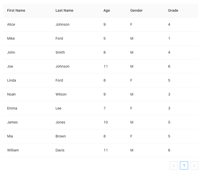
You may notice that the above table shows pagination information at the bottom-right position. By default, an Ant table is a pagination table.
If you do not want pagination, simply set it to false.
<Table rowSelection={rowSelection} dataSource={data} columns={columns} pagination={false} />This is the TableProps definition in the Ant Design system. It has pagination, row selections, filters, sorting, infinite scrolling, and many more features.
Tree
Wikipedia defines a tree view as a “graphical control element that presents a hierarchical view of information. Each item (called a branch or a node) can have a number of subitems. This is often visualized by indentation in a list.” An item can be expanded to reveal subitems, if there are any. And it can be collapsed to hide subitems.
Ant Tree provides sophisticated tree functionalities.
Copy the following code into src/App.js:
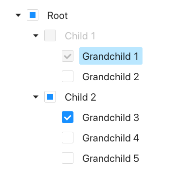
Lines 4–45 define a tree data structure. root has two children, child1 and child2. child1 has two children, grandchild1 and grandchild2. child2 has three children, grandchild3 , grandchild4, and grandchild5. Every child needs to have the attribute, key, which is used to create the JSX element. child1 is disabled (line 12), and grandchild1 has a disabled checkbox (line 17).
Lines 49–55 define the Tree component, where the tree is checkable (line 50). By default, a tree is collapsed.
Line 51 expands grandchild1 and grandchild3. When a child node is expanded, all of its ascendants are expanded.
Line 52 selects grandchild4, i.e., the node is highlighted.
Line 53 checks grandchild1 and grandchild3, i.e. these two nodes have check marks.
Line 54 passes in treeData.
The following is how the tree looks in a browser.
This is the TreeProps definition in the Ant Design system. It can be configured to be focusable, selectable, multiple-selectable, draggable, and for many features.
treeData in TreeProps (line 8) defines a tree data structure, which has the following options:
Conclusion
The Ant Design system is built for enterprise products. It advocates four design values:
- Natural
- Certain
- Meaningful
- Growing
It is an open source code, free for use. It is an enterprise-level UI design language and React UI library.
You may want to check out the component gallery.
Thanks for reading. I hope this was helpful. You can see my other Medium publications here.


