
5 + 1 Ways To Improve Table Performance
Exploring virtualization techniques using Ant Table and AG Grid as examples

Why Do We Need Virtualized Tables?
A table, also called a data grid, is an arrangement of data in rows and columns or possibly in a more complex structure. It is an essential building block of a user interface.
In both React Table and Ant Table, we have provided examples of virtualized tables. Here we use Ant Table as an example to go deep into the topic. The principle can be applied to other table components.
If you are free to use any table component and do not mind the additional bundle size, we strongly recommend Ag Gird, which has builtin virtualization capability.
Here’s how to use Create React App as a base to build a table app:
% yarn create react-app react-virtual-data
% cd react-virtual-data
Install two packages
antd: Ant Design System is an open source code for enterprise-level UI design languages and React UI library, which includes the table component.unique-names-generator: It is a library that generates unique and memorable name strings.
% yarn add antd
% yarn add unique-names-generator
They become part of dependencies in package.json:
"dependencies": {
"antd": "^5.4.4",
"unique-names-generator": "^4.7.1"
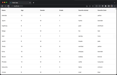
}Create src/dataSource.js, which defines table columns and data.
const {
uniqueNamesGenerator,
names,
animals,
colors,
} = require('unique-names-generator');
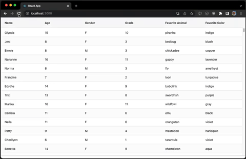
// table columns are defined as Name, Age, Gender, Grader,
// Favorite Animal, and Favorite Color.
export const columns = [
{
title: 'Name',
dataIndex: 'name',
key: 'name',
},
{
title: 'Age',
dataIndex: 'age',
key: 'age',
},
{
title: 'Gender',
dataIndex: 'gender',
key: 'gender',
},
{
title: 'Grade',
dataIndex: 'grade',
key: 'grade',
},
{
title: 'Favorite Animal',
dataIndex: 'animal',
key: 'animal',
},
{
title: 'Favorite Color',
dataIndex: 'color',
key: 'color',
},
];
// generates row data with a given count
export const getData = (count) => {
const data = [];
for (let i = 0; i < count; i++) {
const grade = Math.floor(Math.random() * 11) + 1;
data[i] = {
key: i,
name: uniqueNamesGenerator({
dictionaries: [names],
}),
age: grade + 5,
gender: Math.random() > 0.5 ? 'F' : 'M',
grade,
animal: uniqueNamesGenerator({
dictionaries: [animals],
}),
color: uniqueNamesGenerator({
dictionaries: [colors],
}),
};
}
return data;
};Modify src/App.js to create a table using columns and getData from dataSource, where the table row count is set to 100:
import { Table } from 'antd';
import { columns, getData } from './dataSource';
function App() {
return (
<Table columns={columns} pagination={false} dataSource={getData(100)} />
);
}
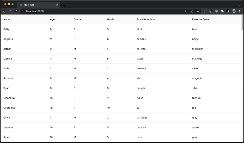
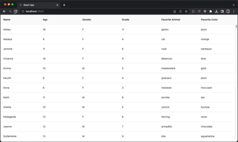
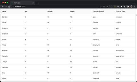
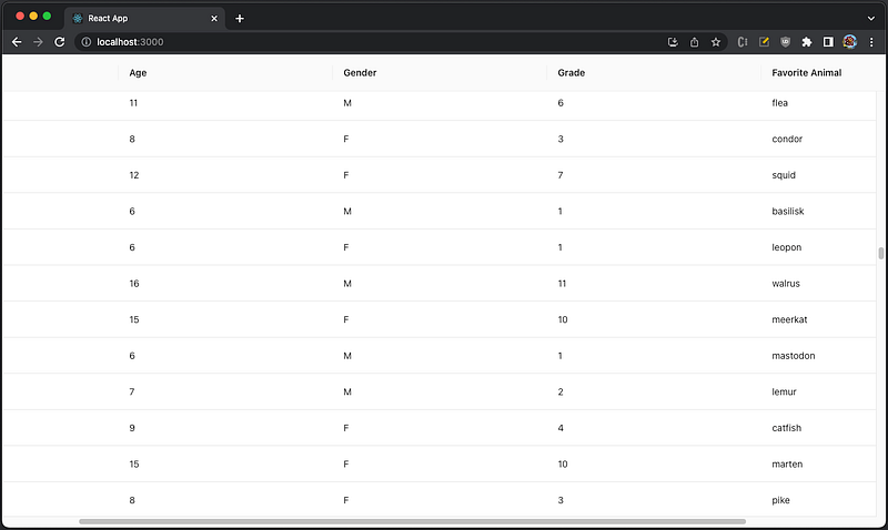
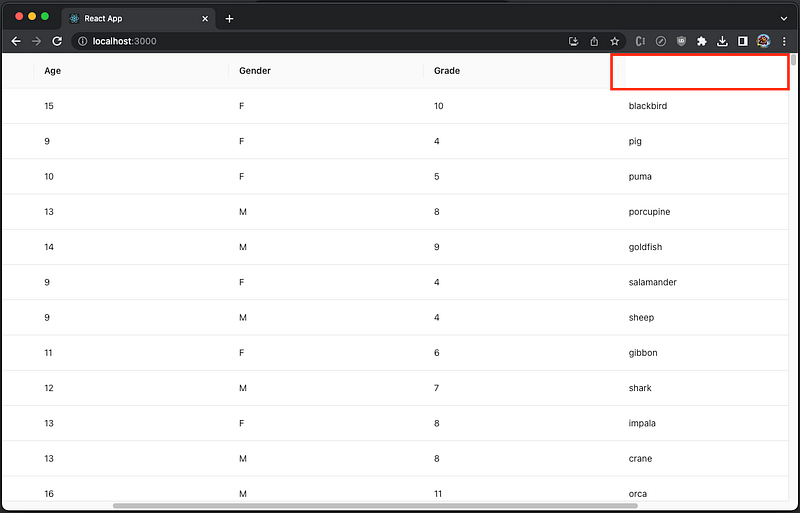
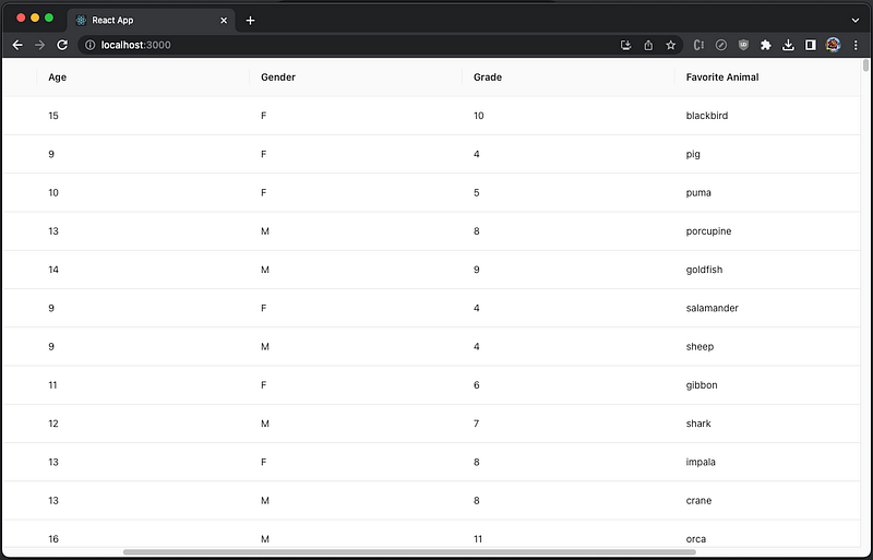
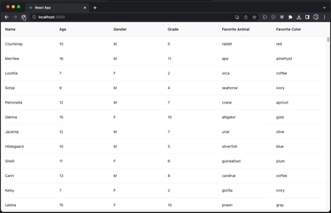
export default App;Execute yarn start, and we see a table with a vertical scrollbar.
- With 100 rows, the table is initialized fast.
- Change the table to have 1,000 rows, and the performance is still good.
- Change the count to 10,000, and the table takes a few seconds to show up.
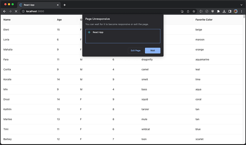
- Change the count to 100,000, and the app does not even respond.
Regardless of the computing power and efficiency of the algorithm, there is a limitation on how many DOM nodes are to be rendered within a perceivable duration. There is a technique known as windowing (virtualizing) to help with this situation. It only renders a small subset of data at any given time, which can dramatically reduce the time it takes to re-render the components and the number of DOM nodes created.
How Can We Virtualize Tables?
There are popular virtualizing libraries, such as react-window, react-virtualized, and react-virtuoso. A previous article has provided examples to display virtualized tables using react-virtualized’s Table and react-virtuoso’s TableVirtuoso. Those are simple tables, limited and restrictive, and may not fit the visual requirements for an enterprise project.
Likely, a project has its own design system, including branded tables. The generic List or Grid can provide more flexibility for existing tables. React Table puts FixedSizeList directly under tbody, and Ant Table can use VariableSizeGrid inside components.body.
Here is Ant table’s TableProps, whose optional prop, components, can be used to customize table elements.
export interface TableProps<RecordType>{
  columns?: ColumnsType<RecordType>;
  pagination?: false | TablePaginationConfig;
  dataSource?: RcTableProps<RecordType>['data'];
  components?: TableComponents<RecordType>;
  ...
}
TableComponents can customize table, header, and/or body.
export interface TableComponents<RecordType> {
  table?: CustomizeComponent;
  header?: {
    wrapper?: CustomizeComponent;
    row?: CustomizeComponent;
    cell?: CustomizeComponent;
  };
  body?: CustomizeScrollBody<RecordType> | {
    wrapper?: CustomizeComponent;
    row?: CustomizeComponent;
    cell?: CustomizeComponent;
  };
}
And CustomizeScrollBody is a component with parameters of raw data and scroll information (scrollbarSize, ref, and onScroll).
export declare type CustomizeScrollBody<RecordType> = (data: readonly RecordType[], info: {
    scrollbarSize: number;
    ref: React.Ref<{
        scrollLeft: number;
    }>;
    onScroll: (info: {
        currentTarget?: HTMLElement;
        scrollLeft?: number;
    }) => void;
}) => React.ReactNode;
Besides generic virtualizing libraries, there are specific libraries built for Ant table virtualization, such as virtualized-table-for-antd and virtuallist-antd.
We are going to explore five ways to virtualize Ant tables. We measure each library by the following five criteria:
- Gzipped size: How much extra footprint
- Data capacity: The number of rows that can be loaded to the table with acceptable performance
- Side effects: Whether there are any unwanted behaviors
- Line of code: The line number, including the actual code, comments, and spacing, as a rough indication of implementation complexity
- Resizing: How a virtualized table reacts to the table width changing
- Customization: Whether it needs special customization for cell rendering, etc.
Utilizing React-Window
react-window is a set of React components for efficiently rendering large lists and tabular data. It renders part of a large data set, just enough to fill the viewport:
- It reduces the work and time required to render the initial view and process updates.
- It reduces the memory footprint by avoiding the over-allocation of DOM nodes.
Install the package, react-window
% yarn add react-windowIt becomes part of dependencies in package.json
"dependencies": {
  "react-window": "^1.8.9"
}
react-window is a small library. According to https://bundlephobia.com/, its gzipped size is 6.4 KB. Out of the box, react-window has four components, FixedSizeList, VariableSizeList, FixedSizeGrid, and VariableSizeGrid.
react-window is an official example provided by the Ant Design System. When components.body is used with render props, each column should have a fixed width value. That is the reason why we create mergedColumns with specified width values.
VariableSizeGrid is used for a fixed-sized row table because its columnWidth is a function that brings flexibility.
Working with ResizeObserver is not a must, but it helps to show how the virtual table adjusts to the dynamic table width. VariableSizeGrid’s resetAfterIndices method clears cached data to ensure the table header and body are synchronized during resizing.
The following modified src/App.js shows how the virtual table works utilizing react-window.
import { useEffect, useRef, useState } from 'react';
import { VariableSizeGrid as Grid } from 'react-window';
import ResizeObserver from 'rc-resize-observer';
import { Table } from 'antd';
import { columns, getData } from './dataSource';
import './App.css';

/**
 * Create an Ant table that is wrapped inside ResizeObserver
 * @param {Object} props takes Table props
 * @returns Table Component
 */
function VirtualTable(props) {
  const { columns, scroll } = props;
  const [tableWidth, setTableWidth] = useState(0);

  // the column width is set to be the equal size
  // '+ 100' is a use case to generate a horizontal scroll
  const width = Math.floor(tableWidth / columns.length)/* + 100 */;

  // each column is assigned the width prop as required by components.body
  const mergedColumns = columns.map((column) => ({
    ...column,
    width,
  }));

  // a ref of the table
  const gridRef = useRef();

  // clear cached data for all items, starting from column 0
  const resetVirtualGrid = () => {
    gridRef.current?.resetAfterIndices({
      columnIndex: 0,
      shouldForceUpdate: true,
    });
  };

  // clear cached data after tableWidth changes
  useEffect(() => resetVirtualGrid, [tableWidth]);

  // generate the table body for Ant table
  const renderVirtualList = (
    rawData,
    { scrollbarSize, /* ref, */ onScroll }
  ) => {
    const totalHeight = rawData.length * 54; // cell height is 54

    return (
      // render each cell for proper width and height
      <Grid
        ref={gridRef}
        columnCount={mergedColumns.length}
        columnWidth={(index) => {
          const { width } = mergedColumns[index];
          // the last column needs to subtract scrollbar size, if there is a vertical scroll
          return totalHeight > scroll.y && index === mergedColumns.length - 1
            ? width - scrollbarSize - 1
            : width;
        }}
        height={scroll.y} // 650
        rowCount={rawData.length}
        rowHeight={() => 54}
        width={tableWidth}
        // needed to scroll header and body together when there is a horizontal scroll
        onScroll={({ scrollLeft }) => {
          onScroll({
            scrollLeft,
          });
        }}
      >
        {/* use render props to render each cell */}
        {({ columnIndex, rowIndex, style }) => (
          // sets the virtual-table-cell class for styling
          <div className="virtual-table-cell" style={style}>
            {/* retrieve the cell data for rowIndex and columnIndex */}
            {rawData[rowIndex][mergedColumns[columnIndex].dataIndex]}
          </div>
        )}
      </Grid>
    );
  };

  return (
    // Ant table that is wrapped inside ResizeObserver
    <ResizeObserver
      onResize={({ width }) => {
        // adjust the table width, if the browser resizes
        setTableWidth(width);
      }}
    >
      <Table
        {...props}
        columns={mergedColumns}
        pagination={false}
        components={{
          body: renderVirtualList, // render the table body
        }}
      />
    </ResizeObserver>
  );
}

function App() {
  return (
    // create the VirtualTable
    <VirtualTable
      columns={columns} // column definition
      dataSource={getData(100000)} // row data
      scroll={{
        y: 650, // the table height
      }}
    />
  );
}

export default App;
To make the table styled similar to Ant table, src/App.css is modified as follows:
.virtual-table-cell {
box-sizing: border-box;
padding: 16px;
border-bottom: 1px solid #e8e8e8;
}
.ant-table {
border-bottom: 2px solid #e8e8e8;
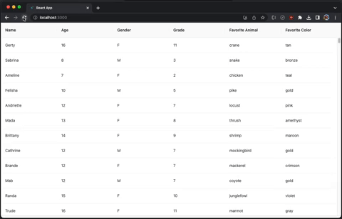
}Execute yarn start, and we see the table loads fast enough for 100,000 rows.
Change the count to 1,000,000. The table takes a few seconds to show up, but it still works.
In the code above, enable the following line:
const width = Math.floor(tableWidth / columns.length) + 100;It generates a horizontal and vertical scroll, and both scrolls work well and efficiently.
Resizing is responsive and smooth.
However, we simply use div to display text. It requires special customization for a cell to render advanced style.
Here is react-window’s scorecard:
- Gzipped size: 6.4 KB
- Data capacity: 1,000,000 rows
- Side effects: None
- Line of code: 116
- Resizing: Work well with
ResizeObserver, and resizing is responsive and smooth. - Customization: Needed
Utilizing React-Virtualized
react-virtualized is also a set of React components for efficiently rendering large lists and tabular data. It renders part of a large data set, just enough to fill the viewport.
Install the package, react-virtualized
% yarn add react-virtualizedIt becomes part of dependencies in package.json
"dependencies": {
  "react-virtualized": "^9.22.5"
}
react-virtualized is a precedent of react-window. It is bulky with full functionality. According to https://bundlephobia.com/, its gzipped size is 27.3 KB. Out of the box, react-virtualized has five major components, Collection, Grid, List, Masonry, and Table, along with eight high order components that help or decorate major components, AutoSizer, ArrowKeyStepper, CellMeasurer, ColumnSizer, InfiniteLoader, MultiGrid, ScrollSync, and WindowScroller.
react-virtualized is similar to react-window, except with a few small differences:
- Use
recomputeGridSizeto clear cached data for all items, instead ofresetAfterIndices. itemContentis a row renderer instead of a cell renderer.cellRendereris a prop instead of achildren.
The following src/App.js virtualizes Ant table using Grid. It uses ResizeObserver to adjust the table width if the browser resizes.
import { useEffect, useRef, useState } from 'react';
import { Grid } from 'react-virtualized';
import ResizeObserver from 'rc-resize-observer';
import { Table } from 'antd';
import { columns, getData } from './dataSource';
import './App.css';

/**
 * Create an Ant table that is wrapped inside ResizeObserver
 * @param {Object} props takes Table props
 * @returns Table Component
 */
function VirtualTable(props) {
  const { columns, scroll } = props;
  // a none-zero value to show correct header during refresh
  const [tableWidth, setTableWidth] = useState(1);

  // the column width is set to be the equal size
  // '+ 100' is a use case to generate a horizontal scroll
  const width = Math.floor(tableWidth / columns.length)/* + 100 */;

  // each column is assigned the width prop as required by components.body
  const mergedColumns = columns.map((column) => ({
    ...column,
    width,
  }));

  // a ref of the table
  const gridRef = useRef();

  // clear cached data for all items, starting from the top left cell
  const resetVirtualGrid = () => {
    gridRef.current?.recomputeGridSize({ columnIndex: 0, rowIndex: 0 });
  };

  // clear cached data after tableWidth changes
  useEffect(() => resetVirtualGrid, [tableWidth]);

  // generate the table body for Ant table
  const renderVirtualList = (
    rawData,
    { scrollbarSize, /* ref, */ onScroll }
  ) => {
    const totalHeight = rawData.length * 54; // cell height is 54

    return (
      // render each cell for proper width and height
      <Grid
        ref={gridRef}
        // call cell renderer to render each cell
        cellRenderer={({ columnIndex, rowIndex, style }) => (
          <div className="virtual-table-cell" style={style}>
            {rawData[rowIndex][mergedColumns[columnIndex].dataIndex]}
          </div>
        )}
        columnCount={mergedColumns.length}
        columnWidth={({ index }) => {
          const { width } = mergedColumns[index];
          // the last column needs to subtract scrollbar size, if there is a vertical scroll
          return totalHeight > scroll.y && index === mergedColumns.length - 1
            ? width - scrollbarSize - 1
            : width;
        }}
        height={scroll.y} // 650
        rowCount={rawData.length}
        rowHeight={() => 54}
        width={tableWidth}
        // needed to scroll header and body together when there is a horizontal scroll
        onScroll={({ scrollLeft }) => {
          onScroll({
            scrollLeft,
          });
        }}
      />
    );
  };

  return (
    // Ant table that is wrapped inside ResizeObserver
    <ResizeObserver
      onResize={({ width }) => {
        // adjust the table width, if the browser resizes
        setTableWidth(width);
      }}
    >
      <Table
        {...props}
        columns={mergedColumns}
        pagination={false}
        components={{
          body: renderVirtualList, // render the table body
        }}
      />
    </ResizeObserver>
  );
}

function App() {
  return (
    // create the VirtualTable
    <VirtualTable
      columns={columns} // column definition
      dataSource={getData(1000000)} // row data
      scroll={{
        y: 650, // the table height
      }}
    />
  );
}

export default App;
Execute yarn start. It takes a few seconds to load 1,000,000 rows, but it still works.
In the code above, enable the following line:
const width = Math.floor(tableWidth / columns.length) + 100;It generates a horizontal and vertical scroll, and both scrolls work well and efficiently.
Resizing is responsive and smooth.
However, we simply use div to display text. It requires special customization for a cell to render advanced style.
Here is react-virtualized’s scorecard:
- Gzipped size: 27.3 KB
- Data capacity: 1,000,000 rows
- Side effects: None
- Line of code: 111
- Resizing: Work well with
ResizeObserver, and resizing is responsive and smooth. - Customization: Needed
Utilizing React-Virtuoso
react-virtuoso is a set of React components that can render enormous data sets.
Install the package, react-virtuoso
% yarn add react-virtuosoIt becomes part of dependencies in package.json
"dependencies": {
  "react-virtuoso": "^4.3.1"
}
react-virtuoso is a medium-sized library. According to https://bundlephobia.com/, its gzipped size is 16.3 KB. Out of the box, react-window has four major components, Virtuoso, GroupedVirtuoso, TableVirtuoso, and VirtuosoGrid.
react-virtuoso is similar to react-window, or react-virtualized, except with a few differences:
- There is no method similar to
resetAfterIndicesorrecomputeGridSizethat clears cached data for all items.gridRefis removed, along with theuseEffectblock, to clear cached data upontableWidthchanges. useWindowScrollmakes the scrolling code simpler (no need to subtract the scrollbar size).itemContentis used to render each row.
The following src/App.js virtualizes Ant table using TableVirtuoso. It uses ResizeObserver to adjust the table width if the browser resizes.
import { useState } from 'react';
import { TableVirtuoso } from 'react-virtuoso';
import ResizeObserver from 'rc-resize-observer';
import { Table } from 'antd';
import { columns, getData } from './dataSource';
import './App.css';

/**
 * Create an Ant table that is wrapped inside ResizeObserver
 * @param {Object} props takes Table props
 * @returns Table Component
 */
function VirtualTable(props) {
  const { columns } = props;
  const [tableWidth, setTableWidth] = useState(0);

  // the column width is set to be the equal size
  // '+ 100' is a use case to generate a horizontal scroll
  const width = Math.floor(tableWidth / columns.length); /* + 100 */

  // each column is assigned the width prop as required by components.body
  const mergedColumns = columns.map((column) => ({
    ...column,
    width,
  }));

  // generate the table body for Ant table
  const renderVirtualList = (
    rawData
    /* { scrollbarSize, ref, onScroll } */
  ) => (
    // render each row for proper width, and the height is managed by useWindowScroll
    <TableVirtuoso
      data={rawData}
      useWindowScroll
      itemContent={(rowIndex, item) =>
        columns.map((col, colIndex) => {
          const { width } = mergedColumns[colIndex];
          return (
            <td
              className="virtual-table-cell"
              key={col.dataIndex}
              style={{
                minWidth: `${width}px`,
                height: 35,
              }}
            >
              {item[col.dataIndex]}
            </td>
          );
        })
      }
    />
  );

  return (
    // Ant table that is wrapped inside ResizeObserver
    <ResizeObserver
      onResize={({ width }) => {
        // adjust the table width, if the browser resizes
        setTableWidth(width);
      }}
    >
      <Table
        {...props}
        columns={mergedColumns}
        pagination={false}
        components={{
          body: renderVirtualList, // render the table body
        }}
      />
    </ResizeObserver>
  );
}

function App() {
  return (
    // create the VirtualTable
    <VirtualTable
      columns={columns} // column definition
      dataSource={getData(1000000)} // row data
      scroll={{
        // the table height, required by components.body
        // even it is not needed with useWindowScroll is set
        y: 650,
      }}
    />
  );
}

export default App;
Execute yarn start. It takes a few seconds to load 1,000,000 rows, but it still works.
In the code above, enable the following line:
const width = Math.floor(tableWidth / columns.length) + 100;It generates a horizontal and vertical scroll. Scroll to the right, and the header has been cut off.
This is caused by not clearing cached data for all items.
Change src/App.css to force .ant-table-header displaying overflow:
.virtual-table-cell {
  box-sizing: border-box;
  padding: 16px;
  border-bottom: 1px solid #e8e8e8;
}

.ant-table {
  border-bottom: 2px solid #e8e8e8;
}

.ant-table-header {
  overflow: visible !important;
}
Now, both scrolls work well and efficiently.
Resizing is responsive and smooth.
However, we simply use td to display text. It requires special customization for a cell to render advanced style.
Here is react-virtuoso’s scorecard:
- Gzipped size: 16.3 KB
- Data capacity: 1,000,000 rows
- Side effects: None
- Line of code: 91
- Resizing: Works with
ResizeObserver, but needs a hack to avoid the header being cut off. Resizing is responsive and smooth. - Customization: Needed
Utilizing Virtualized-Table-For-Antd
virtualized-table-for-antd is the virtualized table component for the Ant Design System. It is a specific implementation without using any virtualizing library. Although the package is named virtualizedtableforantd4, it works for both antd 4 and antd 5.
Install the package, virtualizedtableforantd4
% yarn add virtualizedtableforantd4It becomes part of dependencies in package.json
"dependencies": {
  "virtualizedtableforantd4": "^1.3.1"
}
According to https://snyk.io/advisor/npm-package/virtualizedtableforantd4, its installed size is 63.9 KB.
The following src/App.js calls useVT to create a virtualized table component used as Ant table’s component. It uses ResizeObserver to adjust the table width if the browser resizes.
import { useState } from 'react';
import { useVT } from 'virtualizedtableforantd4';
import ResizeObserver from 'rc-resize-observer';
import { Table } from 'antd';
import { columns, getData } from './dataSource';
import './App.css';

/**
 * Create an Ant table that is wrapped inside ResizeObserver
 * @param {Object} props takes Table props
 * @returns Table Component
 */
function VirtualTable(props) {
  const { columns, scroll, dataSource } = props;
  const [tableWidth, setTableWidth] = useState(0);
  // create a virtual table with specific height
  const [vt] = useVT(() => ({ scroll: { y: scroll.y } }), []);

  const totalHeight = dataSource.length * 54; // cell height is 54

  // each column is assigned the width prop
  // the column width is set to be the equal size, except the last column
  const width = Math.floor(tableWidth / columns.length);
  const mergedColumns = columns.map((column, index) => ({
    ...column,
    // width
    width: totalHeight > scroll.y && index === columns.length - 1
    ? Math.max([0, width - 25])
    : width,
  }));

  return (
    // Ant table that is wrapped inside ResizeObserver
    <ResizeObserver
      onResize={({ width }) => {
        // adjust the table width, if the browser resizes
        setTableWidth(width);
      }}
    >
      <Table
        {...props}
        columns={mergedColumns}
        dataSource={dataSource}
        pagination={false}
        components={vt} // render the whole virtual table
      />
    </ResizeObserver>
  );
}

function App() {
  return (
    // create the VirtualTable
    <VirtualTable
      columns={columns} // column definition
      dataSource={getData(250000)} // row data
      scroll={{
        y: 650, // the table height
      }}
    />
  );
}

export default App;
Execute yarn start. It takes a few seconds to load 250,000 rows. During the loading, there is some intermediate content showing.
While resizing the browser, the responsiveness is slow.
However, this kind of standalone package is not designed to work with ResizeObserver.
Getting rid of ResizeObserver, the usage of useVT is quite simple.
import { useVT } from 'virtualizedtableforantd4';
import { Table } from 'antd';
import { columns, getData } from './dataSource';
import './App.css';

/**
 * Create an Ant table that is wrapped inside ResizeObserver
 * @param {Object} props takes Table props
 * @returns Table Component
 */
function VirtualTable(props) {
  const { columns, scroll, dataSource } = props;
  // create a virtual table with specific height
  const [vt] = useVT(() => ({ scroll: { y: scroll.y } }), []);

  return (
      <Table
        {...props}
        columns={columns}
        dataSource={dataSource}
        pagination={false}
        components={vt} // render the whole virtual table
      />
  );
}

function App() {
  return (
    // create the VirtualTable
    <VirtualTable
      columns={columns} // column definition
      dataSource={getData(250000)} // row data
      scroll={{
        y: 650, // the table height
      }}
    />
  );
}

export default App;
Execute yarn start. It takes a few seconds to load 250,000 rows. During the loading, there is still some intermediate content showing.
However, resizing is a lot more responsive.
We use Ant Table directly, without any customization.
Here is react-virtualized’s scorecard:
- Installed size: 63.9 KB
- Data capacity: 250,000 rows
- Side effects: Intermediate content showing
- Line of code: 40
- Resizing: Work poorly with
ResizeObserver. Its own resizing is responsive and smooth. - Customization: Not needed
Utilizing Virtuallist-Antd
virtuallist-antd is another virtualized table component for the Ant Design System. It is a specific implementation without using any virtualizing library. This package works for both antd 4 and antd 5.
Install the package, virtuallist-antd
% yarn add virtuallist-antdIt becomes part of dependencies in package.json
"dependencies": {
  "virtuallist-antd": "^0.7.6"
}
virtuallist-antd is a small library. According to https://bundlephobia.com/, its gzipped size is 3.6 KB.
The following src/App.js calls VList to create a virtualized table component used as the Ant table’s component. It uses ResizeObserver to adjust the table width if the browser resizes.
import { useMemo, useState } from 'react';
import { VList } from 'virtuallist-antd';
import ResizeObserver from 'rc-resize-observer';
import { Table } from 'antd';
import { columns, getData } from './dataSource';
import './App.css';

/**
 * Create an Ant table that is wrapped inside ResizeObserver
 * @param {Object} props takes Table props
 * @returns Table Component
 */
function VirtualTable(props) {
  const { columns, scroll, dataSource } = props;
  const [tableWidth, setTableWidth] = useState(0);

  const totalHeight = dataSource.length * 54; // cell height is 54

  // each column is assigned the width prop
  // the column width is set to be the equal size, except the last column
  const width = Math.floor(tableWidth / columns.length);
  const mergedColumns = columns.map((column, index) => ({
    ...column,
    // width
    width: totalHeight > scroll.y && index === columns.length - 1
    ? Math.max([0, width - 25])
    : width,
  }));

  // useMemo improves loading performance
  const renderVirtualList = useMemo(() => {
    return VList({
      height: scroll.y,
    });
  }, [scroll.y]);

  return (
    // Ant table that is wrapped inside ResizeObserver
    <ResizeObserver
      onResize={({ width }) => {
        // adjust the table width, if the browser resizes
        setTableWidth(width);
      }}
    >
      <Table
        {...props}
        columns={mergedColumns}
        dataSource={dataSource}
        pagination={false}
        components={renderVirtualList} // render the whole virtual table
      />
    </ResizeObserver>
  );
}

function App() {
  return (
    // create the VirtualTable
    <VirtualTable
      columns={columns} // column definition
      dataSource={getData(250000)} // row data
      scroll={{
        y: 650, // the table height
      }}
    />
  );
}

export default App;
Execute yarn start. It takes a few seconds to load 250,000 rows. During the loading, there is some intermediate content showing.
While resizing the browser, the responsiveness is unsmooth.
However, this kind of standalone package is not designed to work with ResizeObserver.
Getting rid of ResizeObserver, the usage of VList is quite simple.
import { useMemo } from 'react';
import { VList } from 'virtuallist-antd';
import { Table } from 'antd';
import { columns, getData } from './dataSource';
import './App.css';

/**
 * Create an Ant table that is wrapped inside ResizeObserver
 * @param {Object} props takes Table props
 * @returns Table Component
 */
function VirtualTable(props) {
  const { columns, scroll, dataSource } = props;

  // useMemo improves loading performance
  const renderVirtualList = useMemo(() => {
    return VList({
      height: scroll.y,
    });
  }, [scroll.y]);

  return (
    <Table
      {...props}
      columns={columns}
      dataSource={dataSource}
      pagination={false}
      components={renderVirtualList} // render the whole virtual table
    />
  );
}

function App() {
  return (
    // create the VirtualTable
    <VirtualTable
      columns={columns} // column definition
      dataSource={getData(250000)} // row data
      scroll={{
        y: 650, // the table height
      }}
    />
  );
}

export default App;
Execute yarn start. It takes a few seconds to load 250,000 rows. During the loading, there is still some intermediate content showing.
However, resizing is a lot more responsive.
We use Ant Table directly, without any customization.
Here is virtuallist-antd’s scorecard:
- Gzipped size: 3.6 KB
- Data capacity: 250,000 rows
- Side effects: Intermediate content showing
- Line of code: 46
- Resizing: Work poorly with
ResizeObserver. Its own resizing is responsive and smooth. - Customization: Not needed
The AG Grid
AGnostic(AG) Grid is a performant table component, which has builtin virtualization capability. It supports plain JavaScript, React, Angular, and Vue. AG Grid has community edition and enterprise edition. The community edition is free, even for commercial use.
Let’s install ag-grid-community and ag-grid-react to see how it works:
% yarn add ag-grid-community ag-grid-reactThey become part of dependencies in package.json, along with unique-names-generator.
"dependencies": {
  "ag-grid-community": "^29.3.5",
  "ag-grid-react": "^29.3.5",
  "unique-names-generator": "^4.7.1"
}
Modify src/dataSource.js, which defines table columns and data, slightly different from the Ant Design.
const {
  uniqueNamesGenerator,
  names,
  animals,
  colors,
} = require('unique-names-generator');

// table columns are defined as Name, Age, Gender, Grader,
// Favorite Animal, and Favorite Color.
export const columns = [
  {
    field: 'name',
    flex: 1,
  },
  {
    field: 'age',
    flex: 1,
  },
  {
    field: 'gender',
    flex: 1,
  },
  {
    field: 'grade',
    flex: 1,
  },
  {
    field: 'animal',
    headerName: 'Favorite Animal',
    flex: 1,
  },
  {
    field: 'color',
    headerName: 'Favorite Color',
    flex: 1,
  },
];

// generates row data with a given count
export const getData = (count) => {
  const data = [];
  for (let i = 0; i < count; i++) {
    const grade = Math.floor(Math.random() * 11) + 1;
    data[i] = {
      name: uniqueNamesGenerator({
        dictionaries: [names],
      }),
      age: grade + 5,
      gender: Math.random() > 0.5 ? 'F' : 'M',
      grade,
      animal: uniqueNamesGenerator({
        dictionaries: [animals],
      }),
      color: uniqueNamesGenerator({
        dictionaries: [colors],
      }),
    };
  }
  return data;
};
The following src/App.js uses AgGridReact. There is no need for ResizeObserver, as the row width can be configured by flex to adjust to the browser size.
import { AgGridReact } from 'ag-grid-react'; // the AG Grid React Component
import 'ag-grid-community/styles/ag-grid.css'; // core grid CSS, always needed
import 'ag-grid-community/styles/ag-theme-alpine.css'; // optional theme CSS
import { columns, getData } from './dataSource';

function App() {
  return (
    // create the ag grid
    <div className="ag-theme-alpine" style={{ height: 650 }}>
      <AgGridReact
        columnDefs={columns} // column definition
        rowData={getData(100000)} // row data
      />
    </div>
  );
}

export default App;
Execute yarn start, and we see the table takes a few seconds to load 1,000,000 rows.
ag-theme-alpine.css is used for this example. Addtional theme needs to be implemented for specific customization.
The builtin resizing works perfectly.
Here is ag-grid-react’s scorecard:
- Gzipped size: 15.1 KB (
ag-grid-react) + 222.7 KB (ag-grid-community) = 237.8 KB - Data capacity: 1,000,000 rows
- Side effects: None
- Line of code: 18
- Resizing: Builtin and perfect
- Customization: Needed
If you are free to use any table component and do not mind the additional bundle size, we strongly recommend Ag Gird.
Here is ColDef of Ag Gird columns, with many built in setting.
export interface ColDef<TData = any> extends AbstractColDef<TData>, IFilterDef {
/** The unique ID to give the column. This is optional. If missing, the ID will default to the field.
* If both field and colId are missing, a unique ID will be generated.
* This ID is used to identify the column in the API for sorting, filtering etc. */
colId?: string;
/**
* The field of the row object to get the cell's data from.
* Deep references into a row object is supported via dot notation, i.e `'address.firstLine'`.
*/
field?: string;
/**
* A comma separated string or array of strings containing `ColumnType` keys which can be used as a template for a column.
* This helps to reduce duplication of properties when you have a lot of common column properties.
*/
type?: string | string[];
/** Function or expression. Gets the value from your data for display. */
valueGetter?: string | ValueGetterFunc<TData>;
/** A function or expression to format a value, should return a string. Not used for CSV export or copy to clipboard, only for UI cell rendering. */
valueFormatter?: string | ValueFormatterFunc<TData>;
/** Provided a reference data map to be used to map column values to their respective value from the map. */
refData?: {
[key: string]: string;
};
/**
* Function to return a string key for a value.
* This string is used for grouping, Set filtering, and searching within cell editor dropdowns.
* When filtering and searching the string is exposed to the user, so make sure to return a human-readable value. */
keyCreator?: (params: KeyCreatorParams<TData>) => string;
/**
* Custom comparator for values, used by renderer to know if values have changed. Cells who's values have not changed don't get refreshed.
* By default the grid uses `===` is used which should work for most use cases.
*/
equals?: (valueA: any, valueB: any) => boolean;
/** The field of the tooltip to apply to the cell. */
tooltipField?: string;
/**
* Callback that should return the string to use for a tooltip, `tooltipField` takes precedence if set.
* If using a custom `tooltipComponent` you may return any custom value to be passed to your tooltip component.
*/
tooltipValueGetter?: (params: ITooltipParams<TData>) => string | any;
/** Set to `true` (or return `true` from function) to render a selection checkbox in the column. Default: `false` */
checkboxSelection?: boolean | CheckboxSelectionCallback<TData>;
/** Set to `true` to display a disabled checkbox when row is not selectable and checkboxes are enabled. Default: `false` */
showDisabledCheckboxes?: boolean;
/** Icons to use inside the column instead of the grid's default icons. Leave undefined to use defaults. */
icons?: {
[key: string]: Function | string;
};
/**
* Set to `true` if this column is not navigable (i.e. cannot be tabbed into), otherwise `false`.
* Can also be a callback function to have different rows navigable.
* Default: `false`
*/
suppressNavigable?: boolean | SuppressNavigableCallback<TData>;
/** Allows the user to suppress certain keyboard events in the grid cell. Default: `false` */
suppressKeyboardEvent?: (params: SuppressKeyboardEventParams<TData>) => boolean;
/**
* Pasting is on by default as long as cells are editable (non-editable cells cannot be modified, even with a paste operation).
* Set to `true` turn paste operations off.
*/
suppressPaste?: boolean | SuppressPasteCallback<TData>;
/** Set to true to prevent the fillHandle from being rendered in any cell that belongs to this column */
suppressFillHandle?: boolean;
/** Set to `true` for this column to be hidden. Default: `false` */
hide?: boolean;
/** Same as `hide`, except only applied when creating a new column. Not applied when updating column definitions. */
initialHide?: boolean;
/** Set to `true` to block making column visible / hidden via the UI (API will still work). Default: `false` */
lockVisible?: boolean;
/** Lock a column to position to `'left'` or`'right'` to always have this column displayed in that position. `true` is treated as `'left'` */
lockPosition?: boolean | 'left' | 'right';
/** Set to `true` if you do not want this column to be movable via dragging. Default: `false` */
suppressMovable?: boolean;
/** Set to `true` if this column is editable, otherwise `false`. Can also be a function to have different rows editable. Default: `false` */
editable?: boolean | EditableCallback<TData>;
/** Function or expression. Sets the value into your data for saving. Return `true` if the data changed. */
valueSetter?: string | ValueSetterFunc<TData>;
/** Function or expression. Parses the value for saving. */
valueParser?: string | ValueParserFunc<TData>;
/**
* Provide your own cell editor component for this column's cells.
* See [Cell Editor](https://www.ag-grid.com/javascript-data-grid/component-cell-editor/) for framework specific implementation detail.
*/
cellEditor?: any;
/** @deprecated As of v27, use `cellEditor` for framework components too. */
cellEditorFramework?: any;
/** Params to be passed to the `cellEditor` component. */
cellEditorParams?: any;
/** Callback to select which cell editor to be used for a given row within the same column. */
cellEditorSelector?: CellEditorSelectorFunc<TData>;
/** Set to `true` to have cells under this column enter edit mode after single click. Default: `false` */
singleClickEdit?: boolean;
/**
* Set to `true`, to have the cell editor appear in a popup.
*/
cellEditorPopup?: boolean;
/**
* Set the position for the popup cell editor. Possible values are
* - `over` Popup will be positioned over the cell
* - `under` Popup will be positioned below the cell leaving the cell value visible.
*
* Default: `over`. */
cellEditorPopupPosition?: 'over' | 'under';
/** Callback for after the value of a cell has changed, either due to editing or the application calling `api.setValue()`. */
onCellValueChanged?: (event: NewValueParams<TData>) => void;
/** Callback called when a cell is clicked. */
onCellClicked?: (event: CellClickedEvent<TData>) => void;
/** Callback called when a cell is double clicked. */
onCellDoubleClicked?: (event: CellDoubleClickedEvent<TData>) => void;
/** Callback called when a cell is right clicked. */
onCellContextMenu?: (event: CellContextMenuEvent<TData>) => void;
/** A function to tell the grid what Quick Filter text to use for this column if you don't want to use the default (which is calling `toString` on the value). */
getQuickFilterText?: (params: GetQuickFilterTextParams<TData>) => string;
/** Function or expression. Gets the value for filtering purposes. */
filterValueGetter?: string | ValueGetterFunc<TData>;
/** Whether to display a floating filter for this column. Default: `false` */
floatingFilter?: boolean;
/** If enabled then column header names that are too long for the column width will wrap onto the next line. Default `false` */
wrapHeaderText?: boolean;
/** If enabled then the column header row will automatically adjust height to accommodate the size of the header cell.
* This can be useful when using your own `headerComponent` or long header names in conjunction with `wrapHeaderText`.
* Default: `false`
*/
autoHeaderHeight?: boolean;
/**
* The custom header component to be used for rendering the component header. If none specified the default AG Grid header component is used.
* See [Header Component](https://www.ag-grid.com/javascript-data-grid/component-header/) for framework specific implementation detail.
*/
headerComponent?: any;
/** @deprecated As of v27, use `headerComponent` for framework components too. */
headerComponentFramework?: any;
/** The parameters to be passed to the `headerComponent`. */
headerComponentParams?: any;
/**
* Set to an array containing zero, one or many of the following options: `'filterMenuTab' | 'generalMenuTab' | 'columnsMenuTab'`.
* This is used to figure out which menu tabs are present and in which order the tabs are shown.
*/
menuTabs?: ColumnMenuTab[];
/** Params used to change the behaviour and appearance of the Columns Menu tab. */
columnsMenuParams?: ColumnsMenuParams;
/** Set to `true` if no menu should be shown for this column header. Default: `false` */
suppressMenu?: boolean;
/** If `true` or the callback returns `true`, a 'select all' checkbox will be put into the header. */
headerCheckboxSelection?: boolean | HeaderCheckboxSelectionCallback<TData>;
/** If `true`, the header checkbox selection will only select filtered items. */
headerCheckboxSelectionFilteredOnly?: boolean;
/** If `true`, the header checkbox selection will only select nodes on the current page. */
headerCheckboxSelectionCurrentPageOnly?: boolean;
/** Defines the chart data type that should be used for a column. */
chartDataType?: 'category' | 'series' | 'time' | 'excluded';
/** Pin a column to one side: `right` or `left`. A value of `true` is converted to `'left'`. */
pinned?: boolean | 'left' | 'right' | null;
/** Same as `pinned`, except only applied when creating a new column. Not applied when updating column definitions. */
initialPinned?: boolean | 'left' | 'right';
/** Set to true to block the user pinning the column, the column can only be pinned via definitions or API. Default: `false` */
lockPinned?: boolean;
/** Set to true to pivot by this column. */
pivot?: boolean;
/** Same as `pivot`, except only applied when creating a new column. Not applied when updating column definitions. */
initialPivot?: boolean;
/**
* Set this in columns you want to pivot by.
* If only pivoting by one column, set this to any number (e.g. `0`).
* If pivoting by multiple columns, set this to where you want this column to be in the order of pivots (e.g. `0` for first, `1` for second, and so on).
*/
pivotIndex?: number | null;
/** Same as `pivotIndex`, except only applied when creating a new column. Not applied when updating column definitions. */
initialPivotIndex?: number;
/**
* Comparator to use when ordering the pivot columns, when this column is used to pivot on.
* The values will always be strings, as the pivot service uses strings as keys for the pivot groups.
*/
pivotComparator?: (valueA: string, valueB: string) => number;
/** Set to `true` if you want to be able to pivot by this column via the GUI. This will not block the API or properties being used to achieve pivot. Default: `false` */
enablePivot?: boolean;
/** An object of css values / or function returning an object of css values for a particular cell. */
cellStyle?: CellStyle | CellStyleFunc<TData>;
/** Class to use for the cell. Can be string, array of strings, or function that returns a string or array of strings. */
cellClass?: string | string[] | CellClassFunc<TData>;
/** Rules which can be applied to include certain CSS classes. */
cellClassRules?: CellClassRules<TData>;
/**
* Provide your own cell Renderer component for this column's cells.
* See [Cell Renderer](https://www.ag-grid.com/javascript-data-grid/component-cell-renderer/) for framework specific implementation details.
*/
cellRenderer?: any;
/** @deprecated As of v27, use `cellRenderer` for framework components too. */
cellRendererFramework?: any;
/** Params to be passed to the `cellRenderer` component. */
cellRendererParams?: any;
/** Callback to select which cell renderer to be used for a given row within the same column. */
cellRendererSelector?: CellRendererSelectorFunc<TData>;
/** Set to `true` to have the grid calculate the height of a row based on contents of this column. Default: `false` */
autoHeight?: boolean;
/** Set to `true` to have the text wrap inside the cell - typically used with `autoHeight`. Default: `false` */
wrapText?: boolean;
/** Set to `true` to flash a cell when it's refreshed. Default: `false` */
enableCellChangeFlash?: boolean;
/** Set to `true` to prevent this column from flashing on changes. Only applicable if cell flashing is turned on for the grid. Default: `false` */
suppressCellFlash?: boolean;
/** `boolean` or `Function`. Set to `true` (or return `true` from function) to allow row dragging. Default: `false` */
rowDrag?: boolean | RowDragCallback<TData>;
/**
* A callback that should return a string to be displayed by the `rowDragComp` while dragging a row.
* If this callback is not set, the `rowDragText` callback in the `gridOptions` will be used and
* if there is no callback in the `gridOptions` the current cell value will be used.
*/
rowDragText?: (params: IRowDragItem, dragItemCount: number) => string;
/** `boolean` or `Function`. Set to `true` (or return `true` from function) to allow dragging for native drag and drop. Default: `false` */
dndSource?: boolean | DndSourceCallback<TData>;
/** Function to allow custom drag functionality for native drag and drop. */
dndSourceOnRowDrag?: (params: DndSourceOnRowDragParams<TData>) => void;
/** Set to `true` to row group by this column. Default: `false` */
rowGroup?: boolean;
/** Same as `rowGroup`, except only applied when creating a new column. Not applied when updating column definitions. */
initialRowGroup?: boolean;
/**
* Set this in columns you want to group by.
* If only grouping by one column, set this to any number (e.g. `0`).
* If grouping by multiple columns, set this to where you want this column to be in the group (e.g. `0` for first, `1` for second, and so on).
*/
rowGroupIndex?: number | null;
/** Same as `rowGroupIndex`, except only applied when creating a new column. Not applied when updating column definitions. */
initialRowGroupIndex?: number;
/**
* Set to `true` if you want to be able to row group by this column via the GUI.
* This will not block the API or properties being used to achieve row grouping.
* Default: `false`
*/
enableRowGroup?: boolean;
/**
* Set to `true` if you want to be able to aggregate by this column via the GUI.
* This will not block the API or properties being used to achieve aggregation.
* Default: `false`
*/
enableValue?: boolean;
/** Name of function to use for aggregation. In-built options are: `sum`, `min`, `max`, `count`, `avg`, `first`, `last`. Also accepts a custom aggregation name or an aggregation function. */
aggFunc?: string | IAggFunc<TData> | null;
/** Same as `aggFunc`, except only applied when creating a new column. Not applied when updating column definitions. */
initialAggFunc?: string | IAggFunc<TData>;
/**
* The name of the aggregation function to use for this column when it is enabled via the GUI.
* Note that this does not immediately apply the aggregation function like `aggFunc`
* Default: `sum`
*/
defaultAggFunc?: string;
/**
* Aggregation functions allowed on this column e.g. `['sum', 'avg']`.
* If missing, all installed functions are allowed.
* This will only restrict what the GUI allows a user to select, it does not impact when you set a function via the API. */
allowedAggFuncs?: string[];
/** Set to true to have the grid place the values for the group into the cell, or put the name of a grouped column to just show that group. */
showRowGroup?: string | boolean;
/** Set to `true` to allow sorting on this column. Default: `false` */
sortable?: boolean;
/** If sorting by default, set it here. Set to `asc` or `desc`. */
sort?: SortDirection;
/** Same as `sort`, except only applied when creating a new column. Not applied when updating column definitions. */
initialSort?: SortDirection;
/** If sorting more than one column by default, specifies order in which the sorting should be applied. */
sortIndex?: number | null;
/** Same as `sortIndex`, except only applied when creating a new column. Not applied when updating column definitions. */
initialSortIndex?: number;
/** Array defining the order in which sorting occurs (if sorting is enabled). An array with any of the following in any order `['asc','desc',null]` */
sortingOrder?: (SortDirection)[];
/**
* Override the default sorting order by providing a custom sort comparator.
*
* - `valueA`, `valueB` are the values to compare.
* - `nodeA`, `nodeB` are the corresponding RowNodes. Useful if additional details are required by the sort.
* - `isDescending` - `true` if sort direction is `desc`. Not to be used for inverting the return value as the grid already applies `asc` or `desc` ordering.
*
* Return:
* - `0` valueA is the same as valueB
* - `> 0` Sort valueA after valueB
* - `< 0` Sort valueA before valueB
*/
comparator?: (valueA: any, valueB: any, nodeA: IRowNode<TData>, nodeB: IRowNode<TData>, isDescending: boolean) => number;
/** Set to `true` if you want the unsorted icon to be shown when no sort is applied to this column. Default: `false` */
unSortIcon?: boolean;
/** By default, each cell will take up the width of one column. You can change this behaviour to allow cells to span multiple columns. */
colSpan?: (params: ColSpanParams<TData>) => number;
/** By default, each cell will take up the height of one row. You can change this behaviour to allow cells to span multiple rows. */
rowSpan?: (params: RowSpanParams<TData>) => number;
/** Initial width in pixels for the cell. */
width?: number;
/** Same as `width`, except only applied when creating a new column. Not applied when updating column definitions. */
initialWidth?: number;
/** Minimum width in pixels for the cell. */
minWidth?: number;
/** Maximum width in pixels for the cell. */
maxWidth?: number;
/** Used instead of `width` when the goal is to fill the remaining empty space of the grid. */
flex?: number;
/** Same as `flex`, except only applied when creating a new column. Not applied when updating column definitions. */
initialFlex?: number;
/** Set to `true` to allow this column should be resized. Default: `false` */
resizable?: boolean;
/** Set to `true` if you want this column's width to be fixed during 'size to fit' operations. Default: `false` */
suppressSizeToFit?: boolean;
/** Set to `true` if you do not want this column to be auto-resizable by double clicking it's edge. Default: `false` */
suppressAutoSize?: boolean;
/** Never set this, it is used internally by grid when doing in-grid pivoting */
pivotValueColumn?: Column | null;
/** Never set this, it is used internally by grid when doing in-grid pivoting */
pivotTotalColumnIds?: string[];
/** Set to `true` if you want this column header for this column to span the whole height of the header container. Default: `false` */
spanHeaderHeight?: boolean;
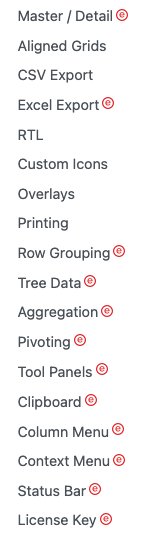
}The enterprise edition supports Row Grouping, Tree Data, Aggregation, and other features that are marked with the Enterprise icon:
Let’s use Tree Data to build a treetable. First, install the additional ag-grid-enterprise:
% yarn add ag-grid-enterpriseIt is added to dependencies in package.json.
"dependencies": {
  "ag-grid-community": "^29.3.5",
  "ag-grid-enterprise": "^29.3.5",
  "ag-grid-react": "^29.3.5",
  "unique-names-generator": "^4.7.1"
}
The name field is removed from src/dataSource.js.
{̶
̶ ̶ ̶f̶i̶e̶l̶d̶:̶ ̶'̶n̶a̶m̶e̶'̶,̶
̶ ̶ ̶f̶l̶e̶x̶:̶ ̶1̶,̶
̶}̶
Instead, the name field is defined as a grouped column in src/App.js:
import { AgGridReact } from 'ag-grid-react'; // the AG Grid React Component
import 'ag-grid-enterprise'; // it is required for treeData
import 'ag-grid-community/styles/ag-grid.css'; // core grid CSS, always needed
import 'ag-grid-community/styles/ag-theme-alpine.css'; // optional theme CSS
import { columns, getData } from './dataSource';
function App() {
return (
// create the ag grid
<div className="ag-theme-alpine" style={{ height: 650 }}>
<AgGridReact
columnDefs={columns} // column definition
rowData={getData(50)} // row data
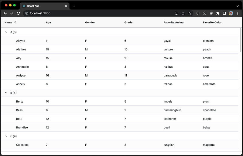
treeData={true} // enable the treetable mode
getDataPath={(data) => [data.name[0], data.name]} // the path to build tree structure
groupDefaultExpanded={-1} // expand all groups by default
autoGroupColumnDef={{ // define the grouping column
colId: 'group',
headerName: 'Name',
minWidth: 100,
sortable: true,
initialSort: 'asc',
}}
/>
</div>
);
}
export default App;Set the row size to 50, and we can see a few grouped rows in the viewing area:
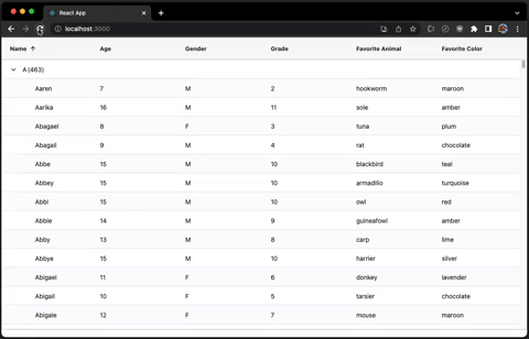
Set the row size to 1,000,000, and run. Albeit it is slow, the treetable still loads:
Conclusion
We have explored virtualization techniques using Ant Table as an example, with popular virtualizing libraries, react-window, react-virtualized, and react-virtuoso, as well as specific libraries built for Ant table virtualization, virtualized-table-for-antd and virtuallist-antd.
Here are the final scorecards:
react-window
- Gzipped size: 6.4 KB
- Data capacity: 1,000,000 rows
- Side effects: None
- Line of code: 46
- Resizing: Work well with
ResizeObserver, and resizing is responsive and smooth. - Customization: Needed
react-virtualized
- Gzipped size: 27.3 KB
- Data capacity: 1,000,000 rows
- Side effects: None
- Line of code: 111
- Resizing: Work well with
ResizeObserver, and resizing is responsive and smooth. - Customization: Needed
react-virtuoso
- Gzipped size: 16.3 KB
- Data capacity: 1,000,000 rows
- Side effects: None
- Line of code: 91
- Resizing: Works with
ResizeObserver, but needs a hack to show the table header’s overflow part. Resizing is responsive and smooth. - Customization: Needed
virtualized-table-for-antd
- Installed size: 63.9 KB
- Data capacity: 250,000 rows
- Side effects: Intermediate content showing
- Line of code: 40
- Resizing: Work poorly with
ResizeObserver. Its own resizing is responsive and smooth. - Customization: Not needed
virtuallist-antd
- Gzipped size: 3.6 KB
- Data capacity: 250,000 rows
- Side effects: Intermediate content showing
- Line of code: 46
- Resizing: Work poorly with
ResizeObserver. Its own resizing is responsive and smooth. - Customization: Not needed
Among the above five ways, react-window is our choice, similar to the recommendation of React Table and Ant Table.
However, if you are free to use any table component and do not mind the additional bundle size, we strongly recommend Ag Gird, which has the builtin virtualization capability.
- Gzipped size: 237.8 KB
- Data capacity: 1,000,000 rows
- Side effects: None
- Line of code: 18
- Resizing: Builtin and perfect
- Customization: Needed
If you have the budget for the Ag Gird enterprise, it would be even better.
Thanks for reading.
Thanks, S Sreeram and Durgadevi Siripurapu for working with me on the Domino products.
Want to Connect?

If you are interested, check out my directory of web development articles.


