
Building a TreeTable Using Ant Design System
10 steps to build a TreeTable component

A Table, also called a data grid, is an arrangement of data in rows and columns or possibly in a more complex structure. It is an essential building block of a user interface.
A TreeTable is an extension of a Table that supports a tree-like hierarchy, typically in the first column. As a Tree, the hierarchy is determined by the parent-children relationships.
We have written about Ant Tables with sorting, filtering, pagination, row selections, infinite scrolling, and many more features. In this article, we will build a TreeTable using its nested-table capability. It takes ten steps to build, and you can always scroll down to the end to see the final source code.
Set up Working Environment
We use Create React App as a base to explore TreeTables. The following command creates a React project:
% yarn create react-app react-tree-table
% cd react-tree-table
We install three additional packages:
% yarn add antd styled-components unique-names-generatorantd: Ant Design System is an open source code for enterprise-level UI design languages and React UI library. We useantd’s Table component to build a TreeTable.styled-components: It is a React-specific CSS-in-JS styling solution that writes CSS code in JavaScript to style components. We usestyled-componentsto style the TreeTable.unique-names-generator: It is a tool to generate unique and memorable name strings. We useunique-names-generatorto generate the TreeTable content.
After the installation, these packages become part of dependencies in package.json:
"dependencies": {
  "antd": "^5.0.0",
  "styled-components": "^5.3.6",
  "unique-names-generator": "^4.7.1"
}
The working environment is ready to build a TreeTable.
Step1: Build a Flat Table
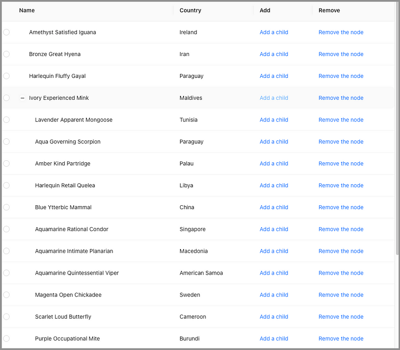
A TreeTable is first a Table. Let’s start with the following flat table:
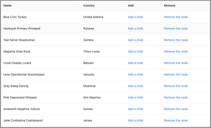
The table has four columns:
Name: It is a name concatenated by a color, an adjective, and an animal. The name is generated byuniqueNamesGenerator.
const createName = () =>
  uniqueNamesGenerator({
    dictionaries: [colors, adjectives, animals],
    style: 'capital',
    separator: ' ',
});County: It is a country name that is generated byuniqueNamesGenerator.
const createCountryName = () =>
  uniqueNamesGenerator({
    dictionaries: [countries],
    style: 'capital',
});Add: It is the add action that adds a child node under the current row. At this point, it is a pure link without any action.
render: () => <a>Add a child</a>Remove: It is the remove action that removes the current row along with children. At this point, it is a pure link without any action.
render: () => <a>Remove the node</a>We build a method, createNewRow, to generate a new row, which has three props, key, name and country.
const createNewRow = () => {
  const name = createName();
  return {
    key: name,
    name,
    country: createCountryName(),
  };
};
The method, createTableData, is used to generate table data with a specified row count (rowCount).
const createTableData = (rowCount) =>
  Array(rowCount)
    .fill(1)
    .map(() => createNewRow());
Modify src/App.js to the following:
- At line 40, the initial Table is created with ten rows.
- At lines 42–64, Table
columnsare defined. - At lines 67–71, the app returns a Table component, with
paginationturned off (line 68),columns(line 69) anddataSource(line 70) set.
Execute yarn start, and we see a flat Table.
Step 2: Implement Add a Child Action
To have a TreeTable, we need to implement Add a child action. A child node is created under the current row when the cell is clicked.
Here is the modified Table columns:
- At lines 14–25, the
onCellattribute is added, which sets props for the cell. One of props can be theonClickcallback (lines 16–23). It also passes in the current row’srecordas a parameter (line 14). - In
antd, a Table row is a parent if itsrecord’schildrenprop is an array of records (could be an empty array for dynamic loading). - At line 18,
record.childrenis set to[], if it is not initialized yet. - At line 21, the newly generated row is added to
record.children. As we have mutatedtableDataby changingrecord.children,setTableDatais called to update the reference.
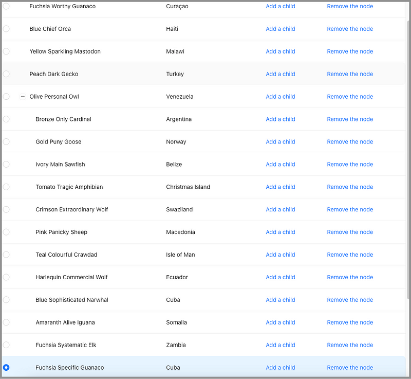
Execute yarn start. Click the first row’s Add a child, and we see a + icon shows up. It indicates that Tomato Outdoor Impala is a parent.
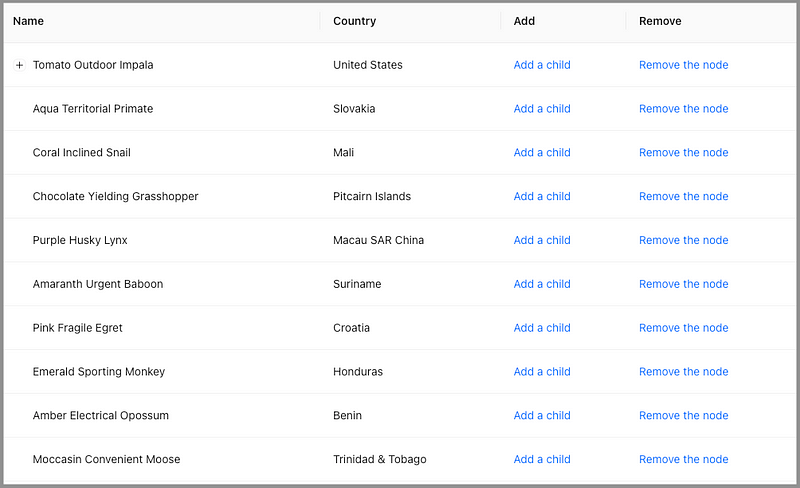
Click the first row’s Add a child again, and nothing happens. The newly added children are hidden behind the + icon.
We would like a parent node expanded to make the newly added row visible. This leads to the next step.
Step 3: Expand the Active Parent Node
How do we expand a parent node?
Table has an expandable prop that controls which parents are open. expandable is a subtable, and could even have an independent column header. For a TreeTable, the subtable’s column header is not needed. Instead, the following configuration props are relevant:
defaultExpandAllRows: It specifies whether to expand all rows initially, and the default value is false.defaultExpandedRowKeys: It specifies initial expanded row keys, and its type isstring[].expandedRowClassName: It specifies the expanded row’sclassName, and its type isfunction(record, index, indent): string.expandedRowKeys: It specifies the row keys whose node is open, and its type isstring[].expandIcon: It customizes the row expansion icon, and its type isfunction({ expanded, onExpand, record })): ReactNode.indentSize: It specifies the indentation size for a subtree, and its type isnumber.onExpand: It is a callback function that is invoked when the row expansion icon is clicked. Its type isfunction(expanded, record).onExpandedRowsChange: It is a callback function that is invoked when the expanded rows change. Its type isfunction(expandedRows).
In TreeTable, expandedRowKeys is used to control whether tree nodes are expanded. The rows that have keys in expandedRowKeys are expanded. Otherwise, those rows are collapsed. Since we take control of expandedRowKeys, its value needs to be managed whenever a user clicks a row expand icon.
expandable={{
  expandedRowKeys,
  onExpandedRowsChange: (expandedRows) => {
    setExpandedRowKeys(expandedRows);
  },
}}
Here is the improved src/App.js:
- At line 8, the state,
expandedRowKeys, is created. - At line 32, the newly added child’s parent key is added to
expandedRowKeys. - At lines 52–57, Table’s
expandableprop is defined.
Execute yarn start. Whenever we add a child, the parent node is automatically expanded.
We can see added children. However, after adding several children, we get confused about which one is the newly added one. The TreeTable needs further improvement.
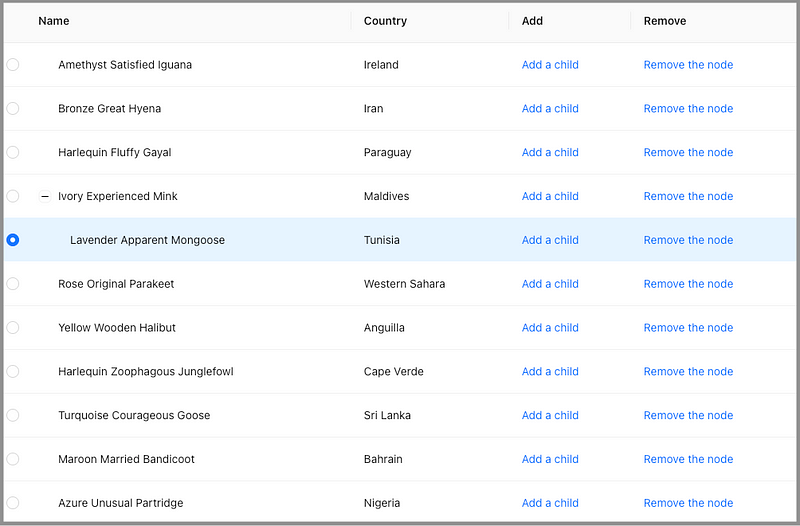
Step 4: Highlight the Newly Added Child
There are many ways to style a row. For simplicity, we use Table’s rowSelection to highlight the newly added row. If Table’s rowSelection prop is configured, the selected row is highlighted. Among many props of rowSelection, we set two of them:
selectedRowKeys: It specifies the selected row keys and its type isstring[].type: It specifies the type, eithercheckboxorradio. The default value ischeckbox.
We choose radio for rowSelection, as radio does not allow multi-selection.
rowSelection={{ selectedRowKeys, type: 'radio' }}This is purely a hack. Alternatively, we can use className to highlight the row. The className can be conditionally set based on whether its key is equal to newRowKey that will be defined in the next step.
Here is the modified src/App.js:
- At line 9, the state,
selectedRowKeys, is created. - At line 34, the newly created child’s key is added to
selectedRowKeys. - At line 52, Table’s
rowSelectionprop is defined. - At line 59, clear the highlighting when a user clicks a row expansion icon.
Execute yarn start. The newly added child is highlighted.
If we keep adding more children, eventually, the newly added child is out of view.
We need another improvement.
Step 5: Scroll the Newly Added Child Into the View
A JavaScript element has a method, scrollIntoView(), that scrolls its ancestor’s container to make the element viewable.
It has three formats:
scrollIntoView(): It takes no parameter and scrolls to the top of the ancestor’s container.scrollIntoView(alignToTop):alignToTopis a boolean value. If true, it scrolls to the top of the ancestor’s container. Otherwise, it scrolls to the bottom of the ancestor’s container.scrollIntoView(scrollIntoViewOptions):scrollIntoViewOptionsis an Object with the following properties: –behavior: It defines the transition animation, eitherautoorsmooth, and the default value isauto. –block: It defines vertical alignment, eitherstart,center,end, ornearest, and the default value isstart. –inline: It defines horizontal alignment, eitherstart,center,end, ornearest, and the default value isnearest.
scrollIntoView(true) is equivalent to scrollIntoViewOptions({block: "start", inline: "nearest"}). scrollIntoView(false) is equivalent to scrollIntoViewOptions({block: "end", inline: "nearest"}).
With scrollIntoView, the newly added child can be scrolled into view.
Here is the modified src/App.js:
- At line 9, the state,
newRowKey, is created. - At lines 12–19,
useEffectis invoked whennewRowKeyis changed. It finds the newly added row element (lines 14–16) and callsscrollIntoView(line 17) to scroll it into view. - At line 44,
newRowKeyis updated with the newly added child’skey. - At line 71, clear
newRowKeyupon row expansion changes.
Execute yarn start. Keep clicking Add a child on the row, Olive Personal Owl, and the newly added child is always in view.
Step 6: Implement Remove the Node Action
We have Add a child working. The next step is to make Remove the node working.
removeRowFromTableData is a method that removes a row with the specific key from the input list, data. There are two use cases for this method:
- If a row does not have a parent, the row is removed from the table data. In this case, data is
tableData. - If a row has a parent, the row is removed from its parent’s children list. In this case, data is
record.parent.children.
const removeRowFromTableData = (data = [], key) => {
  if (key) {
    const index = data.findIndex((item) => item.key === key);
    if (index !== -1) {
      data.splice(index, 1);
    }
  }
};
Here is the modified Table columns:
- To know
record.parent, theAddcolumnonCell’sonClickcallback (lines 14–29) saves a parent reference for the newly added child (line 21). - At lines 36–55, the
Removecolumn adds theonCellattribute. Its callback,onClick, handles the remove action. Ifrecordhas a parent, it is removed from the parent’s children list (line 41). Otherwise, it is removed fromtableData(line 46). - At lines 42–44, it deletes an empty
children. This removes the parent node’s expansion icon. - At lines 48–52, the component’s states are updated:
–
tableDatais updated with a new reference (line 48). –expandedRowKeySetis updated by deletingrecord.key(lines 49–50). –newRowKeyis updated toundefined(line 51). –selectedRowKeysis updated to[](line 52).
Execute yarn start. Click Remove the node on a row, and the row, along with its children, if any, will be removed.
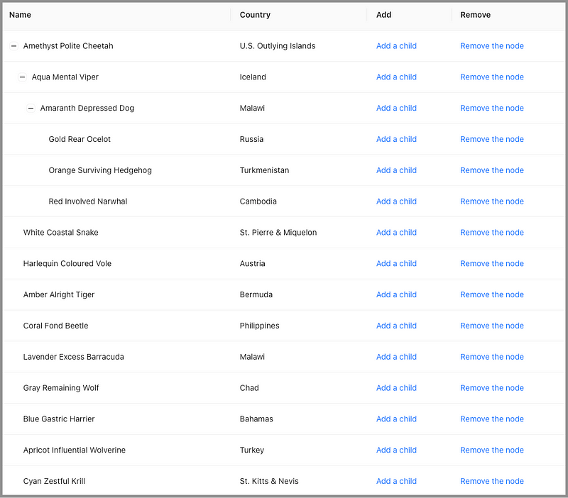
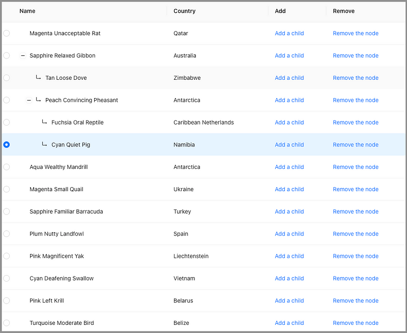
Step 7: Implement Angled Lines for TreeTable Children
Here is a TreeTable with multiple parent nodes expanded.
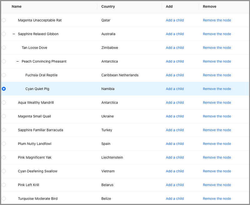
When the list is long, it may not be straightforward to associate a parent with their children. We want to add angled lines that point from a parent to their children.
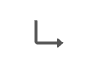
Here is the icon, EnterOutlined.
We flip it along the x-axis to show the association from a parent to each of its children.
Here is src/App.js with angled line changes:
- At lines 8–22, a
Containeris defined to host the table at line 60.Containerensures the content does not wrap. The overflow part will be hidden and show an ellipse if it does not have enough space. - At lines 24–33, the icon,
EnterOutlined, is flipped along the x-axis to be an angled line. - At lines 46–51,
renderis added to theNamecolumn. Ifrecordhas a parent,FlippedEnterIconis prepended to the name (line 48).
Execute yarn start. The parent-children relationship looks clearer with the angled lines.
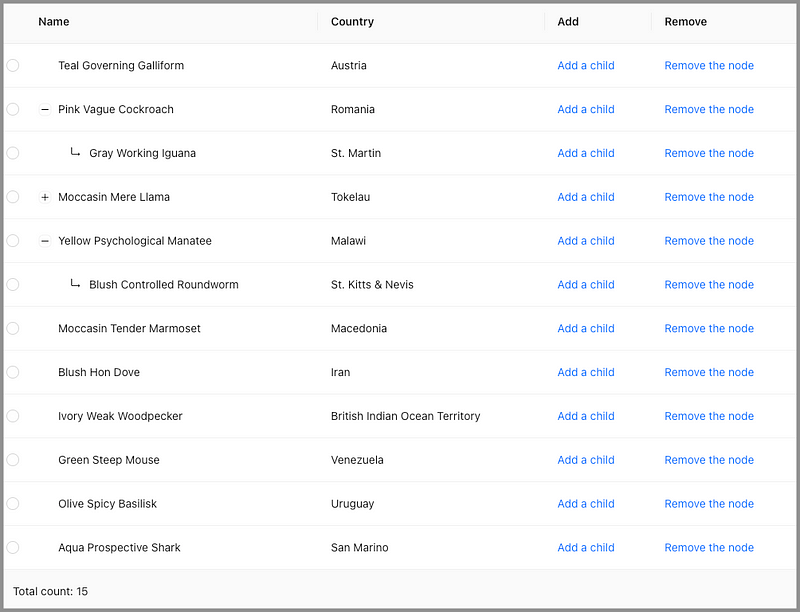
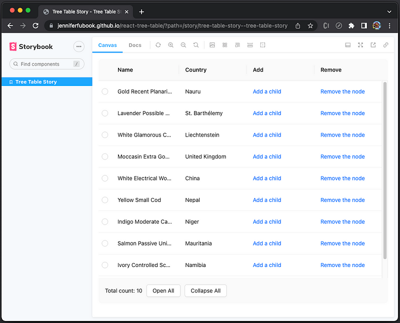
Step 8: Implement Total Count for TreeTable
With a TreeTable partial expanded, it is hard to tell how many rows (nodes) there are. It would help if the total count is displayed.
We need a method to calculate the count.
const getTableRowCount = (data = []) =>
  data.reduce(
    (count, item) =>
      item.children ? count + getTableRowCount(item.children) + 1 : count + 1,
    0
  );
Here is the updated App component:
- At line 6, the state,
tableNodeCount, is created. - At line 10,
useEffectis invoked whentableDatais changed. It recalculates the count and updatestableNodeCount. - At lines 18–22, Table’s
footerprop is defined, wheretableNodeCountis displayed (line 20). - At line 34, the maximal vertical height is set to
700px, to keepfooterin view.
Execute yarn start. The total count is displayed and will not change whether tree nodes are expended or collapsed.
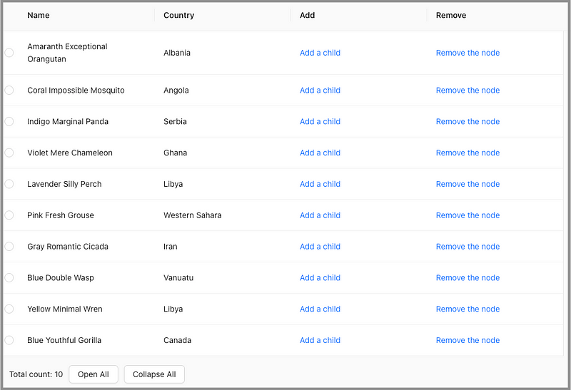
Step 9: Implement Open All and Collapse All Buttons
Is there anything else missing from the TreeTable?
Yes, it would be nice if we have Open All and Collapse All buttons to make all tree nodes open or collapse with one click.
The Collapse All button clears all states upon clicking.
<ButtonAction
  onClick={() => {
    setExpandedRowKeys([]);
    setSelectedRowKeys([]);
    setNewRowKey();
  }}
>
  Collapse All
</ButtonAction>
The Open All button needs a method to get all parent node keys.
const getAllParentNodeKeys = (data = []) =>
  data.reduce(
    (list, item) =>
      item.children
        ? [...list, item.key, ...getAllParentNodeKeys(item.children)]
        : list,
    []
  );
Then it can be defined as follows:
<ButtonAction
  onClick={() => {
    setExpandedRowKeys(getAllParentNodeKeys(tableData));
    setSelectedRowKeys([]);
    setNewRowKey();
  }}
>
  Open All
</ButtonAction>
Here is the full src/App.js:
- At lines 29–31, it styles an action button to have a
10pxspacing at the left side. - At lines 184–206,
footerincludes theOpen Allbutton (lines 187–195) and theCollapse Allbutton (lines 196–204).
Execute yarn start. The Open All and Collapse All buttons are available at footer, along with the total count.
Step 10: Break Down into Different Files
The above TreeTable code works, but it violates the design principle, separation of concerns. We should separate the long src/App.js into distinct sections, where each section addresses a separate concern.
We break down the above src/App.js into three files.
src
├── App.js
├── TreeTable.js
└── utils.jssrc/App.js: It is an application that uses the TreeTable component.
src/utils.js: It is a util collection that provides helper methods.
src/TreeTable: It is TreeTable implementation.
The complete example is located in this repository, and here is the storybook link for a live demo.
This article has described how to set up storybook to show components, as well as how to put it online via GitHub Pages.
Conclusion
It takes ten steps to build a TreeTable using Ant Design System’s nested-table capability. The TreeTable can add children under the current row. The parent node will be automatically opened upon adding a child. The newly added child is highlighted (a hack from the radio selection) and scrolled into view. Deleting a row will delete the row along with all children if any.
The TreeTable footer shows the nodes’ total count, whether these tree nodes are open or collapsed. The footer also has buttons to Open All and Collapse All all tree nodes.
Thanks for reading.
Thanks, Elaine Lee, S Sreeram, Sushmitha Aitha, Pendri Laxmi Prasanna, and Siddhartha Chinthapally, for working with me on TreeTable.
Want to Connect?

If you are interested, check out my directory of web development articles.


