
Next-Level Dashboard Design With Power BI’s New Card Visual With Reference Labels
Harnessing the Full Potential of Power BI’s Latest KPI Card Breakthrough

PBIX file available for download at the end of this article.
Introduction
When Power BI’s new card visual with reference labels came out in November 2023, I was really excited to start experimenting with it, since I found that the visualizations developed with it, as showcased in Microsoft’s documentation, were particularly captivating!

Following my experimentation, I really do find these cards awesome! The degree of customization you can bring to them is impressive and it helps build compelling dashboards using a limited range of shapes and visuals, thereby enhancing report performance.
My favorite features of these new cards include:
- The ability to apply consistent formatting settings across multiple card values for a cohesive visual presentation.
- The flexibility to specify exceptions to these formatting options for individual cards, reference labels, details, etc.
- The option to upload personal images or utilize image URLs for each callout’s value icon.
Here is the anatomy of the new card:
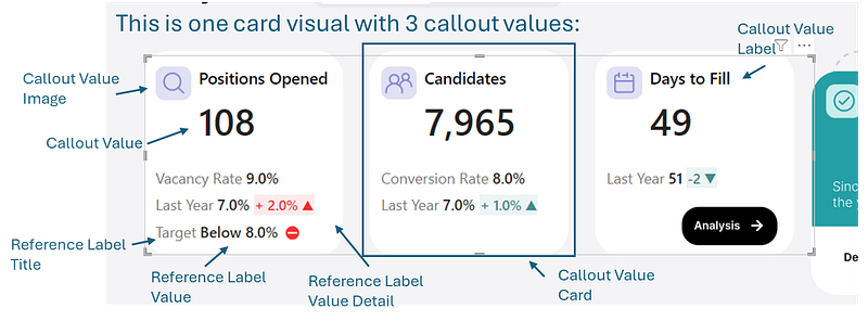
As you can see, beyond the standard callout values, you can incorporate elements like the reference label and detailed reference label values. This functionality is invaluable for presenting Key Performance Indicators (KPIs) with secondary indicators. In my experience, the need to display primary KPIs alongside these secondary indicators is frequent, especially in tactical or operational dashboards, such as those used for tracking talent acquisition activities (as illustrated in this article’s cover image).
In the following sections, I will guide you through the construction of this first new card visual of my dashboard in Power BI. This walkthrough aims to showcase the various functionalities and demonstrate the extensive customization potential inherent in this new Power BI core visual.
Case Study: Talent Acquisition Dashboard
Here is a talent acquisition dashboard I’ve designed in Figma and started developing in Power BI.
The purpose of this dashboard is straightforward — it’s designed to help manage talent acquisition by tracking job requisitions and evaluating the performance of recruitment activities. It’s a practical, detail-oriented dashboard, aimed at helping identify key areas for improvement and solving issues.

The KPI cards at the top of this dashboard were built using Power BI’s new card visual. In the next part, I’ll explain how I put these KPI cards together, walking you through the process and the choices I made.
How to Use Power BI’s New Cards
1. Inserting Power BI’s New Card Visual and Adding Callout Values
The first step to use Power BI’s new card visual is to select it from the visualization panel and to drag the values you would like to use as callout values under the Data field.

2. Adjusting the Shape and Layout
Next, under the Visual tab, you can select the shape of each callout value’s card from different shapes. Here, you can choose from various shapes for each card, like a Rounded Rectangle, and even tweak details such as corner roundness.

When it comes to layout, this tab also lets you align the text and decide how to arrange the cards — whether in a single row, a single column, or a grid format. You also have the option to adjust the spacing between each card.

In my dashboard, I stuck with the default settings, but I’m highlighting these features so you can see the range of customization options available to you.
3. Customizing Callout Values
Next, under the visual tab, are the callout values settings that can be altered. What’s important to highlight here is that you can apply settings to just one of your cards, or apply them across all cards by changing the selection under Series.
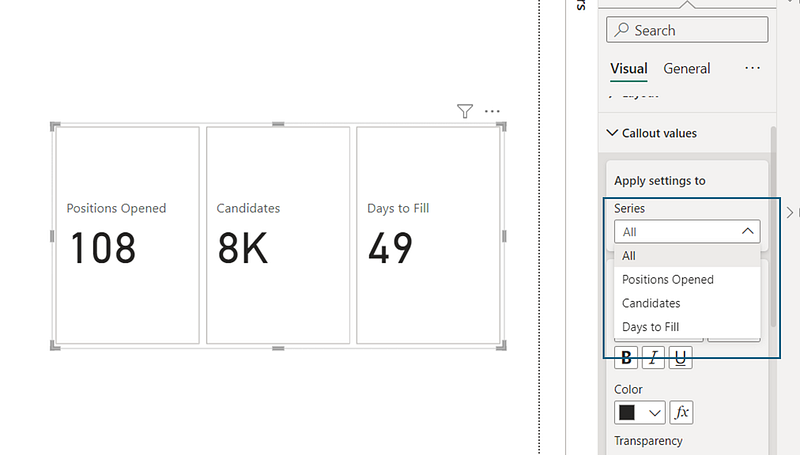
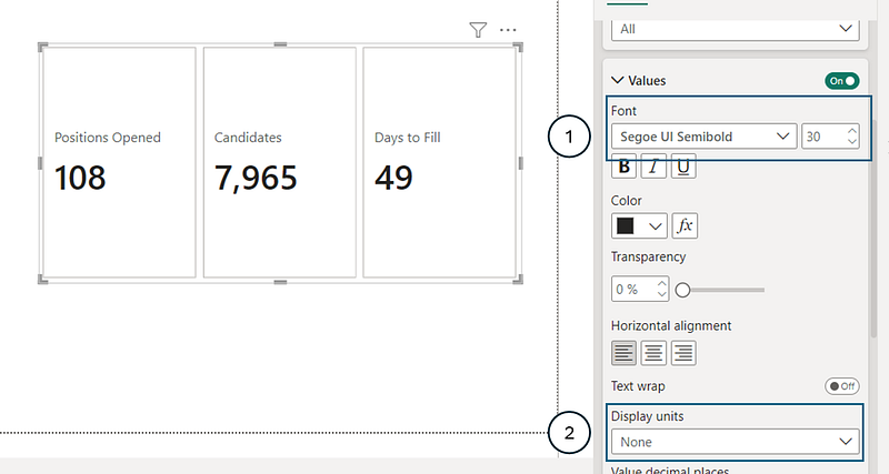
For the talent acquisition dashboard, here’s how I customized the callout values:
- Font: Changed the font style to
Segoe UI Semiboldand decreased the font size to30 - Unit Display: Changed the default unit display to
None
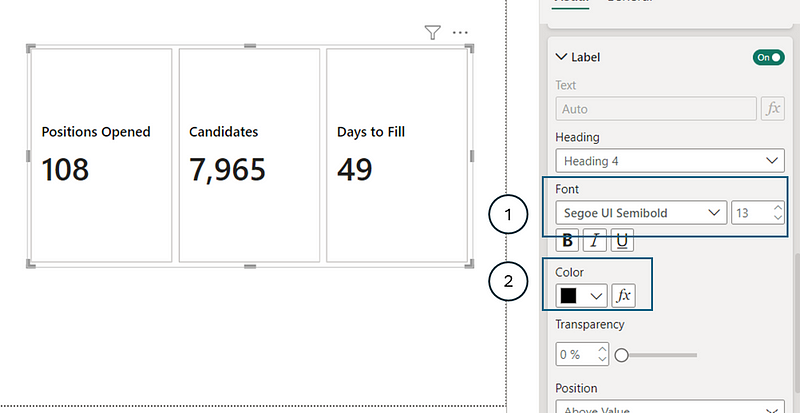
Additionally, under the Label subsection of the callout values (which is the title of these callout values), I made these adjustments:
- Font: Changed font style to
Segoe UI Semiboldand increased font size to13 - Color: Changed color to
black(#000000)
4. Adding Reference Labels
This is my favorite part: adding the reference labels which provide additional detail to the KPIs (callout values).
n the reference label tab, similar to the callout values, you can apply different formatting settings to either a specific series (callout value) or to all series. To add a reference label, start by selecting the specific series you want to work on.
I began by adding measures titled Vacancy Rate , Vacancy Rate LY and Vacancy Rate Target text as reference labels to the Positions Opened serie.

As you can see, the title of these measures and their results appear directly under the selected Callout Value (Serie).
I didn’t want to use the exact titles of the measures as the reference labels, so I adjusted them under the Title tab.
First, I selected the label I wanted to change, chose Custom under Content and then entered the desired title in the Text field. As you can see, there is the fx option, allowing dynamic text assignment to your title based on a DAX measure.
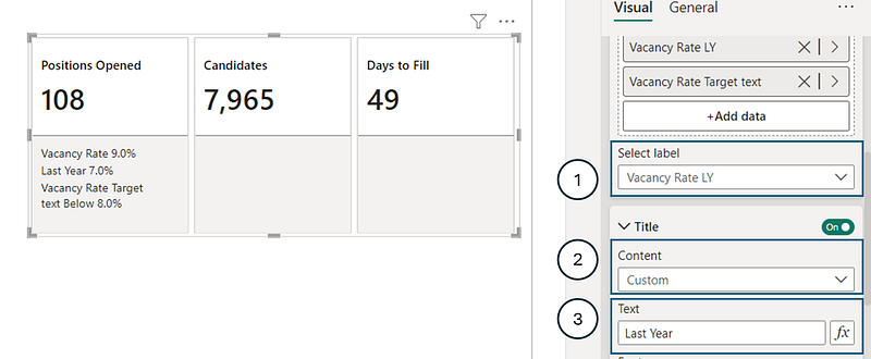
The next exciting sub-tab under Reference labels is Detail. This is where you can add more interpretive information to your reference labels. For example, I wanted to show the difference between this year’s and last year’s vacancy rates next to the Last Year result.
I selected the Vacancy Rate LY measure and then added the Vacancy Rate Variation measure in the Detail section.
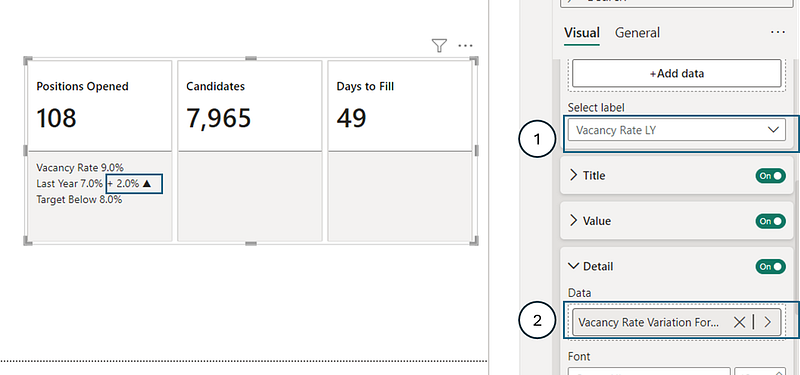
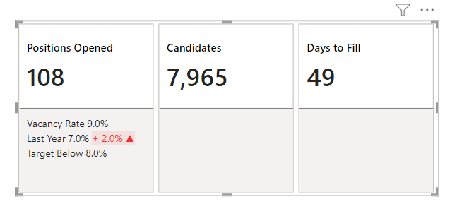
The result of the Vacancy Rate Variation measure (2%) was then displayed beside the Last Year reference label. I also wanted to conditionally format this detail value: red if it increased and green if it decreased. I created the following DAX measures for this:
Color Dark Green = "#428C8D"

Color Dark Red = "#ED3030"

Color Vacancy Rate Variation =
    IF(
        [Vacancy Rate Variation]>0,
        [Color Dark Red],
        [Color Dark Green]
    )
I added the Color Vacancy Rate Variation measure to the Color’s and Font color’s fx fields and adjusted the Color’s Transparency to 90%. Below is an example on how to assign a measure to the fx field.

Applying these steps provided the following result to the visual:
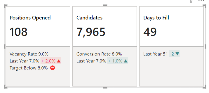
I proceded to repeating these steps to add the relevant reference labels and their detail to each callout value. You can view these steps by downloading the PBIX file available at the end of this article.
5. Formatting Reference Labels
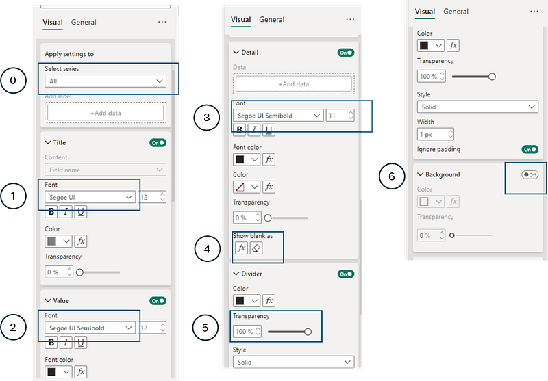
After adding all the reference labels and their details, I moved on to format the section below the callout values, which was grey at the time. One of the great things about these formatting options is the ability to apply changes to all cards at once. Instead of adjusting each series individually, I simply selected All to uniformly apply these settings.
Here are the setting adjustments I made:
- Title Color: Changed the title
colorto a shade ofdark grey(#808080) - Value Font: Changed the value font
styletoSegoe UI Semibold - Detail Font: Changed the Detail font
styletoSegoe UI Semiboldand reduced the font size to11 - Detail Blank Values: With the Detail tab activated for all series, reference labels without details showed
—. To clean this up, I used the following measure for blank values in thefxfield:Blank values = UNICHAR(8203). - Remove Divider: Set the divider’s
Transparencyto100% - Remove Background: Turned
OfftheBackground
Applying all of these steps gave me the following result:

6. Adding Images
A key feature enhancing the visual appeal of the new card visual in Power BI is the ability to add images to each callout value. There are two main ways to do this: you can either upload images directly from your computer, or use the Image URL option to dynamically link an image to the callout values from a web address.
In my project, I chose to upload images from my computer. However, for those interested in using the Image URL function, I’ve detailed this process in my tutorial, “How To Use Power BI’s New Slicer: Building a Market Watch Dashboard,” which offers guidance on enhancing customization and interactivity.
For each callout value, I selected the appropriate serie, selected Image for the Image Type, uploaded the required image, and then adjusted the Size to 38px.

To place all the images on the left of each callout value , I selected All under Series and then selected Left to Text under Position and added a 8px space between image and callout.

7. Formatting Cards
There are also many options available under the Cards tab. You can adjust elements like padding, background, and border. In my project, since I used a custom background created in Figma, I turned off the default Background and Border settings for the cards.
I then placed this card visual over the Figma-created background.

For those interested in how Figma can be used to enhance Power BI projects, I’ve detailed this process in my article “Figma Meets Power BI: Revolutionizing Report Design.” This article provides insights into blending the capabilities of Figma with Power BI for innovative report design.
Conclusion
In conclusion, Power BI’s new card with reference labels is an excellent tool for improving data visualization. It offers a wide range of customization options, making it possible to create detailed and clear dashboards. My work on the talent acquisition dashboard demonstrates how effective it can be in practical, operational environments. Users have the flexibility to modify every part of the card, including callout values, reference labels, and the addition of images, allowing for a thorough representation of KPIs.
This tool is especially valuable for crafting insightful, operational dashboards. The capability to use custom DAX measures for conditional formatting and to add images enhances its adaptability. For a hands-on illustration of these features, the PBIX file I’ve made available for download showcases these functions in use.
For data analysts aiming to produce more detailed and interactive reports, Power BI’s new card with reference labels is a key resource.
To see all these visuals and formatting options in action, as seen in the cover image of this article, you can download my report here.
I appreciate your feedback as it inspires my content. Please feel free to share your thoughts in the comments. If you find this type of insight valuable, your support through claps is always encouraging. Thank you for your interest and readership!
Stay Tuned
Make sure to follow me on Medium to access all my articles on advanced techniques in Power BI visualization.
Connect or Follow Me Here:
Don’t forget to subscribe to
👉 Power BI Publication
👉 Power BI Newsletter
and join our Power BI community
👉 Power BI Masterclass


