
How To Use Power BI’s New Slicer: Building a Market Watch Dashboard
Unlocking Enhanced Customization and Interactivity for Dynamic Data Analysis
PBIX file available for download at the end of this article.
Introduction
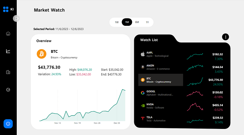
The new Power BI slicer became available in November 2023 and I tested it out in the following Market Watch section of a dashboard I am working on. I was really excited by all the customization options and wanted to start experimenting.
The big difference with the new slicer (compared to the old one), are all these customization options. Here are some of the highlights from my experimentation. You can:
- Add images and descriptions to callout values.
- Modify the callout values’ shapes.
- Specify the desired layout (number of rows and columns)
- Apply all the formatting options of buttons to the slicers (e.g.: specify background, border and font colors to values depending on their
State: Default, Hover, Press and Selected).
In this article, I will share how I leveraged these features to build this slicer of the Market Watch dashboard.

Case Study: Market Watch Dashboard

I am developing a dashboard using Investing.com data to track selected stocks and currencies. This ‘Market Watch’ section offers a dynamic view of assets over different time frames (1 week, 1 month, 6 months, 1 year) and detailed asset information. The dashboard integrates two slicers: one for time periods and another for watch list assets, both utilizing the new Power BI slicer.
How to Use Power BI’s New Slicer
Power BI’s new slicer is available on the visualizations pane. You can select it and drag the fields you wish to use (like with the old slicer).
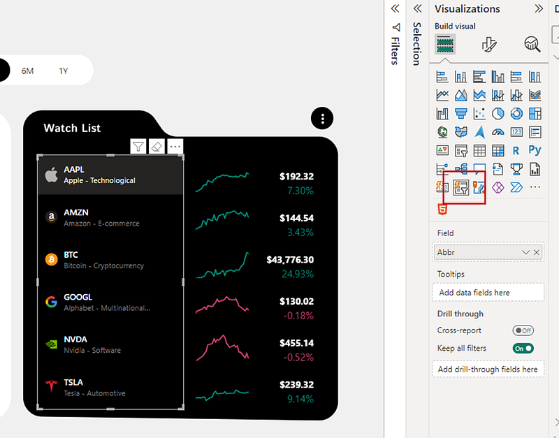
For this slicer, I used the Abbr column from the dimension table Key created in Excel to help navigate the transaction data exported from Investing.Com. You can view the detailed extracts in the folder available for download at the end of this article.

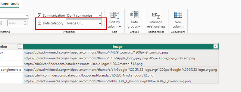
The Image column was generated using public web links to images (with no backgrounds) that represented each asset. To be able to use the image information, it is important that the Data category of this column be Image URL
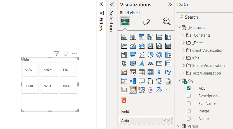
Here was the starting point of the slicer before applying the different formatting options:
Below are the steps that were taken to achieve the final version of the formatted slicer.
1. Layout Adjustment
I started by setting the slicer to display 6 rows and 1 column.
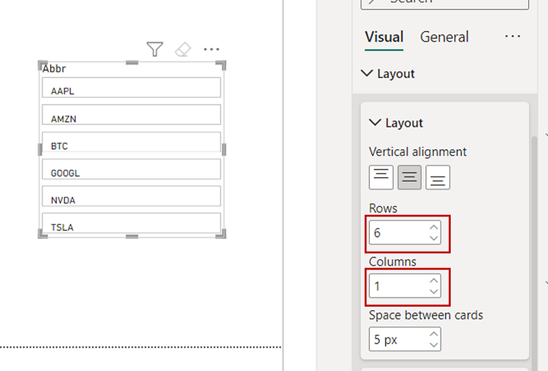
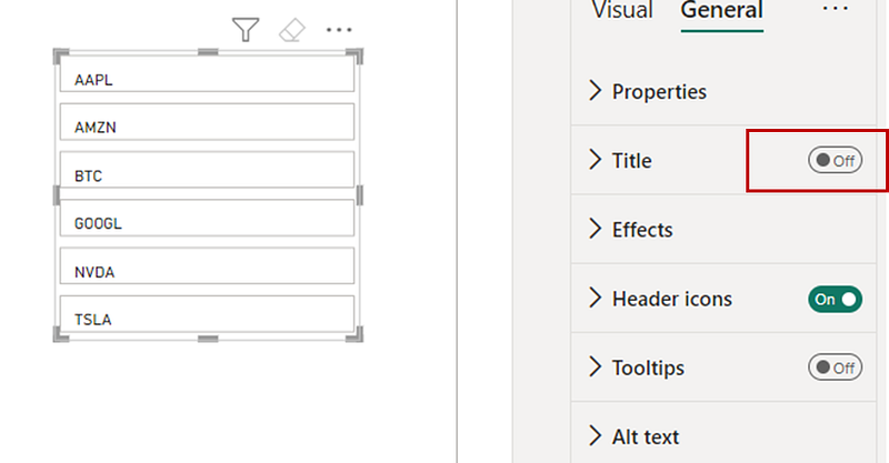
2. Title Removal
I turned Off the title in the General tab for a cleaner look.
3. Changing the Callout Values’ Font
I changed the callout values’ font style to Segeo UI Semibold and applied size 10.
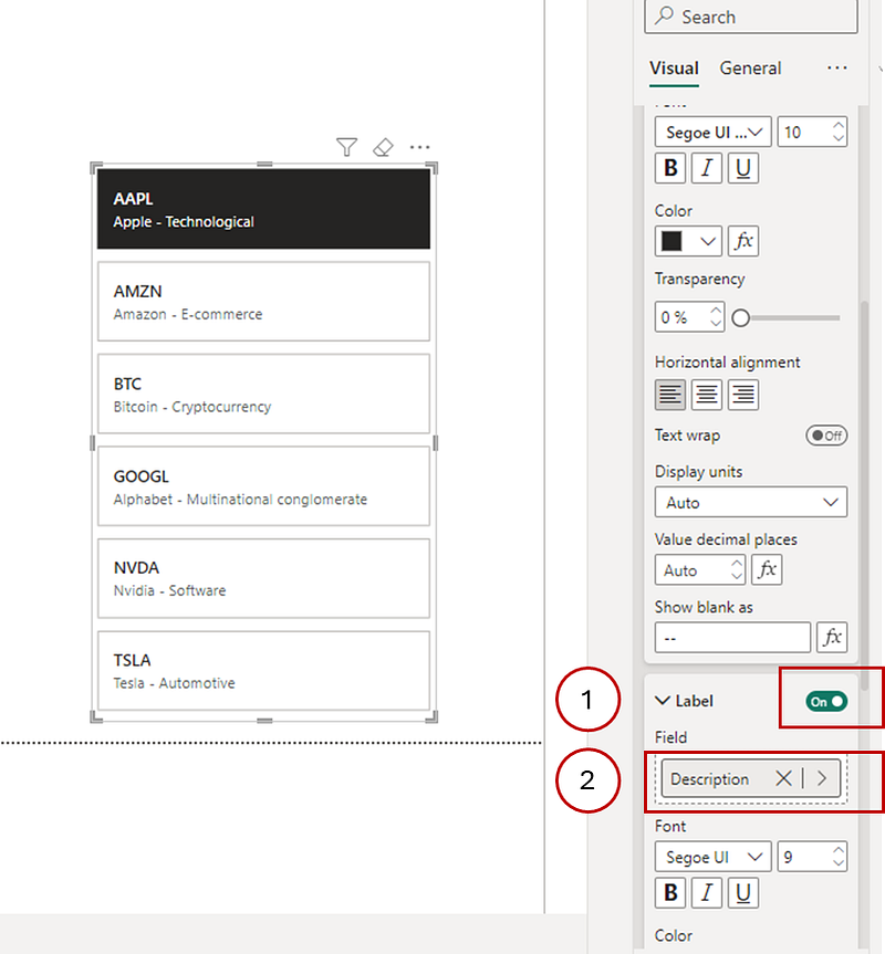
4. Adding the Callout Values’ Description
I created the following DAX measure called Description that I added to the callout values’ Label. This measure renders each asset’s full name and their description.
Description = SELECTEDVALUE('Key'[Full Name]) & " - " & SELECTEDVALUE('Key'[Description])To assign in to the callout values’ Label , we first need to turn it On and add it to the Field value.
5. Incorporating Images
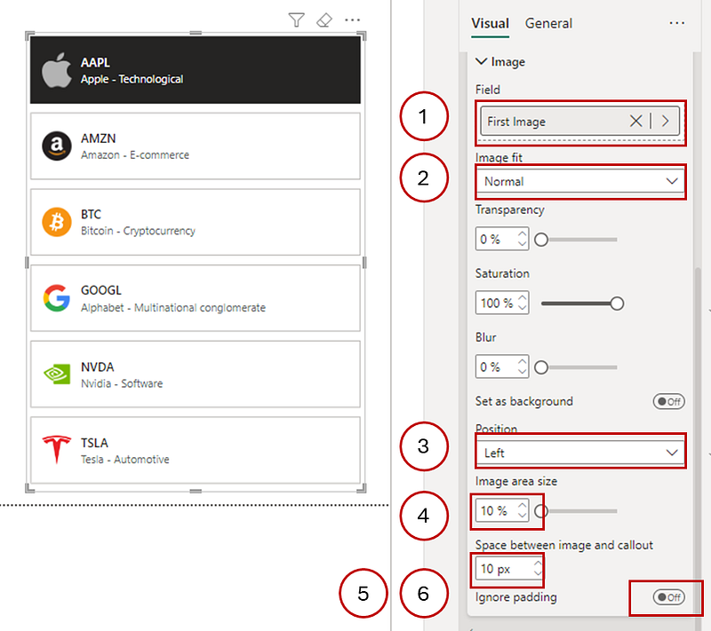
Under Image, I added the Image column from the Key table and made the following changes to the available options:
- Changed the
Image fittoNormal - Changed the
PositiontoLeft - Decreased the
Image area sizeto10% - Decreased the
Space between image and calloutto10 px - Switched
OfftheIgnore paddingoption
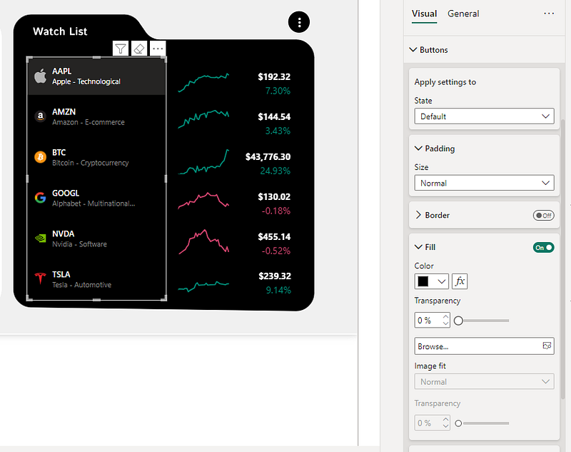
6. Formatting the Button Options
Finally, for the slicer to fit the theme of my dashboard, I made these last changes under the Default Stateof the Button tab.
- Turned
OfftheBorder - Changed the
Fill ColortoBlack (#000000)
Conclusion
So, there you have it! Playing around with Power BI’s new slicer has been a game-changer for my Market Watch dashboard. It’s amazing how a few tweaks in formatting can turn dull data into something that’s not just informative but also pretty cool to look at.
Whether you’re a data geek like me or just someone trying to make sense of all those numbers, these new features are a total win. They say the devil is in the details, and in this case, those details are what make your dashboard stand out. So go ahead, give these tricks a try on your own dashboard and watch the magic happen. Happy slicing!
You can download my report with all visuals and formatting as displayed in the cover picture of this article here.
Engage with Me
What are your experiences with Power BI’s new slicer? Do you have tips or challenges to share? Join the conversation in the comments below.
Stay Tuned
Make sure to follow me on Medium to access all my articles on advanced techniques in Power BI visualization.
In the meantime, here are other articles you might enjoy on data visualization in Power BI.
Connect or Follow Me Here:
Don’t forget to subscribe to
👉 Power BI Publication
👉 Power BI Newsletter
and join our Power BI community
👉 Power BI Masterclass


