
Figma Meets Power BI: Revolutionizing Report Design
Unleashing Creativity and Efficiency in Data Visualization
PBIX and Figma files available for download at the end of this article.
Introduction
I’ve been having a lot of fun lately with Figma, especially when it comes to spicing up my Power BI projects!
Designing in Figma has definitely accelerated my Power BI project delivery over the last few months. It took a few projects to ramp up, but once I got familiarized with the tool, I really found that it not only saved time in the designing process, but also brought values to my Power BI projects, by integrating designs I wouldn’t be able to achieve with Power BI only and increasing my reports performance by reducing the amount of shapes I need.
In this article, I’ll provide a brief overview of Figma and discuss how I incorporate it into my Power BI projects. I’ll also share how I used Figma to create the Power BI report featured on the cover page of this article.
Figma: A Quick Rundown
Figma is an innovative cloud-based design tool, highly regarded in UI/UX design circles. It stands out for its collaboration-friendly environment and robust vector graphics capabilities. Its ease of use, coupled with a comprehensive set of features like plugins, cross-platform accessibility, and user feedback integration, make it a preferred choice for designers.
In the past, I designed Power BI backgrounds using PowerPoint, but Figma has been a game-changer. It’s surprisingly easy to get the hang of and allows for the creation of really sleek visuals.
One great aspect of Figma is its vibrant community and the abundance of free templates available online. This means you can start your designs with prebuilt sketches from professional designers, rather than from scratch.
How I use Figma
I use Figma in many stages of report design, ranging from building low-fidelity wireframes to integrating sketched graphics into my Power BI reports.
During the initial design stages of a Power BI report or dashboard, I often sketch out my ideas, sometimes on paper and other times directly in Figma. I create a draft version of a report and refine it through feedback from clients or end-users.
Thanks to Figma’s collaborative features, I can share links to my designs with others, which streamlines the review process and eliminates the confusion of multiple sketched versions.
Towards the end of the design process, I frequently use a significant portion of the graphics created in Figma as the background for my Power BI report. This is done by exporting the design in SVG format from Figma and then integrating it as the background of the Power BI canvas.
I’m still exploring the full potential of Figma. Many designers create interactive prototypes in Figma, and there’s a new DevMode in Beta that’s designed to facilitate the transition from design to code more efficiently.
Next, I’ll walk you through how I utilized Figma to develop the Power BI report shown on the cover page.
1. Building a Low Fidelity Wireframe Sketch
For this Power BI project, I started by sketching on paper a low fidelity wireframe. Here, I focused mainly on how I wanted to organize and display information, while identifying the type of graphic elements I wanted to leverage.
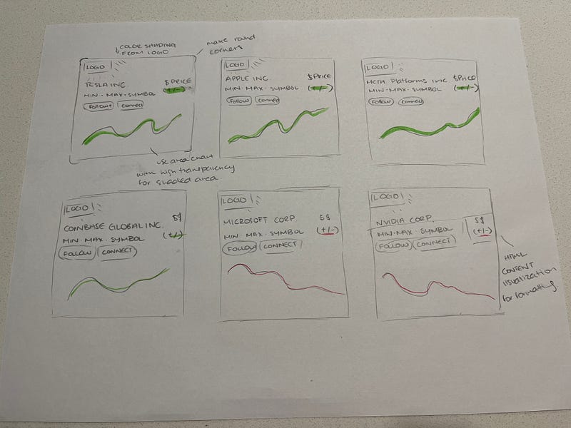
Then I went into Figma to replicate and enhance this sketch.
2. Getting Started With Figma

If this is your first time using Figma, you will need to create an account. There are various account options available; I am currently using the free version. It grants access to the most important features, but limits the number of files you can collaborate on with others.
Once you log into Figma, click on Design File and select Drafts.

This action will open a new design file in Figma, which resembles a blank working document. Within this space, there are four essential components:
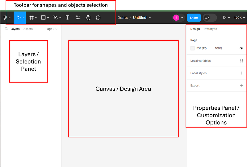
The Figma Editor’s 4 Main Components:
- Toolbar: Located at the top, the toolbar allows you to select objects and shapes to add to the canvas area.
- Layers Panel: Found on the left, this panel displays the names of shapes and objects as you add them to the canvas. Similar to the selection panel in Power BI, it also offers options to rename and group these shapes/objects.
- Canvas: The central area is where you can design your sketch. This is the space where your ideas begin to take shape and come to life.
- Properties Panel: On the right, you’ll find the properties panel. This section presents various customization options for any selected item on the canvas. Here, you can adjust elements such as the fill, stroke, effects, and font of different objects.
3. Sketching in Figma
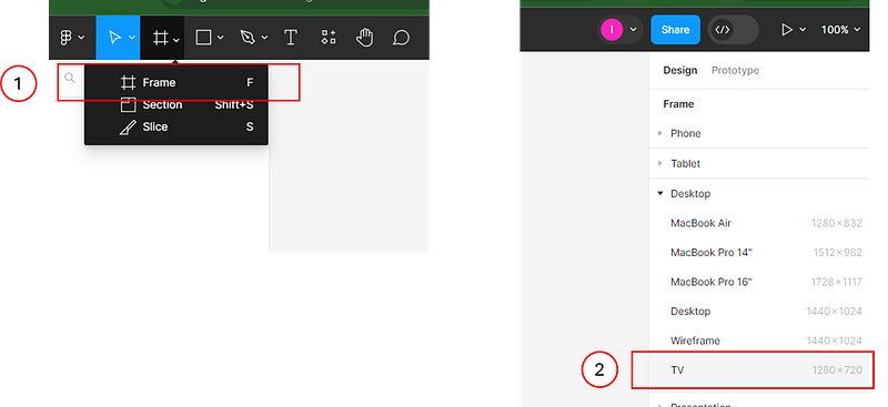
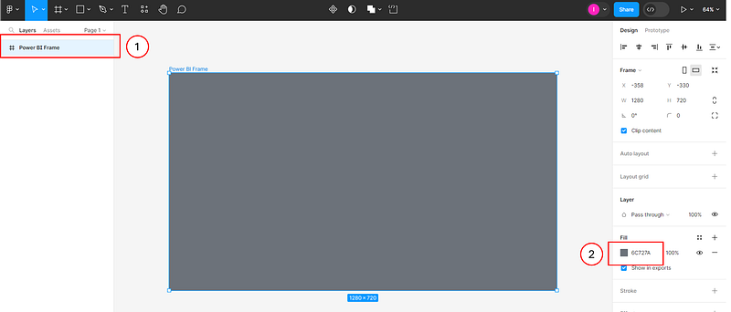
The first step in Figma is to add a frame, which serves as the “background” for the view you are creating. This frame determines the shape and size of your design. To add a frame, select it from the toolbar. Then, using the properties panel, you can set its size. Figma provides several pre-established size options. For a standard Power BI report, the canvas size is typically 1280 x 720, which corresponds to the TV size option in Figma. You can select this option directly.
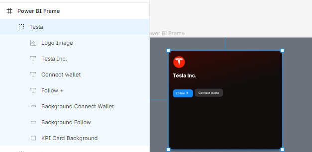
To reconstruct the desired view, I altered the fill color and renamed the frame to “Power BI Frame.” This was done by double-clicking on the frame’s name in the Layers Panel and entering the new name.
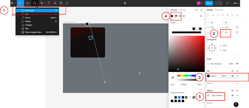
The first element I added to my canvas was a rounded rectangle to serve as the background for the first KPI card. I selected a rectangle shape from the toolbar and drew it on the Canvas. Then, I applied the following formatting options using the Properties panel:
- Changed the Corner Radius to
16. - Altered the Fill to a Gradient and adjusted the colors to achieve the desired effect.
- Added a Drop shadow from the Effects section by clicking on the
+symbol.
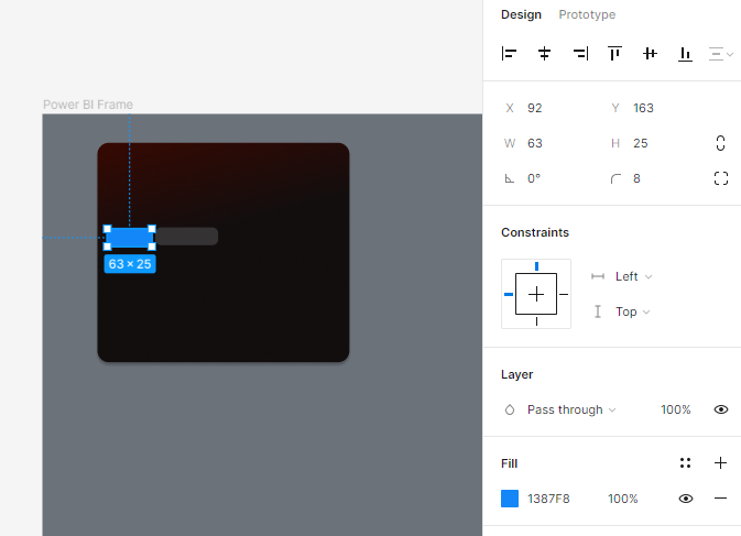
Next, I added oval buttons by inserting additional rectangle shapes, modifying their corner radius, and updating their fill colors.
Subsequently, I added three text boxes by selecting the T from the toolbar and drawing the text boxes in the desired locations.
In the Text section of the properties window, Figma offers numerous formatting options. In this instance, I used Figma’s default font, Inter, but it can be changed from the wide selection available. I also adjusted the font’s weight and size.

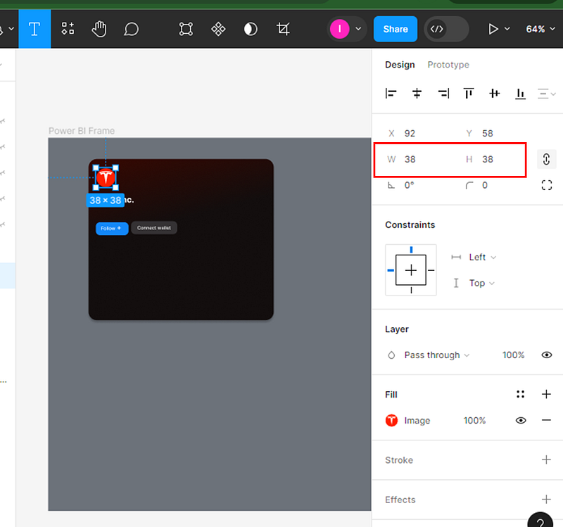
As a final step, I found a logo image online, copied it into the Figma editor, and resized it by adjusting the Width (W) and Height (H) values in the Properties window.
I then renamed all the shapes in the Layers Panel and grouped them together for this first KPI card.

Following this, I copied this group and replicated it five times to create the other KPI cards, making necessary adjustments to each one, such as changing the name and logo.
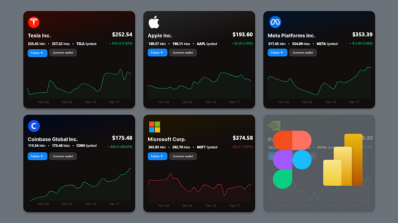
This was my final result in Figma before transitioning to Power BI.
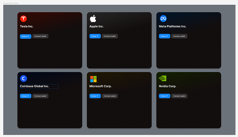
As evident in this Figma sketch, it includes the background of the KPI cards, the stock names, and the design of two buttons. I hadn’t added any stock price data yet, as I planned to do this within Power BI. However, if you are engaged in an iterative design process with a client, you could also include these elements in your Figma sketch and then remove them before exporting and building in Power BI.
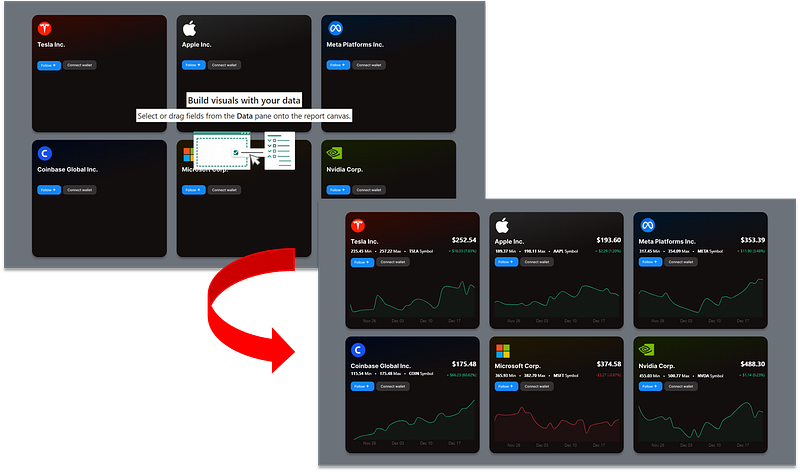
4. Exporting the Figma Sketch and Importing in to Power BI
Finally, to utilize your designed layout in Power BI, you can export it as an SVG file from Figma and then use it as the background for your Power BI report’s canvas.
To export from Figma, first select your frame. Then, click on the + icon located under the Export section of the Properties panel. Choose SVG as the export format and click on the Export button.

In Power BI, you can import this design as the canvas background. To do this, go to the Page’s visualization panel and select the SVG image you exported from Figma. It is important to set the image’s transparency to 0%.

By following these steps, you will have your Figma sketch set as the background of your report in Power BI. You can then proceed to add the required visualizations on top of this background.
Conclusion: Why This Combo Rocks
Mixing Figma with Power BI has transformed how I tackle my projects. It’s like having a secret weapon that not only makes the work faster but also a whole lot more enjoyable. The combination of Figma’s design prowess and Power BI’s analytical strength opens up a world of possibilities, making each report not just a collection of data, but a work of art. It’s a method that any data analyst or report designer looking to jazz up their work should definitely try out.
Was this tutorial sufficient to get started with Figma? I was thinking of potentially doing a video on this. Let me know in the comments if you believe this would help!
You can download my report with all visuals and formatting as displayed in the cover picture of this article here.
Your feedback fuels my content! Engage through comments, and if you find value in such insights, your claps encourage more of this content. Thank you for your readership!
Stay Tuned
Make sure to follow me on Medium to access all my articles on advanced techniques in Power BI visualization.
Connect or Follow Me Here:
Don’t forget to subscribe to
👉 Power BI Publication
👉 Power BI Newsletter
and join our Power BI community
👉 Power BI Masterclass


