avatarEbrahim Mousavi

Free AI web copilot to create summaries, insights and extended knowledge, download it at here

3516

Abstract

b9"><b>Output:</b></p><figure id="a0dd"><img src="https://cdn-images-1.readmedium.com/v2/resize:fit:800/1*3pQHyWQnzXocMkXYfTVT9A.png"><figcaption></figcaption></figure><p id="1f68">With this setup, you can <b>zoom</b>, <b>pan</b>, and <b>adjust</b> the plot interactively within the notebook.</p><h1 id="b14d">2. Creating Interactive Widgets</h1><p id="be18">Interactive widgets allow users to manipulate plot elements dynamically, providing a richer experience in data exploration.</p><h2 id="3398">Using ipywidgets</h2><p id="d9c9"><code>ipywidgets</code> is a popular library for adding interactive widgets to Jupyter Notebooks. It integrates smoothly with Matplotlib to control plot parameters.</p><div id="479e"><pre>pip install ipywidgets</pre></div><h2 id="e8e6">Example: Interactive Plot with Sliders</h2><p id="44fa">Let’s combine Matplotlib with <code>ipywidgets</code> to create a more interactive plotting environment:</p><div id="7a32"><pre><span class="hljs-keyword">import</span> numpy <span class="hljs-keyword">as</span> np <span class="hljs-keyword">import</span> matplotlib.pyplot <span class="hljs-keyword">as</span> plt <span class="hljs-keyword">import</span> ipywidgets <span class="hljs-keyword">as</span> widgets

<span class="hljs-comment"># Activate ipympl backend</span> %matplotlib widget

x = np.linspace(<span class="hljs-number">0</span>, <span class="hljs-number">10</span>, <span class="hljs-number">100</span>)

<span class="hljs-keyword">def</span> <span class="hljs-title function_">update_plot</span>(<span class="hljs-params">frequency, amplitude</span>): y = amplitude * np.sin(frequency * x) fig, ax = plt.subplots() ax.plot(x, y) ax.set_title(<span class="hljs-string">f'Sine Wave - Frequency: <span class="hljs-subst">{frequency}</span>, Amplitude: <span class="hljs-subst">{amplitude}</span>'</span>) plt.show()

frequency_slider = widgets.FloatSlider(value=<span class="hljs-number">1</span>, <span class="hljs-built_in">min</span>=<span class="hljs-number">0.1</span>, <span class="hljs-built_in">max</span>=<span class="hljs-number">5</span>, step=<span class="hljs-number">0.1</span>, description=<span class="hljs-string">'Frequency:'</span>) amplitude_slider = widgets.FloatSlider(value=<span class="hljs-number">1</span>, <span class="hljs-built_in">min</span>=<span class="hljs-number">0.5</span>, <span class="hljs-built_in">max</span>=<span class="hljs-number">2</span>, step=<span class="hljs-number">0.1</span>, description=<span class="hljs-string">'Amplitude:'</span>)

widgets.interact(update_plot, frequency=frequency_slider, amplitude=amplitude_slider)</pre></div><p id="705d">Output:</p><figure id="0b0c"><img src="https://cdn-images-1.readmedium.com/v2/resize:fit:800/1*rcK84BxXS6iWPSAZKcytuA.png"><figcaption></figcaption></figure><p id="38bc">This setup allows users to adjust the <code>frequency</code> and <code>amplitude</code> sliders, with the plot updating in real time.</p><h1 id="a5cf">3. Additional Interactive Features</h1><h2 id="b328">Adding Tooltips with mplcursors</h2><p id="aa70"><code>mplcursors</code> is a Matplotlib extension that adds interactive data cursors (tooltips) to your plots, providing more information about data points on hover.</p><p id="2db9">I copied an example from the official website of <a href="https://mplcursors.readthedocs.io/en/stable/"><b>mplcursors</b></a>. For more information, please refer to this amazing website.</p><div id="31be"><pre><span class="hljs-keyword">import</span> mat

Options

plotlib.pyplot <span class="hljs-keyword">as</span> plt <span class="hljs-keyword">import</span> numpy <span class="hljs-keyword">as</span> np <span class="hljs-keyword">import</span> mplcursors

%matplotlib widget

<span class="hljs-comment"># Create a 2D array by computing the outer product of two ranges</span> data = np.outer(<span class="hljs-built_in">range</span>(<span class="hljs-number">10</span>), <span class="hljs-built_in">range</span>(<span class="hljs-number">1</span>, <span class="hljs-number">5</span>))

fig, ax = plt.subplots() lines = plt.plot(data) ax.set_title(<span class="hljs-string">"Click somewhere on a line.\nRight-click to deselect.\n"</span> <span class="hljs-string">"Annotations can be dragged."</span>) mplcursors.cursor(lines) <span class="hljs-comment"># or just mplcursors.cursor()</span> mplcursors.cursor() plt.show()</pre></div><p id="4bbd"><b>Output:</b></p><figure id="994a"><img src="https://cdn-images-1.readmedium.com/v2/resize:fit:800/1*6u633TcpEeHQcryIgijT4Q.png"><figcaption></figcaption></figure><h1 id="281c">Conclusion</h1><p id="168a">In this seventh part of the <b>Mastering Matplotlib</b> series, we explored the world of <b>interactive plotting</b>. We started by introducing interactive backends and demonstrated how to use different ways to create interactive plots in Jupyter Notebooks. We then delved into<code>ipywidgets</code> to create dynamic plots with interactive controls. Finally, we added an extra layer of interactivity with tooltips using <code>mplcursors</code>. These interactive tools are powerful additions to your data visualization toolkit, enabling you to create more engaging and user-friendly plots.</p><p id="e981">In the next part of the series, we’ll explore even more advanced plotting techniques and customizations to further enhance your visualizations. Here’s what you can look forward to:</p><ul><li><b>Styling with Matplotlib</b>: Learn how to improve the aesthetics of your plots using various styling options.</li><li><b>Using Built-in Styles with </b><code>plt.style.use()</code>: Discover the built-in styles available in Matplotlib and how to apply them to your plots for quick enhancements.</li><li><b>Creating Custom Styles</b>: Find out how to define your own styles to maintain consistency across your visualizations.</li><li><b>Saving and Sharing Styles</b>: Understand how to save your custom styles and share them with others, making collaboration easier.</li></ul><p id="470c"><b>If you like the article and would like to support me make sure to:</b></p><p id="ccd0">👏 Clap for the story (<b>as much as you liked it <a href="https://emojipedia.org/smiling-face-with-smiling-eyes"></a></b><a href="https://emojipedia.org/smiling-face-with-smiling-eyes">😊</a>) and follow me 👉 📰 View more content on my medium profile 🔔 Follow Me: <a href="https://www.linkedin.com/in/ebimsv/"><b>LinkedIn</b></a> | <a href="https://medium.com/@ebimsv"><b>Medium</b></a> | <a href="https://github.com/Ebimsv?tab=repositories"><b>GitHub</b></a> | <a href="https://x.com/ebiimsv"><b>Twitter</b></a></p><p id="9ba7"><b>Feel free to share your thoughts and questions in the comments below!</b></p><h1 id="f42a">References:</h1><ol><li><a href="https://matplotlib.org/stable/users/explain/figure/backends.html">https://matplotlib.org/stable/users/explain/figure/backends.html</a></li><li><a href="https://mplcursors.readthedocs.io/en/stable/">https://mplcursors.readthedocs.io/en/stable/</a></li></ol></article></body>

Mastering Matplotlib: Part 7 — Introduction to Interactive Backends

Enhancing Your Data Visualization Experience with Dynamic Features

🔙 Previous: Exploring 3D Plotting

🔜 Next: Styling Your Plots with Matplotlib

Note: You can find all the code examples for Matplotlib series in my GitHub repository.

Matplotlib supports several interactive backends that allow you to create plots that respond to user input, such as clicks, scrolls, and drags. The choice of backend depends on your environment:

  • TkAgg: Default backend for standard Python environments.
  • Qt5Agg: A popular backend for desktop applications.
  • ipympl: A backend designed for Jupyter Notebooks, providing interactive plots directly in the notebook.

Interactive backends enable features like zooming, panning, and dynamic updates, making your visualizations more engaging. Panning refers to the ability to move or slide across a visualization to view different portions of the data without changing the zoom level.

1. Using ipympl for Jupyter Notebooks

The ipympl backend is ideal for creating interactive plots in Jupyter Notebooks. It integrates seamlessly with the notebook interface, allowing you to interact with your plots directly within the notebook cells.

Installation and Setup

First, you need to install the ipympl package:

pip install ipympl

Note: You may need to restart the kernel to use updated packages.

To activate the ipympl backend in a Jupyter Notebook, include the following magic command at the beginning of your notebook:

%matplotlib widget

This command enables interactive plotting for the entire notebook session.

Creating an Interactive Plot

Let’s create a simple interactive plot using ipympl:

import matplotlib.pyplot as plt
import numpy as np

# Activate the ipympl backend
%matplotlib widget

# Generate some data
x = np.linspace(0, 10, 100)
y = np.sin(x)

# Create an interactive plot
fig, ax = plt.subplots()
line, = ax.plot(x, y)

# Add interactivity
ax.set_title('Interactive Sine Wave')
ax.set_xlabel('X-axis')
ax.set_ylabel('Y-axis')

plt.show()

Output:
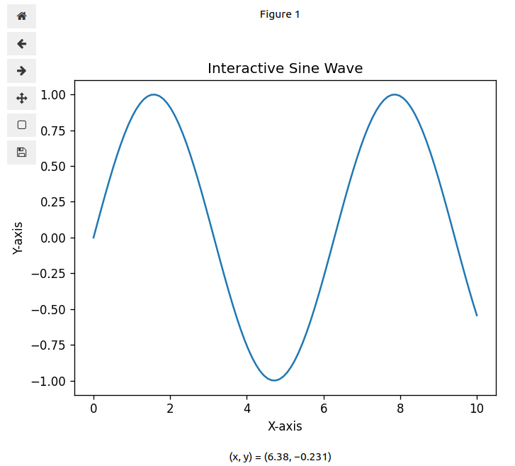
With this setup, you can zoom, pan, and adjust the plot interactively within the notebook.

2. Creating Interactive Widgets

Interactive widgets allow users to manipulate plot elements dynamically, providing a richer experience in data exploration.

Using ipywidgets

ipywidgets is a popular library for adding interactive widgets to Jupyter Notebooks. It integrates smoothly with Matplotlib to control plot parameters.

pip install ipywidgets

Example: Interactive Plot with Sliders

Let’s combine Matplotlib with ipywidgets to create a more interactive plotting environment:

import numpy as np
import matplotlib.pyplot as plt
import ipywidgets as widgets

# Activate ipympl backend
%matplotlib widget

x = np.linspace(0, 10, 100)

def update_plot(frequency, amplitude):
    y = amplitude * np.sin(frequency * x)
    fig, ax = plt.subplots()
    ax.plot(x, y)
    ax.set_title(f'Sine Wave - Frequency: {frequency}, Amplitude: {amplitude}')
    plt.show()

frequency_slider = widgets.FloatSlider(value=1, min=0.1, max=5, step=0.1, description='Frequency:')
amplitude_slider = widgets.FloatSlider(value=1, min=0.5, max=2, step=0.1, description='Amplitude:')

widgets.interact(update_plot, frequency=frequency_slider, amplitude=amplitude_slider)

Output:
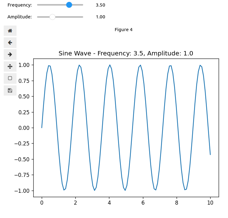
This setup allows users to adjust the frequency and amplitude sliders, with the plot updating in real time.

3. Additional Interactive Features

Adding Tooltips with mplcursors

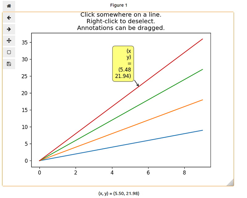
mplcursors is a Matplotlib extension that adds interactive data cursors (tooltips) to your plots, providing more information about data points on hover.

I copied an example from the official website of mplcursors. For more information, please refer to this amazing website.

import matplotlib.pyplot as plt
import numpy as np
import mplcursors

%matplotlib widget

# Create a 2D array by computing the outer product of two ranges
data = np.outer(range(10), range(1, 5))

fig, ax = plt.subplots()
lines = plt.plot(data)
ax.set_title("Click somewhere on a line.\nRight-click to deselect.\n"
             "Annotations can be dragged.")
mplcursors.cursor(lines)  # or just mplcursors.cursor()
mplcursors.cursor()
plt.show()

Output:
Conclusion

In this seventh part of the Mastering Matplotlib series, we explored the world of interactive plotting. We started by introducing interactive backends and demonstrated how to use different ways to create interactive plots in Jupyter Notebooks. We then delved intoipywidgets to create dynamic plots with interactive controls. Finally, we added an extra layer of interactivity with tooltips using mplcursors. These interactive tools are powerful additions to your data visualization toolkit, enabling you to create more engaging and user-friendly plots.

In the next part of the series, we’ll explore even more advanced plotting techniques and customizations to further enhance your visualizations. Here’s what you can look forward to:

  • Styling with Matplotlib: Learn how to improve the aesthetics of your plots using various styling options.
  • Using Built-in Styles with plt.style.use(): Discover the built-in styles available in Matplotlib and how to apply them to your plots for quick enhancements.
  • Creating Custom Styles: Find out how to define your own styles to maintain consistency across your visualizations.
  • Saving and Sharing Styles: Understand how to save your custom styles and share them with others, making collaboration easier.

If you like the article and would like to support me make sure to:

👏 Clap for the story (as much as you liked it 😊) and follow me 👉 📰 View more content on my medium profile 🔔 Follow Me: LinkedIn | Medium | GitHub | Twitter

Feel free to share your thoughts and questions in the comments below!

References:

  1. https://matplotlib.org/stable/users/explain/figure/backends.html
  2. https://mplcursors.readthedocs.io/en/stable/
Matplotlib
Interactive
Data Visualization
Dynamic Features
Backend
Recommended from ReadMedium
avatarMr.shadow
AI(Artificial intelligence)

2 min read