
Mastering Matplotlib: Part 8 — Styling Your Plots with Matplotlib
A Comprehensive Guide to Styling Your Plots in Matplotlib
🔙 Previous: Introduction to Interactive Backends
🔜 Next: Integrating Matplotlib with Other Libraries
Note: You can find all the code examples for Matplotlib series in my GitHub repository.
Welcome to the eighth part of the Mastering Matplotlib series. By now, you’ve learned how to create a wide range of plots and customize them with labels, titles, and annotations. In this part, we’ll dive into the world of styling in Matplotlib, where you’ll learn how to apply built-in styles, create your own custom styles, and save and share these styles for consistent and professional-looking plots.
Introduction to Plot Styling
Styling in Matplotlib allows you to change the overall appearance of your plots quickly and consistently. Whether you’re preparing figures for a publication, presentation, or just want to maintain a uniform style across multiple plots, Matplotlib’s styling capabilities make it easy to achieve the desired look.
1. Using Built-in Styles with plt.style.use()
Matplotlib comes with a variety of built-in styles that can be applied to your plots with a single line of code. These styles can dramatically change the look and feel of your plots, making them more suitable for different purposes like presentations, reports, or technical papers.
Applying a Built-in Style
To use a built-in style, simply call plt.style.use() with the name of the style:
import matplotlib.pyplot as plt

# Apply a built-in style
plt.style.use('ggplot')

x = [1, 2, 3, 4, 5]
y = [10, 20, 15, 25, 30]

plt.plot(x, y)
plt.title('Sales Over Time')
plt.xlabel('Time (months)')
plt.ylabel('Sales (units)')
plt.show()
Output:
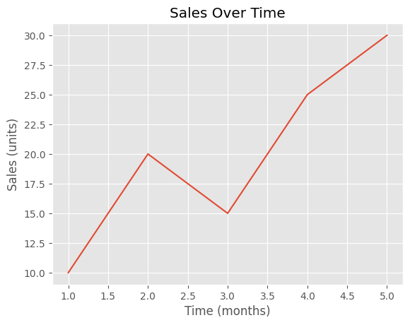
In this example, we applied the ‘ggplot’ style, which gives the plot a distinctive appearance inspired by the popular R package ggplot2. Matplotlib includes several other styles, such as seaborn, fivethirtyeight, dark_background, and more.
Listing All Available Styles
You can list all the available styles in Matplotlib using the following code:
print(plt.style.available)This will output a list of all the built-in styles that you can use.
['Solarize_Light2', '_classic_test_patch', '_mpl-gallery',
'_mpl-gallery-nogrid', 'bmh', 'classic',
'dark_background', 'fast', 'fivethirtyeight',
'ggplot', 'grayscale', 'seaborn-v0_8',
'seaborn-v0_8-bright', 'seaborn-v0_8-colorblind',
'seaborn-v0_8-dark', 'seaborn-v0_8-dark-palette',
'seaborn-v0_8-darkgrid', 'seaborn-v0_8-deep',
'seaborn-v0_8-muted', 'seaborn-v0_8-notebook',
'seaborn-v0_8-paper', 'seaborn-v0_8-pastel',
'seaborn-v0_8-poster', 'seaborn-v0_8-talk',
'seaborn-v0_8-ticks', 'seaborn-v0_8-white',
'seaborn-v0_8-whitegrid', 'tableau-colorblind10']
2. Creating Custom Styles
While built-in styles are convenient, there might be cases where you need a specific look that isn’t covered by the default options. In such cases, you can create your own custom style by defining a set of rcParams (runtime configuration parameters) that control various aspects of your plot’s appearance.
Defining Custom Styles
You can define a custom style by setting rcParams directly in your script:
plt.rcParams['axes.facecolor'] = 'lightgray'
plt.rcParams['axes.edgecolor'] = 'black'
plt.rcParams['axes.grid'] = True
plt.rcParams['grid.color'] = 'white'
plt.rcParams['grid.linestyle'] = '--'
plt.rcParams['font.size'] = 14
plt.rcParams['lines.linewidth'] = 2
plt.rcParams['lines.color'] = 'blue'

plt.plot(x, y)
plt.title('Custom Styled Plot')
plt.xlabel('Time (months)')
plt.ylabel('Sales (units)')
plt.show()
Output:
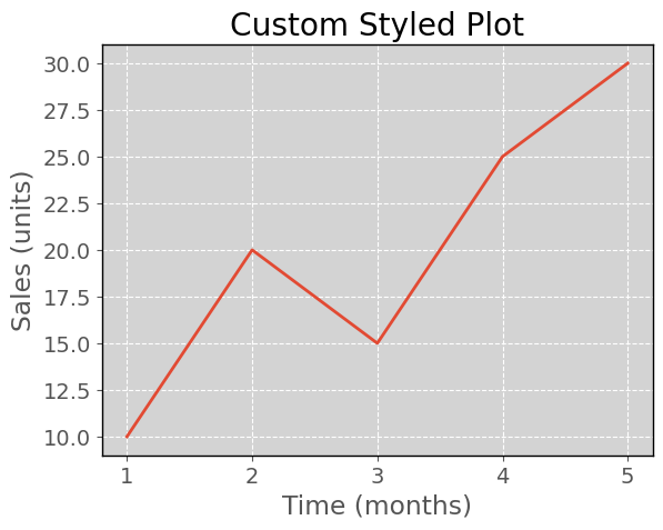
In this example, we customized the plot’s background color, gridlines, font size, and line properties.
Applying Custom Styles with a Context Manager
To temporarily apply a custom style, you can use a context manager, which ensures the style only affects specific plots:
with plt.style.context({'axes.facecolor': 'lightgray',
                        'axes.edgecolor': 'black',
                        'grid.color': 'white',
                        'grid.linestyle': '--',
                        'font.size': 14}):
    plt.plot(x, y)
    plt.title('Temporarily Styled Plot')
    plt.xlabel('Time (months)')
    plt.ylabel('Sales (units)')
    plt.show()
Using a context manager is useful when you want to apply a style to a single plot without affecting others.
3. Saving and Sharing Styles
Once you’ve created a custom style that you like, you might want to save it for reuse in other projects or share it with colleagues. Matplotlib allows you to save styles in a .mplstyle file, which can be loaded and applied just like the built-in styles.
Saving a Custom Style
To save a custom style, create a .mplstyle file and write your rcParams into it. For example, create a file named my_custom_style.mplstyle with the following content:
axes.facecolor: lightgray
axes.edgecolor: black
axes.grid: True
grid.color: white
grid.linestyle: --
font.size: 14
lines.linewidth: 2
lines.color: blue
Loading and Applying a Custom Style
You can apply the saved custom style by specifying the path to the .mplstyle file:
plt.style.use('my_custom_style.mplstyle')

plt.plot(x, y)
plt.title('Plot with Custom Style')
plt.xlabel('Time (months)')
plt.ylabel('Sales (units)')
plt.show()
This makes it easy to maintain a consistent look across multiple projects or share your style with others.
Sharing Your Custom Style
If you want to share your custom style with others, simply distribute the .mplstyle file. Others can place the file in their Matplotlib style directory or use the full path when applying it with plt.style.use().
Conclusion
In this eighth part of the Mastering Matplotlib series, we explored the power of styling in Matplotlib. You learned how to apply built-in styles with plt.style.use(), create and apply custom styles using rcParams, and save and share your styles for consistent and professional plots. By mastering these styling techniques, you can ensure your plots not only convey data effectively but also look polished and visually appealing.
In the next part of the series, we will explore the essential techniques for saving and exporting your Matplotlib figures. You’ll learn how to save plots in various formats, customize DPI and figure sizes for optimal quality, and ensure your visuals meet publication standards.
If you like the article and would like to support me make sure to:
👏 Clap for the story (as much as you liked it 😊) and follow me 👉 📰 View more content on my medium profile 🔔 Follow Me: LinkedIn | Medium | GitHub | Twitter
Feel free to share your thoughts and questions in the comments below!


