
Mastering Matplotlib: Part 9 — Integrating Matplotlib with Other Libraries
Combining Data Visualization with Pandas, NumPy, Seaborn, and Plotly
🔙 Previous: Styling Your Plots with Matplotlib
Note: You can find all the code examples for Matplotlib series in my GitHub repository.
In the previous parts of the Mastering Matplotlib series, we’ve covered everything from basic plotting to advanced customization techniques. Now, in Part 9, we’ll explore how Matplotlib integrates seamlessly with other powerful libraries in the Python ecosystem, enhancing your data visualization capabilities. Whether you’re working with data in Pandas, performing mathematical computations with NumPy, or creating aesthetically pleasing plots with Seaborn, Matplotlib serves as the backbone for visualizing data. We’ll also look at how to leverage Plotly for creating interactive plots that go beyond static images.
1. Matplotlib with Pandas
Pandas is a powerful data manipulation library, and its integration with Matplotlib makes it easy to visualize data stored in DataFrames. Pandas has built-in support for plotting, which is powered by Matplotlib.
Plotting with Pandas DataFrames
Let’s start by creating a simple plot from a Pandas DataFrame:
import pandas as pd
import matplotlib.pyplot as plt

# Sample data
data = {'Month': ['Jan', 'Feb', 'Mar', 'Apr'],
        'Sales': [200, 300, 400, 350]}

df = pd.DataFrame(data)

# Plotting directly from DataFrame
df.plot(x='Month', y='Sales', kind='line', marker='o', title='Monthly Sales')
plt.xlabel('Month')
plt.ylabel('Sales (units)')
plt.show()
Output:
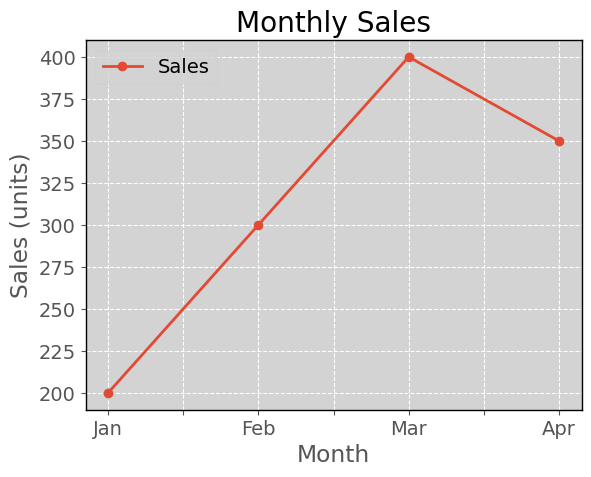
In this example:
df.plot()uses Pandas' built-in plotting functionality, which internally uses Matplotlib.- The
kindparameter specifies the type of plot (e.g., 'line', 'bar', 'scatter'). - Additional Matplotlib functions like
xlabel()andylabel()can be used for further customization.
Customizing Pandas Plots with Matplotlib
You can easily customize Pandas plots using Matplotlib’s capabilities:
ax = df.plot(x='Month', y='Sales', kind='bar', color='skyblue', legend=False)
ax.set_title('Monthly Sales')
ax.set_xlabel('Month')
ax.set_ylabel('Sales (units)')
plt.xticks(rotation=45)
plt.grid(True)
plt.show()
Output:
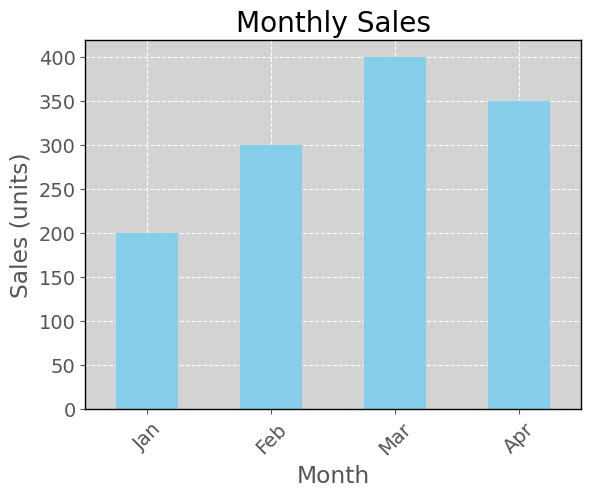
Here, we:
- Use a bar plot instead of a line plot.
- Customize colors, axis labels, title, and add gridlines.
2. Matplotlib with NumPy
NumPy is essential for numerical computations in Python, and Matplotlib is often used to visualize the results of these computations.
Plotting NumPy Arrays
Let’s visualize some data generated using NumPy:
import numpy as np
import matplotlib.pyplot as plt

# Generating data
x = np.linspace(0, 10, 100)
y = np.sin(x)

# Plotting
plt.plot(x, y)
plt.title('Sine Wave')
plt.xlabel('x')
plt.ylabel('sin(x)')
plt.grid(True)
plt.show()
Output:
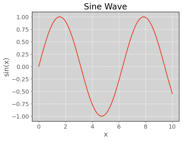
In this example, np.linspace() generates 100 points between 0 and 10, and np.sin() calculates the sine of each point, which we then plot using Matplotlib.
Subplots with NumPy
You can easily create subplots to compare multiple datasets:
y2 = np.cos(x)

plt.figure(figsize=(10, 4))

plt.subplot(1, 2, 1)
plt.plot(x, y)
plt.title('Sine Wave')
plt.grid(True)

plt.subplot(1, 2, 2)
plt.plot(x, y2, color='orange')
plt.title('Cosine Wave')
plt.grid(True)

plt.show()
Output:
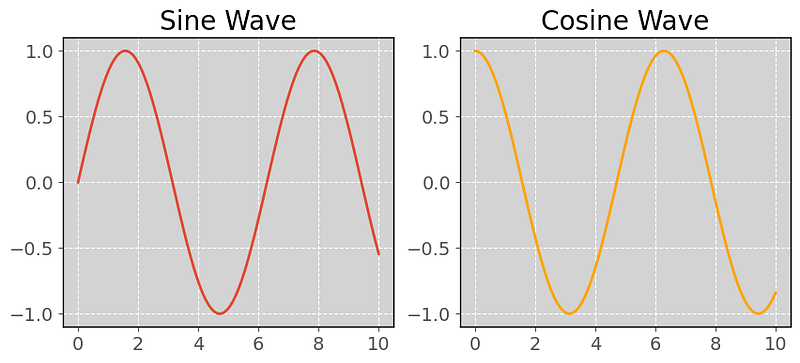
This example creates two subplots, one for the sine wave and another for the cosine wave.
3. Matplotlib with Seaborn
Seaborn is a statistical data visualization library that builds on Matplotlib, providing a high-level interface for drawing attractive and informative statistical graphics.
Creating Seaborn Plots with Matplotlib Customization
Seaborn integrates tightly with Matplotlib, allowing you to use Matplotlib’s customization features on Seaborn plots:
import seaborn as sns
import matplotlib.pyplot as plt

# Sample data
tips = sns.load_dataset("tips")

# Creating a Seaborn plot
sns.scatterplot(x='total_bill', y='tip', hue='day', data=tips)

# Customizing with Matplotlib
plt.title('Tips vs Total Bill by Day')
plt.xlabel('Total Bill ($)')
plt.ylabel('Tip ($)')
plt.grid(True)
plt.show()
Output:
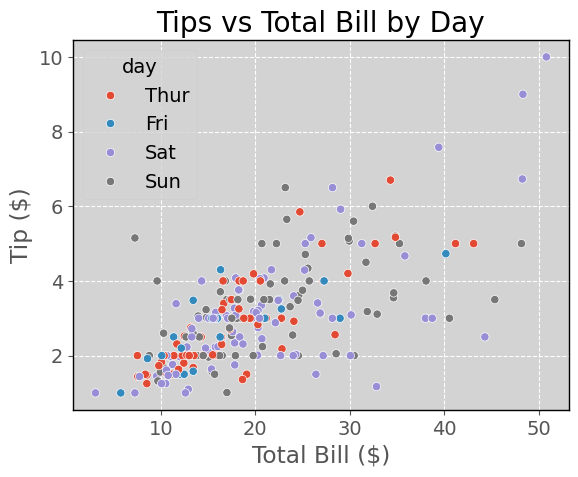
In this example:
- We use Seaborn’s
scatterplot()function to create a scatter plot. - Matplotlib is used to add a title, labels, and gridlines.
Combining Seaborn and Matplotlib Plots
You can combine Seaborn and Matplotlib plots to create complex visualizations:
sns.boxplot(x='day', y='total_bill', data=tips)
sns.stripplot(x='day', y='total_bill', data=tips, color='black', alpha=0.5)
plt.title('Total Bill Distribution by Day')
plt.show()
Output:
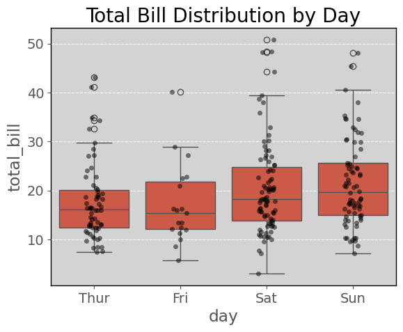
This example overlays a Seaborn strip plot on top of a box plot, creating a detailed view of the data distribution.
4. Integrating with Plotly for Interactive Plots
Plotly is a library for creating interactive plots that can be embedded in web applications or viewed in Jupyter notebooks.
Creating Interactive Plots with Plotly and Matplotlib
You can convert a Matplotlib plot to a Plotly interactive plot using mpl_to_plotly:
Note: For the following codes, my Matplotlib version is ‘3.9.0’, and also I installed plotly, and nbformat with these commands:
pip install plotly
pip install nbformat
The code is:
import matplotlib.pyplot as plt
import numpy as np
import plotly.tools as tls
import plotly.graph_objs as go

# Generating data
x = np.linspace(0, 10, 100)
y = np.sin(x)

# Creating a Matplotlib plot
plt.plot(x, y)
plt.title('Sine Wave')
plt.xlabel('x')
plt.ylabel('sin(x)')

# Converting to Plotly
plotly_fig = tls.mpl_to_plotly(plt.gcf())

# Displaying the Plotly figure
plotly_fig.show()
Output:
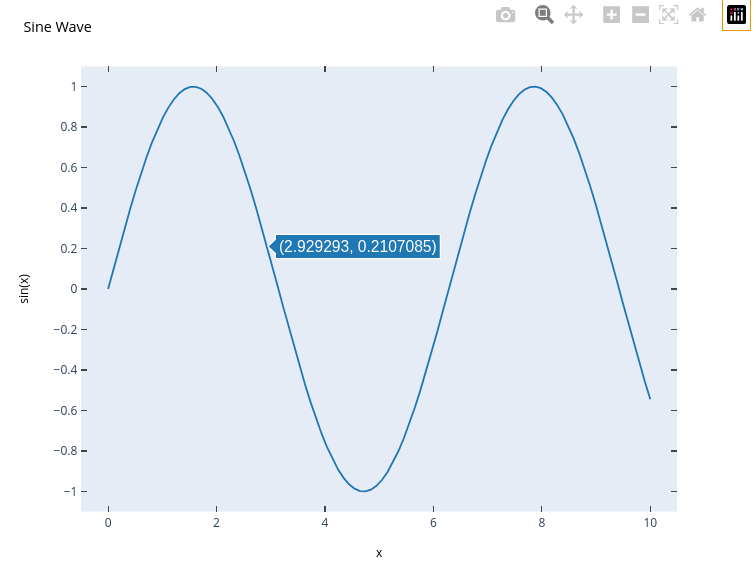
This code:
- Creates a Matplotlib plot.
- Converts it into a Plotly figure using
mpl_to_plotly. - Displays the interactive Plotly figure.
Enhancing Interactivity with Plotly
With Plotly, you can add interactive features like hover text, zooming, and dynamic legends:
import plotly.express as px

# Data
df = px.data.iris()

# Plotly Express
fig = px.scatter(df, x='sepal_width', y='sepal_length',
                 color='species', title='Iris Sepal Width vs Length')

fig.show()
Output:
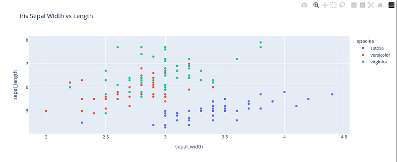
This code generates an interactive scatter plot with Plotly Express, where you can hover over points to see details, zoom, and toggle legends.
Conclusion
In this ninth part of the “Mastering Matplotlib” series, we explored how Matplotlib integrates with other powerful libraries like Pandas, NumPy, Seaborn, and Plotly. These integrations allow you to leverage the strengths of each library, whether it’s manipulating data with Pandas, performing numerical computations with NumPy, creating aesthetically pleasing plots with Seaborn, or adding interactivity with Plotly. These tools are invaluable for enhancing your data visualization capabilities, making your plots not only informative but also engaging.
If you like the article and would like to support me make sure to:
👏 Clap for the story (as much as you liked it 😊) and follow me 👉 📰 View more content on my medium profile 🔔 Follow Me: LinkedIn | Medium | GitHub | Twitter
Feel free to share your thoughts and questions in the comments below!


