
Mastering Matplotlib: Part 6 — Exploring 3D Plotting
Unleashing the Power of Three-Dimensional Visualization
🔙 Previous: Working with Images in Matplotlib
🔜 Next: Introduction to Interactive Backends
Note: You can find all the code examples for Matplotlib series in my GitHub repository.
In this sixth installment of the Mastering Matplotlib series, we’ll delve into the world of three-dimensional plotting. 3D plots allow us to visualize data in an additional dimension, which can reveal patterns and insights that are not easily discernible in 2D plots. Using Matplotlib’s mpl_toolkits.mplot3d module, we can create a wide range of 3D visualizations, including line plots, scatter plots, surface plots, wireframes, Contour Graphs, and more. This guide will walk you through these different types of 3D plots with practical examples and code snippets to help you get started.
Introduction to mpl_toolkits.mplot3d
The mpl_toolkits.mplot3d module in Matplotlib provides tools for creating three-dimensional plots. This module enables you to project data points in a 3D space, making it possible to create line plots, scatter plots, surfaces, and more, all in three dimensions. To get started with 3D plotting, you'll need to import the Axes3D class from this module.
from mpl_toolkits.mplot3d import Axes3D
import matplotlib.pyplot as plt
import numpy as np
With this setup, you’re ready to start exploring the various types of 3D plots.
1. 3-Dimensional Line Graph Using Matplotlib
A 3D line plot is one of the simplest ways to visualize data in three dimensions. It shows how a variable changes over time or another continuous variable.
Example:
fig = plt.figure()
ax = fig.add_subplot(111, projection='3d')
t = np.linspace(0, 20, 100)
x = np.sin(t)
y = np.cos(t)
z = t

ax.plot(x, y, z, label='3D line')
ax.set_xlabel('X Label')
ax.set_ylabel('Y Label')
ax.set_zlabel('Z Label')
ax.legend()
plt.show()
Output:
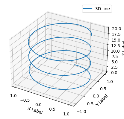
This code creates a 3D line plot where x and y are sine and cosine functions of t, respectively, and z is t itself.
2. 3-Dimensional Scatter Graph Using Matplotlib
3D scatter plots are useful for visualizing the relationship between three variables. Each point in the scatter plot represents a data point in 3D space.
Example:
fig = plt.figure()
ax = fig.add_subplot(111, projection='3d')
x = np.random.rand(100)
y = np.random.rand(100)
z = np.random.rand(100)

ax.scatter(x, y, z, c='r', marker='o')
ax.set_xlabel('X Label')
ax.set_ylabel('Y Label')
ax.set_zlabel('Z Label')
plt.show()
Output:
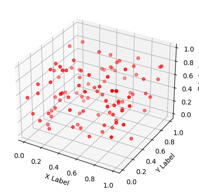
Here, x, y, and z are random variables, and the plot shows how these variables are distributed in 3D space.
3. Surface Graphs Using the Matplotlib Library
Surface plots display a three-dimensional surface that connects a grid of (x, y) points, making them ideal for visualizing functions of two variables.
Example:
fig = plt.figure()
ax = fig.add_subplot(111, projection='3d')
X = np.linspace(-5, 5, 100)
Y = np.linspace(-5, 5, 100)

X_grid, Y_grid = np.meshgrid(X, Y)
Z = np.sin(np.sqrt(X_grid**2 + Y_grid**2))

ax.plot_surface(X_grid,
                Y_grid, Z,
                cmap='viridis',
                edgecolor='green')
ax.set_xlabel('X Label')
ax.set_ylabel('Y Label')
ax.set_zlabel('Z Label')
plt.show()
Output:
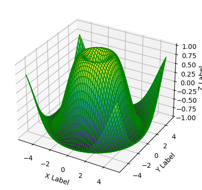
This example generates a 3D surface plot of the function z = sin(sqrt(x^2 + y^2)), using the viridis colormap for visualization.
Note: The np.meshgrid function takes two 1D arrays (let’s say X and Y) and returns two 2D matrices that represent a grid of coordinates. Here’s a step-by-step explanation and example.
For instance:
Let’s define our 1D arrays:
X = np.array([-5, -4, -3])
Y = np.array([-5, -4, -3])
Resulting Grids
After applying np.meshgrid, you'll get:
- X_grid:
[[-5, -4, -3],
 [-5, -4, -3],
[-5, -4, -3]]- Y_grid:
[[-5, -5, -5],
 [-4, -4, -4],
 [-3, -3, -3]]
4. Wireframes Graph Using Matplotlib Library
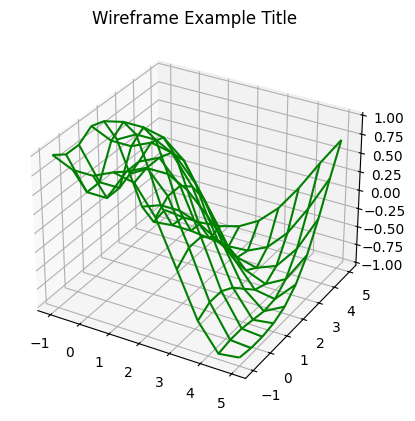
A wireframe plot is similar to a surface plot, but it only draws lines at the intersections of the grid, giving a skeletal view of the surface.
Example:
from mpl_toolkits import mplot3d
import numpy as np
import matplotlib.pyplot as plt

# function for z axis
def f(x, y):
    return np.sin(np.sqrt(x ** 2 + y ** 2))

# x and y axis
x = np.linspace(-1, 5, 10)
y = np.linspace(-1, 5, 10)

X, Y = np.meshgrid(x, y)
Z = f(X, Y)

fig = plt.figure()
ax = plt.axes(projection='3d')
ax.plot_wireframe(X, Y, Z, color='green')
ax.set_title('Wireframe Example Title')
Output:
5. Contour Graphs Using the Matplotlib Library
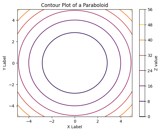
Contour plots are a powerful tool for visualizing three-dimensional data on a two-dimensional plane. They are particularly useful when you want to represent a surface by displaying lines of constant value, known as contour lines, which can help in understanding the shape and structure of the data more clearly.
Why Use Contour Plots?
- Visualization of 3D Data: Contour plots allow you to visualize the topography of a surface on a flat plane, making it easier to interpret patterns, peaks, and valleys.
- Comparison with Surface Plots: Unlike surface plots, which provide a 3D perspective, contour plots offer a more abstract view that can sometimes reveal features that are less obvious in 3D.
- Applications: They are commonly used in fields like meteorology (e.g., to represent pressure maps), geography (e.g., elevation maps), and engineering (e.g., to visualize potential fields).
Example: Paraboloid Function
An example that works well for applying contour plots is the paraboloid function, which is commonly used in optimization problems and 3D modeling. The paraboloid is a simple yet illustrative example where contour plots can clearly show concentric circles representing different levels of the function.
5–1. Surface Plot of the Paraboloid:
Let’s first create a surface plot of the paraboloid function:
import numpy as np
import matplotlib.pyplot as plt

# Generate grid of X and Y values
X = np.linspace(-5, 5, 100)
Y = np.linspace(-5, 5, 100)
X_grid, Y_grid = np.meshgrid(X, Y)

# Define the paraboloid function Z = X^2 + Y^2
Z = X_grid**2 + Y_grid**2

# Create a 3D surface plot
fig = plt.figure()
ax = fig.add_subplot(111, projection='3d')
ax.plot_surface(X_grid, Y_grid, Z, cmap='inferno', edgecolor='none')
ax.set_xlabel('X Label')
ax.set_ylabel('Y Label')
ax.set_zlabel('Z Label')
ax.set_title('Surface Plot of a Paraboloid')
plt.show()
Output:
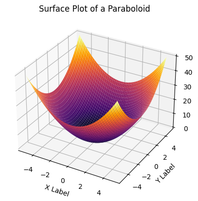
This surface plot will display the classic bowl shape of a paraboloid.
5-2. Contour Plot of the Paraboloid:
Now, let’s create a contour plot of the same function:
# Create a 2D contour plot
plt.contour(X_grid, Y_grid, Z, cmap='inferno')
plt.colorbar(label='Z value')
plt.xlabel('X Label')
plt.ylabel('Y Label')
plt.title('Contour Plot of a Paraboloid')
plt.show()
Output:
5-3. Filled Contour Plot:
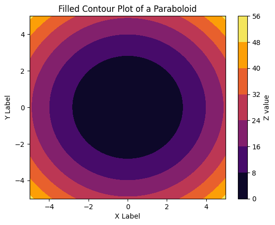
You can also create filled contour plots using plt.contourf, which fills the areas between contour lines with color. For a more vivid representation, you can use a filled contour plot:
# Create a filled contour plot
plt.contourf(X_grid, Y_grid, Z, cmap='inferno')
plt.colorbar(label='Z value')
plt.xlabel('X Label')
plt.ylabel('Y Label')
plt.title('Filled Contour Plot of a Paraboloid')
plt.show()
Output:
6. Drawing Surface Triangles in Python
Surface triangles are a type of plot that breaks down a surface into triangular facets, which can be useful for visualizing irregularly gridded data.
Example:
import numpy as np
import matplotlib.pyplot as plt
from matplotlib.tri import Triangulation

# Generate grid data
x = np.linspace(-5, 5, 50)
y = np.linspace(-5, 5, 50)
X, Y = np.meshgrid(x, y)

# Define a function for Z-axis (height)
Z = np.sin(np.sqrt(X**2 + Y**2))

# Generate triangulation
triang = Triangulation(X.flatten(), Y.flatten())

# Plotting
fig = plt.figure()
ax = fig.add_subplot(111, projection='3d')
ax.plot_trisurf(triang, Z.flatten(), cmap='viridis', edgecolor='none')

# Set titles and labels
ax.set_title('Surface Triangulation Example')
ax.set_xlabel('X-axis')
ax.set_ylabel('Y-axis')
ax.set_zlabel('Z-axis')

# Show plot
plt.show()
Output:
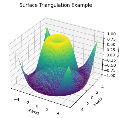
In this example, a simple triangular surface is created by specifying three points in 3D space.
7. Draw a Möbius Strip in Python
A Möbius strip is a surface with only one side and one edge, which makes it an interesting object to visualize in 3D.
Example:
fig = plt.figure()
ax = fig.add_subplot(111, projection='3d')
theta = np.linspace(0, 2*np.pi, 100)
w = np.linspace(-0.5, 0.5, 10)
theta, w = np.meshgrid(theta, w)
r = 1 + w * np.cos(theta / 2)
x = r * np.cos(theta)
y = r * np.sin(theta)
z = w * np.sin(theta / 2)

ax.plot_surface(x, y, z, cmap='coolwarm')
ax.set_xlabel('X Label')
ax.set_ylabel('Y Label')
ax.set_zlabel('Z Label')
plt.show()
Output:
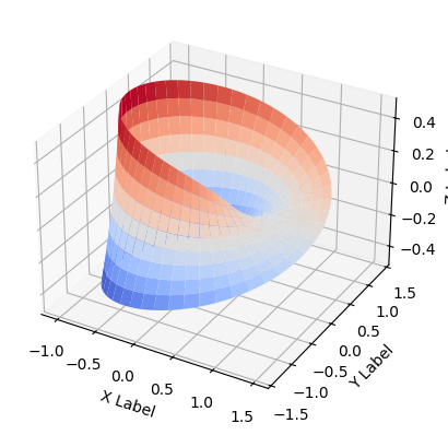
This code generates a Möbius strip by parameterizing the coordinates in 3D space and using the plot_surface function to render it.
Conclusion
In this part of the Mastering Matplotlib series, we explored various types of 3D plots available in Matplotlib, including line plots, scatter plots, surface plots, wireframes, and even more complex structures like Möbius strips. These tools allow you to add depth to your data visualizations and present your data in a more engaging and informative way. With the examples and code snippets provided, you’re now equipped to start creating your own 3D visualizations using Matplotlib.
In the seventh section of the Matplotlib series (Part — 7), I will cover interactive plotting, including an introduction to interactive backends, using ipympl for Jupyter Notebooks, exploring plots with mpl_interactions, and creating interactive widgets.
If you like the article and would like to support me make sure to:
👏 Clap for the story (as much as you liked it 😊) and follow me 👉 📰 View more content on my medium profile 🔔 Follow Me: LinkedIn | Medium | GitHub | Twitter
Feel free to share your thoughts and questions in the comments below!