avatarEbrahim Mousavi

Free AI web copilot to create summaries, insights and extended knowledge, download it at here

3512

Abstract

<code>imshow()</code>. The <code>cmap='gray'</code> argument ensures the grayscale image is displayed correctly.</p><h2 id="29ea">2. Customizing Colormaps</h2><p id="4bde">Colormaps are essential when visualizing data in images, as they map the data values to colors. Matplotlib offers a variety of built-in colormaps, which you can customize to enhance the visual appeal or clarity of your images.</p><p id="fa1a"><b>Note</b>: You can read more about colormaps with this <a href="https://matplotlib.org/stable/users/explain/colors/colormaps.html"><b>link</b></a>.</p><p id="4bbe"><b>Example</b>: Applying and Customizing Colormaps</p><div id="0622"><pre><span class="hljs-comment"># Generate sample data</span> data = np.random.random((<span class="hljs-number">10</span>, <span class="hljs-number">10</span>))

<span class="hljs-comment"># Display the data with different colormaps</span> plt.figure(figsize=(<span class="hljs-number">8</span>, <span class="hljs-number">6</span>))

plt.subplot(<span class="hljs-number">2</span>, <span class="hljs-number">2</span>, <span class="hljs-number">1</span>) plt.imshow(data, cmap=<span class="hljs-string">'viridis'</span>) plt.title(<span class="hljs-string">"Viridis Colormap"</span>) plt.axis(<span class="hljs-string">'off'</span>)

plt.subplot(<span class="hljs-number">2</span>, <span class="hljs-number">2</span>, <span class="hljs-number">2</span>) plt.imshow(data, cmap=<span class="hljs-string">'plasma'</span>) plt.title(<span class="hljs-string">"Plasma Colormap"</span>) plt.axis(<span class="hljs-string">'off'</span>)

plt.subplot(<span class="hljs-number">2</span>, <span class="hljs-number">2</span>, <span class="hljs-number">3</span>) plt.imshow(data, cmap=<span class="hljs-string">'coolwarm'</span>) plt.title(<span class="hljs-string">"Coolwarm Colormap"</span>) plt.axis(<span class="hljs-string">'off'</span>)

plt.subplot(<span class="hljs-number">2</span>, <span class="hljs-number">2</span>, <span class="hljs-number">4</span>) plt.imshow(data, cmap=<span class="hljs-string">'magma'</span>) plt.title(<span class="hljs-string">"Magma Colormap"</span>) plt.axis(<span class="hljs-string">'off'</span>)

plt.show()</pre></div><p id="efb8"><b>Output:</b></p><figure id="d4a9"><img src="https://cdn-images-1.readmedium.com/v2/resize:fit:800/1*hvEb_CcDtw1dKGZjeiLo4Q.png"><figcaption></figcaption></figure><p id="4c31">In this example, we visualize the same data using four different colormaps: <code>viridis</code>, <code>plasma</code>, <code>coolwarm</code>, and <code>magma</code>. This helps how different colormaps can impact the perception of the data.</p><h2 id="08f2">3. Adding Colorbars</h2><p id="c93d">Colorbars provide a visual reference for the mapping between data values and colors in your images. They are particularly useful when working with continuous data.</p><p id="d292"><b>Example</b>: Adding a Colorbar</p><div id="0a80"><pre><span class="hljs-comment"># Generate sample data</span> data = np.random.random((<span class="hljs-number">10</span>, <span class="hljs-number">10</span>))

<span class="hljs-comment"># Display the image with a colorbar</span> plt.imshow(data, cmap=<span class="hljs-string">'gray'</span>) plt.colorbar(label=<span class="hljs-string">'Intensity'</span>) plt.title(<span class="hljs-string">"Image with Colorbar"</span>) plt.axis(<span class="hljs-string">'off'</span>) plt.show()</pre></div><p id="40e7"><b>Output:</b></p><figure id="2e80"><img src="https://cdn-images-1.readmedium.com/v2/re

Options

size:fit:800/1*nxBELK-MPcpvXMGyywqrmg.png"><figcaption></figcaption></figure><p id="6a33">In this example, we display an image with the <code>gray</code> colormap and add a colorbar to indicate the intensity values.</p><h2 id="ab89">4. Overlaying Plots on Images</h2><p id="2ba7">Overlaying plots on images can be useful for highlighting specific regions or data points on an image. Matplotlib allows you to easily overlay plots such as scatter plots, line plots, and more.</p><p id="7942"><b>Example</b>: Overlaying a Scatter Plot on an Image</p><div id="e792"><pre><span class="hljs-comment"># Generate a sample image and overlay data</span> image = np.random.random((<span class="hljs-number">100</span>, <span class="hljs-number">100</span>)) x = np.random.randint(<span class="hljs-number">0</span>, <span class="hljs-number">100</span>, <span class="hljs-number">20</span>) y = np.random.randint(<span class="hljs-number">0</span>, <span class="hljs-number">100</span>, <span class="hljs-number">20</span>)

plt.imshow(image, cmap=<span class="hljs-string">'gray'</span>) plt.scatter(x, y, color=<span class="hljs-string">'red'</span>, marker=<span class="hljs-string">'o'</span>) plt.title(<span class="hljs-string">"Scatter Plot Overlay on Image"</span>) plt.axis(<span class="hljs-string">'off'</span>) plt.show()</pre></div><p id="f8e9"><b>Output:</b></p><figure id="dd03"><img src="https://cdn-images-1.readmedium.com/v2/resize:fit:800/1*sPsymTPedFyF2eFnKZjUPQ.png"><figcaption></figcaption></figure><p id="a27a">In this example, we display a grayscale image and overlay a scatter plot on top of it, with red markers indicating specific data points.</p><h2 id="c5b5">Conclusion</h2><p id="e3a6">In this part of the “<b>Mastering Matplotlib</b>” series, we’ve explored various techniques for working with images in Matplotlib. From <b>displaying images</b> with <code>imshow()</code> to <b>customizing colormaps</b>, <b>adding colorbars</b>, and <b>overlaying plots</b>, these tools are invaluable for any data scientist or researcher working with visual data. With these skills, you can effectively convey your data's story through powerful visualizations.</p><p id="46e7">In the next part of this series (<a href="https://readmedium.com/mastering-matplotlib-part-6-exploring-3d-plotting-0423821e2e10"><b>Part — 6</b></a>), we’ll continue our exploration by diving into more advanced topics, such as 3D plotting and interactive visualizations.</p><p id="f545"><b>If you like the article and would like to support me make sure to:</b></p><p id="b66d">👏 Clap for the story (<b>as much as you liked it <a href="https://emojipedia.org/smiling-face-with-smiling-eyes"></a></b><a href="https://emojipedia.org/smiling-face-with-smiling-eyes">😊</a>) and follow me 👉 📰 View more content on my medium profile 🔔 Follow Me: <a href="https://www.linkedin.com/in/ebimsv/"><b>LinkedIn</b></a> | <a href="https://medium.com/@ebimsv"><b>Medium</b></a> | <a href="https://github.com/Ebimsv?tab=repositories"><b>GitHub</b></a> | <a href="https://x.com/ebiimsv"><b>Twitter</b></a></p><p id="7a93"><b>Feel free to share your thoughts and questions in the comments below!</b></p><h1 id="4964">References:</h1><ol><li><a href="https://matplotlib.org/stable/tutorials/images.html">https://matplotlib.org/stable/tutorials/images.html</a></li><li><a href="https://matplotlib.org/stable/gallery/color/colormap_reference.html">https://matplotlib.org/stable/gallery/color/colormap_reference.html</a></li></ol></article></body>

Mastering Matplotlib: Part 5 — Working with Images

Enhancing Visuals and Data Representation

🔙 Previous: Subplots, Layouts, and Advanced Customizations

🔜 Next: Exploring 3D Plotting

Note: You can find all the code examples for Matplotlib series in my GitHub repository.

In this section we dive into the world of image manipulation and visualization. Images are ubiquitous in data analysis and scientific research, and being able to effectively display, customize, and overlay plots on images can greatly enhance the interpretability of your results. This section will guide you through key functionalities in Matplotlib for working with images, including displaying images, customizing colormaps, adding colorbars, and overlaying plots on top of images. By the end of this tutorial, you will have the skills to handle images in Matplotlib with confidence and precision.

1. Displaying Images with imshow()

The imshow() function is the core tool in Matplotlib for displaying images. It accepts a variety of input formats, including 2D arrays for grayscale images and 3D arrays for RGB images.

Example: Displaying a Grayscale and an RGB Image

import matplotlib.pyplot as plt
import numpy as np

# Create a sample grayscale image
grayscale_image = np.random.random((10, 10))

# Create a sample RGB image
rgb_image = np.random.random((10, 10, 3))

# Display the grayscale image
plt.figure(figsize=(8, 4))
plt.subplot(1, 2, 1)
plt.imshow(grayscale_image, cmap='gray')
plt.title("Grayscale Image")
plt.axis('off')

# Display the RGB image
plt.subplot(1, 2, 2)
plt.imshow(rgb_image)
plt.title("RGB Image")
plt.axis('off')

plt.show()

Output:

In this example, we generate a random grayscale image and an RGB image and display them side by side using imshow(). The cmap='gray' argument ensures the grayscale image is displayed correctly.

2. Customizing Colormaps

Colormaps are essential when visualizing data in images, as they map the data values to colors. Matplotlib offers a variety of built-in colormaps, which you can customize to enhance the visual appeal or clarity of your images.

Note: You can read more about colormaps with this link.

Example: Applying and Customizing Colormaps

# Generate sample data
data = np.random.random((10, 10))

# Display the data with different colormaps
plt.figure(figsize=(8, 6))

plt.subplot(2, 2, 1)
plt.imshow(data, cmap='viridis')
plt.title("Viridis Colormap")
plt.axis('off')

plt.subplot(2, 2, 2)
plt.imshow(data, cmap='plasma')
plt.title("Plasma Colormap")
plt.axis('off')

plt.subplot(2, 2, 3)
plt.imshow(data, cmap='coolwarm')
plt.title("Coolwarm Colormap")
plt.axis('off')

plt.subplot(2, 2, 4)
plt.imshow(data, cmap='magma')
plt.title("Magma Colormap")
plt.axis('off')

plt.show()

Output:
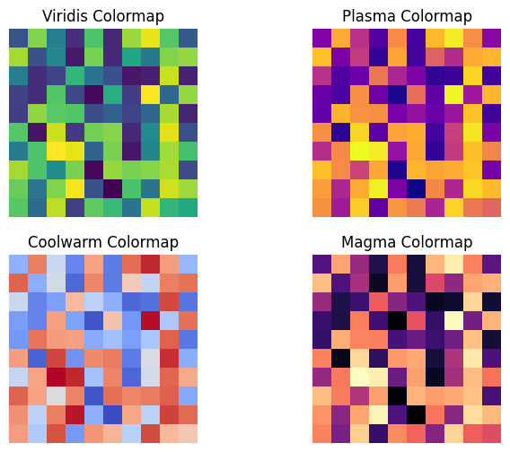
In this example, we visualize the same data using four different colormaps: viridis, plasma, coolwarm, and magma. This helps how different colormaps can impact the perception of the data.

3. Adding Colorbars

Colorbars provide a visual reference for the mapping between data values and colors in your images. They are particularly useful when working with continuous data.

Example: Adding a Colorbar

# Generate sample data
data = np.random.random((10, 10))

# Display the image with a colorbar
plt.imshow(data, cmap='gray')
plt.colorbar(label='Intensity')
plt.title("Image with Colorbar")
plt.axis('off')
plt.show()

Output:
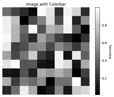
In this example, we display an image with the gray colormap and add a colorbar to indicate the intensity values.

4. Overlaying Plots on Images

Overlaying plots on images can be useful for highlighting specific regions or data points on an image. Matplotlib allows you to easily overlay plots such as scatter plots, line plots, and more.

Example: Overlaying a Scatter Plot on an Image

# Generate a sample image and overlay data
image = np.random.random((100, 100))
x = np.random.randint(0, 100, 20)
y = np.random.randint(0, 100, 20)

plt.imshow(image, cmap='gray')
plt.scatter(x, y, color='red', marker='o')
plt.title("Scatter Plot Overlay on Image")
plt.axis('off')
plt.show()

Output:
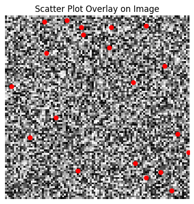
In this example, we display a grayscale image and overlay a scatter plot on top of it, with red markers indicating specific data points.

Conclusion

In this part of the “Mastering Matplotlib” series, we’ve explored various techniques for working with images in Matplotlib. From displaying images with imshow() to customizing colormaps, adding colorbars, and overlaying plots, these tools are invaluable for any data scientist or researcher working with visual data. With these skills, you can effectively convey your data's story through powerful visualizations.

In the next part of this series (Part — 6), we’ll continue our exploration by diving into more advanced topics, such as 3D plotting and interactive visualizations.

If you like the article and would like to support me make sure to:

👏 Clap for the story (as much as you liked it 😊) and follow me 👉 📰 View more content on my medium profile 🔔 Follow Me: LinkedIn | Medium | GitHub | Twitter

Feel free to share your thoughts and questions in the comments below!

References:

  1. https://matplotlib.org/stable/tutorials/images.html
  2. https://matplotlib.org/stable/gallery/color/colormap_reference.html
Matplotlib
Matplotlib Tutorial
Visualization
Machine Learning
Data Science
Recommended from ReadMedium