
Mastering Matplotlib: Part 4. Subplots, Layouts, and Advanced Customizations

🔙 Previous: Different Plot Types in Matplotlib
🔜 Next: Working with Images
Note: You can find all the code examples for Matplotlib series in my GitHub repository.
In the previous sections, we’ve covered the basics of plotting, customizing plots, and enhancing them with labels, titles, and legends. In this tutorial, we’ll explore how to create and customize multiple subplots within a single figure, and then dive into advanced plot customization techniques, including adding error bars, using logarithmic axes, and more. These skills will help you create more complex and informative visualizations.
1. Subplots and Layouts
Creating Multiple Subplots
When you need to display multiple plots side by side or in a grid within a single figure, you can use subplots. The plt.subplots() function is a tool for this purpose.
import matplotlib.pyplot as plt

# Create a 2x2 grid of subplots
fig, axs = plt.subplots(2, 2)

# Plot in each subplot
axs[0, 0].plot([1, 2, 3, 4], [10, 20, 25, 30])
axs[0, 1].plot([1, 2, 3, 4], [20, 25, 30, 35])
axs[1, 0].plot([1, 2, 3, 4], [30, 35, 40, 45])
axs[1, 1].plot([1, 2, 3, 4], [40, 45, 50, 55])

plt.show()
Output:
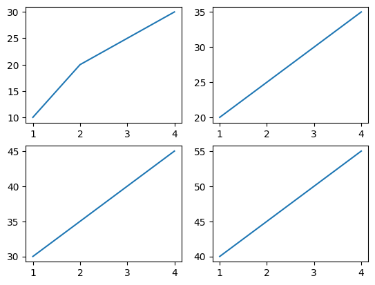
This code creates a 2x2 grid of subplots, each with its own line plot. The axs array is indexed by [row, column], allowing you to access and plot on individual subplots.
Customizing Layout with subplots()
You can customize the layout of your subplots using parameters like figsize, hspace, and wspace:
fig, axs = plt.subplots(2, 2, figsize=(8, 6))
fig.subplots_adjust(hspace=0.4, wspace=0.2)

axs[0, 0].plot([1, 2, 3, 4], [10, 20, 25, 30])
axs[0, 1].plot([1, 2, 3, 4], [20, 25, 30, 35])
axs[1, 0].plot([1, 2, 3, 4], [30, 35, 40, 45])
axs[1, 1].plot([1, 2, 3, 4], [40, 45, 50, 55])

plt.show()
Output:
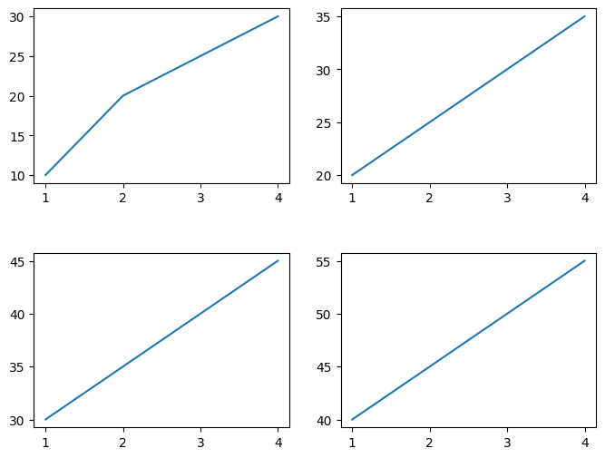
figsizesets the overall size of the figure.hspaceandwspacecontrol the space between rows and columns of subplots.
Using GridSpec for Advanced Layouts
For more control over subplot placement, we can use GridSpec. This allows us to create complex layouts by specifying the exact location and size of each subplot within a grid.
import matplotlib.gridspec as gridspec

fig = plt.figure(figsize=(8, 6))
gs = gridspec.GridSpec(3, 3)

ax1 = fig.add_subplot(gs[0, :])
ax2 = fig.add_subplot(gs[1, :2])
ax3 = fig.add_subplot(gs[1:, 2])
ax4 = fig.add_subplot(gs[2, 0])
ax5 = fig.add_subplot(gs[2, 1])

ax1.plot([1, 2, 3, 4], [10, 20, 25, 30])
ax2.plot([1, 2, 3, 4], [20, 25, 30, 35])
ax3.plot([1, 2, 3, 4], [30, 35, 40, 45])
ax4.plot([1, 2, 3, 4], [40, 45, 50, 55])
ax5.plot([1, 2, 3, 4], [50, 55, 60, 65])

plt.show()
Output:
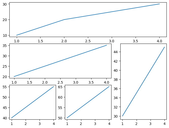
In this example:
GridSpec(3, 3)creates a 3x3 grid.- Subplots can span multiple rows and columns, offering flexibility in layout design.
Sharing Axes Between Subplots
Sharing axes between subplots ensures that they have the same scale, which is particularly useful when comparing data across multiple plots.
fig, axs = plt.subplots(2, 2, sharex=True, sharey=True)

axs[0, 0].plot([1, 2, 3, 4], [10, 20, 25, 30])
axs[0, 1].plot([1, 2, 3, 4], [20, 25, 30, 35])
axs[1, 0].plot([1, 2, 3, 4], [30, 35, 40, 45])
axs[1, 1].plot([1, 2, 3, 4], [40, 45, 50, 55])

plt.show()
Output:
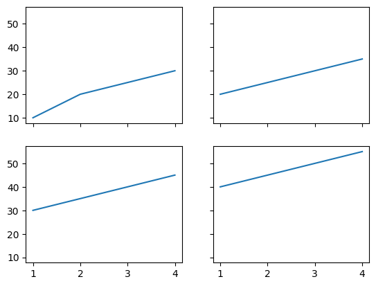
In this case:
sharex=Trueandsharey=Trueensure that all subplots share the same x and y axes, respectively.
2. Advanced Plot Customization
Adding Error Bars
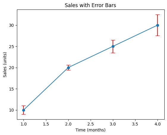
Error bars provide a visual representation of the variability of data points. You can add them to your plots using the yerr and xerr arguments in the plot() function:
x = [1, 2, 3, 4]
y = [10, 20, 25, 30]
yerr = [1, 0.6, 1.5, 2.5]

plt.errorbar(x, y, yerr=yerr, fmt='-o', ecolor='red', capsize=5)
plt.title('Sales with Error Bars')
plt.xlabel('Time (months)')
plt.ylabel('Sales (units)')
plt.show()
Output:
In this example:
yerrspecifies the error margins for the y values.fmt='-o'defines the line style and marker.ecolorsets the color of the error bars, andcapsizeadjusts the size of the caps at the ends of the error bars.
Plotting with Logarithmic Axes
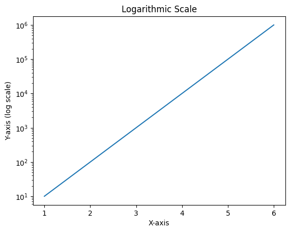
Logarithmic scales are useful for data that spans several orders of magnitude. You can set the x or y axis to a logarithmic scale using set_xscale() and set_yscale():
x = [1, 2, 3, 4, 5, 6]
y = [10, 100, 1000, 10000, 100000, 1000000]

plt.plot(x, y)
plt.yscale('log')
plt.title('Logarithmic Scale')
plt.xlabel('X-axis')
plt.ylabel('Y-axis (log scale)')
plt.show()
Output:
In this plot:
plt.yscale('log')converts the y-axis to a logarithmic scale, making it easier to visualize data with large ranges.
Customizing Line Styles with Dictionaries
Matplotlib allows for the customization of line styles using dictionaries, providing a more flexible way to specify colors, line styles, markers, and more:
line_style = {'color': 'purple',
              'linestyle': '-.',
              'linewidth': 2,
              'marker': 'x'}

x = [1, 2, 3, 4]
y = [10, 20, 25, 30]

plt.plot(x, y, **line_style)
plt.title('Customized Line Style')
plt.xlabel('X-axis')
plt.ylabel('Y-axis')
plt.show()
Output:
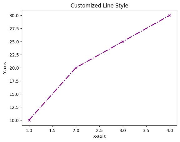
In this example, the line style is defined in a dictionary, making the code more readable and easier to modify.
Adding Custom Legends and Annotations
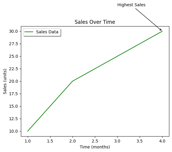
Custom legends and annotations can further enhance your plot by providing additional context and highlighting specific data points:
x = [1, 2, 3, 4]
y = [10, 20, 25, 30]

plt.plot(x, y, label='Sales Data', color='green')
plt.title('Sales Over Time')
plt.xlabel('Time (months)')
plt.ylabel('Sales (units)')
plt.legend(loc='upper left', fontsize=10, frameon=True, shadow=True)

# Add annotation
plt.annotate('Highest Sales', xy=(4, 30), xytext=(3, 35),
             arrowprops=dict(facecolor='black', arrowstyle='->'))

plt.show()
Output:
In this plot:
label='Sales Data'adds a label to the plot for the legend.plt.legend()creates a customized legend with a shadow and specific location.plt.annotate()highlights the highest sales point with an annotation and an arrow.
Conclusion
In this fourth part of the “Mastering Matplotlib” series, we explored how to create and customize multiple subplots, giving you the tools to organize your data into clear, coherent visualizations. We also delved into advanced customization techniques, such as adding error bars, using logarithmic axes, customizing line styles, and adding detailed legends and annotations. These advanced skills will allow you to create more sophisticated and informative plots.
Our exploration of Matplotlib in the next section (Part — 5) will focus on the powerful capabilities of working with images. We will learn how to display images effectively using the imshow() function, customize their appearance with colormaps, and enhance our visualizations by incorporating colorbars for better data interpretation. Additionally, we'll discover techniques to overlay plots on images, allowing for more informative and visually engaging presentations of our data.
If you like the article and would like to support me make sure to:
👏 Clap for the story (as much as you liked it 😊) and follow me 👉 📰 View more content on my medium profile 🔔 Follow Me: LinkedIn | Medium | GitHub | Twitter
Feel free to share your thoughts and questions in the comments below!


