
Mastering Matplotlib: Part 3. Exploring Different Plot Types
Unleashing the Power of Visualization through Varied Charting Techniques
🔙 Previous: Enhancing Plots with Labels, Titles, Legends, and Customizations
🔜 Next: Subplots, Layouts, and Advanced Customizations
Note: You can find all the code examples for Matplotlib series in my GitHub repository.
Welcome to the third part of the “Mastering Matplotlib” series. So far, we’ve covered the basics of Matplotlib, enhanced our plots with labels, titles, legends, and customizations. Now, it’s time to explore a variety of plot types that Matplotlib offers. This tutorial will walk you through creating bar plots, histograms, scatter plots, pie charts, and box plots, with practical examples and customization tips for each.
1. Bar Plots
Bar plots are useful for comparing different categories or groups. Let’s start with simple vertical and horizontal bar plots, and then move on to grouped and stacked bars.
Vertical and Horizontal Bars
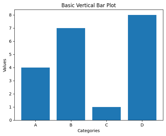
Here’s how to create a basic vertical bar plot:
import matplotlib.pyplot as plt

categories = ['A', 'B', 'C', 'D']
values = [4, 7, 1, 8]

plt.bar(categories, values)
plt.xlabel('Categories')
plt.ylabel('Values')
plt.title('Basic Vertical Bar Plot')
plt.show()
Output:
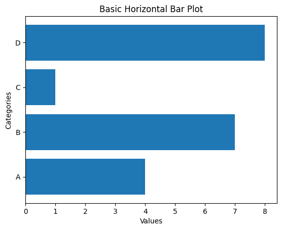
To create a horizontal bar plot, use barh() instead of bar():
plt.barh(categories, values)
plt.xlabel('Values')
plt.ylabel('Categories')
plt.title('Basic Horizontal Bar Plot')
plt.show()
Output:
Grouped and Stacked Bars
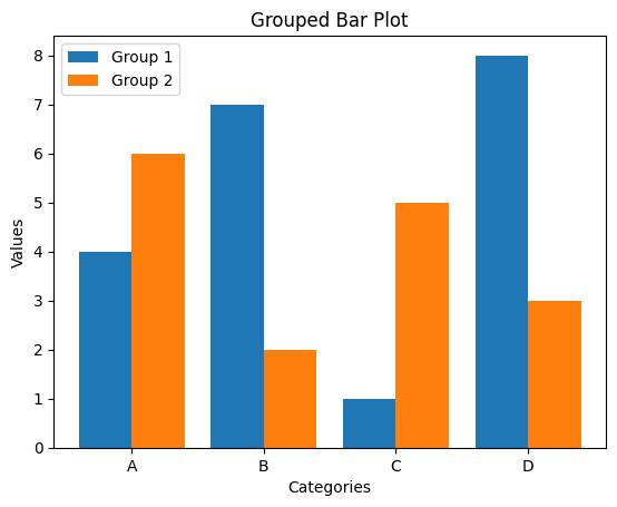
Grouped bar plots allow you to compare multiple groups side by side. Here’s an example:
import numpy as np

categories = ['A', 'B', 'C', 'D']
values1 = [4, 7, 1, 8]
values2 = [6, 2, 5, 3]

x = np.arange(len(categories))

plt.bar(x - 0.2, values1, width=0.4, label='Group 1')
plt.bar(x + 0.2, values2, width=0.4, label='Group 2')
plt.xticks(x, categories)
plt.xlabel('Categories')
plt.ylabel('Values')
plt.title('Grouped Bar Plot')
plt.legend()
plt.show()
Output:
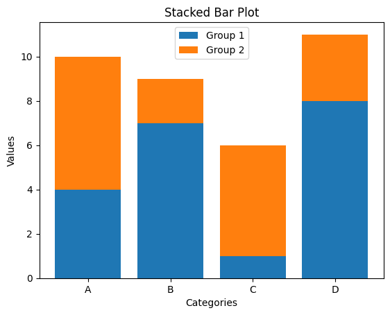
For stacked bar plots, where bars are stacked on top of each other, you can use the following code:
plt.bar(categories, values1, label='Group 1')
plt.bar(categories, values2, bottom=values1, label='Group 2')
plt.xlabel('Categories')
plt.ylabel('Values')
plt.title('Stacked Bar Plot')
plt.legend()
plt.show()
Output:
2. Histograms
Histograms are used to display the distribution of a dataset. Let’s look at how to create and customize histograms in Matplotlib.
Customizing Bins
The bins parameter controls the number of bins in your histogram:
import matplotlib.pyplot as plt

data = [1, 2, 2, 3, 3, 3, 4, 4, 4, 4, 5, 5, 5, 5, 5]

plt.hist(data, bins=5)
plt.xlabel('Value')
plt.ylabel('Frequency')
plt.title('Histogram with 5 Bins')
plt.show()
Output:
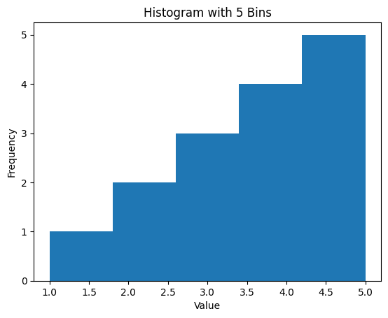
You can adjust the number of bins to better capture the distribution of your data.
Normalization and Density Plots
You can normalize the histogram to show the density instead of the raw frequency by setting density=True:
plt.hist(data, bins=5, density=True)
plt.xlabel('Value')
plt.ylabel('Density')
plt.title('Normalized Histogram')
plt.show()
Output:
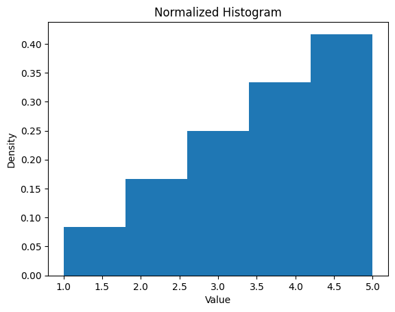
This gives you a histogram where the area under the curve equals 1.
3. Scatter Plots
Scatter plots are great for visualizing the relationship between two variables. Let’s explore how to create and customize scatter plots in Matplotlib.
Customizing Markers
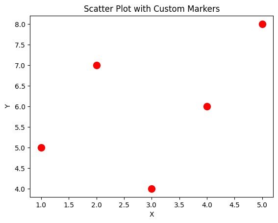
You can customize the markers in a scatter plot by changing their size, shape, and color:
x = [1, 2, 3, 4, 5]
y = [5, 7, 4, 6, 8]

plt.scatter(x, y, color='red', marker='o', s=100)  # s controls the size of markers
plt.xlabel('X')
plt.ylabel('Y')
plt.title('Scatter Plot with Custom Markers')
plt.show()
Output:
Colormap and Size
Scatter plots can also be customized to show variations in data through colors and sizes. Here’s an example:
import numpy as np

x = np.random.rand(50)
y = np.random.rand(50)
sizes = np.random.rand(50) * 1000
colors = np.random.rand(50)

plt.scatter(x, y, s=sizes, c=colors, cmap='viridis', alpha=0.5)
plt.colorbar()  # Adds a colorbar to the plot
plt.xlabel('X')
plt.ylabel('Y')
plt.title('Scatter Plot with Colormap and Size Variation')
plt.show()
Output:
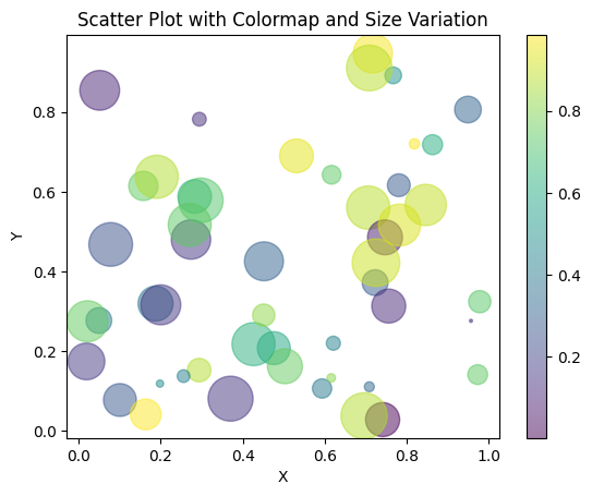
In this plot:
s=sizeschanges the size of each marker based on thesizesarray.c=colorsassigns colors to markers based on thecolorsarray.cmap='viridis'sets the colormap.
4. Pie Charts
Pie charts are useful for showing the proportions of categories. Let’s look at how to create and customize pie charts in Matplotlib.
Exploding Slices
You can “explode” or separate slices of the pie chart for emphasis:
labels = ['A', 'B', 'C', 'D']
sizes = [15, 30, 45, 10]
explode = (0, 0.1, 0, 0)  # only "explode" the 2nd slice

plt.pie(sizes, labels=labels, explode=explode, autopct='%1.1f%%', shadow=True, startangle=90)
plt.title('Pie Chart with Exploded Slice')
plt.show()
Output:
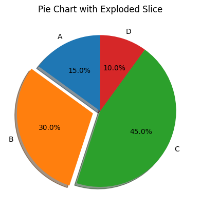
In this example:
explodespecifies how far each slice is "pulled out" from the center.autopctshows the percentage value inside the slices.shadowadds a shadow to the chart for depth.startangle=90rotates the chart so that the first slice starts at 90 degrees.
Customizing Colors
You can also customize the colors of the slices:
labels = ['A', 'B', 'C', 'D']
sizes = [15, 30, 45, 10]

colors = ['gold', 'yellowgreen', 'lightcoral', 'lightskyblue']

plt.pie(sizes, labels=labels, colors=colors, autopct='%1.1f%%', startangle=140)
plt.title('Pie Chart with Custom Colors')
plt.show()
Output:
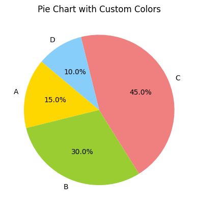
Here, the colors argument defines the color of each slice.
5. Box Plots
Box plots are useful for showing the distribution of data, highlighting the median, quartiles, and outliers.
Basic Box Plot
Here’s how to create a basic box plot:
data = [np.random.normal(0, std, 100) for std in range(1, 4)]

plt.boxplot(data)
plt.title('Basic Box Plot')
plt.xlabel('Dataset')
plt.ylabel('Value')
plt.show()
Output:
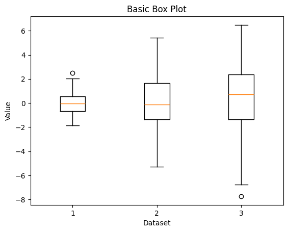
This code generates box plots for three different datasets with varying standard deviations.
Customizing Whiskers and Outliers
You can customize the appearance of the whiskers and outliers in the box plot:
plt.boxplot(data, notch=True, vert=True, patch_artist=True,
            whiskerprops=dict(color='blue', linewidth=2),
            flierprops=dict(marker='o', color='red', markersize=8),
            medianprops=dict(color='green', linewidth=2))
plt.title('Customized Box Plot')
plt.xlabel('Dataset')
plt.ylabel('Value')
plt.show()
Output:
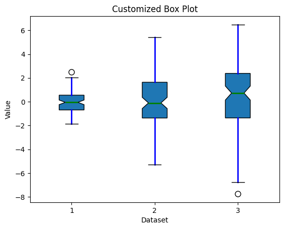
In this example:
notch=Trueadds a notch to the box plot.patch_artist=Truefills the box with color.whiskerpropscustomizes the whiskers.flierpropscustomizes the appearance of outliers.medianpropschanges the appearance of the median line.
Conclusion
In this third part of the “Mastering Matplotlib” series, we explored a variety of plot types, including bar plots, histograms, scatter plots, pie charts, and box plots. We covered how to create these plots and customize them to make your data visualizations more informative and visually appealing.
In the next part of the series (Part — 4), we’ll dive into advanced techniques for optimizing our visualizations, enabling you to create complex figures that effectively convey your data’s story. Join us as we uncover the power of Matplotlib, making your data visualizations not only informative but also visually captivating.
If you like the article and would like to support me make sure to:
👏 Clap for the story (as much as you liked it 😊) and follow me 👉 📰 View more content on my medium profile 🔔 Follow Me: LinkedIn | Medium | GitHub | Twitter
Feel free to share your thoughts and questions in the comments below!


