
Mastering Matplotlib: Part 2. Enhancing Plots with Labels, Titles, Legends, and Customizations
Elevate Your Data Visualization Skills with Essential Plot Components and Personalization Techniques

🔙 Previous: Introduction and Basic Plotting Techniques
🔜 Next: Exploring Different Plot Types
Note: You can find all the code examples for Matplotlib series in my GitHub repository.
Welcome back to the second part of the “Mastering Matplotlib” series. In the first part, we covered the basics of Matplotlib, including how to create simple line plots and customize them with different styles and markers. Now, we’re going to take your plotting skills to the next level by focusing on how to enhance your plots with labels, titles, legends, and various customization techniques.
1. Labels, Titles, and Legends
Adding Titles and Labels
Adding titles and labels is essential for making your plots informative and easy to understand. Let’s start by adding a title to the plot and labels to the x and y axes:
import matplotlib.pyplot as plt

x = [1, 2, 3, 4]
y = [10, 20, 25, 30]

plt.plot(x, y)
plt.title('Sales Over Time')
plt.xlabel('Time (months)')
plt.ylabel('Sales (units)')
plt.show()
Output:
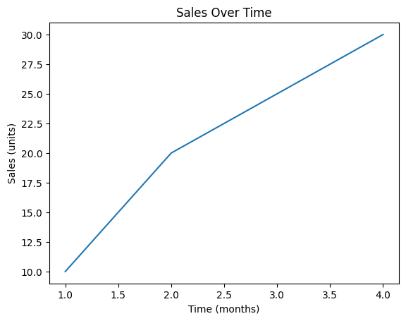
In this example:
plt.title('Sales Over Time')adds a title to the plot.plt.xlabel('Time (months)')labels the x-axis.plt.ylabel('Sales (units)')labels the y-axis.
Customizing Fonts and Sizes
You can further customize the appearance of your titles and labels by adjusting their fonts and sizes:
plt.title('Sales Over Time', fontsize=16, fontweight='bold', color='blue')
plt.xlabel('Time (months)', fontsize=12, fontstyle='italic')
plt.ylabel('Sales (units)', fontsize=12, fontstyle='italic')
plt.plot(x, y)
plt.show()
Output:
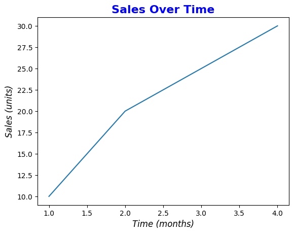
Here:
fontsizeadjusts the size of the text.fontweightcan make the text bold.fontstylecan italicize the text.colorchanges the text color.
Creating and Positioning Legends
Legends help distinguish between different data series in your plot. You can add a legend using the legend() function:
y2 = [15, 25, 20, 35]

plt.plot(x, y,  label='Product A')
plt.plot(x, y2, label='Product B')
plt.xlabel('Time (months)')
plt.ylabel('Sales (units)')
plt.title('Sales Comparison')
plt.legend(loc='upper left')
plt.show()
Output:
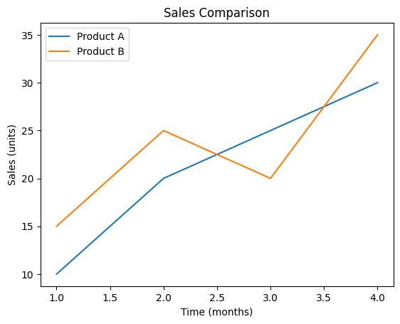
In this example:
label='Product A'andlabel='Product B'specify the labels for the two lines.plt.legend(loc='upper left')positions the legend in the upper left corner of the plot.
You can position the legend using various options like 'upper right', 'lower left', 'center', or even by specifying coordinates.
Adding Gridlines
Gridlines make it easier to read values off the plot. You can add them with the grid() function:
plt.plot(x, y)
plt.xlabel('Time (months)')
plt.ylabel('Sales (units)')
plt.title('Sales Over Time')
plt.grid(True)
plt.show()
Output:
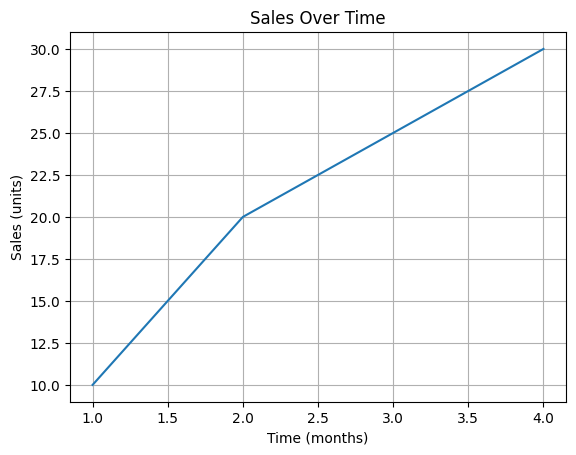
Setting plt.grid(True) turns on the gridlines, and you can further customize them by adjusting their style, color, and width:
plt.grid(color='gray', linestyle='--', linewidth=0.5)Please try the above code and see the result of that.
2. Plot Customization
Customizing your plot’s dimensions, axes, ticks, and adding annotations can greatly enhance its readability and aesthetic appeal.
Adjusting Plot Dimensions
You can adjust the size of your plot using the figsize parameter in plt.figure():
plt.figure(figsize=(8, 4))
plt.plot(x, y)
plt.title('Sales Over Time')
plt.show()
Output:
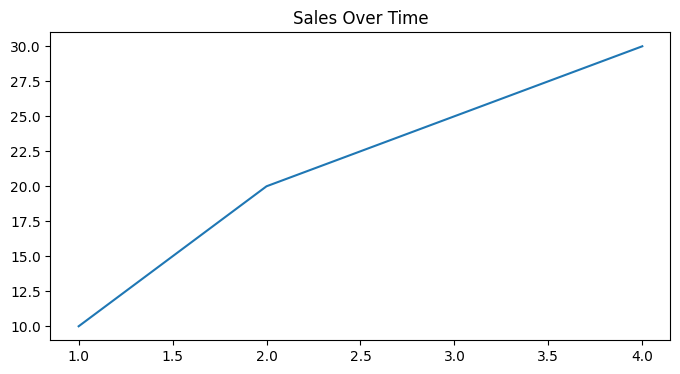
This example creates a plot that is 8 inches wide and 4 inches tall.
Changing Axes Limits
Sometimes, you might want to set specific limits for your x and y axes:
plt.plot(x, y)
plt.title('Sales Over Time')
plt.xlim(0, 5)
plt.ylim(0, 40)
plt.show()
Output:
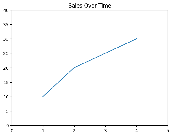
plt.xlim() and plt.ylim() allow you to set the minimum and maximum values for the axes.
Customizing Ticks and Tick Labels
Ticks and tick labels can be customized to better represent your data:
plt.plot(x, y)
plt.title('Sales Over Time')
plt.xticks([1, 2, 3, 4], ['Jan', 'Feb', 'Mar', 'Apr'])
plt.yticks([10, 20, 30], ['Low', 'Medium', 'High'])
plt.show()
Output:
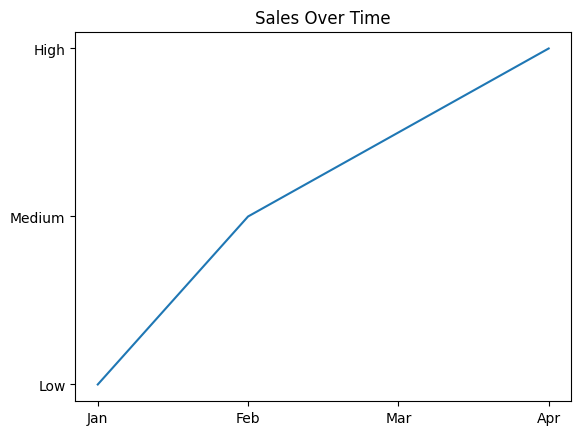
In this example:
plt.xticks()replaces the default numeric ticks with custom labels like 'Jan', 'Feb', etc.plt.yticks()customizes the y-axis ticks to display 'Low', 'Medium', and 'High'.
Adding Annotations
Annotations can highlight specific points or trends in your plot:
plt.plot(x, y, marker='o')
plt.title('Sales Over Time')
plt.xlabel('Time (months)')
plt.ylabel('Sales (units)')
plt.annotate('Peak Sales', xy=(4, 30), xytext=(3, 35),
             arrowprops=dict(facecolor='black', arrowstyle='->'))
plt.show()
Output:
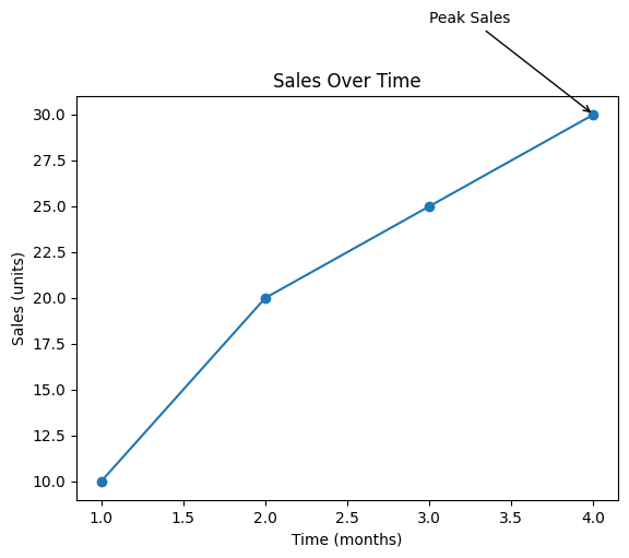
In this example:
plt.annotate()adds the text 'Peak Sales' near the point (4, 30).xytextsets the position of the annotation text.arrowpropsadds an arrow pointing to the annotated point.
Conclusion
In this second part of the “Mastering Matplotlib” series, we enhanced our plots by adding informative titles, labels, and legends. We also explored how to customize the plot’s appearance by adjusting dimensions, changing axis limits, customizing ticks, and adding annotations. These techniques are essential for creating clear, informative, and visually appealing plots.
In the next part of the series (Part — 3), we’ll delve deeper into different types of plots, such as bar plots, histograms, scatter plots, and pie charts, and explore how to create and customize them using Matplotlib.
If you like the article and would like to support me make sure to:
👏 Clap for the story (as much as you liked it 😊) and follow me 👉 📰 View more content on my medium profile 🔔 Follow Me: LinkedIn | Medium | GitHub | Twitter
Feel free to share your thoughts and questions in the comments below!


