avatarEbrahim Mousavi

Free AI web copilot to create summaries, insights and extended knowledge, download it at here

3999

Abstract

e figure.</li><li><code>plt.plot()</code> creates a line plot.</li><li><code>plt.xlabel()</code>, <code>plt.ylabel()</code>, and <code>plt.title()</code> add labels and a title.</li><li><code>plt.show()</code> displays the plot.</li></ul><h1 id="01d7">Overview of pyplot</h1><p id="4f2f"><code>pyplot</code> is designed to provide a simple interface for creating common types of plots. It supports a variety of plotting functions like <code>plot()</code>, <code>scatter()</code>, <code>bar()</code>, <code>hist()</code>, and more. Each of these functions can be customized with arguments to adjust colors, styles, markers, and other properties.</p><h1 id="3e7d">Basic Plotting</h1><p id="b145">Now that we’ve covered the basics, let’s explore how to create and customize plots in Matplotlib.</p><h2 id="ea17">Plotting Line Graphs</h2><p id="f1cd">Line graphs are the simplest and most common type of plot. You can plot a basic line graph using the <code>plot()</code> function:</p><div id="2af5"><pre><span class="hljs-keyword">import</span> matplotlib.pyplot <span class="hljs-keyword">as</span> plt

x = [<span class="hljs-number">1</span>, <span class="hljs-number">2</span>, <span class="hljs-number">3</span>, <span class="hljs-number">4</span>] y = [<span class="hljs-number">1</span>, <span class="hljs-number">4</span>, <span class="hljs-number">2</span>, <span class="hljs-number">3</span>]

plt.plot(x, y) plt.xlabel(<span class="hljs-string">'X-axis'</span>) plt.ylabel(<span class="hljs-string">'Y-axis'</span>) plt.title(<span class="hljs-string">'Basic Line Graph'</span>) plt.<span class="hljs-keyword">show</span>()</pre></div><p id="49f1"><b>Output:</b></p><figure id="5187"><img src="https://cdn-images-1.readmedium.com/v2/resize:fit:800/1*_SSMwwH_d-l0-3DvINIq9g.png"><figcaption></figcaption></figure><p id="3e77">This will generate a simple line graph, plotting <code>y</code> against <code>x</code>.</p><h2 id="ba3d">Customizing Line Styles and Colors</h2><p id="291f">Matplotlib allows you to customize line styles and colors to make your plots more visually appealing. You can change the <b>color</b>, <b>line style</b>, and <b>marker</b> of the line using additional arguments in the <code>plot()</code> function:</p><div id="8728"><pre><span class="hljs-keyword">import</span> matplotlib.pyplot <span class="hljs-keyword">as</span> plt

x = [<span class="hljs-number">1</span>, <span class="hljs-number">2</span>, <span class="hljs-number">3</span>, <span class="hljs-number">4</span>] y = [<span class="hljs-number">1</span>, <span class="hljs-number">4</span>, <span class="hljs-number">2</span>, <span class="hljs-number">3</span>]

plt.plot(x, y, color=<span class="hljs-string">'green'</span>, linestyle=<span class="hljs-string">'--'</span>, linewidth=<span class="hljs-number">2</span>) plt.xlabel(<span class="hljs-string">'X-axis'</span>) plt.ylabel(<span class="hljs-string">'Y-axis'</span>) plt.title(<span class="hljs-string">'Customized Line Graph'</span>) plt.show()</pre></div><p id="8581"><b>Output:</b></p><figure id="a9d5"><img src="https://cdn-images-1.readmedium.com/v2/resize:fit:800/1*Zwg6A8i1PpF845fxpXWhnA.png"><figcaption></figcaption></figure><p id="17b1"><b>In this example:</b></p><ul><li><code>color='green'</code> changes the line color.</li><li><code>linestyle='--'</code> makes the line dashed.</li><li><code>linewidth=2</code> increases the line thickness.</li></ul><h2 id="8e3c">Adding Markers</h2><p id="e5bf">Markers are used to highlight individual data points on the line. You can add markers by specifying the <code>marker</code> argument:</p><div id="54a3"><pre><span class="hljs-keyword">import</span> matplotlib.pyplot <span class="hljs-keyword">as</span> plt

x = [<span class="hljs-number">1</span>, <span class="hljs-number">2</span>, <span class="hljs-number">3</span>, <span class="hljs-number">4</span>] y = [<span class="hljs-number">1</span>, <span class="hljs-number">4</span>, <span class="hljs-number">2</span>, <span cla

Options

ss="hljs-number">3</span>]

plt.plot(x, y, marker=<span class="hljs-string">'o'</span>, color=<span class="hljs-string">'blue'</span>, linestyle=<span class="hljs-string">'-'</span>, linewidth=<span class="hljs-number">2</span>) plt.xlabel(<span class="hljs-string">'X-axis'</span>) plt.ylabel(<span class="hljs-string">'Y-axis'</span>) plt.title(<span class="hljs-string">'Line Graph with Markers'</span>) plt.show()</pre></div><p id="ce75">Output:</p><figure id="092f"><img src="https://cdn-images-1.readmedium.com/v2/resize:fit:800/1*wlARv5J2qIpNBLe5A3t1RQ.png"><figcaption></figcaption></figure><p id="ee1f">Here, <code>marker='o'</code> adds circular markers at each data point.</p><h2 id="e6d4">Plotting Multiple Lines</h2><p id="65c5">You can plot multiple lines on the same graph by calling the <code>plot()</code> function multiple times before <code>show()</code>:</p><div id="a7c5"><pre><span class="hljs-keyword">import</span> matplotlib.pyplot <span class="hljs-keyword">as</span> plt

x = [<span class="hljs-number">1</span>, <span class="hljs-number">2</span>, <span class="hljs-number">3</span>, <span class="hljs-number">4</span>] y1 = [<span class="hljs-number">1</span>, <span class="hljs-number">4</span>, <span class="hljs-number">2</span>, <span class="hljs-number">3</span>] y2 = [<span class="hljs-number">2</span>, <span class="hljs-number">3</span>, <span class="hljs-number">4</span>, <span class="hljs-number">5</span>]

plt.plot(x, y1, marker=<span class="hljs-string">'o'</span>, color=<span class="hljs-string">'blue'</span>, label=<span class="hljs-string">'Line 1'</span>) plt.plot(x, y2, marker=<span class="hljs-string">'s'</span>, color=<span class="hljs-string">'red'</span>, label=<span class="hljs-string">'Line 2'</span>) plt.xlabel(<span class="hljs-string">'X-axis'</span>) plt.ylabel(<span class="hljs-string">'Y-axis'</span>) plt.title(<span class="hljs-string">'Multiple Lines'</span>) plt.legend() plt.show()</pre></div><p id="faf5">Output:</p><figure id="a26e"><img src="https://cdn-images-1.readmedium.com/v2/resize:fit:800/1*vxFG-yXmG2Ii0_HRxN1Iyg.png"><figcaption></figcaption></figure><p id="adda">This code plots two lines with different styles and adds a legend to distinguish between them.</p><h1 id="a848">Conclusion</h1><p id="677d">In this first part of the “<b>Mastering Matplotlib</b>” series, we introduced you to the basics of Matplotlib, a powerful Python library for data visualization. We covered what Matplotlib is, how to install and set it up, and explored the fundamental structure of a Matplotlib plot. You learned how to create basic line graphs, customize line styles and colors, add markers, and plot multiple lines on a single graph.</p><p id="e61c">These foundational skills are crucial as we move forward into more advanced topics. In the next part of this tutorial series (<a href="https://readmedium.com/mastering-matplotlib-part-6-exploring-3d-plotting-0423821e2e10"><b>Part — 2</b></a>), we’ll focus on enhancing your plots with detailed <b>labels</b>, <b>titles</b>, and <b>legends</b>. We’ll also dive into plot customization techniques, such as <b>adjusting dimensions</b>, <b>changing axis limits</b>, <b>customizing ticks</b>, and <b>adding annotations</b>.</p><p id="6efa"><b>If you like the article and would like to support me make sure to:</b></p><p id="97fd">👏 Clap for the story (<b>as much as you liked it <a href="https://emojipedia.org/smiling-face-with-smiling-eyes"></a></b><a href="https://emojipedia.org/smiling-face-with-smiling-eyes">😊</a>) and follow me 👉 📰 View more content on my medium profile 🔔 Follow Me: <a href="https://www.linkedin.com/in/ebimsv/"><b>LinkedIn</b></a> | <a href="https://medium.com/@ebimsv"><b>Medium</b></a> | <a href="https://github.com/Ebimsv?tab=repositories"><b>GitHub</b></a> | <a href="https://x.com/ebiimsv"><b>Twitter</b></a></p><p id="27c8">Feel free to share your thoughts and questions in the comments below!</p><h1 id="1f68">References:</h1></article></body>

Mastering Matplotlib: Part 1. An Introduction and Basic Plotting Techniques

Unlocking Data Visualization: Your First Steps with Matplotlib

Source: OpenArt SDXL

🔜 Next: Enhancing Plots with Labels, Titles, Legends, and Customizations

During my recent machine learning course at the university, I explored various essential tools and techniques used in data analysis and visualization. I’ve decided to share some of these insights in a series of blog posts on Medium. This post on Matplotlib is part of that series, offering a practical introduction to one of Python’s most powerful plotting libraries. For those interested in diving deeper, additional code examples can be found at my GitHub page: [GitHub].

Matplotlib is one of the most popular plotting libraries in Python, widely used for creating static, animated, and interactive visualizations. Whether you are a data scientist, engineer, or just someone who wants to visualize data, Matplotlib provides all the tools you need to create publication-quality plots. In this tutorial, we’ll start with the basics, setting a strong foundation for more advanced plotting in the series.

Installation and Setup

Before diving into plotting, you need to install Matplotlib. You can install it using pip:

pip install matplotlib

Once installed, you can import Matplotlib in your Python scripts or Jupyter notebooks:

import matplotlib.pyplot as plt

pyplot is the Matplotlib submodule that provides a MATLAB-like interface, making it easier to create plots quickly.

Basic Structure of a Matplotlib Plot

Matplotlib plots typically consist of several components:

  • Figure: The entire window or page where the plot appears.
  • Axes: The area where the data is plotted, including the x and y-axis.
  • Axis: Represents the data values, including ticks and labels.
  • Plot Elements: These include lines, markers, text, etc., that are added to the Axes.

Here’s an example of a simple plot:

import matplotlib.pyplot as plt

# Create data
x = [1, 2, 3, 4, 5]
y = [2, 3, 5, 7, 11]

# Create a plot
plt.figure(figsize=(8, 6))
plt.plot(x, y)

# Add labels and title
plt.xlabel('X-axis')
plt.ylabel('Y-axis')
plt.title('Simple Line Plot')

# Show the plot
plt.show()

Output:
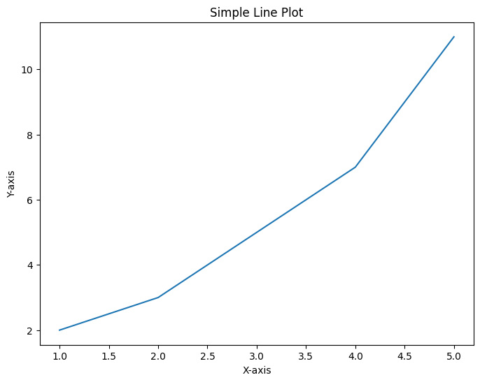
In this code:

  • plt.figure() initializes the figure.
  • plt.plot() creates a line plot.
  • plt.xlabel(), plt.ylabel(), and plt.title() add labels and a title.
  • plt.show() displays the plot.

Overview of pyplot

pyplot is designed to provide a simple interface for creating common types of plots. It supports a variety of plotting functions like plot(), scatter(), bar(), hist(), and more. Each of these functions can be customized with arguments to adjust colors, styles, markers, and other properties.

Basic Plotting

Now that we’ve covered the basics, let’s explore how to create and customize plots in Matplotlib.

Plotting Line Graphs

Line graphs are the simplest and most common type of plot. You can plot a basic line graph using the plot() function:

import matplotlib.pyplot as plt

x = [1, 2, 3, 4]
y = [1, 4, 2, 3]

plt.plot(x, y)
plt.xlabel('X-axis')
plt.ylabel('Y-axis')
plt.title('Basic Line Graph')
plt.show()

Output:
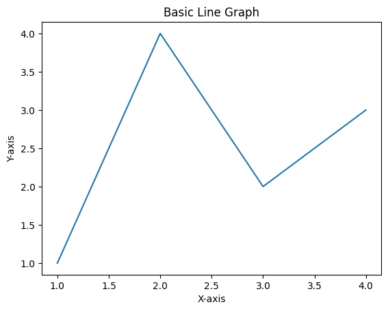
This will generate a simple line graph, plotting y against x.

Customizing Line Styles and Colors

Matplotlib allows you to customize line styles and colors to make your plots more visually appealing. You can change the color, line style, and marker of the line using additional arguments in the plot() function:

import matplotlib.pyplot as plt

x = [1, 2, 3, 4]
y = [1, 4, 2, 3]

plt.plot(x, y, color='green', linestyle='--', linewidth=2)
plt.xlabel('X-axis')
plt.ylabel('Y-axis')
plt.title('Customized Line Graph')
plt.show()

Output:
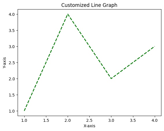
In this example:

  • color='green' changes the line color.
  • linestyle='--' makes the line dashed.
  • linewidth=2 increases the line thickness.

Adding Markers

Markers are used to highlight individual data points on the line. You can add markers by specifying the marker argument:

import matplotlib.pyplot as plt

x = [1, 2, 3, 4]
y = [1, 4, 2, 3]

plt.plot(x, y, marker='o', color='blue', linestyle='-', linewidth=2)
plt.xlabel('X-axis')
plt.ylabel('Y-axis')
plt.title('Line Graph with Markers')
plt.show()

Output:
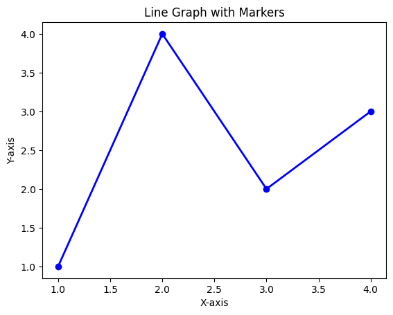
Here, marker='o' adds circular markers at each data point.

Plotting Multiple Lines

You can plot multiple lines on the same graph by calling the plot() function multiple times before show():

import matplotlib.pyplot as plt

x = [1, 2, 3, 4]
y1 = [1, 4, 2, 3]
y2 = [2, 3, 4, 5]

plt.plot(x, y1, marker='o', color='blue', label='Line 1')
plt.plot(x, y2, marker='s', color='red', label='Line 2')
plt.xlabel('X-axis')
plt.ylabel('Y-axis')
plt.title('Multiple Lines')
plt.legend()
plt.show()

Output:
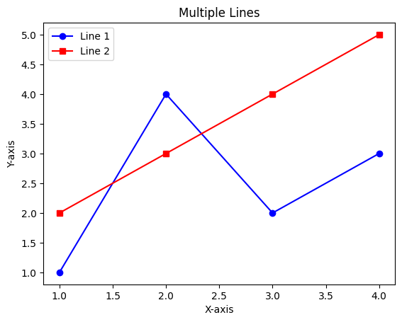
This code plots two lines with different styles and adds a legend to distinguish between them.

Conclusion

In this first part of the “Mastering Matplotlib” series, we introduced you to the basics of Matplotlib, a powerful Python library for data visualization. We covered what Matplotlib is, how to install and set it up, and explored the fundamental structure of a Matplotlib plot. You learned how to create basic line graphs, customize line styles and colors, add markers, and plot multiple lines on a single graph.

These foundational skills are crucial as we move forward into more advanced topics. In the next part of this tutorial series (Part — 2), we’ll focus on enhancing your plots with detailed labels, titles, and legends. We’ll also dive into plot customization techniques, such as adjusting dimensions, changing axis limits, customizing ticks, and adding annotations.

If you like the article and would like to support me make sure to:

👏 Clap for the story (as much as you liked it 😊) and follow me 👉 📰 View more content on my medium profile 🔔 Follow Me: LinkedIn | Medium | GitHub | Twitter

Feel free to share your thoughts and questions in the comments below!

References:

Matplotlib
Machine Learning
Visualization
AI
Data Mining
Recommended from ReadMedium
avatarMr.shadow
AI(Artificial intelligence)

2 min read