
How to Design Attractive Power BI Reports
In It to Win It 🤠: Part 1 of Participating in the FP20 Analytics Challenge on Data-Driven Education Management
Introduction
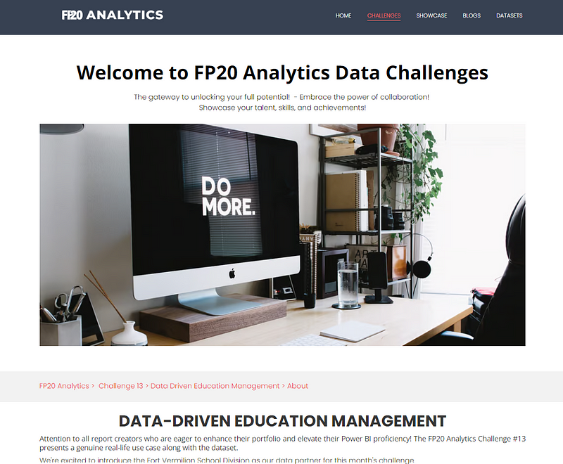
I’ve decided to participate in my first analytics competition: the FP20 Analytics Challenge on Data-Driven Education Management (you can view the challenge site here)! Why? I wanted access to the real data provided by the Fort Vermilion School Division (FVSD) and to explore the education domain 😁.
As I navigate this challenge, I plan to write a few articles on my methods. This first article focuses on developing the initial report design for this challenge. As you will see in the next sections, the ‘final output’ of my initial design process is mostly work in progress sketches (like the one presented in this cover image). I don’t work too hard on having final sketched versions in this stage since I find the last 20% can easily take 90% of the time/resources and a lot might change once we actually start working in Power BI. For me, what’s important in this initial design stage is to construct a solid data narrative for our report before going full steam ahead in Power BI.
This design stage is, for me, the most daunting aspect of building a Power BI report. If you also feel it can get overwhelming figuring out how to structure your dashboard, I am right there with you! Hopefully some of the tips shared through my steps will help you in your next project.
About the Challenge
The Fort Vermilion School Division (FVSD) in Alberta, Canada, known for its data-driven educational approach, offers a challenge using their real data. The data encompasses student assessments across three semesters (Fall, Winter, Spring) over 3 school years, utilizing three test types (TOSREC, TOWRE, TOSWRF) with associated costs. Students are categorized by their performance into different levels and groups, with lower performers requiring additional classes in intervention groups.
The challenge involves creating a Power BI report to analyze and present data such as the total and percentage of students per assessment level, teacher requirements for intervention groups, and projected testing costs, all broken down by semester, school year, and school. This report aims to facilitate strategic planning and resource allocation in education.
Technical Requirements:
There are a few technical requirements that must be respected, such as the report:
- Must be restricted to a maximum of 2 pages.
- Contain at least 2 ZoomCharts Drill Down Visuals (with the competition being sponsored by ZoomCharts).
- Contain a tutorial overlay.
You can read the full brief here.
Step 1: Understand the User and Their Requirements
The first step involves understanding who will be using the Power BI report and what type of insights they wish to extract. I personally like to write it down explicitly (and normally validate with the client/user, but we don’t have that opportunity in the context of the competition 😅).
In our case, we understand the users from the FVSD are analytically savvy and would like their Power BI report to help them extract insights around student performance, its evolution over time, and the planning of intervention groups for students performing below average.
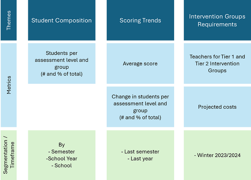
In their documentation, they also referenced some key metrics they would want the dashboard to display. I find it helpful to organize the information requirements into this type of architecture where I specify the key themes and then list the type of information needed.
Step 2: Start Sketching
You have the data, you have the requirements, it’s tempting to jump right away into Power BI and start developing your data model, DAX measures, etc., but I try to resist it! The goal here is to avoid being overly influenced by the data and its trends before forming an initial concept for the report.
Personally, I enjoy doing preliminary sketches on paper, some prefer working directly in design tools like Figma. Do what allows you to be the most creative and fluid in drafting your initial ideas.
When sketching, it’s important to concentrate on creating frames that tell a story and offer insights, rather than just showcasing all the requested KPIs. I find it helpful to imagine myself as one of the end-users who is preparing to present on the current status or overall performance of their program. With this perspective in mind, I try to design the ideal report that would effectively aid in conveying this narrative.
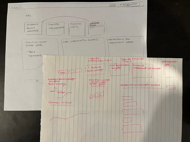
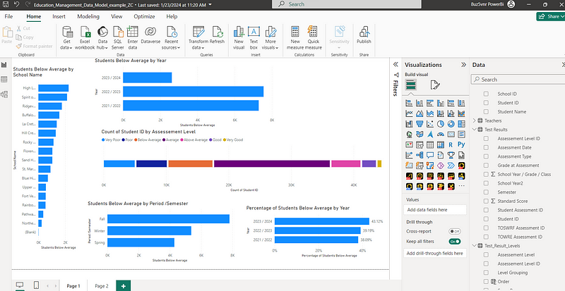
Here is an example of a few sketches I started doing for this project. It’s messy, but it allowed me to build an initial idea of what I wanted the first page of the report to look like.
Step 3: Take a QUICK Look at The Data
Now, I like to take a quick look at the data in Power BI to get a better sense of the dimensions of the data model and the distribution of the data. I don’t spend a lot of time working on the data model or creating DAX measures. Most of the time, I make the data model obvious connections and drag and drop columns in bar chart visualization just to get an idea of what is going on.
The process is messy, but it does the job ✅.
Step 4: Get Inspired
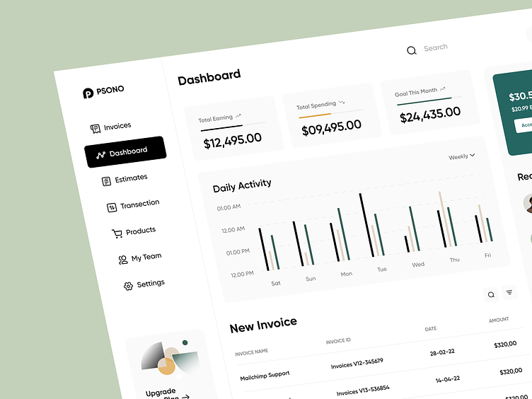
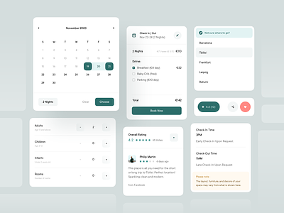
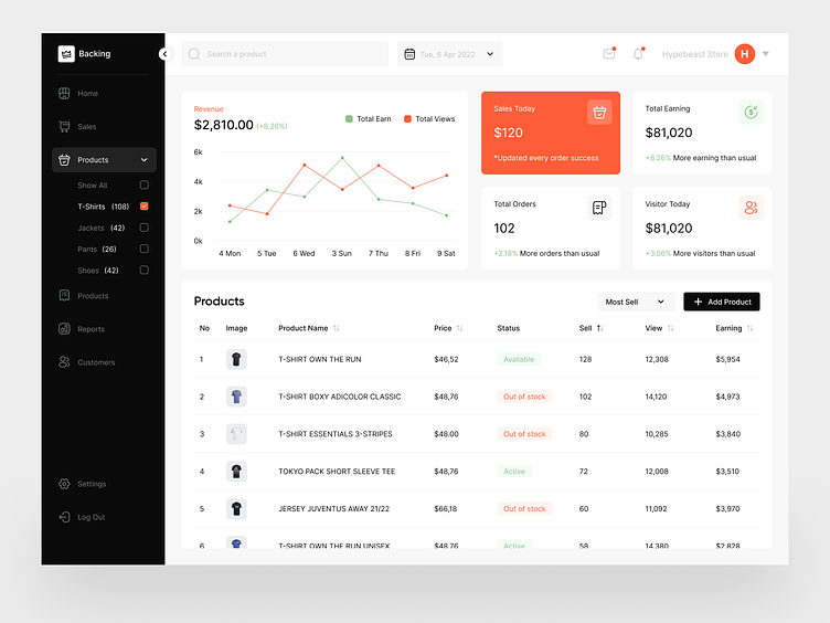
Now that I have a preliminary idea of the type of report I want to develop and a high-level view of the data, I go to my favorite design platforms to get inspiration from work done by other designers.
I’ve listed below my favorite go-to spots. Apart from Envato Elements, you can create a free account on these platforms and search for inspiration using tags like ‘Dashboard’, ‘Analytics’, etc.:
- Dribbble
- Behance
- Figma Community
- Envato Elements
At this point, I usually start collecting screenshots of ideas and concepts that I would want to incorporate into my report. I like to work in Figma, so often at this point, I even start a Figma draft file and paste over the work I see here.
For this project, here are some designs that caught my eye:
Step 5: Build a ‘Higher’ Fidelity Sketch
While many of us are familiar with the concepts of low fidelity and high fidelity sketches, I like to think of them more as a continuum. Like, you don’t need to build one low fidelity sketch and one high fidelity sketch. You can have multiple sketches that become increasingly close to the desired final product.
At this point, I usually start working in Figma because it accelerates the process of building and modifying shapes, text boxes, images, etc. There are also plugins from which you can also leverage assets (such as icons and pictures) from Figma community contributors.
For insights on incorporating Figma in Power BI project design, see my article: Figma Meets Power BI: Revolutionizing Report Design.
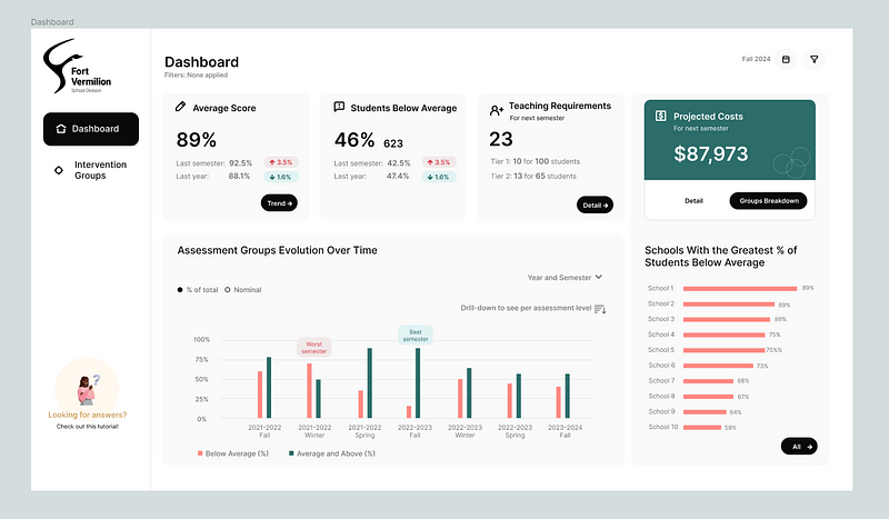
Here is where I am at in my ‘higher’ fidelity sketch in Figma. The design is slowly starting to take shape. It’s not complete yet, still a work in progress…
What’s important here is not to obsess over including each data point requested by the user or client. Instead, focus on creating a compelling, insights-driven narrative. Once you have a solid framework, it becomes easier to determine where to add additional details, rather than trying to map out everything precisely from the start.
Step 6: Refine Sketch with Color and Typography Selection
Color and typography play an important role in visual design.
It’s good to always keep in mind the user’s organization and try to match their branding identity. In our case, since we are making a report for the FVSD, I checked out their website to get a sense of the colors and fonts they use.
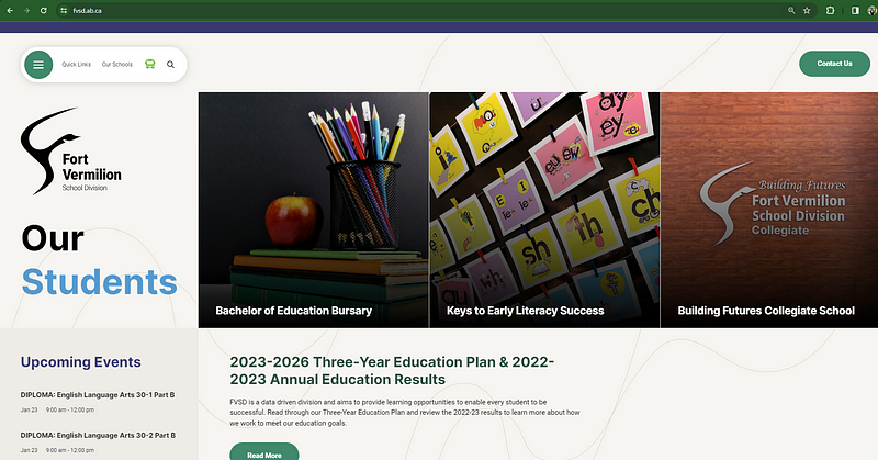
We see their main colors are green, light blue, dark purple, and beige. Ideally, we should incorporate this palette into the report design as much as possible. I’m undecided whether to use their color theme or experiment with colors from my inspiration shots in step 4.
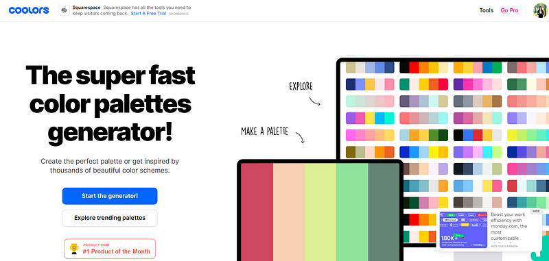
Online color palette generators are helpful for building a report color palette. You can insert some of the colors you plan to use, and the tool suggests complementary colors. My favorite one is Coolors .
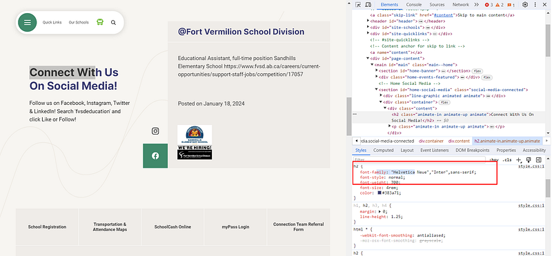
Regarding fonts, they mainly use Helvetica Neue, identifiable by selecting text, right-clicking, and choosing ‘Inspect.’
If you want to use fonts that aren’t default fonts in Power BI, you can! The only thing to keep in mind is that users need to also have these fonts installed on their device to be able to view them like you. For guidance on this, refer to my article: Beyond Defaults: Using Custom Fonts in Power BI
Another key point is accessibility when chosing colors and typography. Here are some things to keep in mind:
- Readability: Choose font sizes and weights that ensure readability. For accessibility, ensure there’s a high contrast between the text and background colors.
- Color Contrast: Check the contrast between background and text or visual elements to make sure they are legible for users with visual impairments.
- Color Blindness Considerations: Consider using patterns or icons in addition to colors in charts and graphs to aid users who are color-blind.
Step 7: Socialize Your Work in Progress
I find it helpful to get others’ opinions on some of my work in progress. I rarely wait to have a finalized version of one of my ‘better’ sketches. When I see an opportunity to collect feedback, I capitalize on it, as this helps ensure I’m on the right track and minimizes rework.
In client projects, I often present work in progress informally to gauge initial reactions and gather thoughts. When I started consulting independently, I worried this might seem unprofessional, but I’ve found that clients actually appreciate this approach...
For internal or personal projects (like this one!), I seek feedback from my sister or friends. It’s valuable to get input from people less analytically savvy to ensure you report/dashboard caters to the ‘lowest-denominator’ in terms of analytical expertise. (Yes — roasting my sister, but should get away with it since I haven’t yet been graced by her readership 😂💔). By experience, I am also always careful about socializing design ideas with other Power BI developers — we tend to not focus on the same elements that are actually important to the end-users... It’s good to seek feedback from a diversity of individuals, while concentrating on people that reflect the targeted end-user.
Conclusion
To wrap up, designing effective Power BI dashboards is an iterative and creative process. My approach involves understanding the user’s needs, sketching initial ideas, getting inspired and socializing them.
As I mentioned previously, this is the toughest stage in report development for me. It’s easy to get overwhelmed, and an inspirational tip one of my friends shared with me a few years ago (but not at all in a Power BI report development context 😅) is “B- changes the world”. If your sketch at this point is a B- deliverable, you are doing great! 💪
Take note that I don’t go through all of this in one sitting. I usually spread out the process over a few days to have time to reflect and come back to my work with a fresh mindset. Personally, I like to take walks and think about it between working sessions. That’s actually when I come up with my best ideas… maybe the Canadian cold ☃️has that effect!
I am excited to see how this project evolves and would love to get your feedback on my sketch!
Stay tuned for my next update in navigating this challenge!


