
How to create a two moon dataset and make predictions on it
As I have gone through part of Lesson 3 on the Udacity Introduction to Machine Learning, I have been learning about the Support Vector Machine, or SVM, estimator. In my last post I discussed using SVM’s SVC model to linearly classify whether bills were authentic. That post can be found here:- https://readmedium.com/how-to-use-the-support-vector-machine-svm-as-a-classifier-e3b597d1b125
In this post I am endeavouring to discuss how to use SVC on nonlinear datasets. Since it is difficult to find nonlinear datasets to make predictions on, I decided to take advantage of a facility that is part of sklearn, a machine learning library that was written to be compatible with the Python programming language. The dataset I used was sklearn’s make_moons dataset. I do have to say I was quite pleased to be able to create this dataset rather than scouring the internet looking for a suitable one to use.
I have written this script in a free online Jupyter Notebook, Google Colab. The great thing about this Jupyter Notebook is the fact that I can save my work in my Google drive. There are other Jupyter Notebooks that can be used, such as Saturn Cloud, Microsoft Azure, or www.jupyter.org, but I prefer Google Colab at this time.
After I created the file, I imported the libraries that I would need to properly run the program. In this instance I decided to import pandas, numpy, matplotlib, seaborn, and sklearn. Pandas is a library that creates and modifies datasets, so is an integral part of machine learning. Numpy carries out quick algebraic calculations and is also necessary because of the work it performs on vectors. Matplotlib and seaborn are graphical facilities that perform plotting functions of the data. And finally, sklearn is the primary library that is used to carry out machine learning operations.
After I imported the libraries, I created the dataset using sklearn’s make_moons function:-

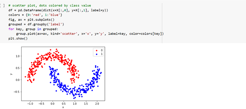
Once the moons dataset had been created, I used matplotlib to plot it on a graph, which is seen below:-
I then defined the independent variables. The first thing I did was to place the label in a variable called target, and then drop the label from the dataframe. I then placed the target in y, which is a variable I defined. The rest of the data, df, was then placed in X, which was another variable I defined. X is the independent variable while y is dependent.
I then used sklearn’s train_test_split to split the X and y variables up for training and validating:-

Once the training and validating datasets had been created, I defined the model. Since this is an exercise of SVM’s, I was obliged to use SVC and tune its parameters to achieve the best performance. In my previous post, I used the ‘linear’ kernel to achieve the best results in the bill authentication dataset, but in this post I have had to use a kernel that is nonlinear in an attempt to achieve the best accuracy. In the end I settled for the ‘rbf’ kernel. The radial basis kernel, or rbf, is a kernel function that is used in machine learning to find a nonlinear classifier or regression line.
The rbf kernel function is used to transform n-dimensional input to m-dimensional input, where m is much higher than n, and then find the dot product in higher dimensional efficiently. The main idea to use this kernel is: A linear classifier or regression curve in higher dimensions becomes a Non-linear classifier or regression curve in lower dimensions. I would at this time like to mention that I covered the concepts of dimensionality and dot products when I posted a course review on Udacity’s Linear Algebra course, the link being here:- https://readmedium.com/course-review-udacitys-linear-algebra-course-with-python-1b3f4f37f457

After I defined the model, I predicted on the validation set and achieved 100% accuracy!

I then evaluated the prediction with sklearn’s classification_report and confusion_matrix, which gave a breakdown of the score I achieved:-


