How to Create a Radar Chart in Python
Radar chart is a visualization technique used to compare multiple variables. This is a tutorial on how to create a radar chart in python.
Radar chart, also called as Spider chart or Web chart is a graphical method used for comparing multiple quantitative variables. It is a two dimensional polar visualization.
This is a tutorial on how to prepare a radar chart in python.
Import Libraries
We will be using Matplotlib library for visualization and NumPy library for several mathematical functions.
import numpy as np
import matplotlib.pyplot as pltplt.style.use('ggplot')Note that I have set the style for matplotlib as ggplot, you set your favorite style or use the default style.
Data for visualization
We will visualize the marks obtained by 2 students- Alice and Bob in five subjects using Radar chart. The subjects and marks are provided as lists.
subjects=['PHY','CHEM','BIO','MATH', 'ECO']
alice=[60,40,68,94,27]
bob=[81,30,75,37,46]
Obtain Angles
In this example, we are using radar chart to visualize 5 variables. Hence the chart would have 5 polar axes.
Total angle within the circle is 360 degree (2 pi radians). The angle between each axis will be 72 degree(360/5).
Matplotlib uses the angles in radians for preparing polar plots. We can obtain the angles using linespace function of numpy as below.
angles=np.linspace(0,2*np.pi,len(subjects), endpoint=False)
print(angles)Output:[0. 1.25663706 2.51327412 3.76991118 5.02654825]Note that endpoint parameter has to be set as False.
Completing full circle
We have obtained the angles for each variable. However, this can generate only four-fifth of a circle, we have to add the first angle at the end of the array to completely describe the circle.
angles=np.concatenate((angles,[angles[0]]))
print(angles)
Output:
[0. 1.25663706 2.51327412 3.76991118 5.02654825 0.]Similarly the first value has to be appended for all other arrays/lists used for visualization to maintain length consistency.
subjects.append(subjects[0])
alice.append(alice[0])
bob.append(bob[0])
Plotting Radar Chart
A basic radar chart can be plotted by setting polar=True in add_subplot function. and providing angles and values as argument to plot function.
fig=plt.figure(figsize=(6,6))
ax=fig.add_subplot(polar=True)
ax.plot(angles,alice)
plt.show()
Customizing the Radar Chart
We can customize the radar chart by adding more information.
Line and Marker Line and marker styles can be changed by providing arguments within the plot function. In the below code, line and marker style are set by using positional argument similar to a matplotlib line chart. Line color is set by using color argument of plot function.
Fill the Plot Area Plot are can be filled using the fill function providing the angle and values as arguments. Color and opacity can be set by using color and alpha parameters. It is a good practice to use contrasting colors and lower value of alpha when comparing for multiple entities.
Adding Polar Grids and Labels We can observe in the above figure that the polar axes are spaced at 45 degree from each other and the angles are provided as labels. The spacing of angles and the labels can be customized by using set_thetagrids function.
Add Legend Legend can be added by using plt.legend function and setting label within the plot function.
Add or Remove Grid Grid function can be used to show/hide the circular grid.
fig=plt.figure(figsize=(6,6))
ax=fig.add_subplot(polar=True)
#basic plot
ax.plot(angles,alice, 'o--', color='g', label='Alice')
#fill plot
ax.fill(angles, alice, alpha=0.25, color='g')
#Add labels
ax.set_thetagrids(angles * 180/np.pi, subjects)plt.grid(True)
plt.tight_layout()
plt.legend()
plt.show()
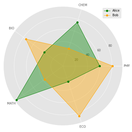
Alice vs Bob
Finally we have reached the much anticipated section of the tutorial, How Alice fares against Bob? This question can be answered by combining radar charts for Alice and Bob in the same chart.
fig=plt.figure(figsize=(6,6))
ax=fig.add_subplot(111, polar=True)
#Alice Plot
ax.plot(angles,alice, 'o-', color='g', linewidth=1, label='Alice')
ax.fill(angles, alice, alpha=0.25, color='g')#Bob Plot
ax.plot(angles,bob, 'o-', color='orange', linewidth=1, label='Bob')
ax.fill(angles, bob, alpha=0.25, color='orange')ax.set_thetagrids(angles * 180/np.pi, subjects)plt.grid(True)
plt.tight_layout()
plt.legend()
plt.show()
Just by glancing though the radar chart, we can observe that Alice performed much better than Bob in Mathematics. The performance of them were comparable in Biology and Chemistry. Bob’s performance in Physics and Economics was better than that of Alice. This is the advantage of Radar chart, it is very easy to comprehend when comparing several entities on multiple variables.
A radar chart is ideal for comparing 2–4 entities over 3–10 quantitative variables. Larger number of entities or variables can render the chart cluttered and difficult to comprehend.
Resources
Entire code for the tutorial is available in by GitHub repository.
You can access the tutorial in video format here:
https://www.youtube.com/watch?v=_VdOPQiaN64
Become a Member
I hope you like the article, I would highly recommend signing up for Medium Membership to read more articles by me or stories by thousands of other authors on variety of topics. Your membership fee directly supports me and other writers you read. You’ll also get full access to every story on Medium.
Similar Articles by the Author