
How To Build Responsive Layouts With Bootstrap 4 and Angular 📐
Every web app is assumed to be responsive, period.
Yes, even the complex enterprise applications bursting with large data tables and charts. Even if it isn’t the best fit, every type of content should be accessible from any kind of device…
Responsive web design (RWD) is an approach to web design which makes web pages render well on a variety of devices and window or screen sizes — Wikipedia
or for the more visual folks…
OK Tomáš, we have been building responsive web apps since forever so what’s the big deal ?!
Well, after many years of waiting, Bootstrap 4 was finally released in January 2018. Bootstrap was the first widely popular css framework which contained responsive css grid as one if its main features. The new version built upon this successful foundation and brings many improvements which makes working with responsive grids even easier.
Bootstrap is the OG of the responsive layouts
Angular 6 was released in May 2018. It brought unification of versioning in the Angular ecosystem. This means that all Angular projects are now released together.
Angular CLI 6 changed quite a lot in comparison to previous versions. New angular.json config file has completely different structure than the original angular-cli.json . This has some implications for how we approach Bootstrap / Angular integration in our projects.
There are many approaches to building responsive apps with Angular. Feel free to use one of the many available css frameworks or use Angular semi-official flex-layout library. Personally, I prefer Bootstrap because of simple declarative approach which is decoupled from the application logic. As always, use what is best for your particular use case.
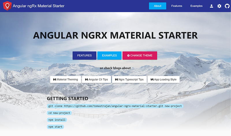
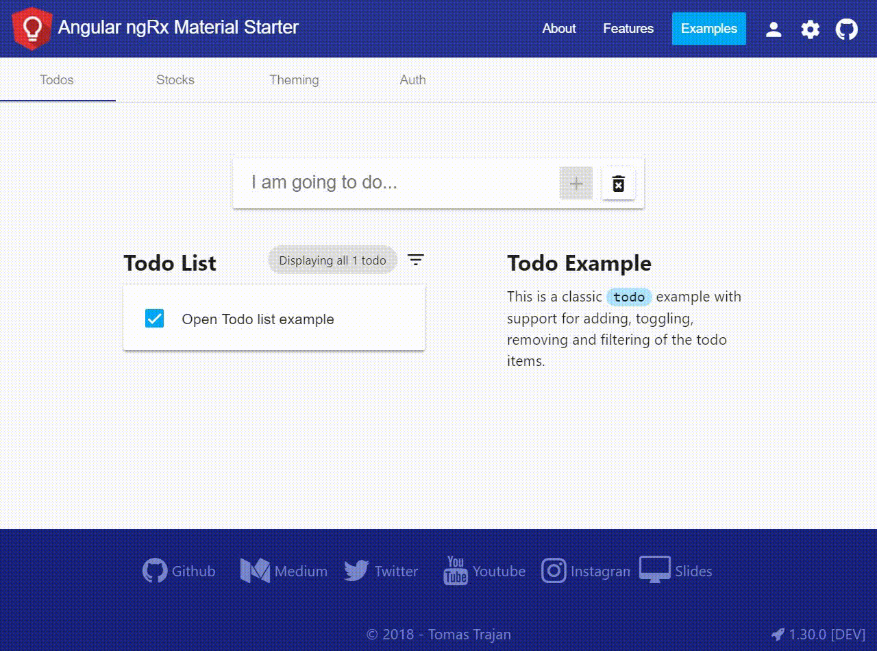
In this post we will integrate Bootstrap 4 in a fresh Angular 6 project generated using Angular CLI. Feel free to check out Angular Ngrx Material Starter if you’re interested in more complete example (GitHub repo).
Follow me on Twitter to get notified about the newest blog posts and interesting frontend stuff
We’re going to focus on using Bootstrap grid to create responsive layouts in Angular applications, therefore we will be only using
bootstrap-gridandbootstrap-rebootpackages. We will NOT be using any Bootstrap styling or components like dropdowns or forms…
Let’s do this ! Angular 6 ❤️ Bootstrap 4
First, we create new Angular project using Angular CLI’s ng new command…
ng new angular-bootstrap-example --style scss --prefix abe
In the command above, we are setting up support for Sass styles with .scss file extensions and prefix for our components as a initial letter of the project, hence abe.
Next, we have to install Bootstrap using npm i -S bootstrap.
Let’s look into our main styles.scss file located in src folder and add following two lines…
Another way of doing this would be adding minified Bootstrap distribution straight into angular.json file like in the following heavily simplified example…
Importing Bootstrap grid in the main style.scss file has one major advantage over importing it in the angular.json file. It enables us to override any Sass variable used by the Bootstrap styles definitions.
In practice, it can be useful to create styles-variables.scss file next to our styles.scss in the src folder with responsive layout breakpoints (as defined in Bootstrap by default).
That way we can import it on the first line of our styles.scss to be used with Bootstrap but also in any other component styles file to implement custom responsiveness in a consistent manner.
PRO TIP: Styles implemented in
styles.scssfile are applied only after application has already started up. You might want to display loading indicator before that happens to achieve better user experience on slower networks in many emerging markets. In that case you will have to add some inline styles directly intoindex.html
Learn how to implement this by checking one of my previous posts…
Building responsive layout
Adding Bootstrap reboot and grid enables us to easily build responsive layouts. Let’s see how it works by building a minimal example.
Our layout will have header, content and footer. The content will contain two main sections. We want to display them side by side on the large screens. On the smaller screens, we want them to be displayed as a single column, one under the other.
Please notice that in our example, all parts of the layout will be implemented inside of
AppComponent. In the real world application, all the parts would probably be implemented as stand alone components likeHeaderComponent,FooterComponentand the content would be probably populated with the help of theRouterbased on the current url… To see that in action, check out this more complex project…
Basic responsive grid classes
Let’s start with a quick recapitulation of how to build responsive layouts with Bootstrap. Feel free to skip this section if you have some previous experience with Bootstrap…
Layout is usually wrapped in the element with .container class to make it a bit narrower and centered on the very large screens. You might want to skip .container when building dashboards though. The next wrapper element uses .row class to signify responsive row. Every row has 12 columns by default.
Columns can be specified using .col class which applies to the extra small screens. We can add additional modifier like -sm -md -lg -xl to limit its effect to a particular screen size. Columns take appropriate amount of space based on their count. In practice, we often specify column size explicitly. For example, we can have a row with .col-md-4 and .col-md-8 which adds up to 12 columns. Check out official documentation for more details…
Do you think that NgRx or Redux are overkill for your needs? Looking for something simpler? Check out @angular-extensions/model library!

Responsive helper classes
Building high-level responsive layout is only half of the story. Often, it is also the content of the particular element which has to be responsive.
Imagine you have a header toolbar with a logo, company name and a navigation menu. On smaller screen, the amount of space becomes very limited so we might want to hide company name and display only the logo.
⚠️ Responsive helper classes work differently in Bootstrap 4
Previous versions of Bootstrap used responsive helper classes like .hidden-xs or .visible-sm-inline. This have changed. Current responsive helpers are more in line with css itself by following its display property.
This means that to achieve <div class="hidden-xs"></div> we now have to use <div class="d-none d-sm-block"></div>.
As we can see, helper classes are now “stacked” in a left to right fashion. We start by setting display none for the extra small screens and override it by setting it to block on small screens and larger…
Similarly, if we wanted to hide element only on the largest screens we would use <span class="d-inline d-xl-none"></div>. Notice that we can use any valid css display value as a modifier (eg block, inline-block, flex, …).
It takes some time to get used to the new style but in the end it is much more intuitive
Using Bootstrap 4 with Angular Material
Building everything from scratch can be fun but often, achieving results fast is a much more preferable way of doing business…
We can add Angular Material by running npm i -S @angular/material @angular/cdk @angular/animations and importing some of the available modules in our AppModule file. Let’s say we’re interested in a MatToolbarModule and MatCardModule…
The template then can be adjusted to…
And a last missing piece is to import one of the pre-build Angular Material themes into styles.scss file and we’re good to go!
👁️ Check out and play around with this minimalistic working example on ⚡StackBlitz!
BONUS: Additional resets
Even our minimal inclusion of Bootstrap adds couple of styles that don’t play so nicely with the Angular Material out of the box. Let’s create new styles-reset.scss file with the following content and import it after the original Bootstrap imports in the main styles.scss file.
Bootstrap also sets link color and uses underline text-decoration on the hovered links. We can remove this styles by adjusting content of the styles-variables.scss file like this..
Do you want to learn more about how to build your own custom Angular Material themes instead of using the pre-build one? Check out one of my older article…
Hooray!
We made it to the end! Hope you found this article helpful!
Please, help spread these tips to a wider audience with your 👏 👏 👏 and follow me on 🕊️ Twitter to get notified about newest blog posts 😉

Do you find the information in this article useful?
We are providing tailored expert support for developing of your Angular applications. Explore our wide range offers on angularexperts.ch
And never forget, future is bright

Starting an Angular project? Check out Angular NgRx Material Starter!

Feel free to check some other interesting Typescript, RxJS & Angular posts…


