
How to Build a Dynamic Calendar Visual in Power BI
A Step-by-Step Tutorial to Create an Interactive Calendar Dashboard in Power BI
🎁PBIX file available for download at the end of this article!
Introduction
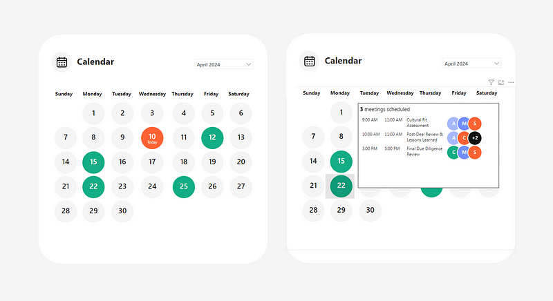
I’ve recently been working on Power BI projects that required tracking and visualizing upcoming meetings linked to project management activities. Building on one of Chandeep’s tutorials on developing a calendar dashboard using Power BI’s native matrix visual, I created a visual, as displayed on the cover image of this article, that highlights the dates of meetings. It also enables users to hover over the dates to see the details of each meetings.
Wanting to add a contemporary twist to it 🎨, I incorporated SVG code within some of the measures used to display the circles (in the calendar and the tooltip). However, you will notice that the key principles in setting up this calendar view rely solely on native Power BI visuals with fairly simple functions.
If you are interested in learning more about how to use SVGs in Power BI, here is my previous article where I explain in more detail how the code works:
In the following article, I will describe step-by-step how I developed this calendar visualization.
1. Prepare the Data Tables
The first step was to prepare the data tables. In my case, I had all the meetings in on excel table I named ProjectMeetings. I loaded it through Power Query. You can also access it in the folder available for download at the end of this article.

Then, I created the following calendar table in Power Query, leveraging the minimum and maximum date values of the ProjectMeetings table.

Here is the code used in Power Query to generate this table:
let
    GetMinDate = Date.StartOfMonth(List.Min(ProjectMeetings[#"Date"])),
    GetMaxDate = Date.EndOfMonth(List.Max(ProjectMeetings[#"Date"])),
    Source = #table({"MinDate", "MaxDate"}, {{GetMinDate, GetMaxDate}}),
    AddDateColumn = Table.AddColumn(Source, "Date", each {Number.From([MinDate])..Number.From([MaxDate])}),
    ExpandDates = Table.ExpandListColumn(AddDateColumn, "Date"),
    SelectColumns = Table.SelectColumns(ExpandDates, {"Date"}),
    ChangeDateType = Table.TransformColumnTypes(SelectColumns,{{"Date", type date}}),
    AddYearColumn = Table.AddColumn(ChangeDateType, "Year", each Date.Year([Date])),
    AddMonthTextColumn = Table.AddColumn(AddYearColumn, "Month", each Date.MonthName([Date])),
    AddMonthColumn = Table.AddColumn(AddMonthTextColumn, "Month - No", each Date.Month([Date])),
    AddWeekColumn = Table.AddColumn(AddMonthColumn, "Week - No", each Date.WeekOfYear([Date])),
    AddWeekdayColumn = Table.AddColumn(AddWeekColumn, "Weekday - No", each Date.DayOfWeek([Date])),
    AddWeekdayNamesColumn = Table.AddColumn(AddWeekdayColumn, "Weekday - Name", each Date.DayOfWeekName([Date])),
    AddDayColumn = Table.AddColumn(AddWeekdayNamesColumn, "Day - No", each Date.Day([Date])),
    AddStartofMonthDateColumn = Table.AddColumn(AddDayColumn, "Start of Month Date", each Date.StartOfMonth([Date])),
    AddYearandMonthColumn = Table.AddColumn(AddStartofMonthDateColumn, "Year and Month", each [Month] & " " & Number.ToText([Year])),
    ChangeDataTypes = Table.TransformColumnTypes(AddYearandMonthColumn,{{"Year", Int64.Type}, {"Month", type text}, {"Month - No", Int64.Type}, {"Week - No", Int64.Type}, {"Weekday - No", Int64.Type}, {"Weekday - Name", type text}, {"Day - No", Int64.Type}, {"Start of Month Date", type date}, {"Year and Month", type text}})
in
    ChangeDataTypes
I then loaded the Calendar table to model, connecting both tables on the Date column.

2. Preparing the Initial Visual
Next, with the data loaded, I was ready to prepare the initial matrix visual.
I first started by adding the matrix visual and dragged the Week — No and Weekday — Name fields from the Calendar table to the visual’s Rows and Columns, respectively.

To ensure that the weekday names were displayed in the proper order, I went to the table view and sorted the field by the Weekday — No column.
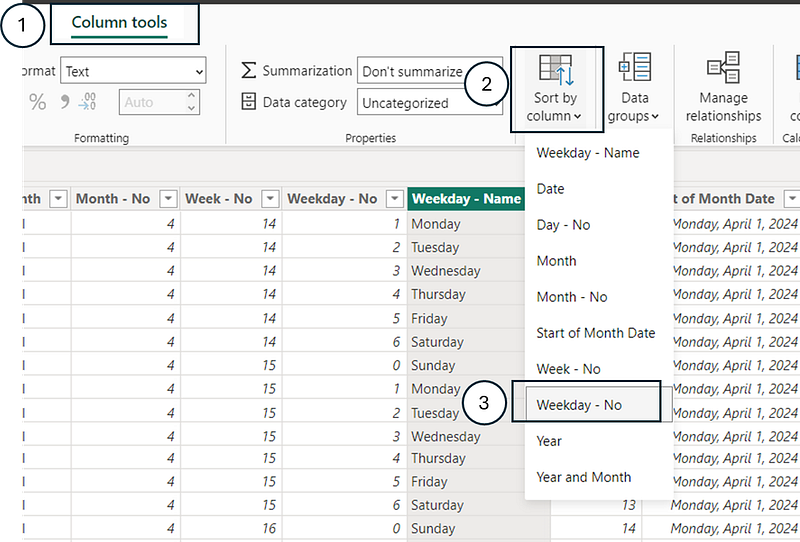
Next, I added a slicer with the Year and Month field from the Calendar table. To ensure the dates were displayed in the proper order, I sorted the field by the Start of Month Date column of the Calendar table.

3. Setting Up the Measures to Display the Calendar Dates
I first started by creating a measure title Meetings that gives the distinct count of meetings.
Meetings = DISTINCTCOUNT(ProjectMeetings[Index])Then, I also prepared a measure called Today that rendered today’s date.
Today = TODAY()Next, I made sure to have all my colors stored in DAX measures to ease referencing.
Color Black = "#141414"
Color Blue = "#748FFE"
Color Green = "#13AE85"
Color Grey = "#F5F5F5"
Color Light Blue = "#A7B9FE"
Color Orange = "#FF6334"
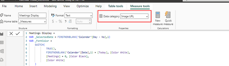
Color White = "#FFFFFF"Finally, leveraging the power of SVGs 🔥, I created the following Meetings Display measure to add in the Values’ field of the matrix. The goal of this measure was to generate circles with the dates inside of them. The color of each circle is defined depending on if the date is today or if the date holds meetings(s).
Meetings Display =
VAR _SelectedDate = FIRSTNONBLANK('Calendar'[Day - No],1)
VAR _FontColor =
    SWITCH(
            TRUE(),
            FIRSTNONBLANK('Calendar'[Date],1) = [Today], [Color White],
            [Meetings] = 0, [Color Black],
            [Color White]
    )

VAR _BackgroundColor =
    SWITCH(
        TRUE(),
        FIRSTNONBLANK('Calendar'[Date],1) = [Today], [Color Orange],
        [Meetings] = 0, [Color Grey],
        [Color Green]
    )

VAR _VisualDisplay =
IF(
    FIRSTNONBLANK('Calendar'[Date],1) = [Today],
    "
data:image/svg+xml;utf8, <svg width='75' height='60' xmlns='http://www.w3.org/2000/svg'>
<circle cx='37.5' cy='30' r='30' fill='"&_BackgroundColor&"' />
<text x='37.5' y='28' font-family='Segoe UI Semibold' font-size='20' fill='"&_FontColor&"' text-anchor='middle' alignment-baseline='middle'>"&_SelectedDate&"</text>
<text x='37.5' y='42' font-family='Segoe UI' font-size='10' fill='"&_FontColor&"' text-anchor='middle' alignment-baseline='middle'>Today</text>
</svg>
",

"
data:image/svg+xml;utf8, <svg width='75' height='60' xmlns='http://www.w3.org/2000/svg'>
<circle cx='37.5' cy='30' r='30' fill='"&_BackgroundColor&"' />
<text x='37.5' y='30' font-family='Segoe UI Semibold' font-size='20' fill='"&_FontColor&"' text-anchor='middle' alignment-baseline='middle'>"&_SelectedDate&"</text>
</svg>
"
)

RETURN _VisualDisplay_SelectedDate: Captures the day number from the ‘Calendar’ table’s ‘Day — No’ column for the first non-blank date in context. If there’s no specific date, it defaults to 1. This value is used later to display the day number in the SVG.
_FontColor: Determines the font color to use in the SVG based on conditions:
- If the date in context is today’s date, it uses the color specified by
[Color White]. - If the number of meetings (
[Meetings]) for the date in context is 0, it uses[Color Black]. - For any other case, it defaults to
[Color White].
_BackgroundColor: Decides the background color (circle fill color) for the SVG:
- If the date in context is today, it uses
[Color Orange]. - If there are no meetings for the date, it uses
[Color Grey]. - In all other cases, it defaults to
[Color Green].
_VisualDisplay:
- The measure generates different SVG code based on whether the selected date is today or not:
- If today: It generates an SVG image with a circle and two lines of text. The first line displays the day number, and the second line says “Today”. Both the circle’s fill color and the text’s color adjust based on the variables defined above.
- If not today: It creates a similar SVG image but with only one line of text (the day number), and without the “Today” label.
SVG Structure: Each SVG contains a circle and text elements positioned centrally. The circle’s fill color and the text’s color vary according to the logic defined in the _FontColor and _BackgroundColor variables.
⚠️Key things to keep in mind using this measure to render the SVG visual:
- The
Data categoryof a measure containing SVG code needs to beImage URL. You can define this from theMeasure toolstab.
- The
Image sizespecifications set in the matrix are the same as the ones defined in the measure. In my case, the height was defined as60 pxand the width was75 px.

After applying a few formatting steps (such as removing column and row totals, resizing columns, adjusting the slicer to a drop-down menu, etc.), I had the following calendar visual:

You can view the details of the formatting steps in the PBIX file available for download at the end of this article.
4. Creating a Distinct Table of Meeting Participants and Assigning Them Colors
The goal of this step was to create a table with all the participants names and assign each one a color that would be shown in the bubble’s tooltip.

I first created a calculated table named Participants that holds all the participants of the ProjectMeetings table.
Participants = DISTINCT(ProjectMeetings[Participant])Then, I created a calculated column Color that used the function RAND to assign a random value between 0 and 1 to each participant. I then assigned a color based on the result of each.
Color =
VAR _RandomValue = RAND()
VAR _Color =
    SWITCH(
        TRUE(),
        _RandomValue<=0.25, [Color Blue],
        _RandomValue<=0.5, [Color Orange],
        _RandomValue<=0.75, [Color Green],
        [Color Light Blue]
    )
RETURN _Color
Finally, I connected this new calculated table to the ProjectMeetings table in the data model.

5. Setting Up the Tooltip That Provides the Meeting Details

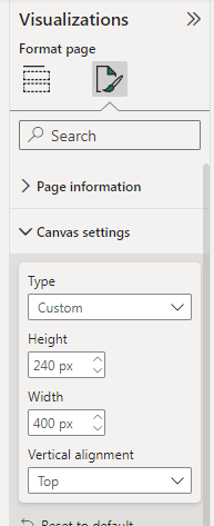
I started by creating a new page and customizing Height and Width in the Canvas settings.
I then added a table visual and added the fields Start , End , and Topic from ProjectMeetings to it.
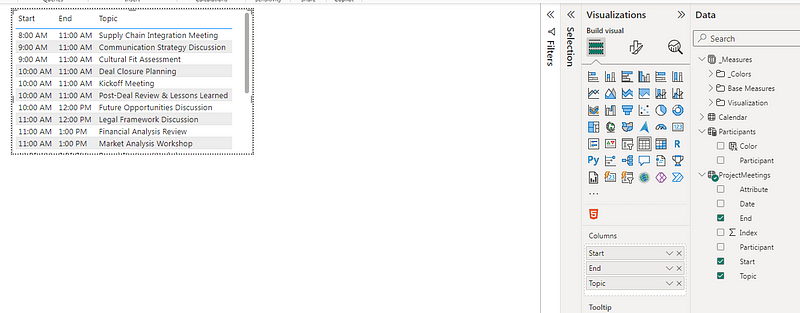
The fourth field I added to the table was the following measure titled Participants Display. The objective of this measure was to create those overalapping circles displaying the first letter of each meeting participant’s name. If there were over 3 participants, then the third circle would display the number of additionall participants (e.g.: +2).
Participants Display =
VAR _FirstParticipant = FIRSTNONBLANK(ProjectMeetings[Participant],1)
VAR _SecondParticipant =
    CALCULATE(
        FIRSTNONBLANK(ProjectMeetings[Participant],1),
        FILTER(
            ProjectMeetings,
            ProjectMeetings[Participant] <> _FirstParticipant
        )
    )
VAR _FirstParticipantLetter = LEFT(_FirstParticipant,1)
VAR _SecondParticipantLetter = LEFT(_SecondParticipant,1)
VAR _FirstParticipantColor =
    CALCULATE(
        FIRSTNONBLANK(Participants[Color],1),
        FILTER(
            Participants,
            Participants[Participant] = _FirstParticipant
        )
    )
VAR _SecondParticipantColor =
    CALCULATE(
        FIRSTNONBLANK(Participants[Color],1),
        FILTER(
            Participants,
            Participants[Participant] = _SecondParticipant
        )
    )
VAR _ThirdValue =
    SWITCH(
        TRUE(),
        [Participants]>2 && [Participants]<4,
            CALCULATE(
                FIRSTNONBLANK(ProjectMeetings[Participant],1),
                FILTER(
                    ProjectMeetings,
                    ProjectMeetings[Participant] <> _FirstParticipant &&
                    ProjectMeetings[Participant] <> _SecondParticipant
                )
            ),
        [Participants]>3, "+" & [Participants]-2
    )
VAR _ThirdValueColor =
    IF(
        [Participants]>2 && [Participants]<4,
            CALCULATE(
                FIRSTNONBLANK(Participants[Color],1),
                FILTER(
                    Participants,
                    Participants[Participant] = _ThirdValue
                )
            ),
            [Color Black]
    )
VAR _ThirdValueLetter =
    IF(
        [Participants]>2 && [Participants]<4,
        LEFT(_ThirdValue,1),
        _ThirdValue
    )

VAR _Display =
    SWITCH(
         TRUE(),
    [Participants]>2,
"data:image/svg+xml;utf8, <svg width='100' height='40' xmlns='http://www.w3.org/2000/svg'>
  <circle cx='20' cy='20' r='20' fill='"&_FirstParticipantColor&"' stroke='white' stroke-width='2' />
  <text x='20' y='20' font-family='Segoe UI Semibold' font-size='14' fill='white' text-anchor='middle' alignment-baseline='middle' >"&_FirstParticipantLetter&"</text>
  <circle cx='50' cy='20' r='20' fill='"&_SecondParticipantColor&"' stroke='white' stroke-width='2' />
  <text x='50' y='20' font-family='Segoe UI Semibold' font-size='14' fill='white' text-anchor='middle' alignment-baseline='middle' >"&_SecondParticipantLetter&"</text>
  <circle cx='80' cy='20' r='20' fill='"&_ThirdValueColor&"' stroke='white' stroke-width='2' />
  <text x='80' y='20' font-family='Segoe UI Semibold' font-size='14' fill='white' text-anchor='middle' alignment-baseline='middle' >"&_ThirdValueLetter&"</text>
</svg>
",
[Participants]>0,
"data:image/svg+xml;utf8, <svg width='100' height='40' xmlns='http://www.w3.org/2000/svg'>
  <circle cx='20' cy='20' r='20' fill='"&_FirstParticipantColor&"' stroke='white' stroke-width='2' />
  <text x='20' y='20' font-family='Segoe UI Semibold' font-size='14' fill='white' text-anchor='middle' alignment-baseline='middle' >"&_FirstParticipantLetter&"</text>
  <circle cx='50' cy='20' r='20' fill='"&_SecondParticipantColor&"' stroke='white' stroke-width='2' />
  <text x='50' y='20' font-family='Segoe UI Semibold' font-size='14' fill='white' text-anchor='middle' alignment-baseline='middle' >"&_SecondParticipantLetter&"</text>
</svg>
"
)
RETURN _Display_FirstParticipant: Finds the first non-blank participant from the ProjectMeetings table.
_SecondParticipant: Determines the second distinct participant in the ProjectMeetings table by excluding the first participant found.
_FirstParticipantLetter and _SecondParticipantLetter: Extracts the first letter of the first and second participants’ names, respectively.
_FirstParticipantColor and _SecondParticipantColor: Fetches the color associated with the first and second participants from the Participants table.
_ThirdValue: Decides what the third visual element represents. It could be either:
- The third distinct participant (if the total number of participants is between 3 and 3, inclusive), identified by their name.
- A “+” symbol followed by the remaining number of participants minus two (if there are more than three participants).
_ThirdValueColor: Determines the color for the third visual element, which is either the color associated with the third participant or black for the “+” symbol representation.
_ThirdValueLetter: Represents the first letter of the third participant’s name or the “+” symbol with the remaining participant count.
_Display:
- If there are more than two participants, the measure generates an SVG with three circles: The first two circles are colored based on the first two participants’ associated colors and contain their initials. The third circle’s color and content depend on whether there’s a third specific participant or a need to indicate additional participants beyond three.
- If there are only two participants (implied by the [Participants]>0 condition), it generates an SVG similar to the above but only with the first two circles.
After adding this measure as field in the table visual, I applied a few formatting steps such as making the column headers font white and resizing the columns.

At the end, I also added a title to the tooltip page based on the measure Tooltip Title.
Tooltip Title =
    SWITCH(
        TRUE(),
        [Meetings] = 0, "No meetings scheduled",
        [Meetings] = 1, "<b>" & [Meetings] & "</b>" & " meeting scheduled",
        "<b>" & [Meetings] & "</b>" & " meetings scheduled"
    )
As you will notice, I had some HTML code in my measure to bold the number of meetings. I leveraged the HTML content visual in Power BI to integrate the measure in my page.
If you are curious in knowing more how to use HTML and CSS in Power BI, here is one of my recent article on this topic:
As a final step, I added the tooltip page I created to the matrix visual.

Wrapping Up
Building a calendar visualization to display date related activities can be a cool option to leverage in some of your future dashboard projects 😎. As you can see, the logic is quite simple and you can go a step further a mimic some popular modern application interfaces using a bit of SVG code.
I hope this has given some ideas/inspired you. Would love to hear what you think and if you have other use cases you plan on using this type of visualization?! 💡
Here is the PBIX file to see all these examples in action.
Happy Power BI report designing ✨🎨!


